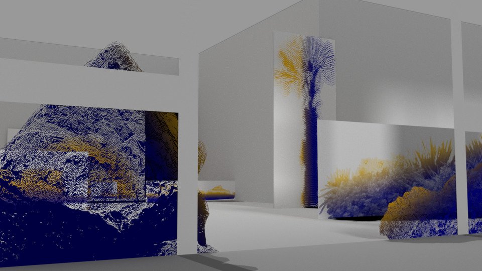
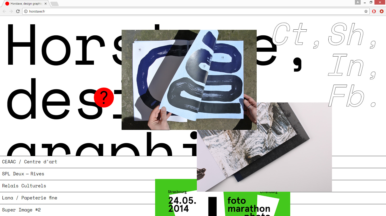
Projects 2026 — 2015
-
- Graphic design
- Website
Images
Text
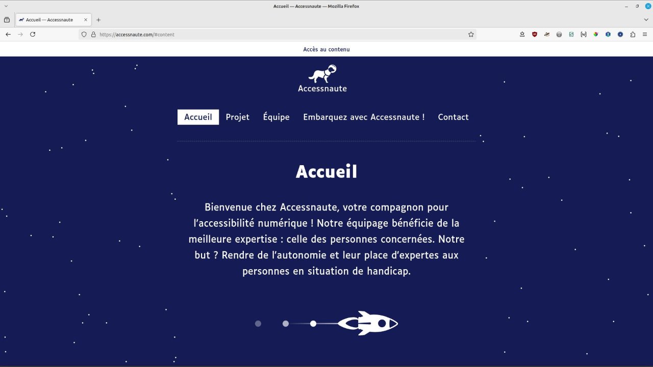
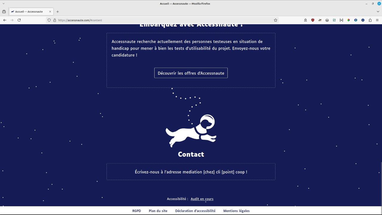
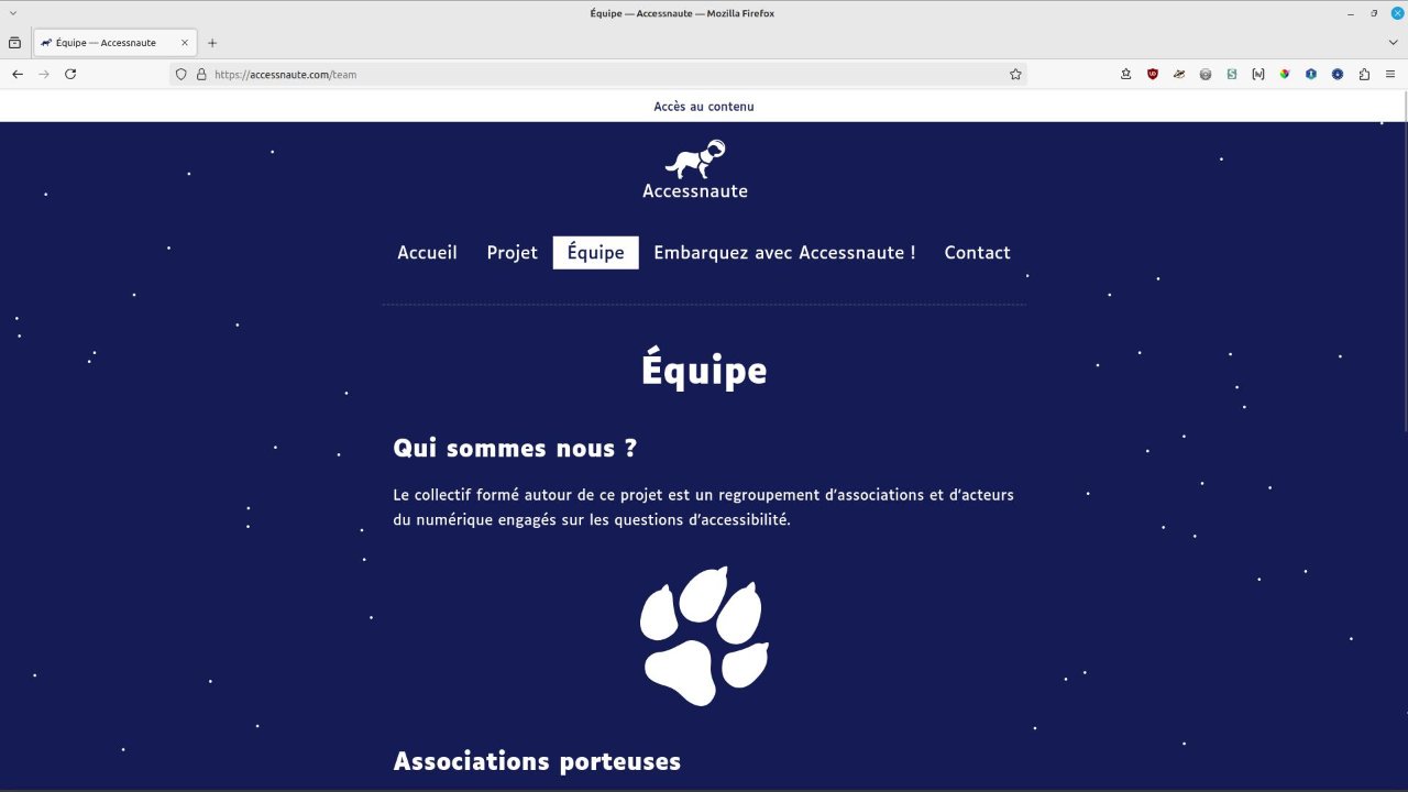
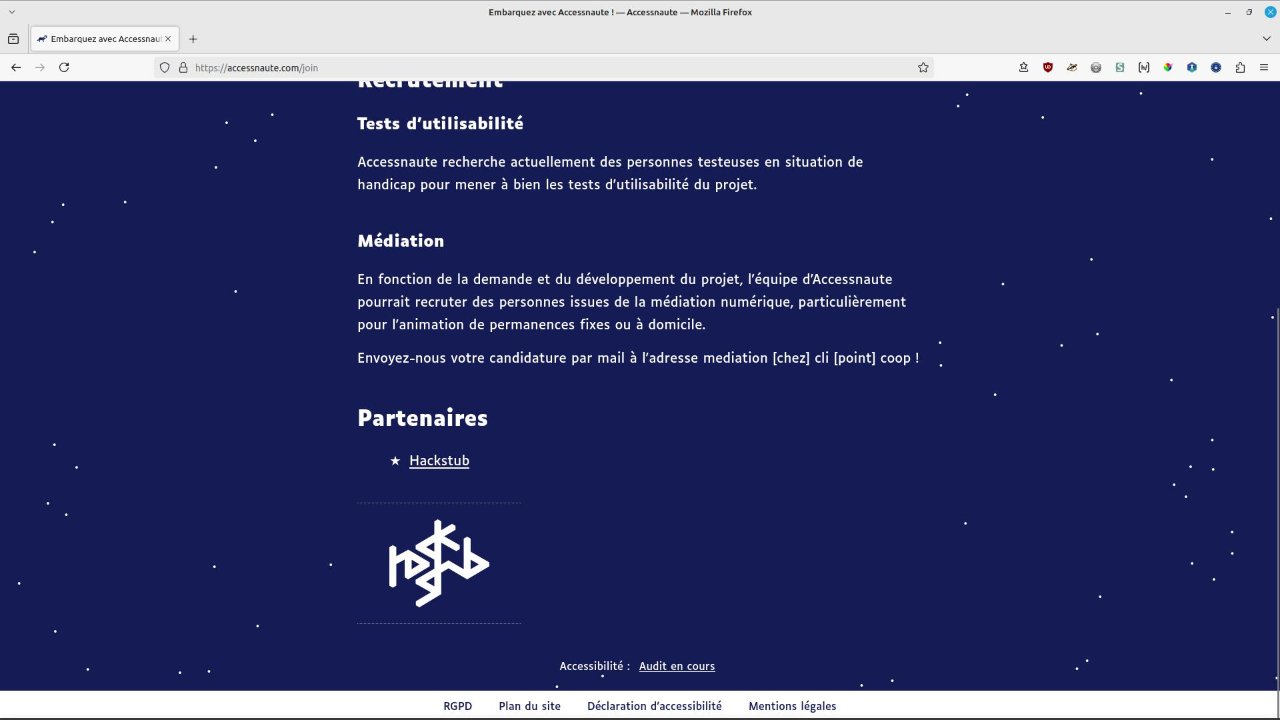
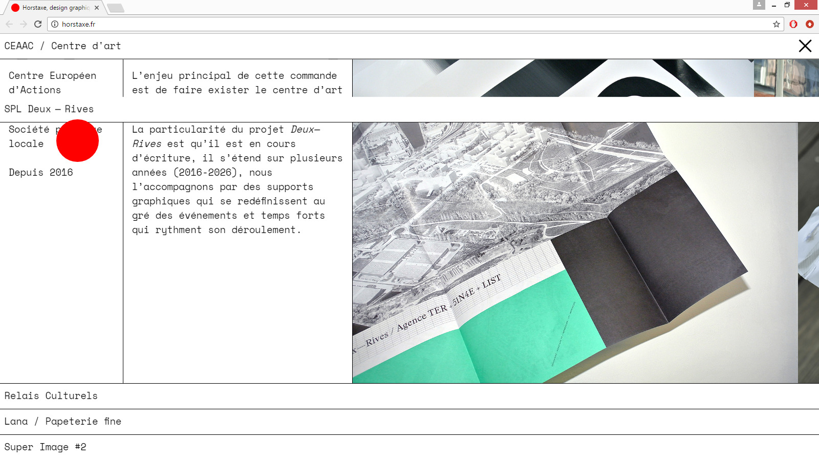
Visual identity, graphic design and development of the showcase website for Accessnaute, a digital accessibility project led by the CLI.
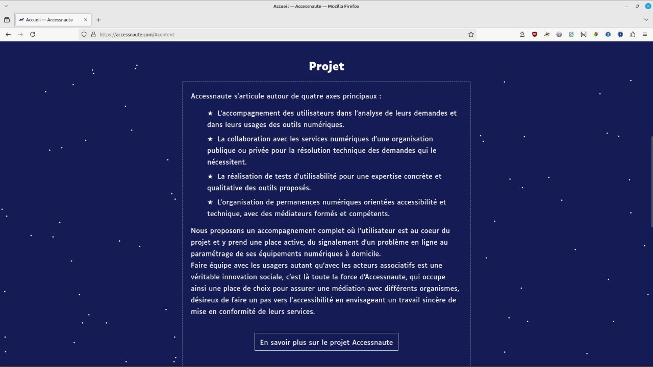
The aim of the project is to set up a platform for reporting accessibility problems, usability tests carried out by people with disabilities and digital accessibility-oriented computing permanencies in Strasbourg.
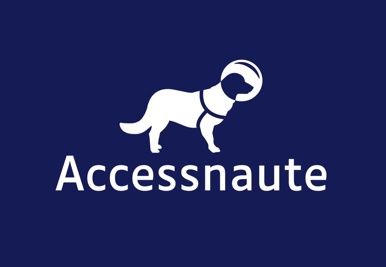
The identity explores the spatial register and the logotype represents a space guide dog. These graphic choices have been made to highlight the support and mediation dimension of the project, in particular the figure of the guide dog, presented as a companion for digital accessibility. They enhance the main objective of the Accessnaute project, which is to give people with disabilities back their autonomy and their place as experts.
Infos
- Year:
-
2024
- Location:
-
Strasbourg
- Type:
-
commission
- Customer:
-
Accessnaute, project led by the CLI
- Texts and images:
-
Accessnaute
- Font:
-
Luciole, Laurent Bourcellier, CC BY 4.0, 2019.
- CMS:
-
GRAV
-
Graphic design
Images
Text
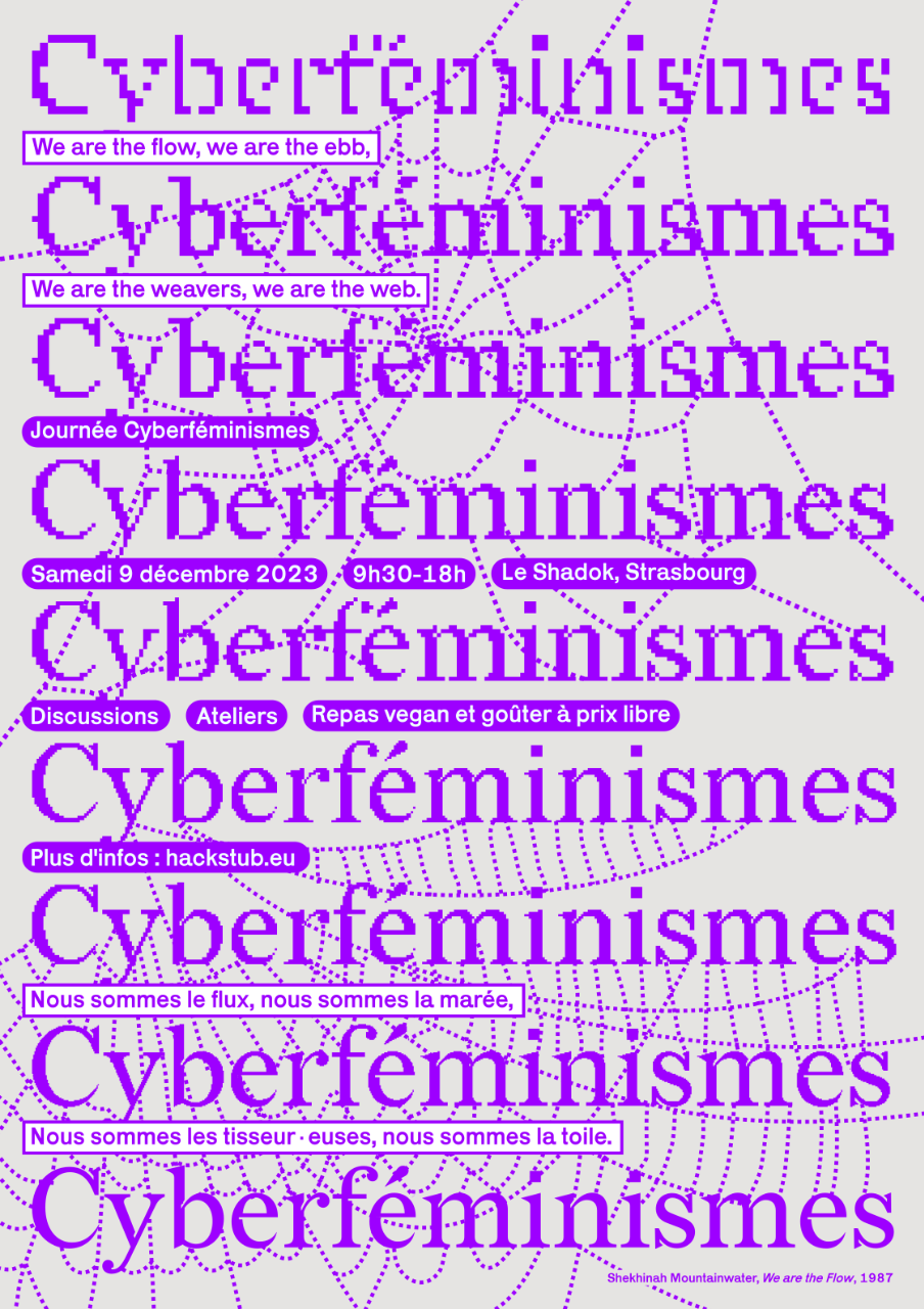
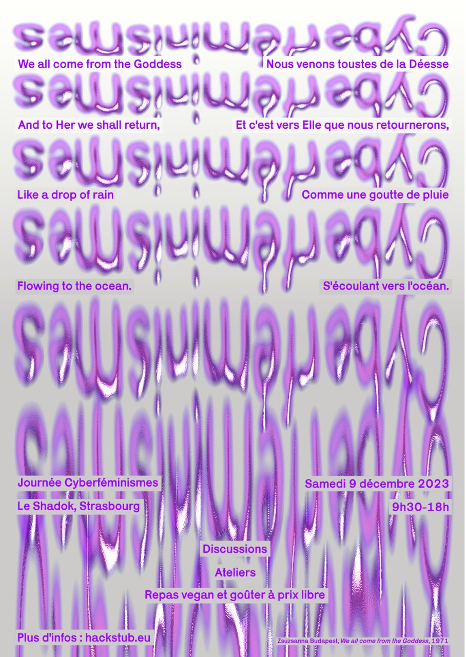
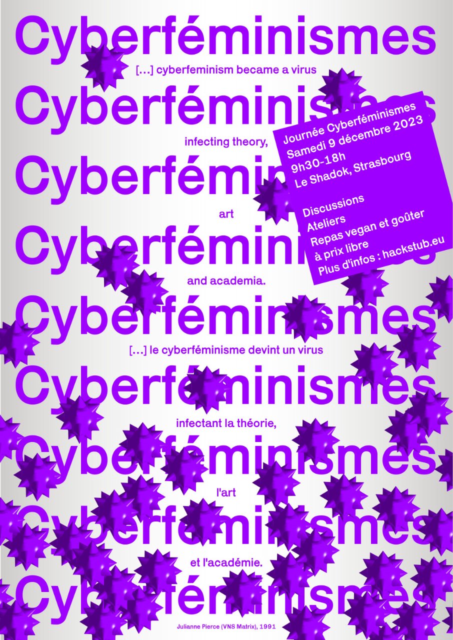
Triptych of posters for the Cyberfeminisms day on 9 December 2023 from 9.30am to 6pm at the Shadok in Strasbourg.
Organised by Hackstub, this key moment was devoted to discussions and workshops confronting gender issues in technology with emancipation strategies implemented in physical spaces and cyberspaces.
The themes represented in the posters were: the web/the network, the goddess/the flow, the virus/propagation.
Each poster features a quote from a cyberfeminist figure. The first poster quotes Shekhinah Mountainwater in We are the Flow, 1987: “We are the flow, we are the ebb, We are the weavers, we are the web”. The second quotes Zsuzsanna Budapest with We all come from the Goddess, 1971: “We all come from the Goddess And to Her we shall return Like a drop of rain Flowing to the ocean”. And the third is Julianne Pierce (from VNS Matrix collective), 1991: “[...] cyberfeminism became a virus infecting theory, art and academia”.
Infos
- Year:
-
2023
- Location:
-
Strasbourg
- Type:
-
commission
- Customer:
-
Hackstub
- Texts and images:
-
Hackstub
- Fonts:
-
Redaction, Jeremy Mickel, SIL Open Font License, 1.1, 2020 and Karrik, Jean-Baptiste Morizot and Lucas Le Bihan, SIL Open Font License, 1.1, 2019.
-
- Graphic design
- Website
- Research tool
Images
Text
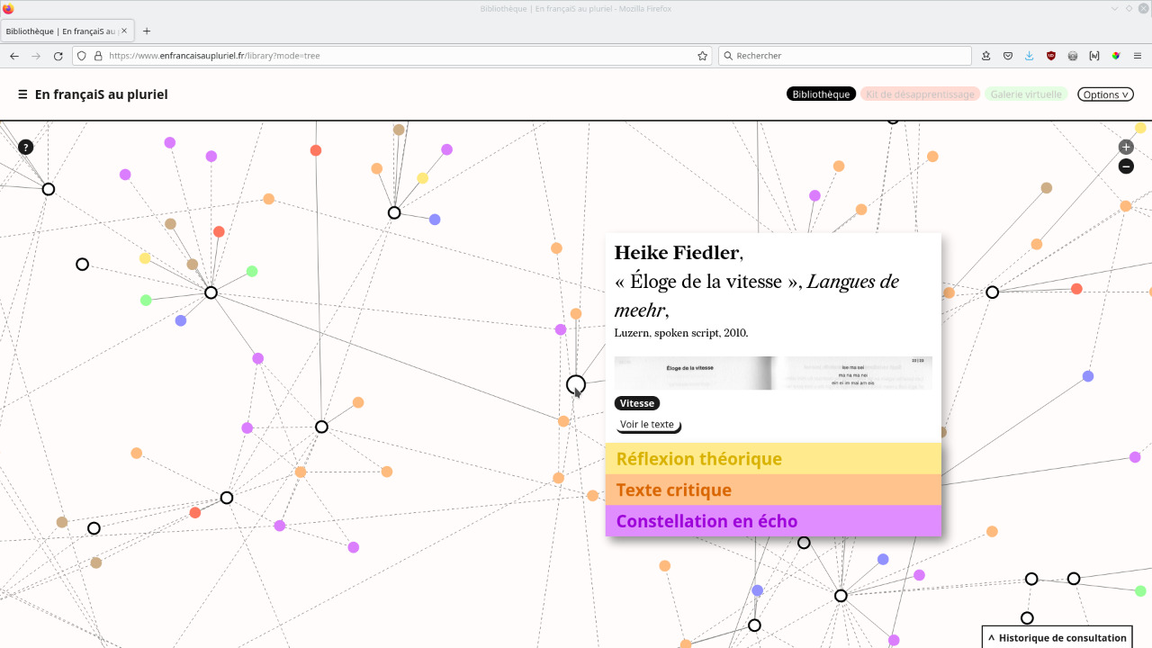
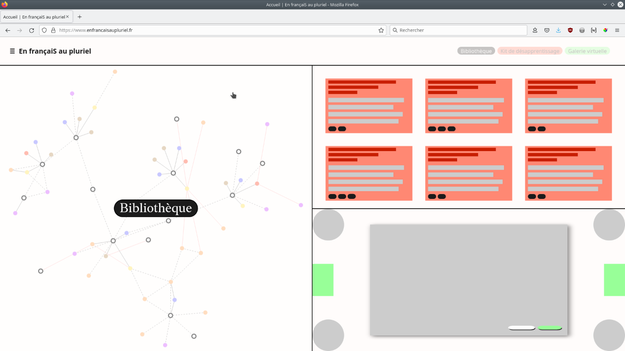
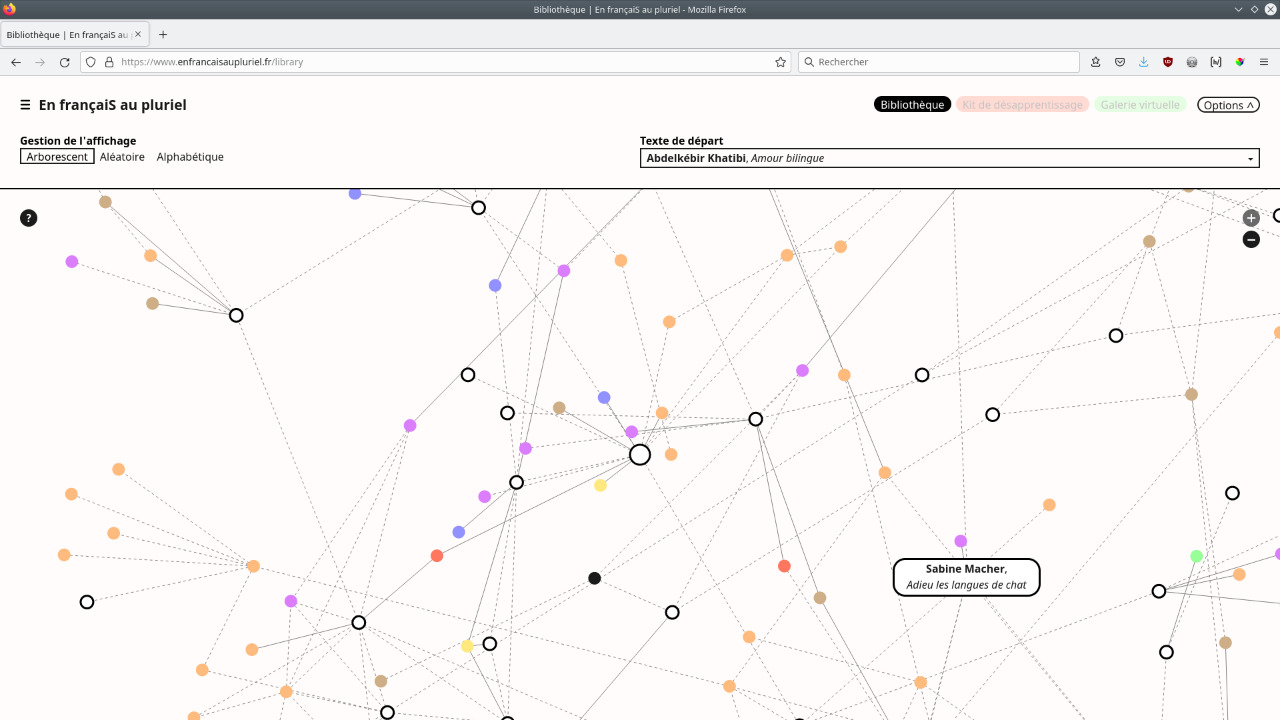
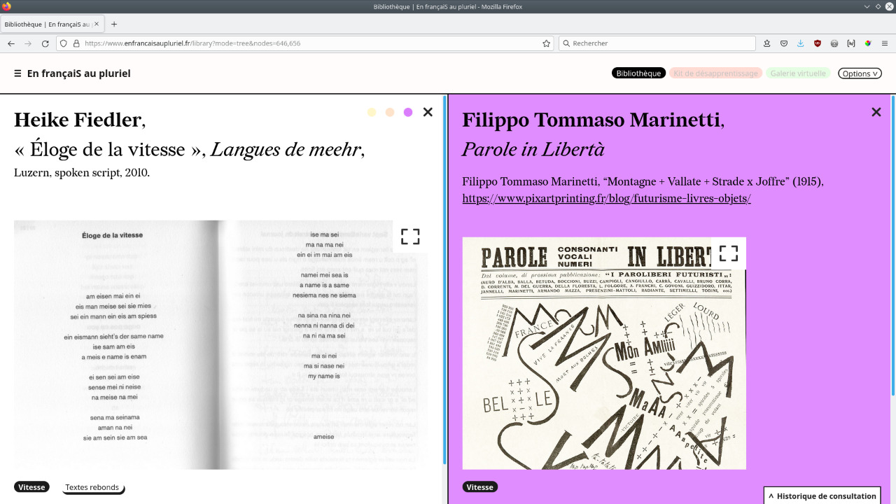
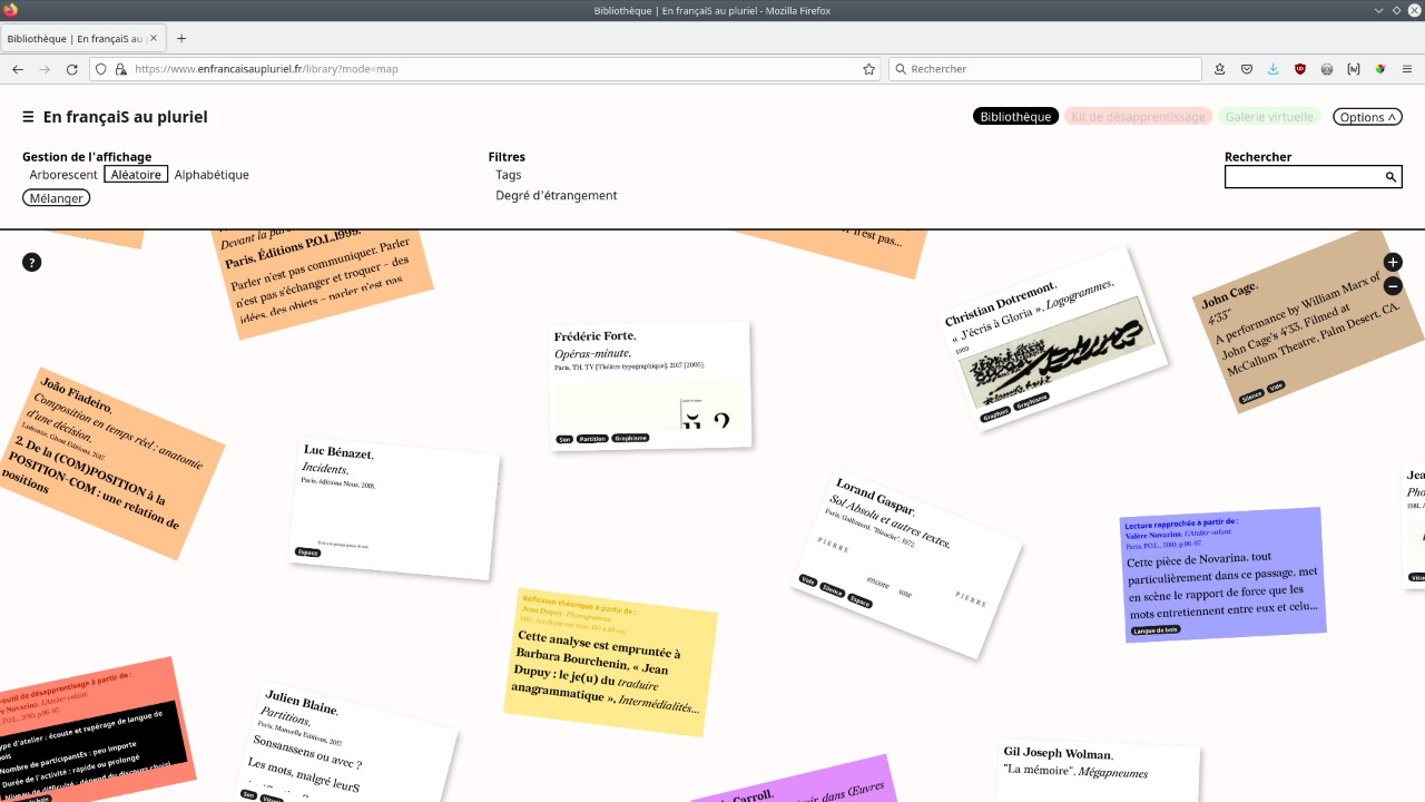
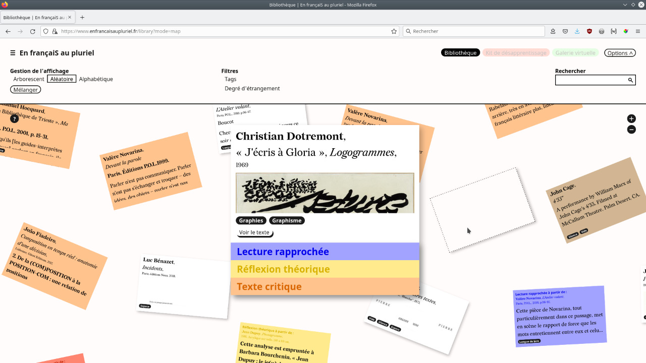
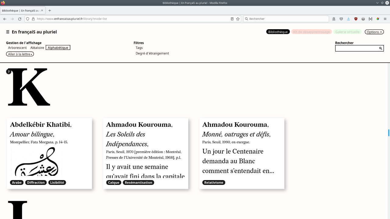
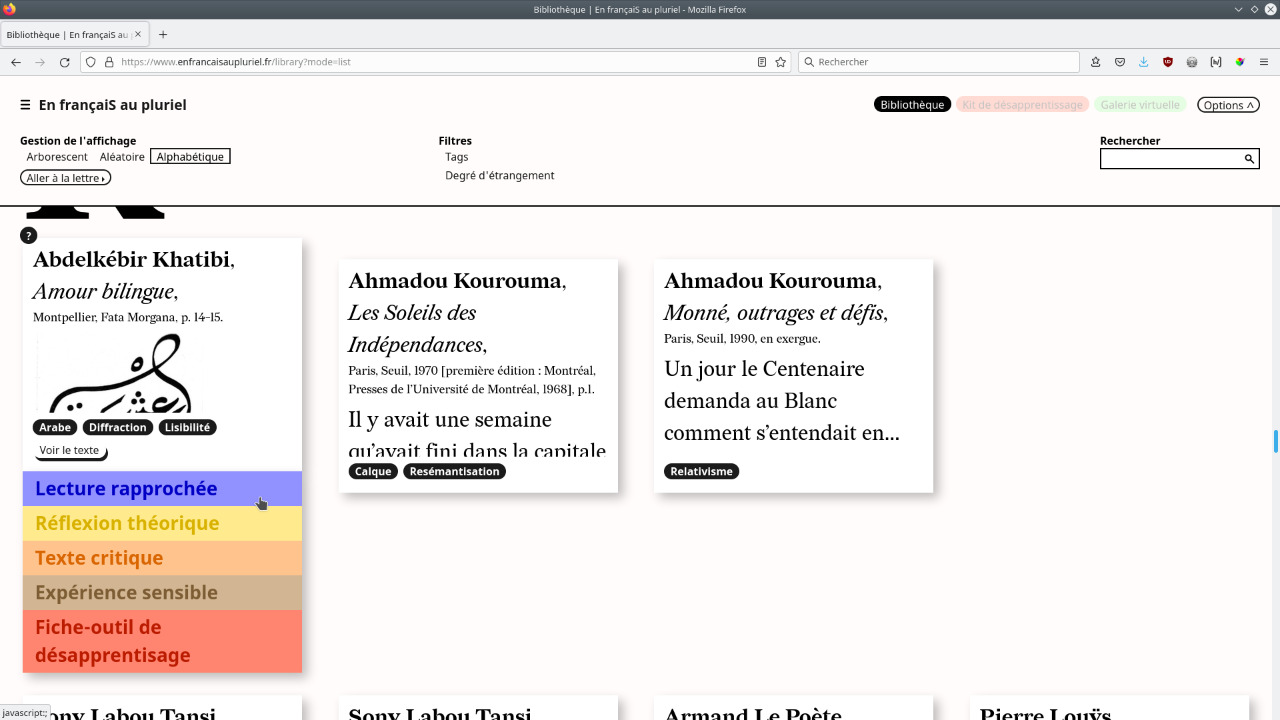
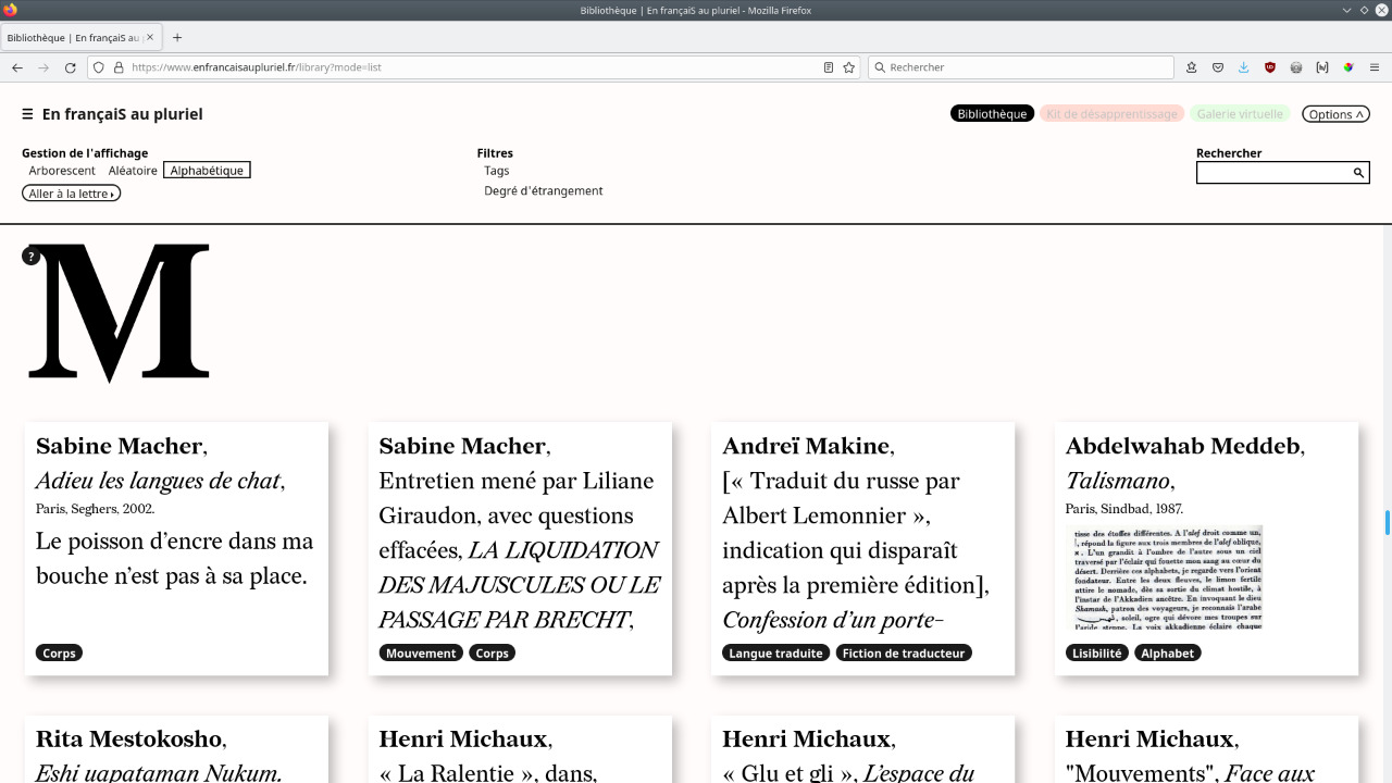
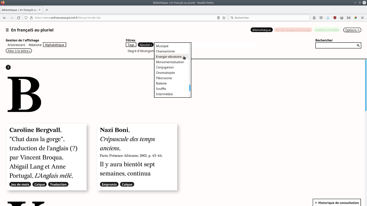
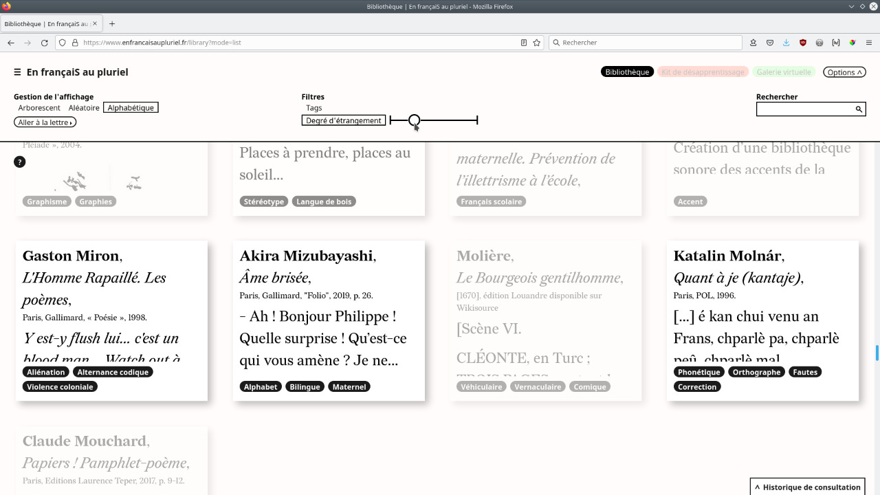
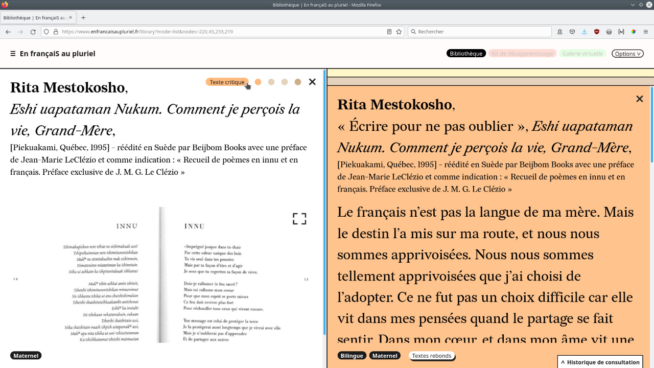
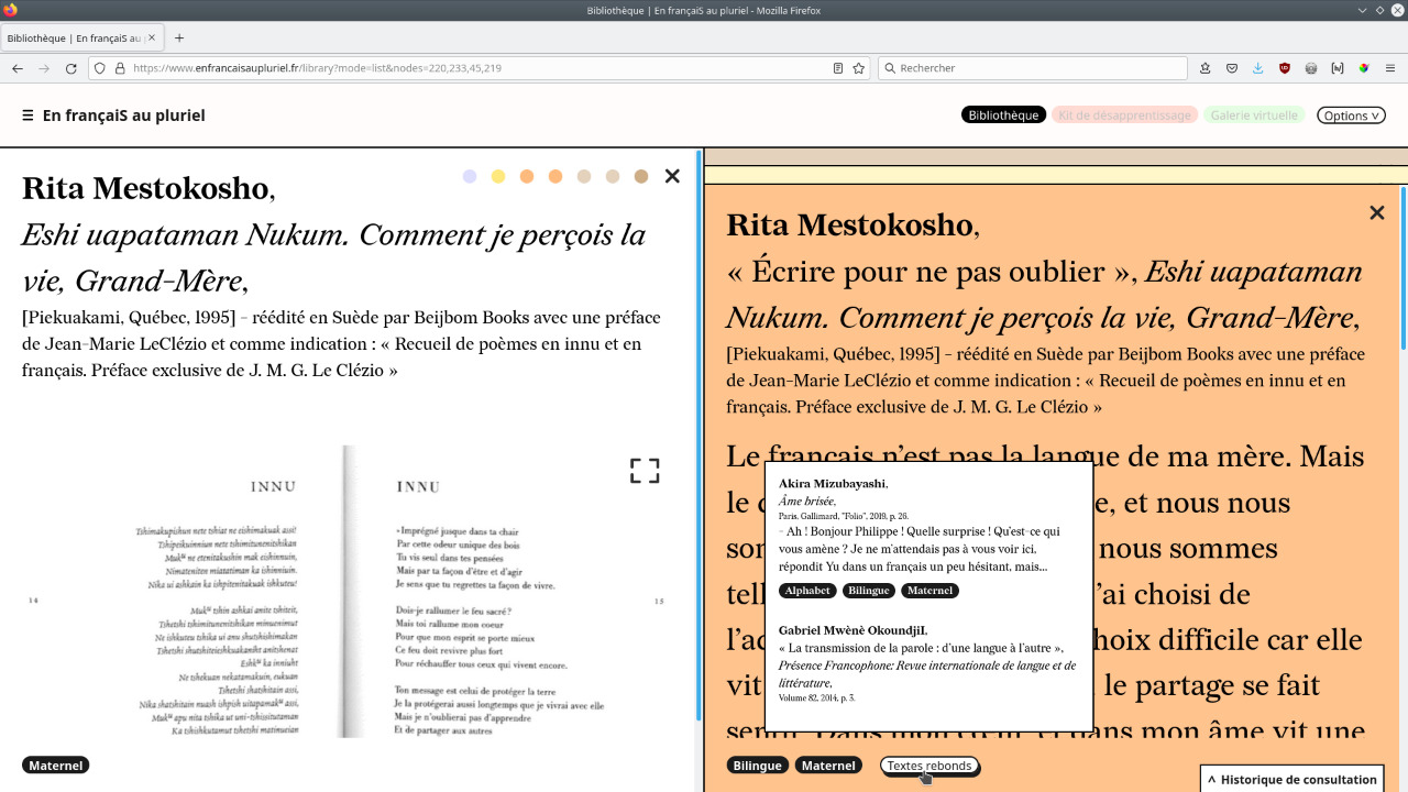
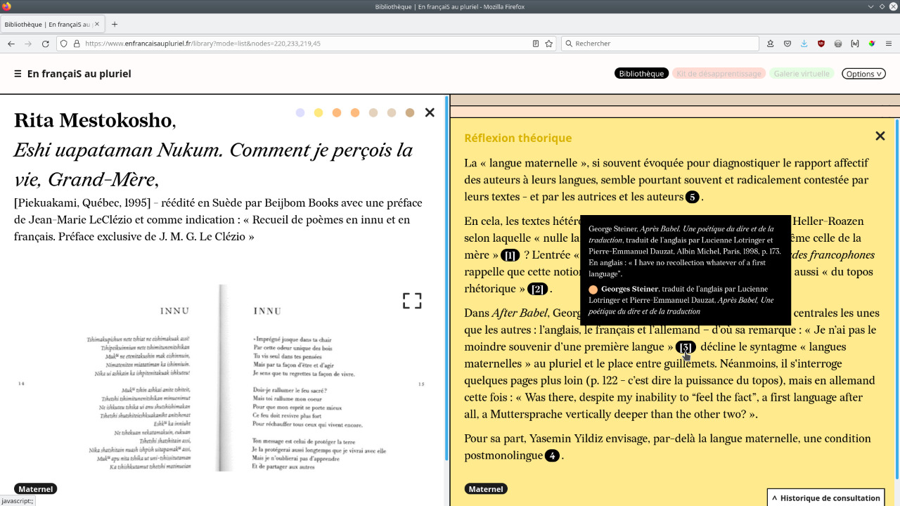
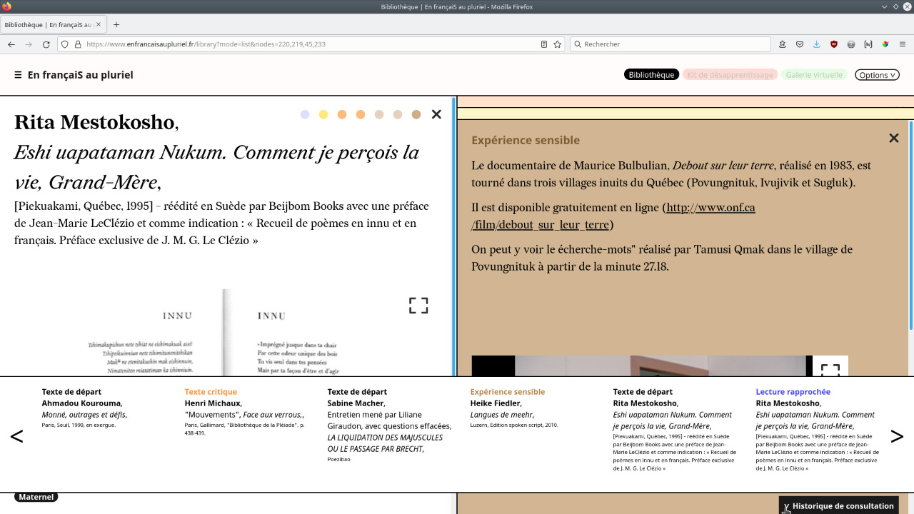
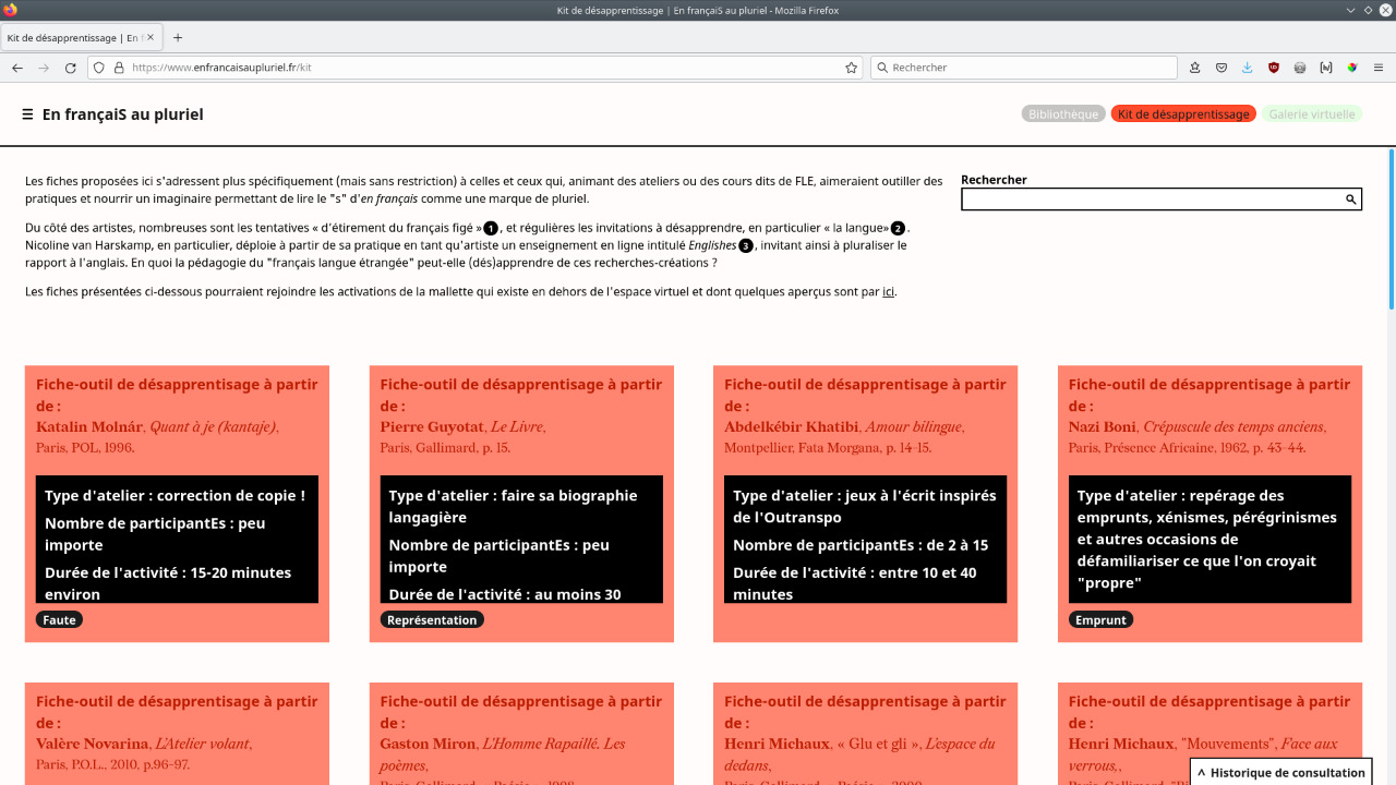
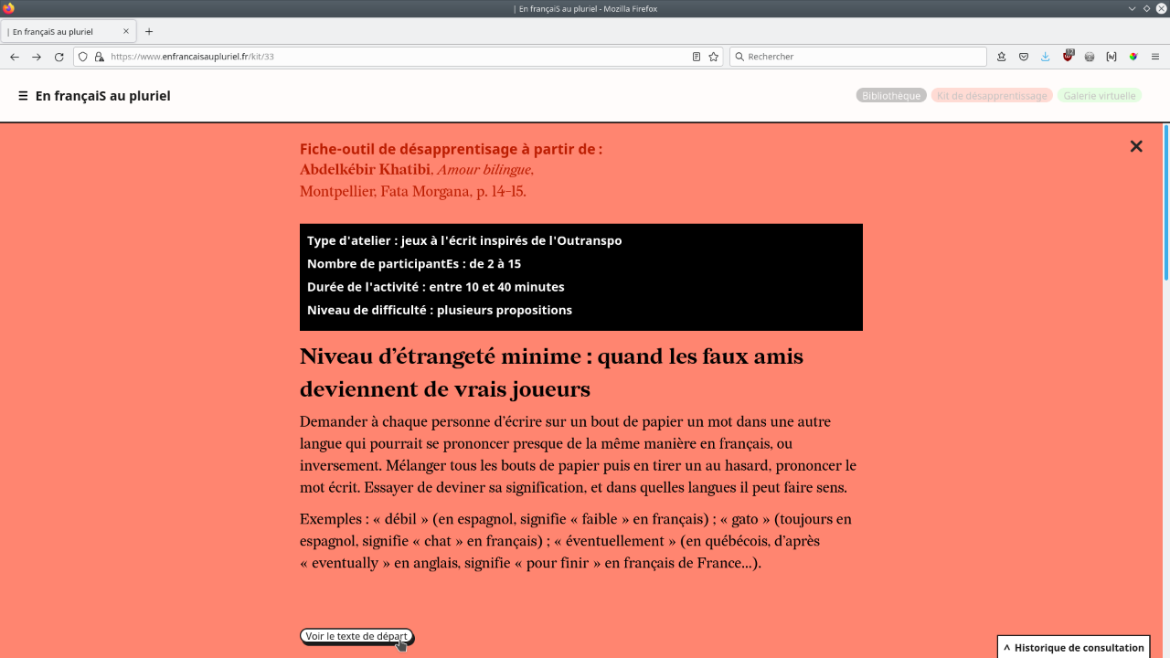
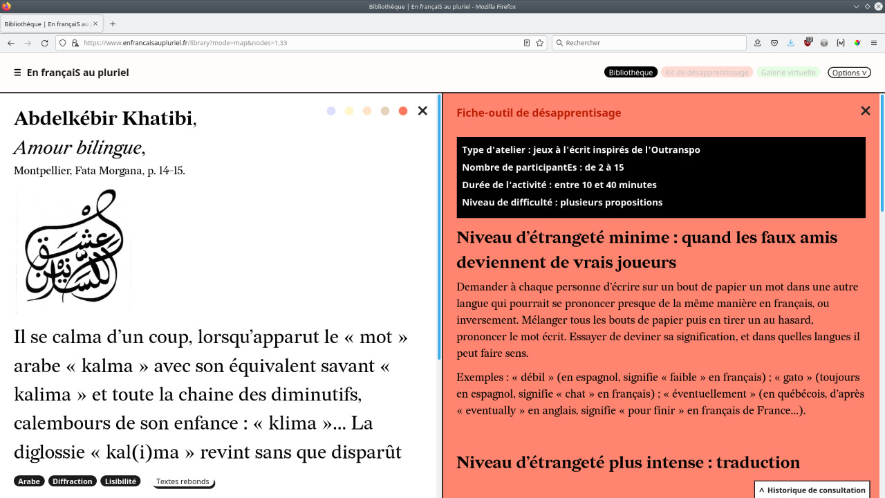
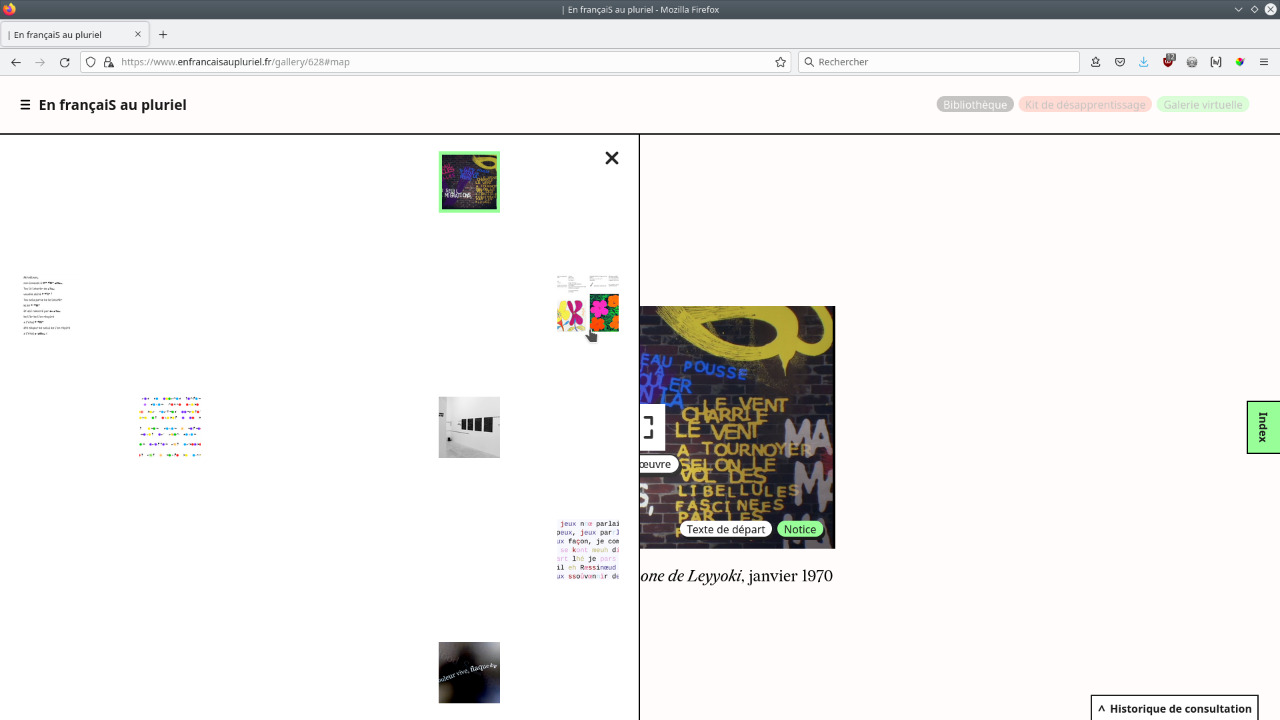
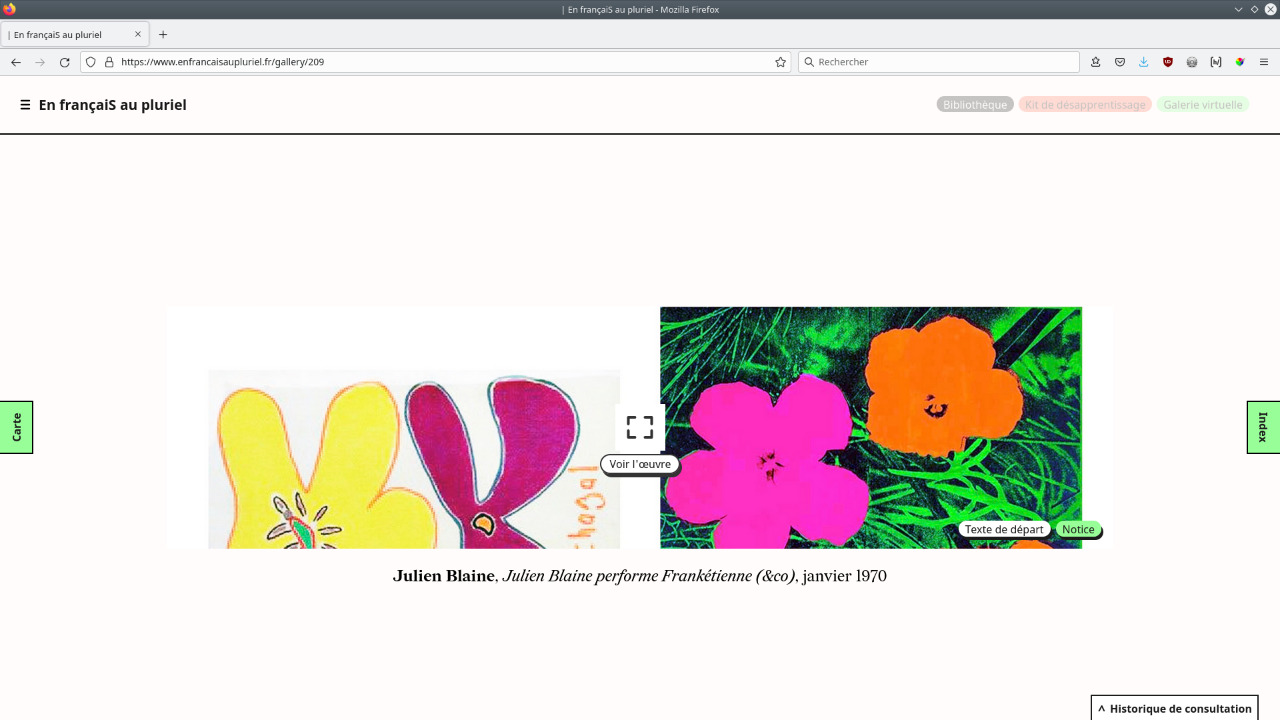
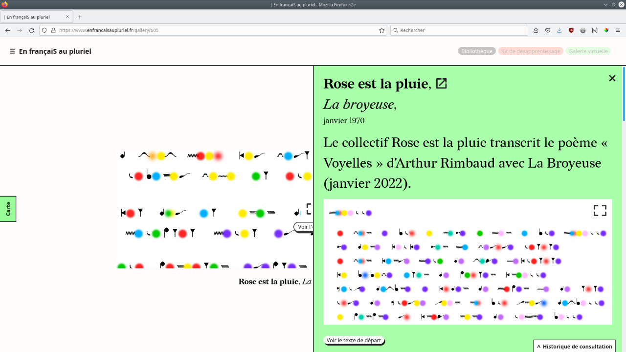
Graphic design of the research tool En françaiS au pluriel by linguistics researcher Myriam Suchet, which questions the immutability of (living) languages, in particular French.
The website contains a large collection of literary texts carefully selected and analyzed by Myriam Suchet, which testify to the plurality of the French language, and demonstrate with evidence that the "s" in en français is a plural mark. This library can be browsed via three different display modes (tree-like, random and alphabetical) and the contents can also be filtered by tags or degrees of foreignness. Designed as nodes, the starting texts unfold constellations of writings and references whose links can be visualised and which can be read opposite each other. The platform also devotes a section to unlearning kits, intended to support and deconstruct the learning of French, as well as a virtual gallery where you can discover digital creations that resonate with the corpus of online texts.
Infos
- Year:
-
2022
- Location:
-
Arcueil
- Type:
-
commission in collaboration with Nicolas Chesnais
- Customer:
-
Figures Libres collective for Myriam Suchet
- Texts and images:
-
apart from the quoted authors, Myriam Suchet
- Development:
-
Nicolas Chesnais (frontend) and Bachir Soussi-Chiadmi (backend)
- Project coordination and graphic support:
-
Maud Boyer
- Fonts:
-
Redaction, Jeremy Mickel, SIL Open Font License, 1.1, 2020 and Noto sans, Google fonts, Open Font License, 2012.
- CMS:
-
Drupal
-
Text
Images
Text
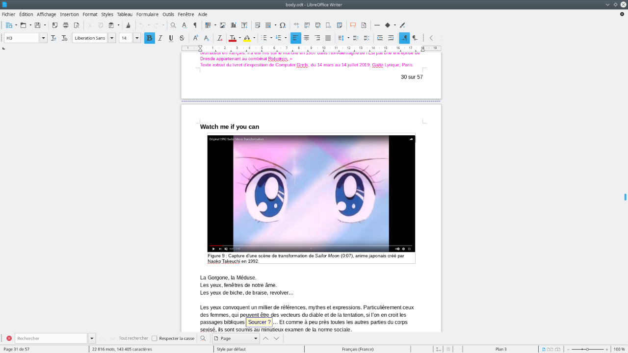
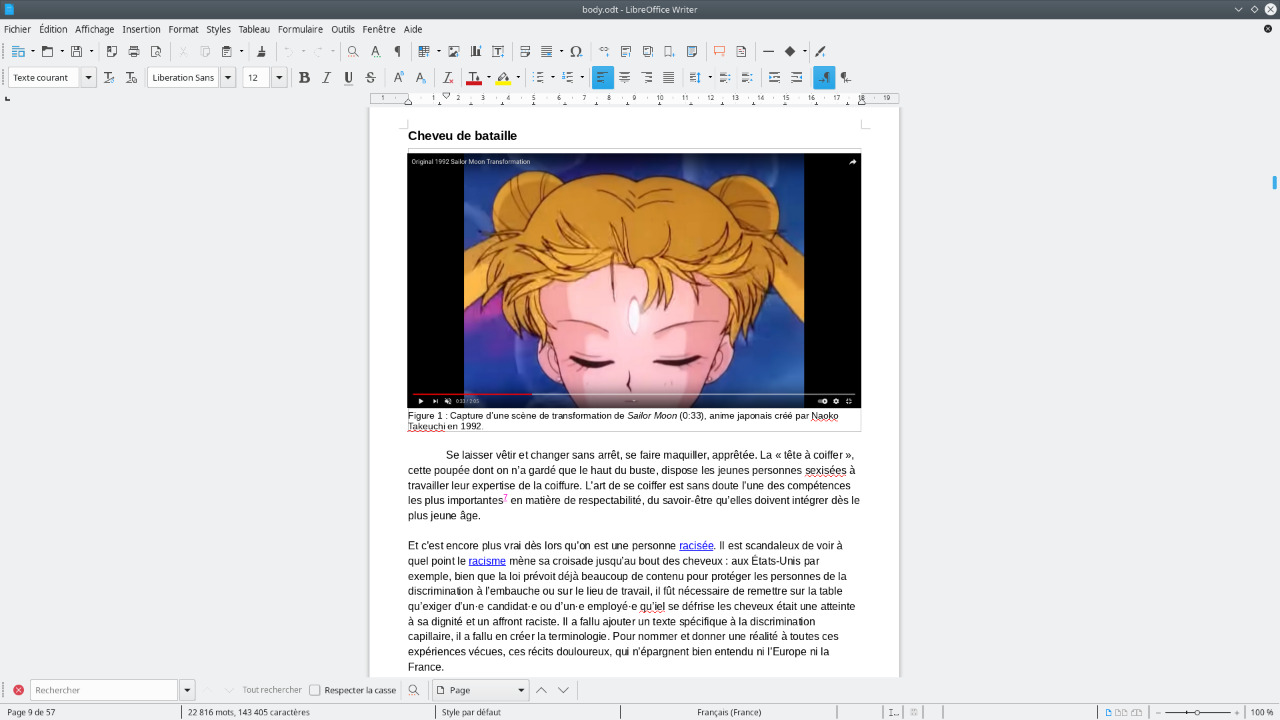
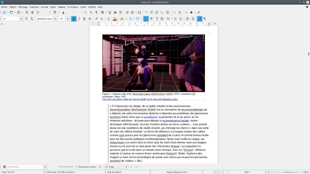
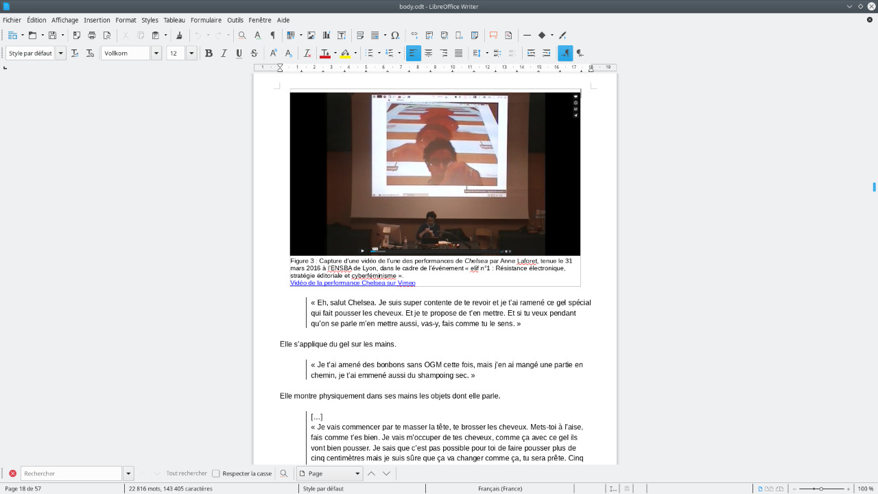
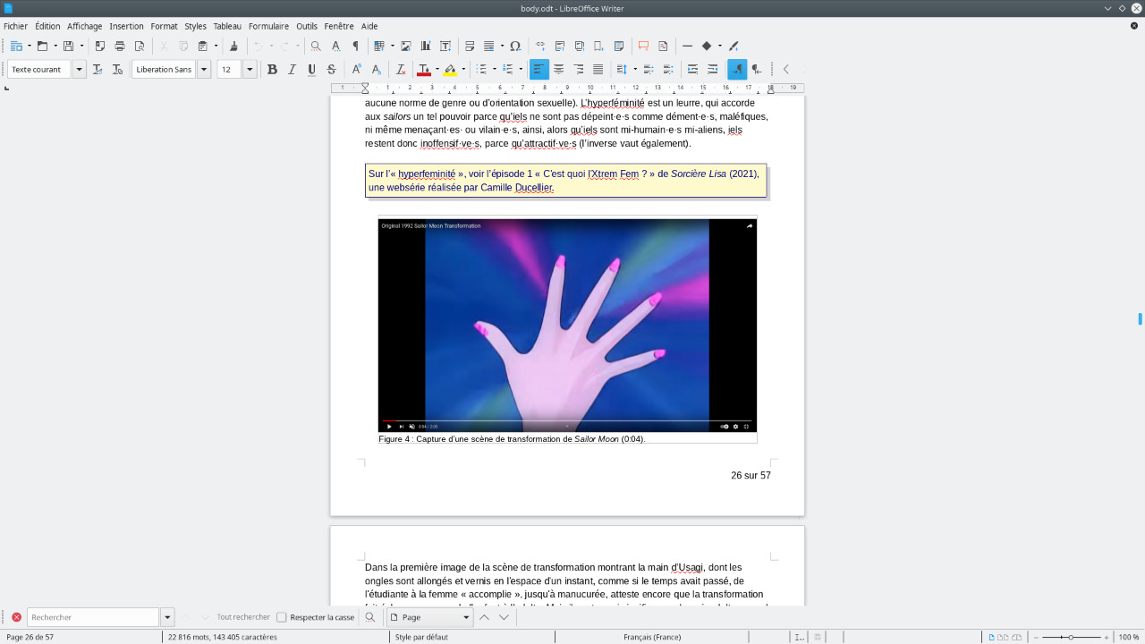
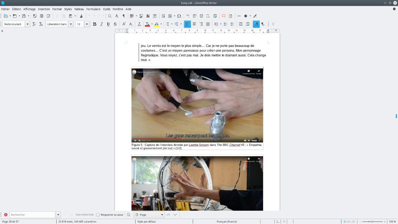
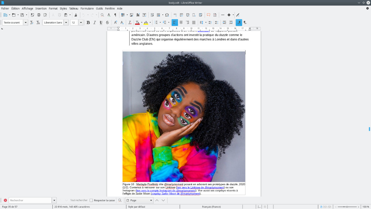
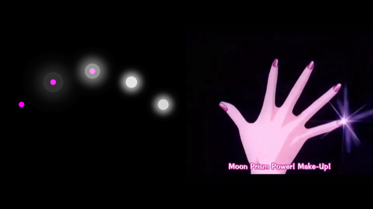
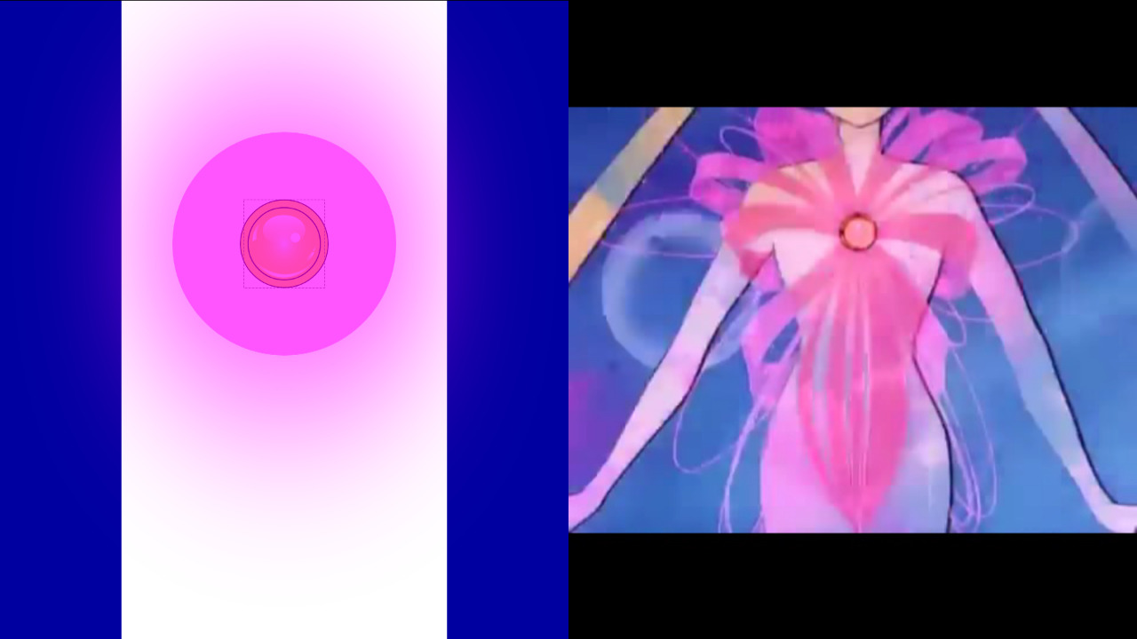
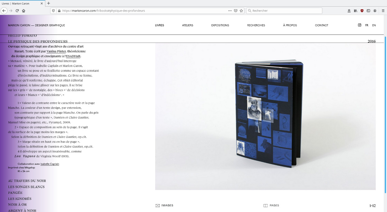
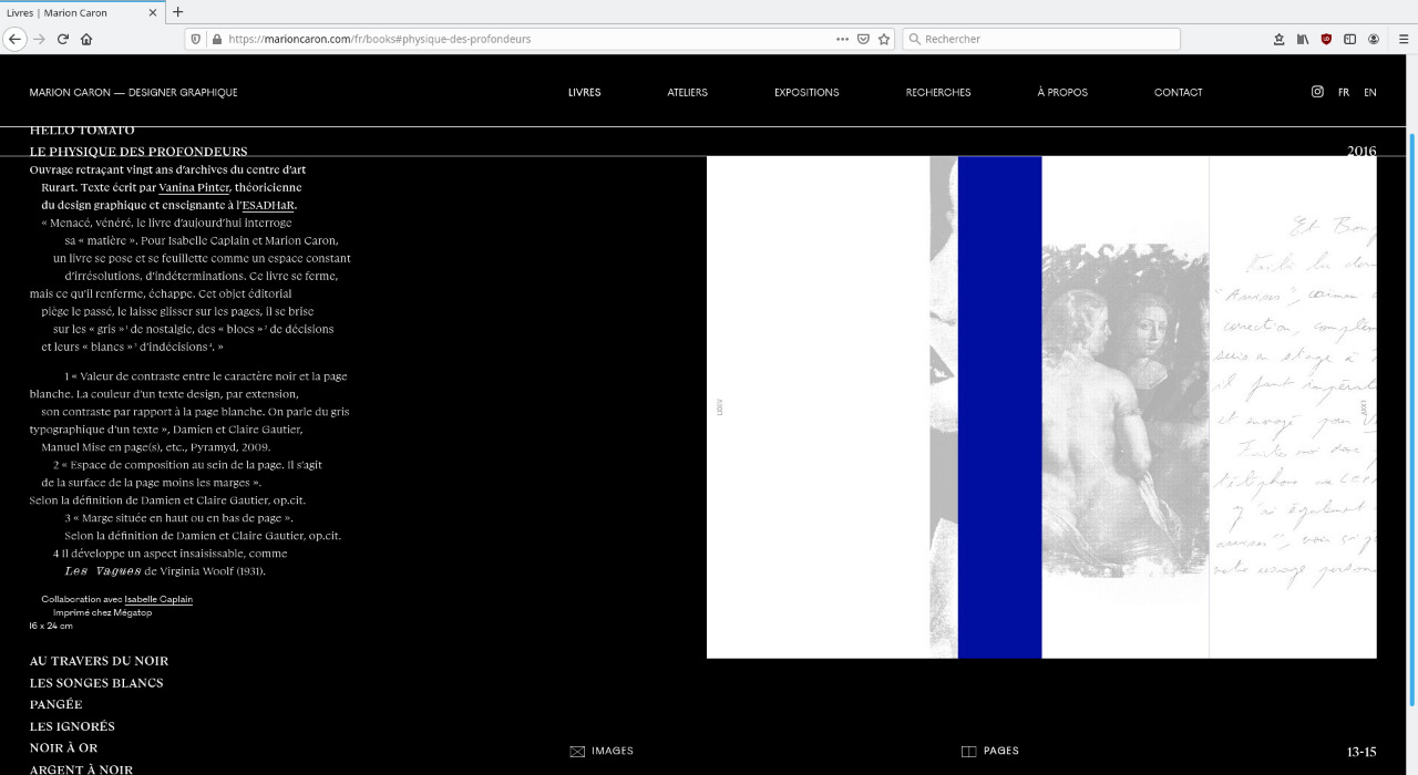
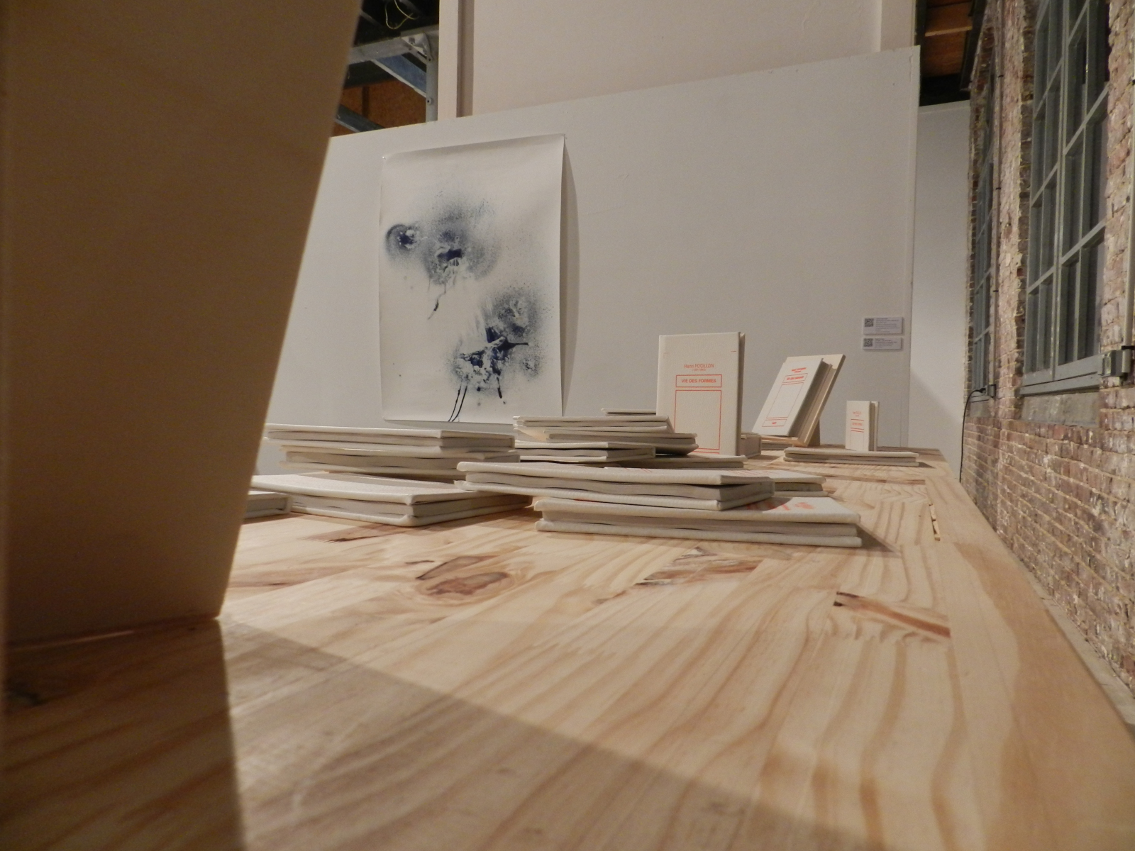
Full title: Body Recoding, de l'injonction au réenchantement des corps sexisés. Corps, Style, Mouvement
A text on the body and its transformation as a vector of power, based on an analysis of the Japanese anime Sailor Moon created by Naoko Takeuchi in 1992, and cyberfeminist references. The reappropriation of their bodies and its representations by gendered people through technology, hacking, artistic expression, fiction or games become substitutes to the magical powers of sailors.
The text has been versioned with git and imported on Gitlab in order to allow its amendment and access at different states of writing. It is also accessible from a Nextcloud directory, in its entirety (body-text) and sectioned into parts (member-text) referring to various body parts focused during Usagi Tsukino's transformation into Sailor Moon.
- Font :
Infos
- Year:
-
since 2020
- Location:
-
Strasbourg
- Type:
-
personnal project
- Font:
-
Liberation Sans by Pravin Satpute, Herbert Duerr and Caius Chance, SIL Open Font License, 2012
-
- Websites
- Experiments
Images
Text
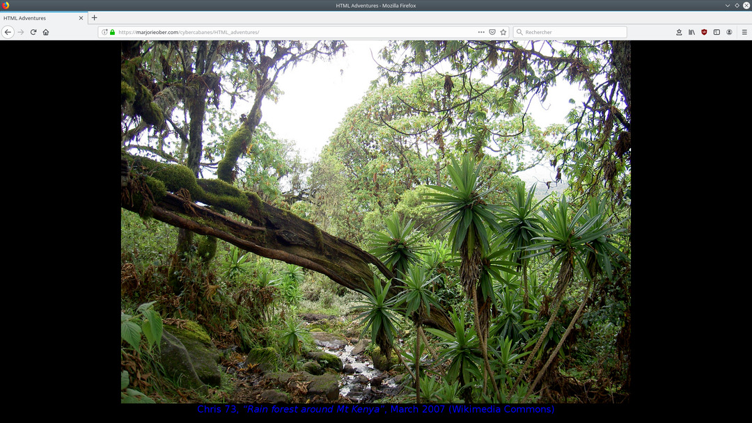
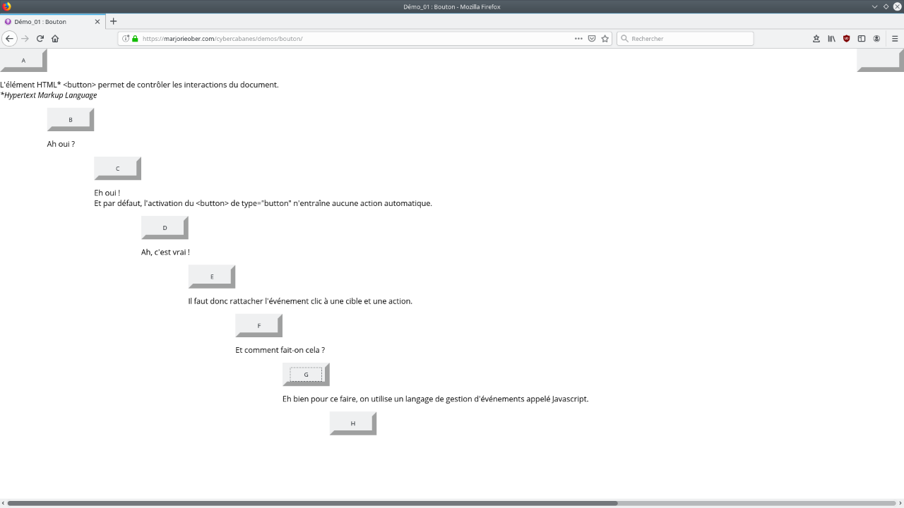
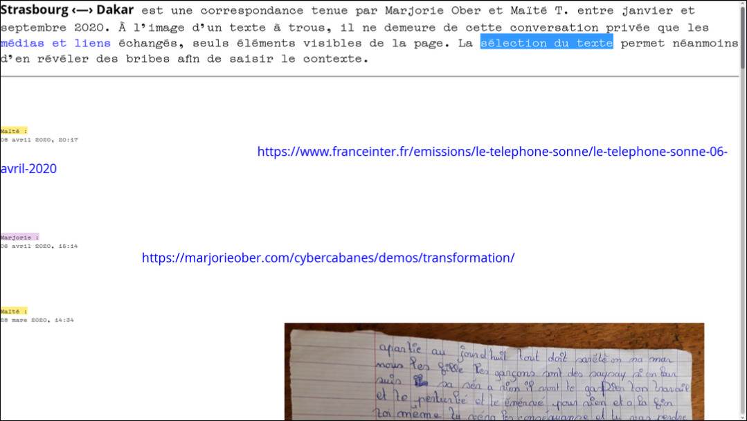
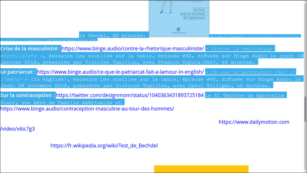
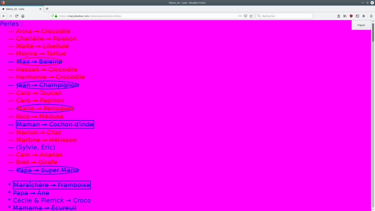
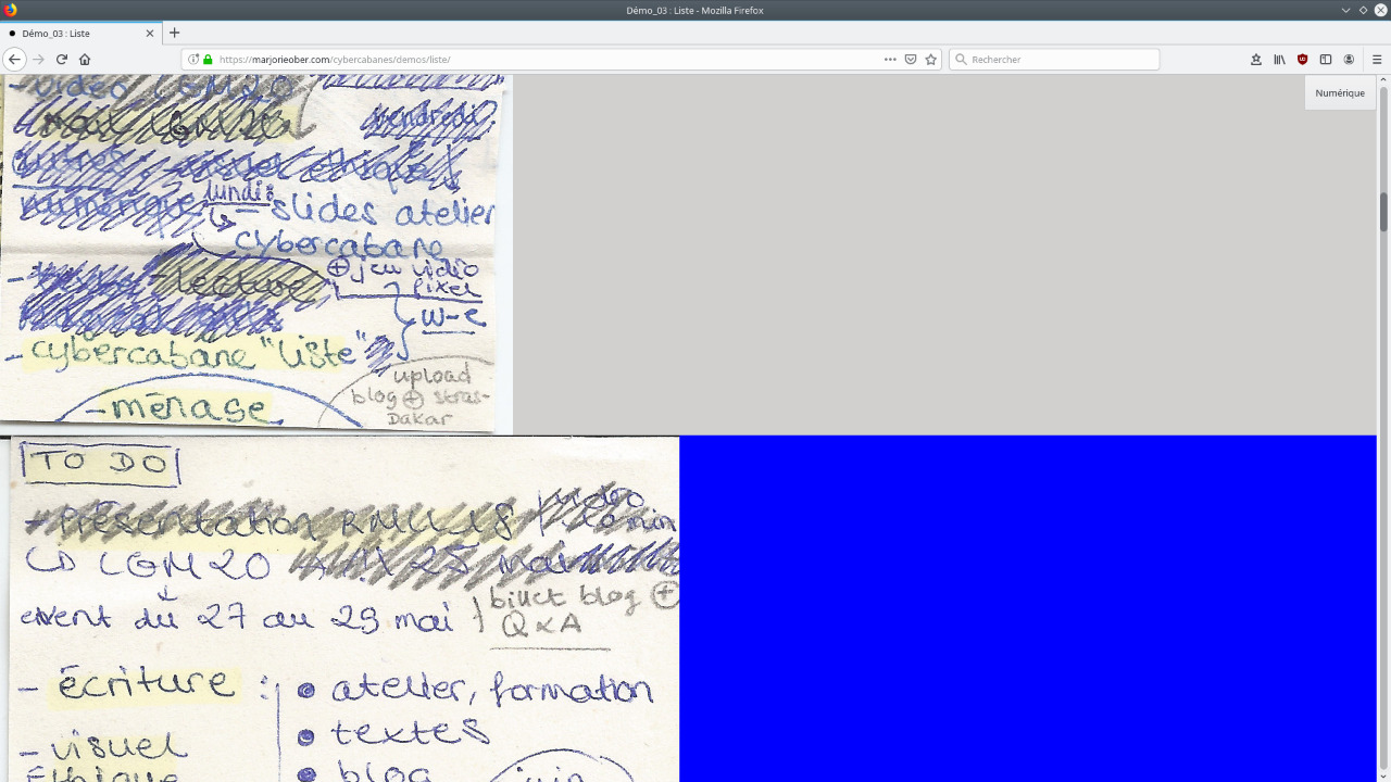
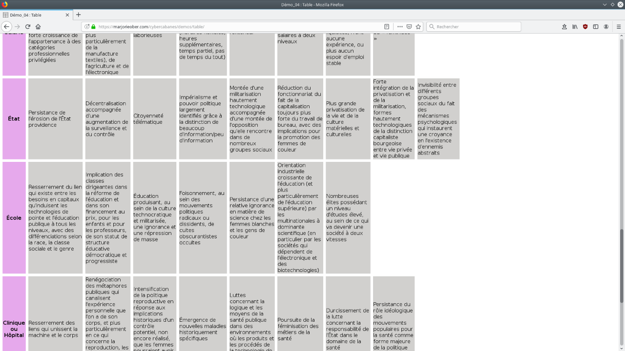
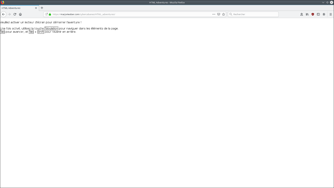
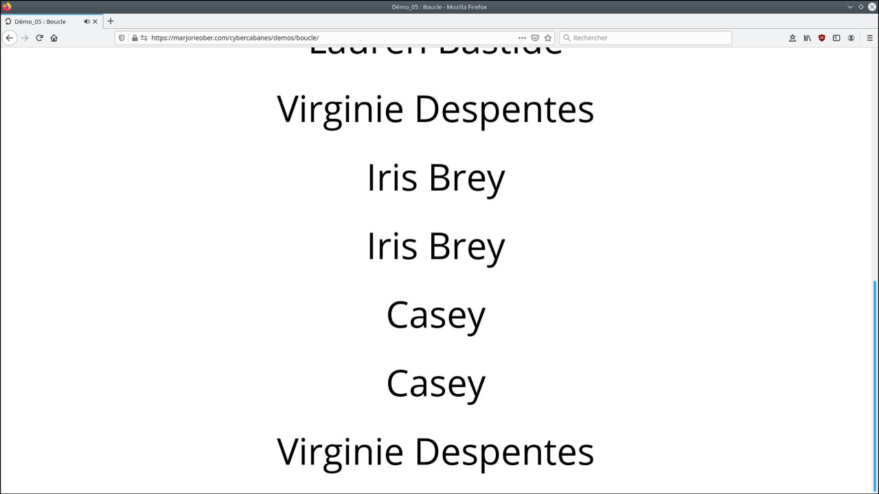
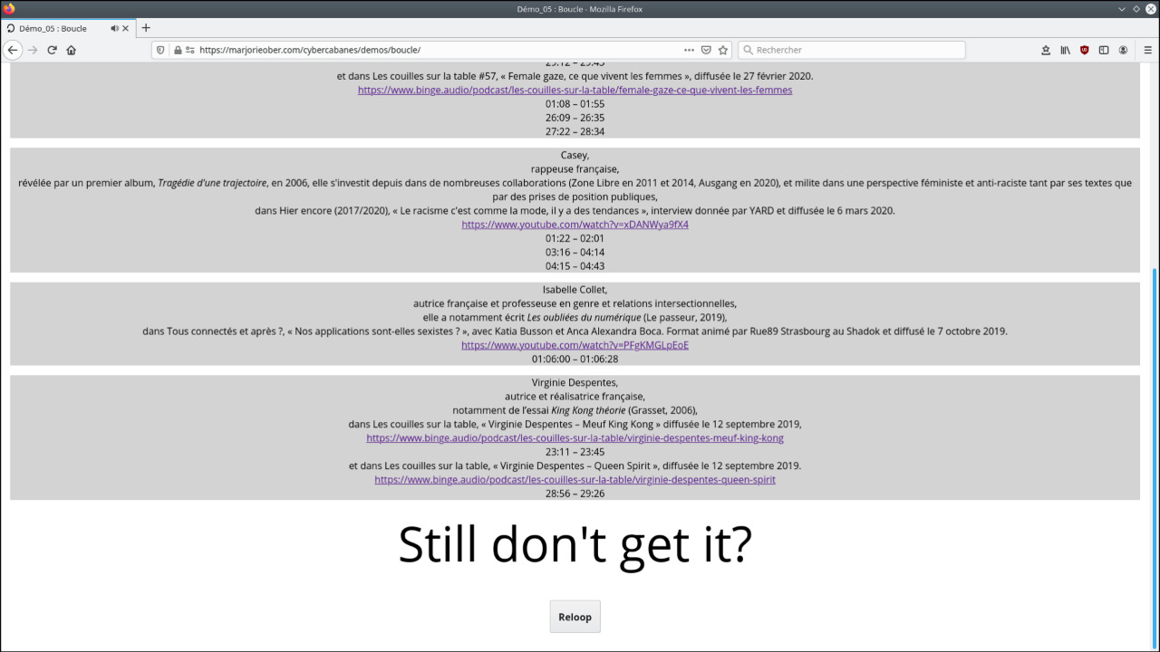
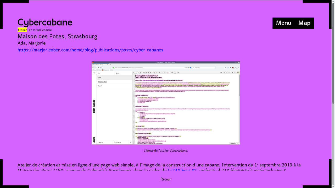
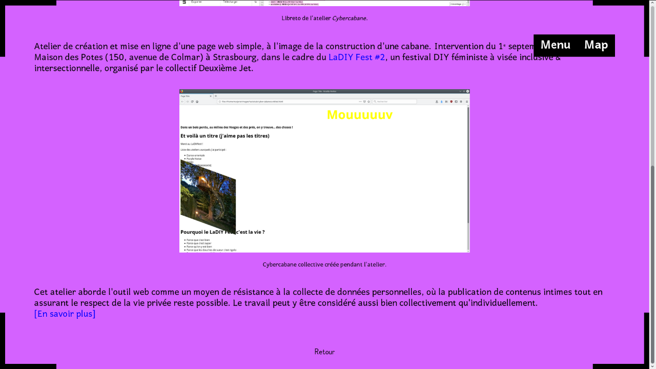
Collection of experimental web pages as part of a personal research project. Each page is designed like a hut and left in a raw, unsophisticated state. The experimentation, which is above all graphic, formal, exploits content that is sometimes documentary (mainly involving cyberfeminist concepts), sometimes meta (approaching the demo,playing with web notions and HTML elements such as buttons, tables, lists, etc.), sometimes narrative, in the order of storytelling, like Strasbourg ‹—› Dakar or HTML Adventures. Cyberhuts aim to enhance the creative process, and are sometimes the subject of collaborative work. The persons credited can be found in the corresponding pages.
These prototype-pages fix the research at a given moment, giving body and materiality to the documentation. They become traces of the preparatory work carried out for larger-scale projects. Listed in a directory and accessible from a single root, they are also, in a simpler sense, the training rooms of a coding dojo, a space in which to practice programming. Eventually, the idea is to link them via a webring, a series of websites linked by a common navigation bar that allows you to move from one site to any other, much like a loop.
Infos
- Year:
-
since 2020
- Location:
-
Strasbourg
- Type:
-
personnal project
-
- Visual identity
- Website
Images
Text
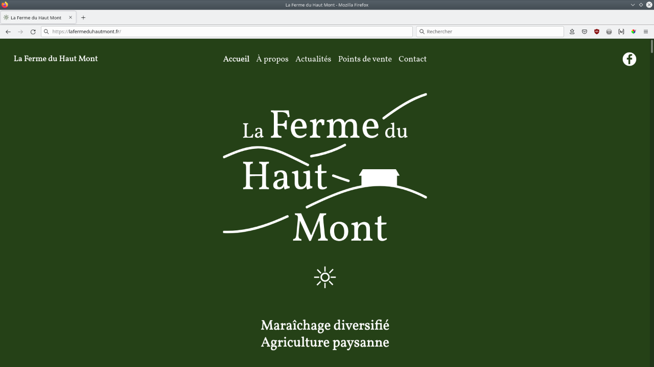
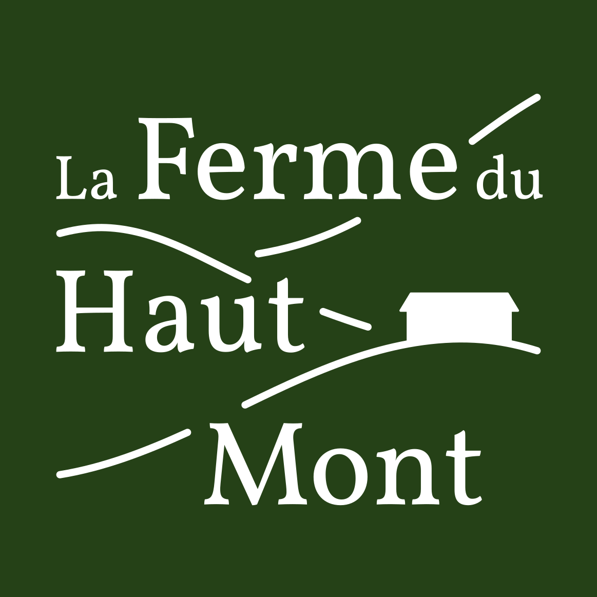
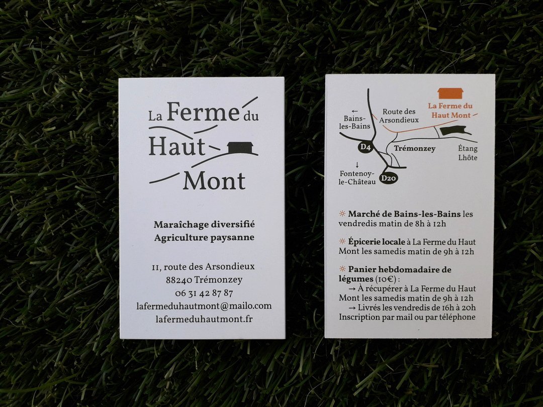
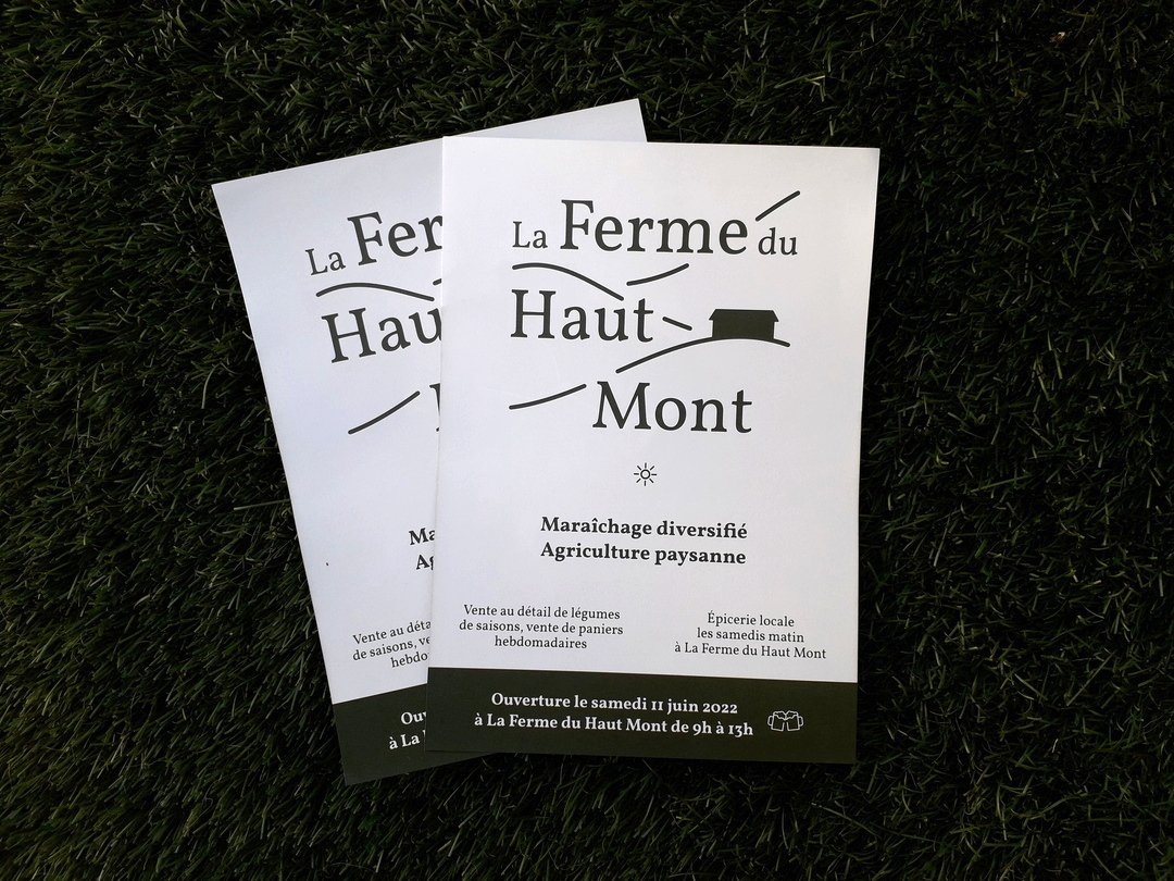
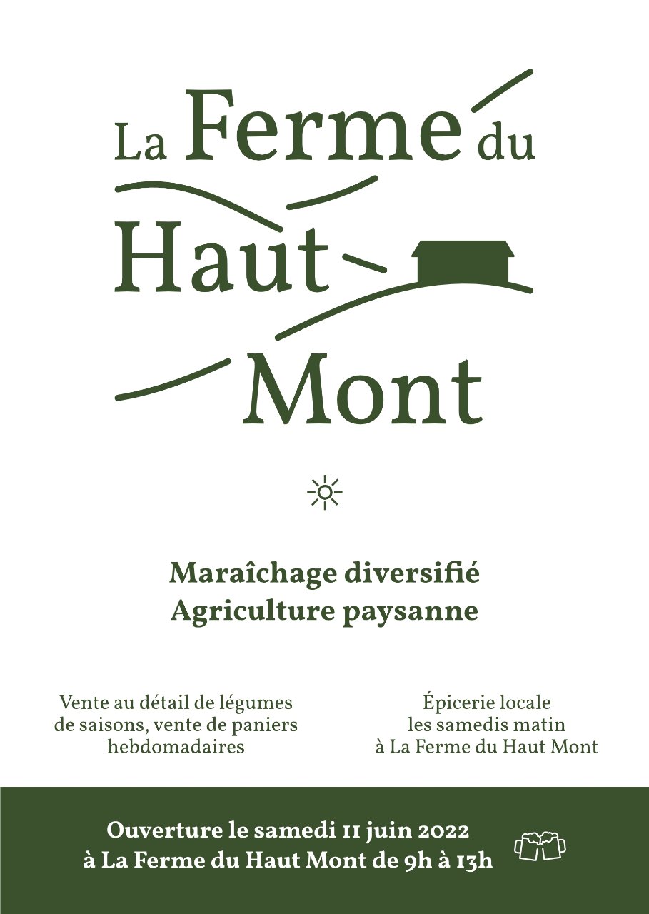
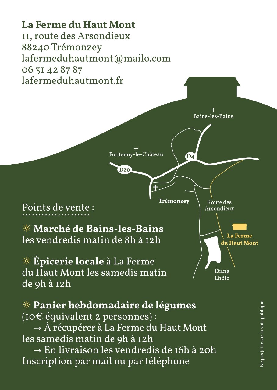
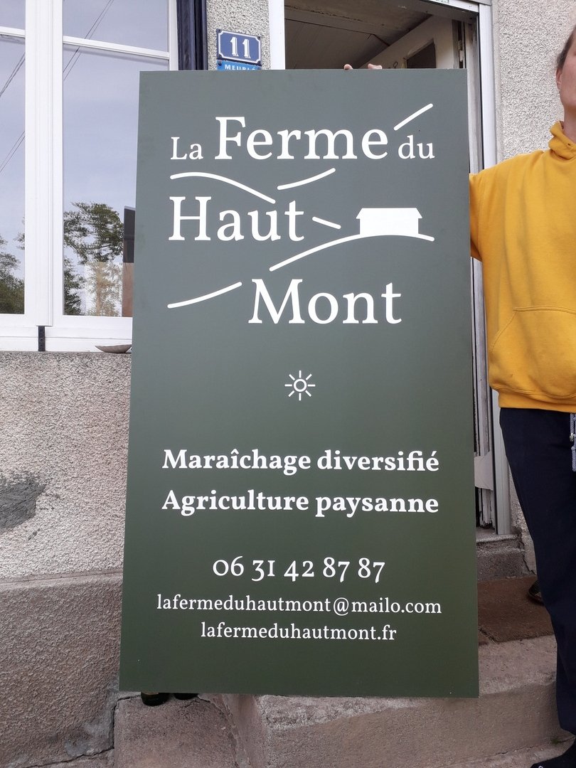
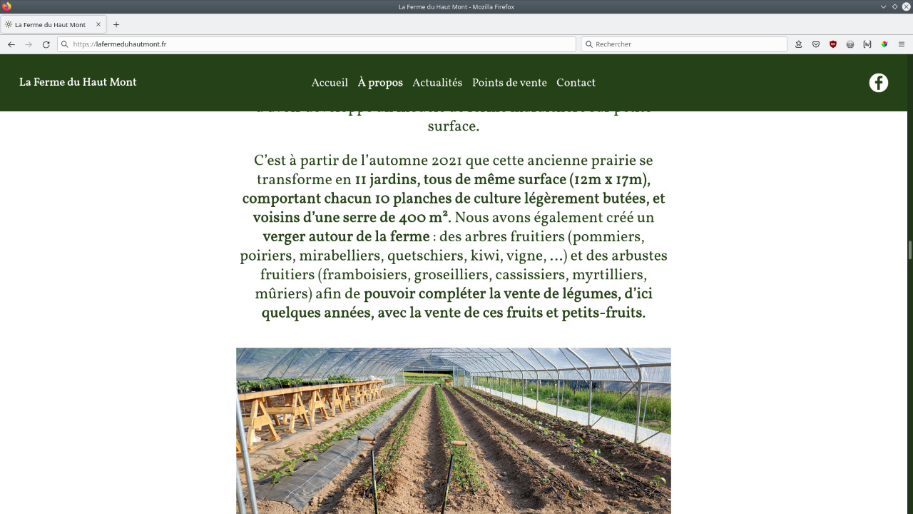
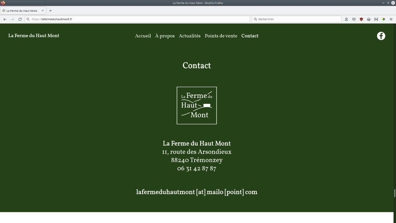
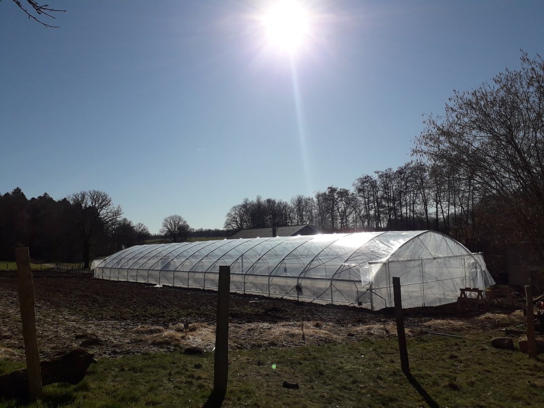
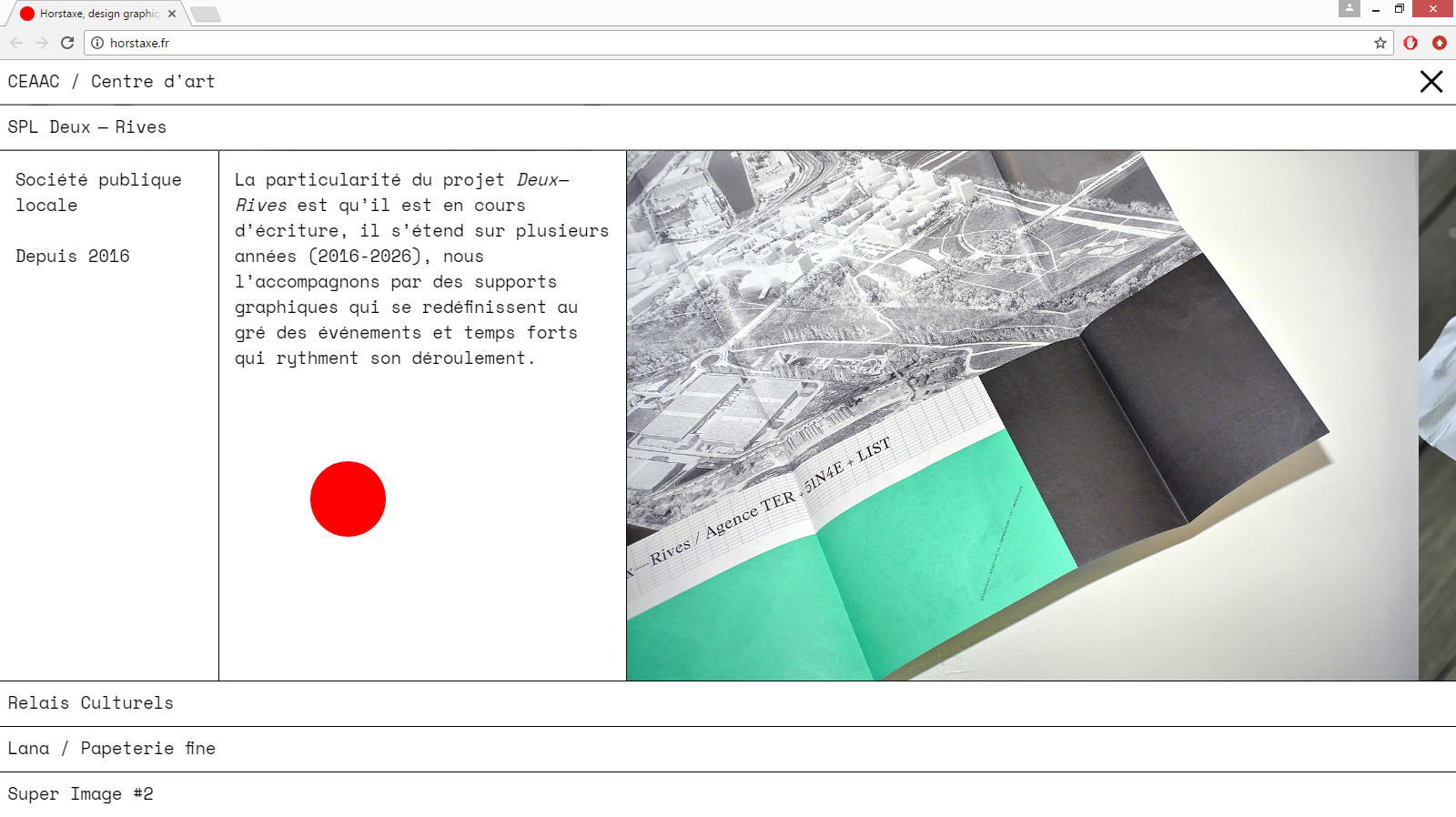
Visual identity of La Ferme du Haut Mont, a market garden production site in the Vosges whose activity is the cultivation and sale of fruits and vegetables from peasant seeds and farming techniques.
Creation of multiple communication supports: logotype, business card, flyer to announce the opening, signage, visuals for social networks and website. The identity plays with the shape and counter-shape of the mountains, and isolates three of them in the logo to refer to the origin of the name Trémonzey which is the commune where the farm is located and which means “Between three mountains”. The aesthetic line is intended to be simple and radical to reflect the world and reality of this human-sized family farm, with the choice of this forest green as the only colour to highlight the forest biome that surrounds it.
Infos
- Year:
-
2022
- Location:
-
Trémonzey
- Type:
-
commission in collaboration with Nicolas Chesnais
- Customer:
-
La Ferme du haut Mont
- Texts and images:
-
La Ferme du haut Mont
- Fonts:
-
Vollkorn, Friedrich Althausen, SIL Open Font License, 2006.
-
Graphic design
Images
Text
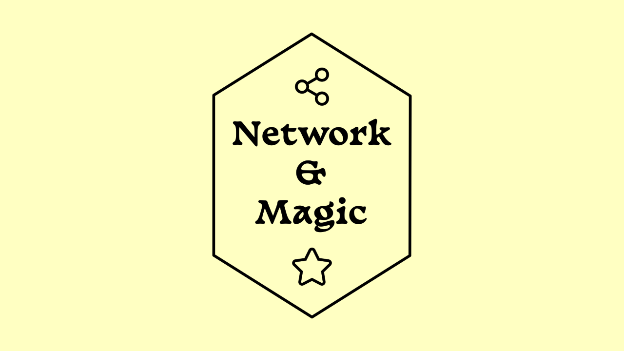
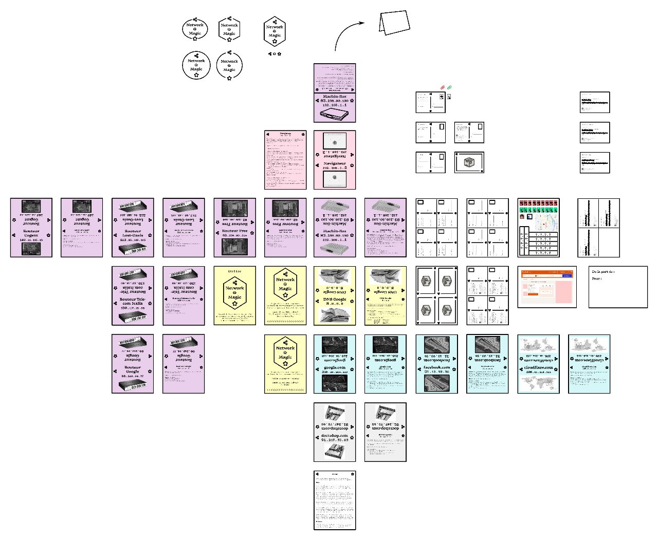
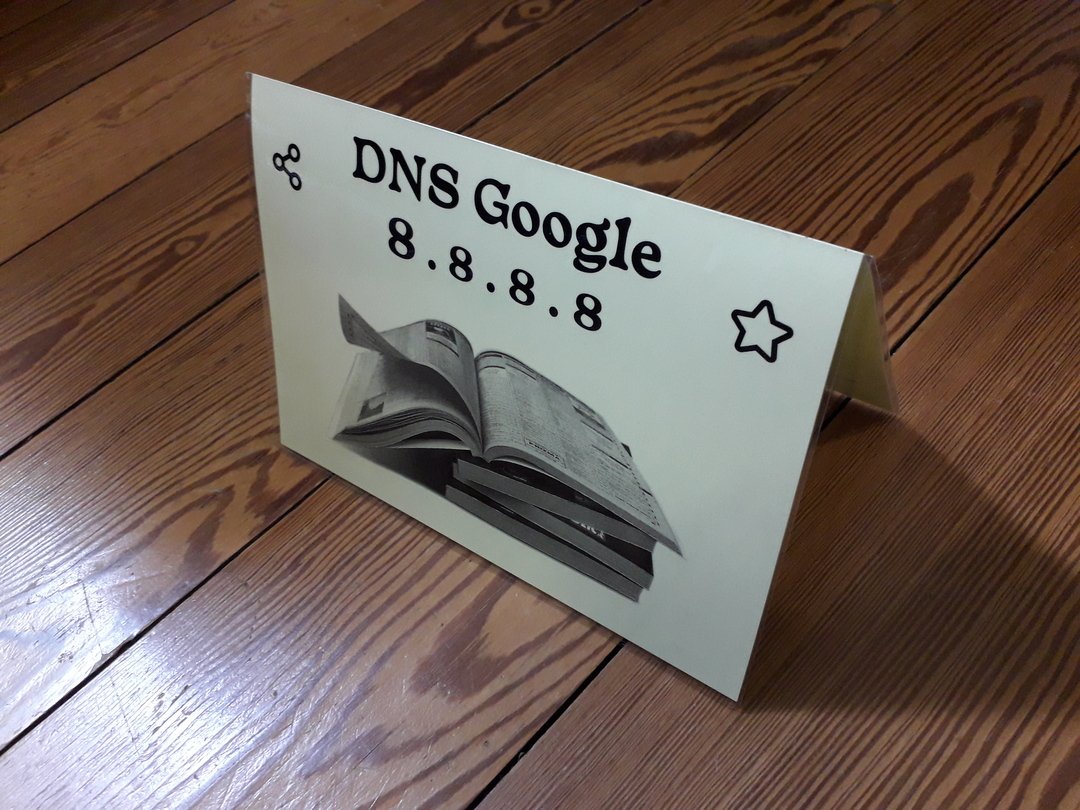
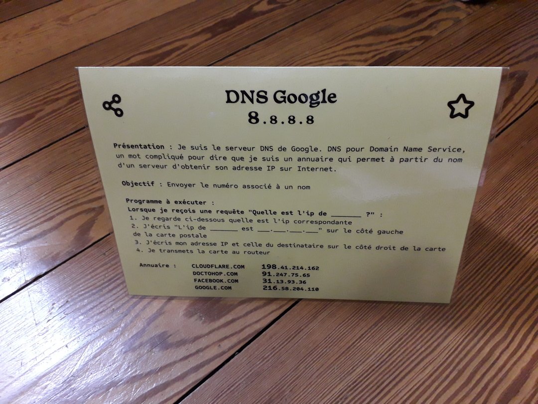
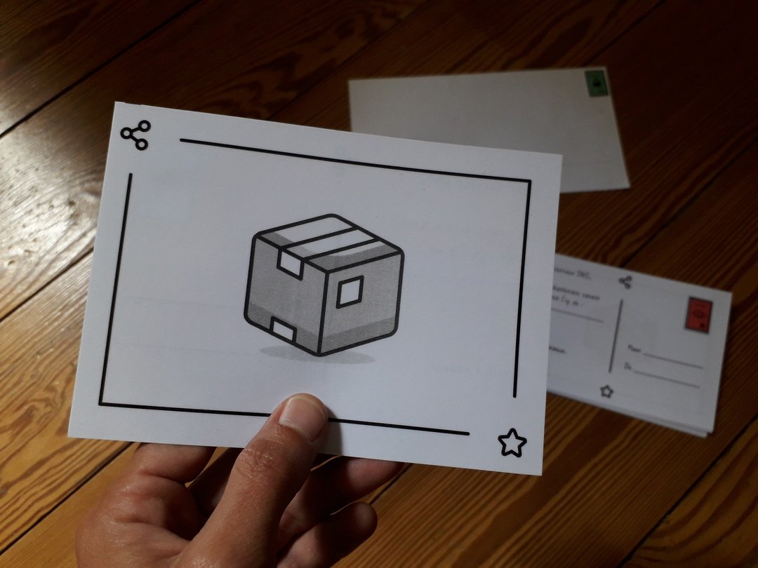
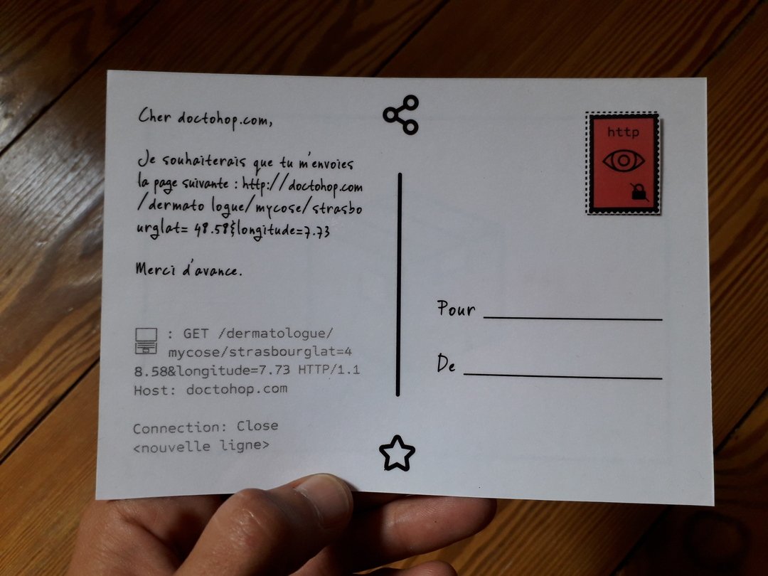
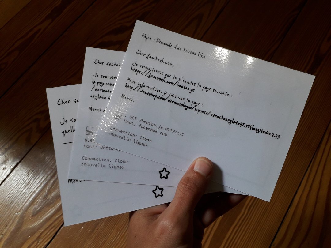
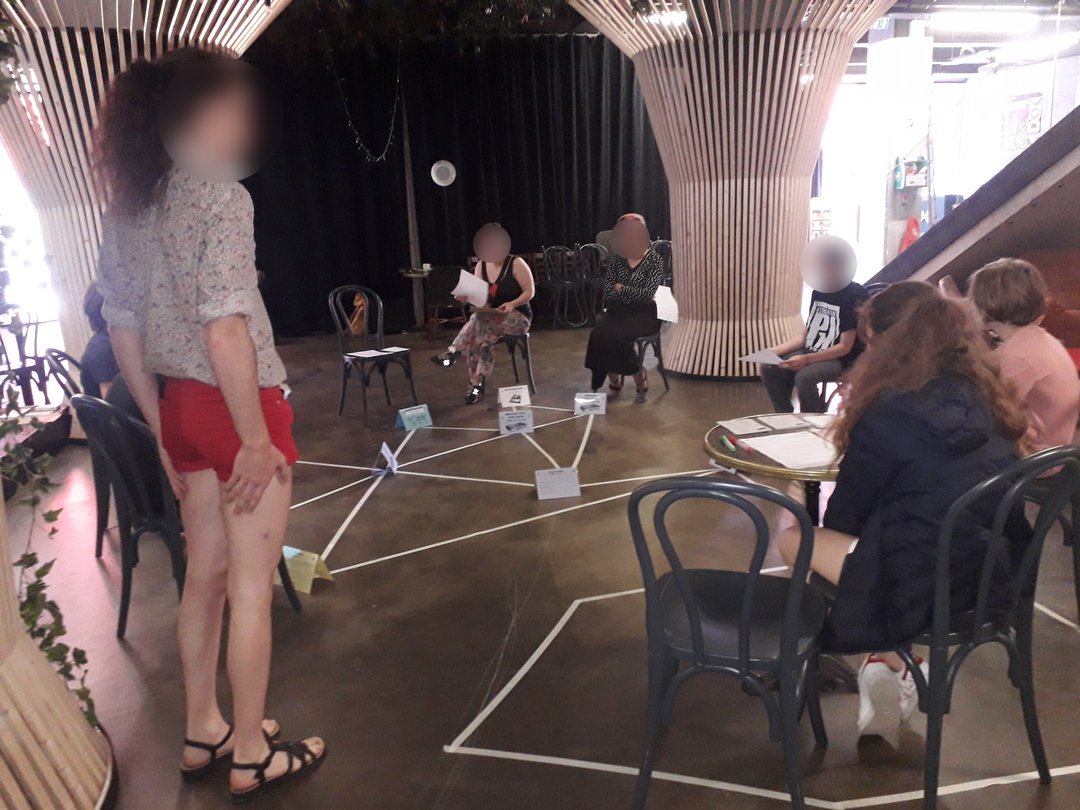
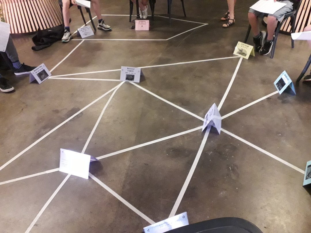
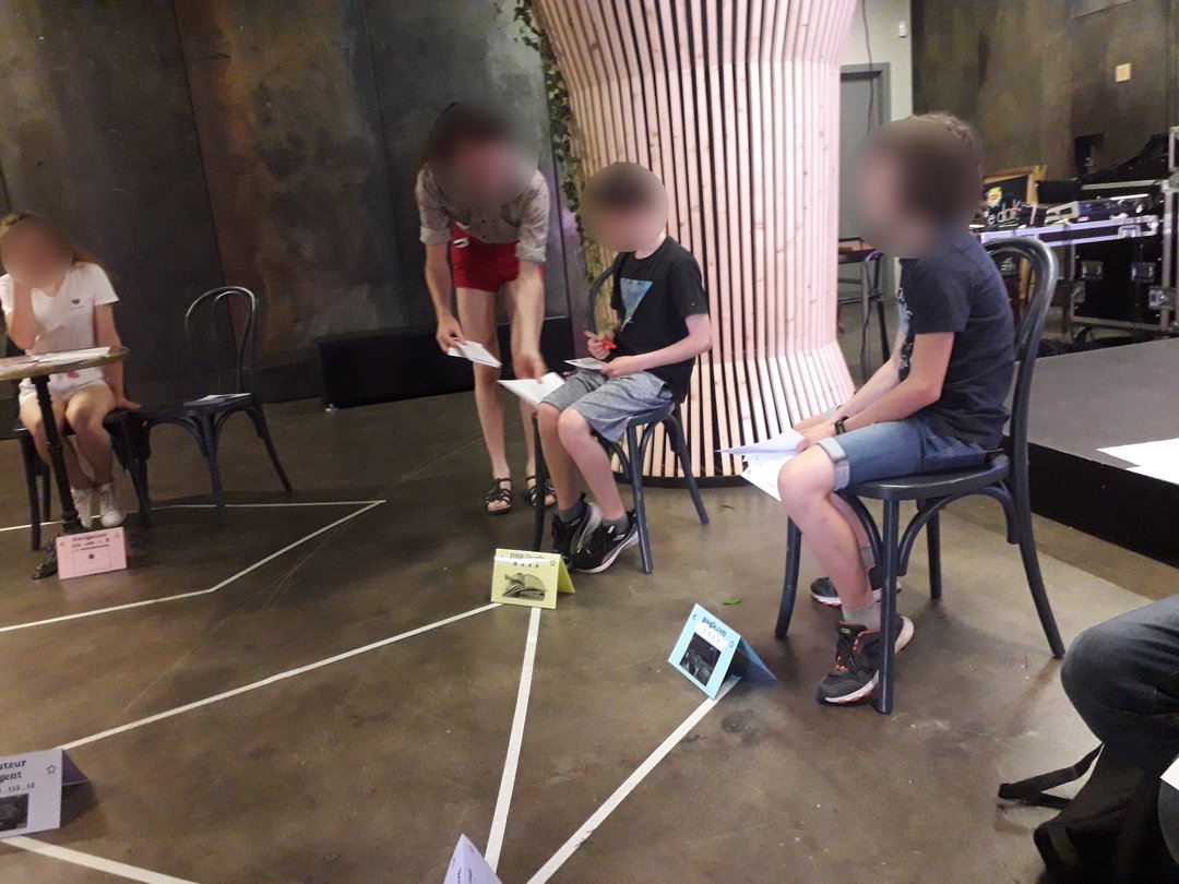
Graphic contribution to Network & Magic, a role-playing game to understand the basics of how the Internet works, 2022.
Charting, printing and shaping of the different elements of the game: generic visual, name tags and cards for the roles, postcards, stamps…
Games proposed in the premises of the Mutual Aid Group Aube and at the Shadok with the Hackstub associative hackerspace in Strasbourg during 2022-23.Infos
- Year:
-
2022
- Location:
-
Strasbourg
- Type:
-
commission
- Customer:
-
Hackstub
- Original game:
-
Ljf
- Images:
-
Hackstub
- Fonts:
-
Basteleur, Keussel, SIL Open Font License v1.1, 2021 and Sometype Mono, Ryoichi Tsunekawa, Dharma Type, SIL Open Font License v1.1, 2007.
-
- Visual identity
- Website
- Animation
Images
Text
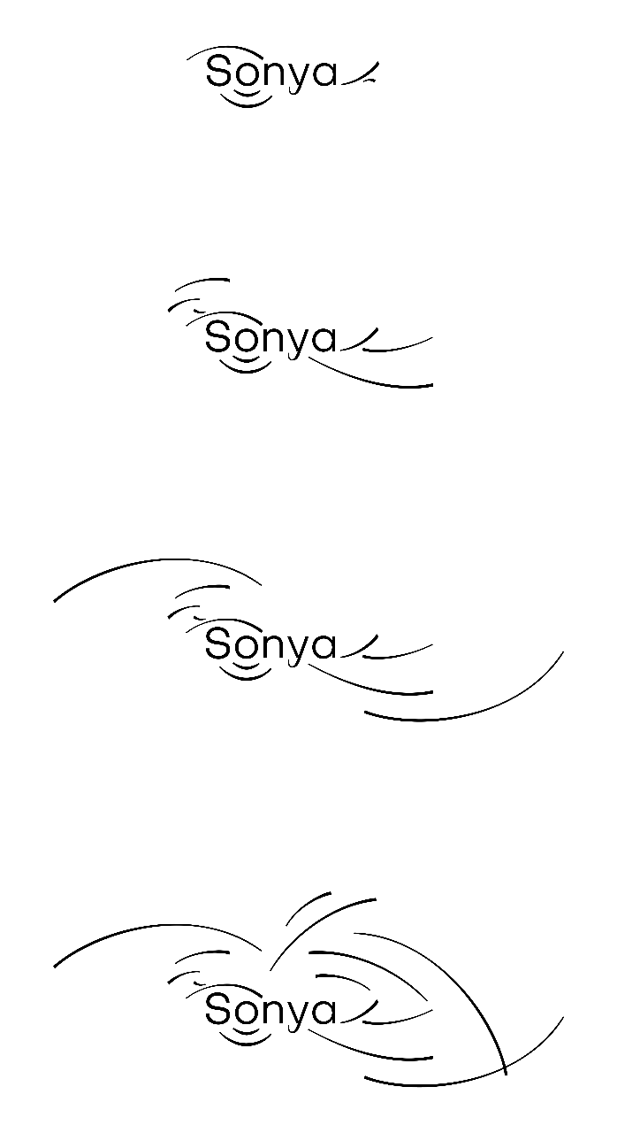
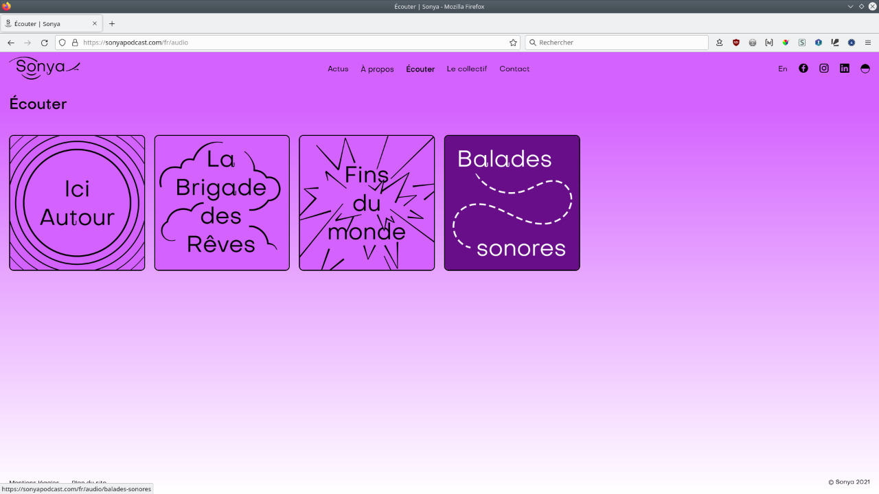
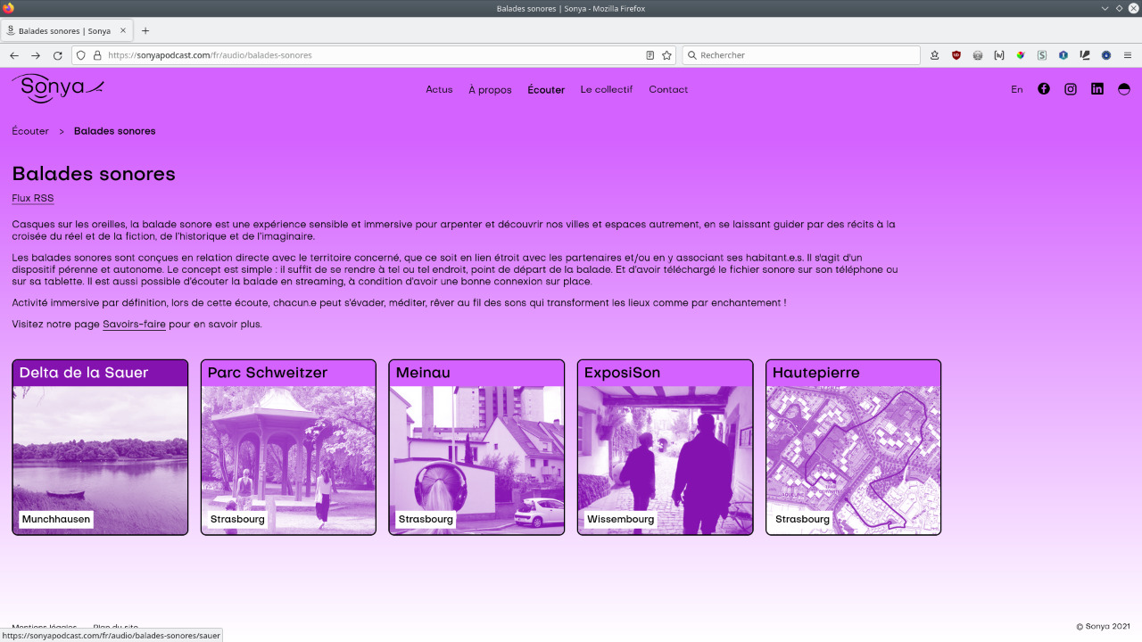
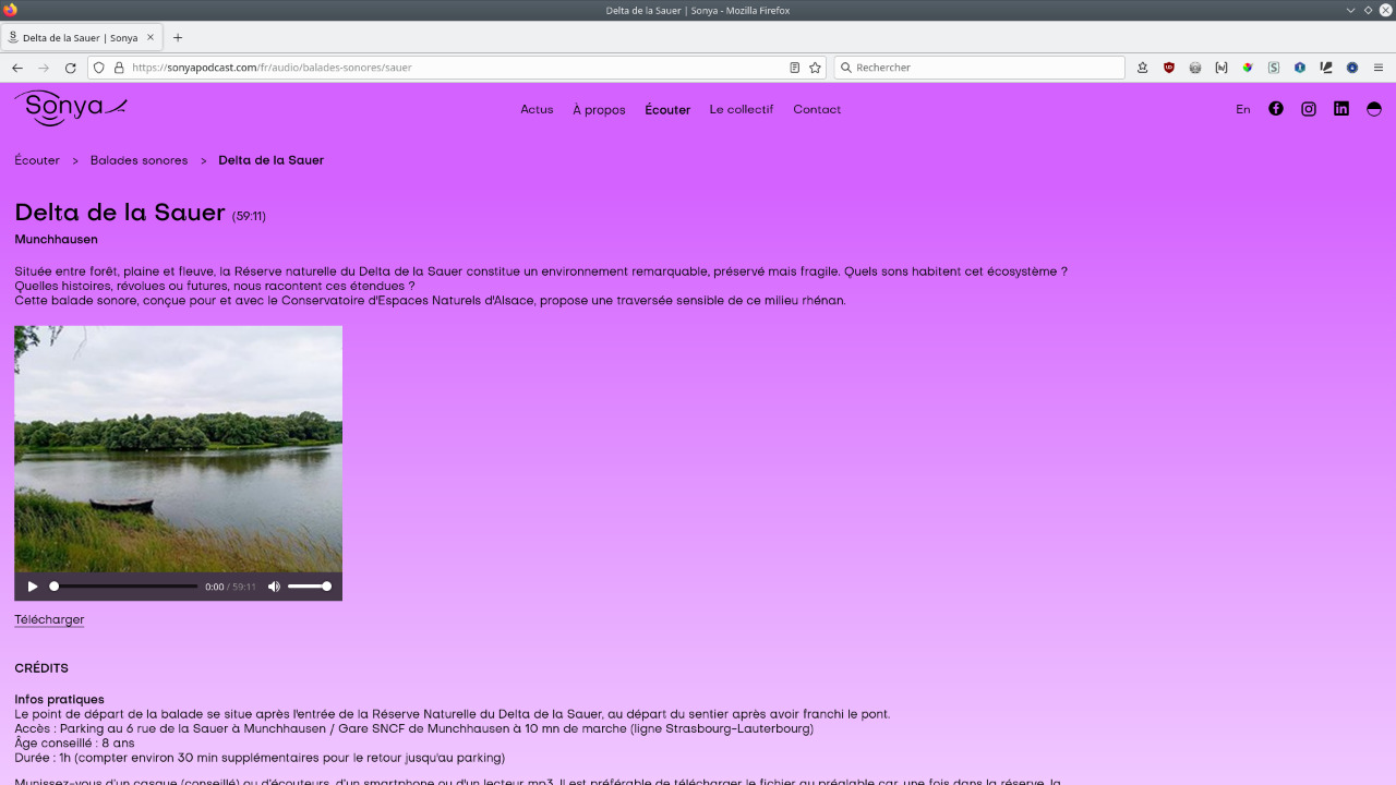
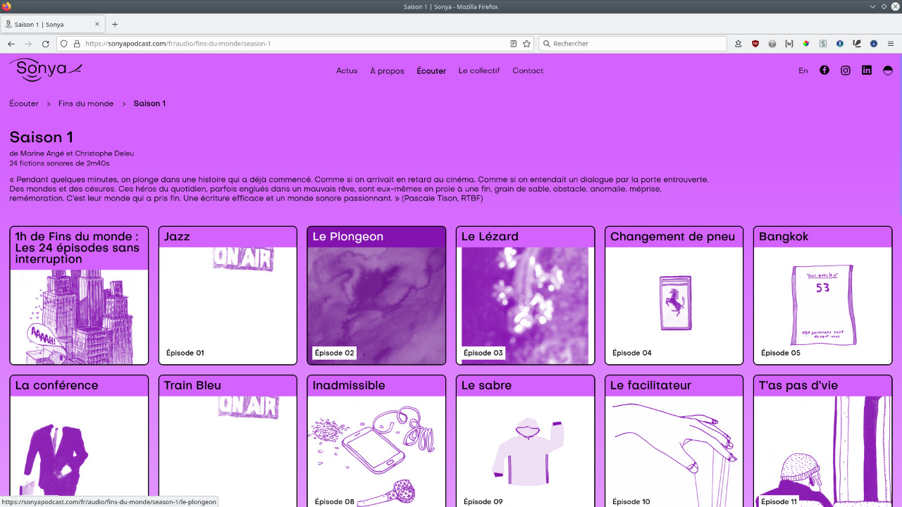
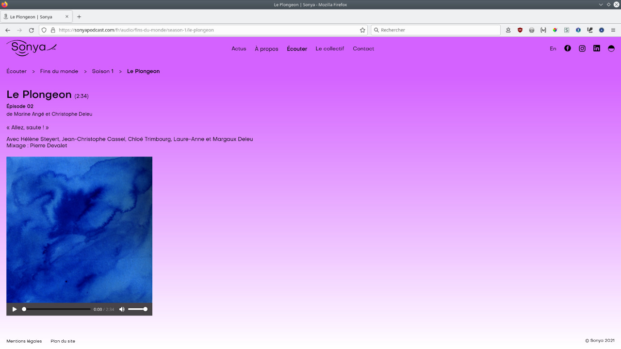
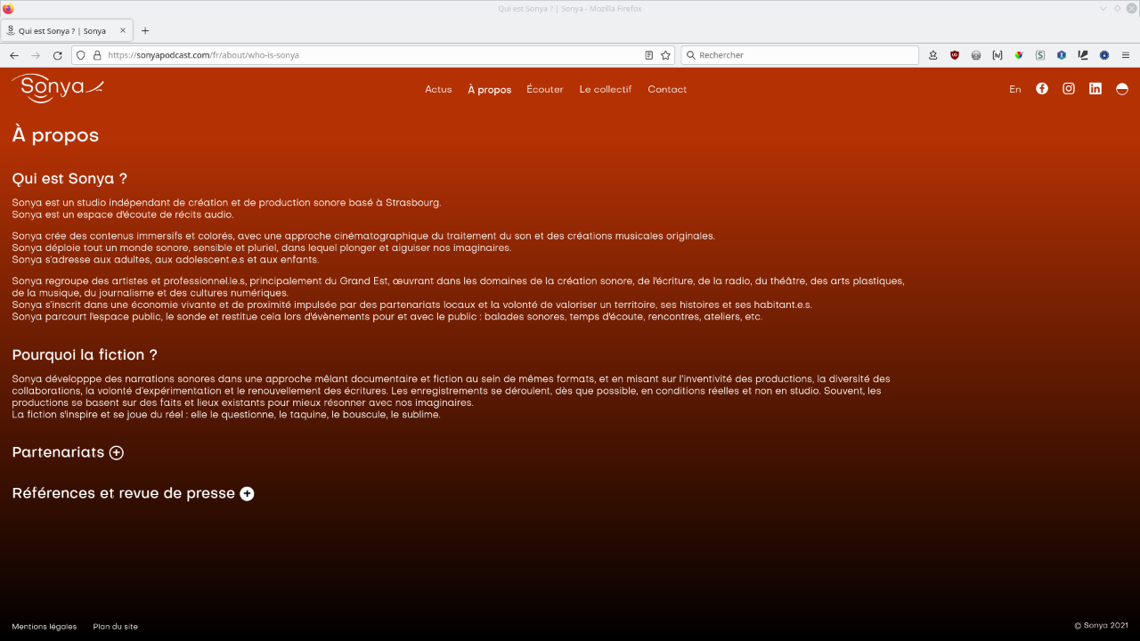
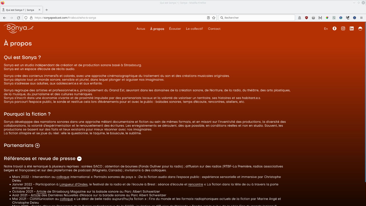
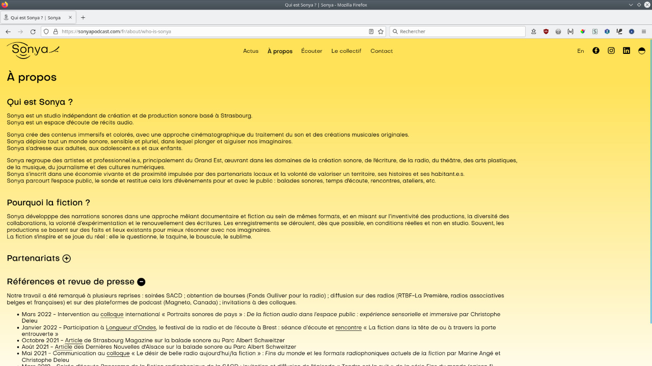
Creation of the visual identity of Sonya (logotype, animation and website). Sonya is a listening space dedicated to audio storytelling. Sonya is also a sound creation and production studio based in Strasbourg.
The graphic design and development of Sonya's website (v.1 of the web platform) have been made in collaboration with Audrey Meyer.The visual identity shows the deployment of a graphic universe, like the baseline which promises
“a world of audio storytelling”
. Thus the logo has an evolving and entropic character, it comes alive and transforms itself according to the media and themes.
The sign, sound and colour are preferred to the visual and are enough to define ambiences, which can already be experienced on the showcase website, particularly by switching between day and night modes. Similarly, the sound portraits allow the Sonya team to be heard rather than seen.Infos
- Year:
-
2022
- Location:
-
Strasbourg
- Type:
-
commission
- Customer:
-
Sonya
- Texts and images:
-
Sonya
- Fonts:
-
Subjectivity and Objectivity by Alex Slobzheninov, SIL Open Font License, 2018.
- CMS:
-
GRAV.
-
- Graphic design
- Website
Images
Text
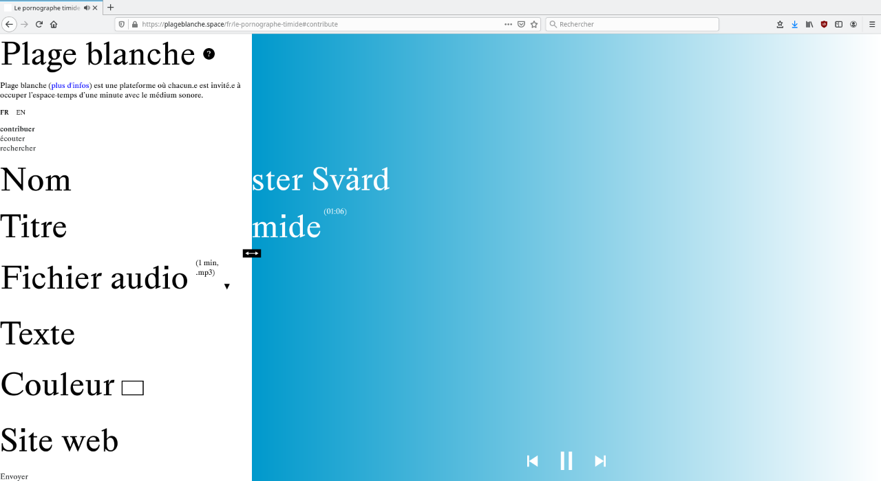
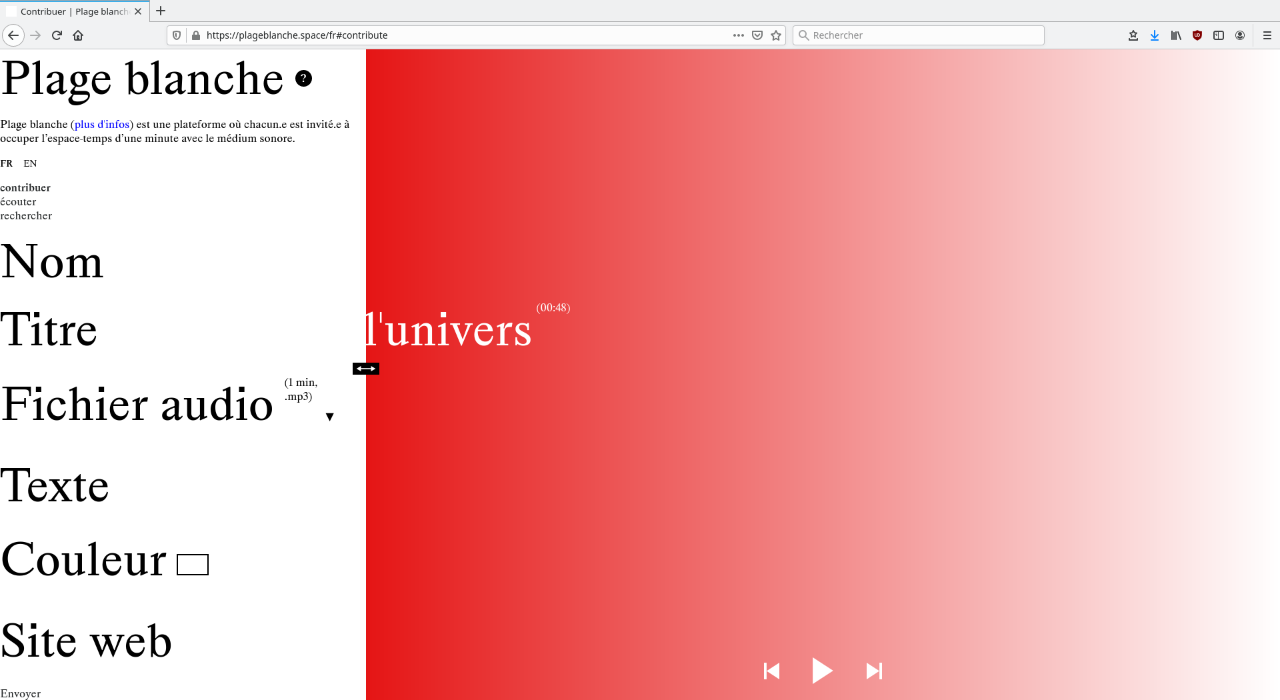
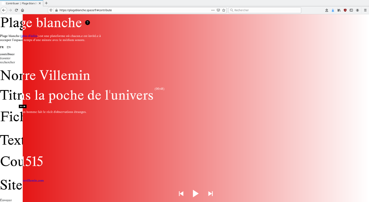
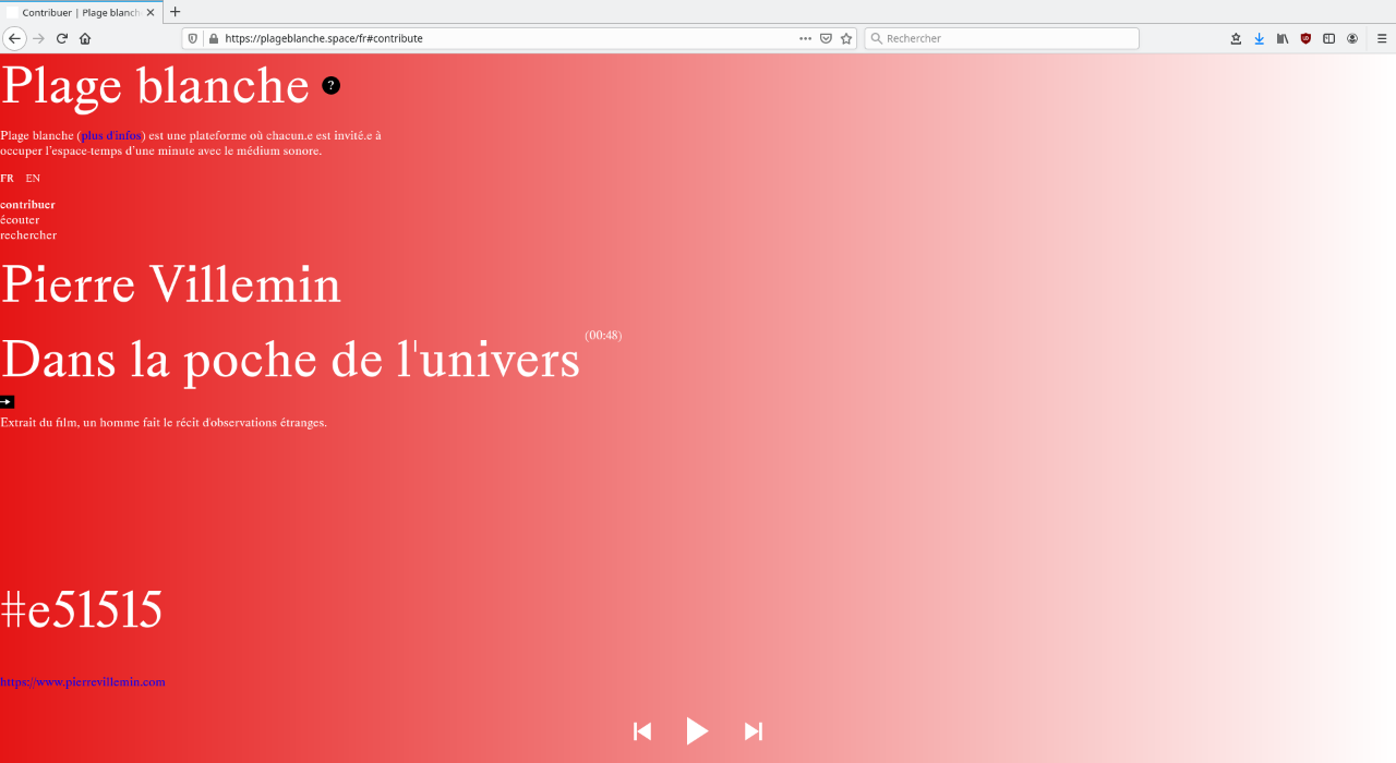
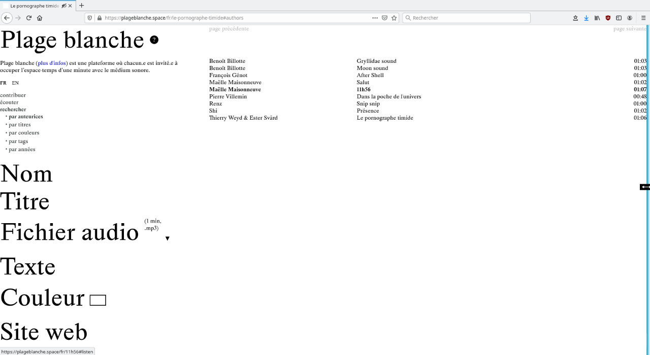
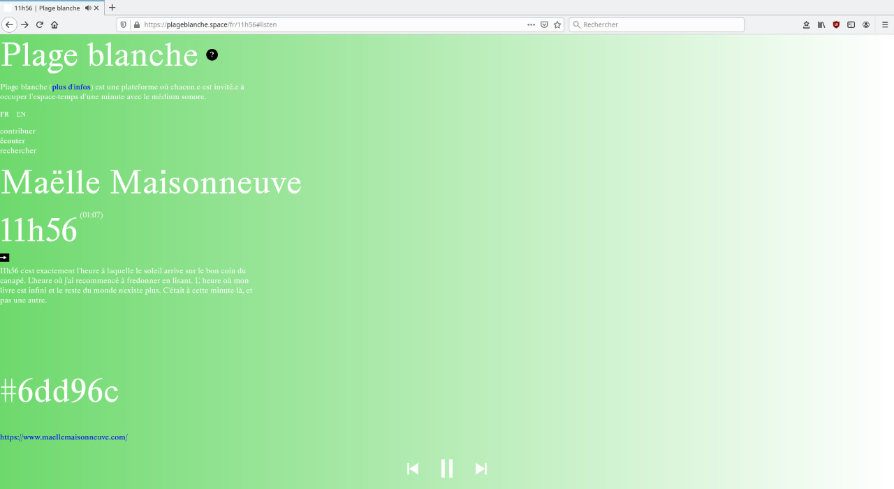
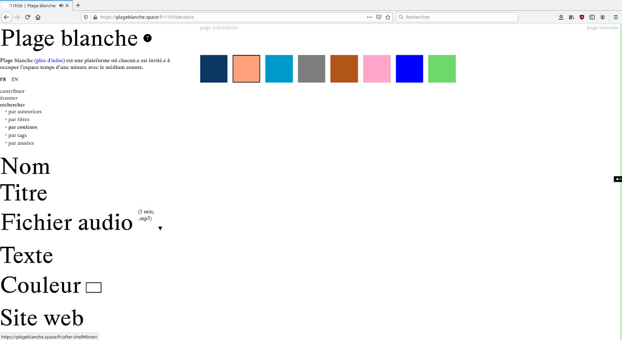
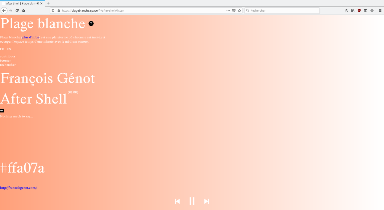
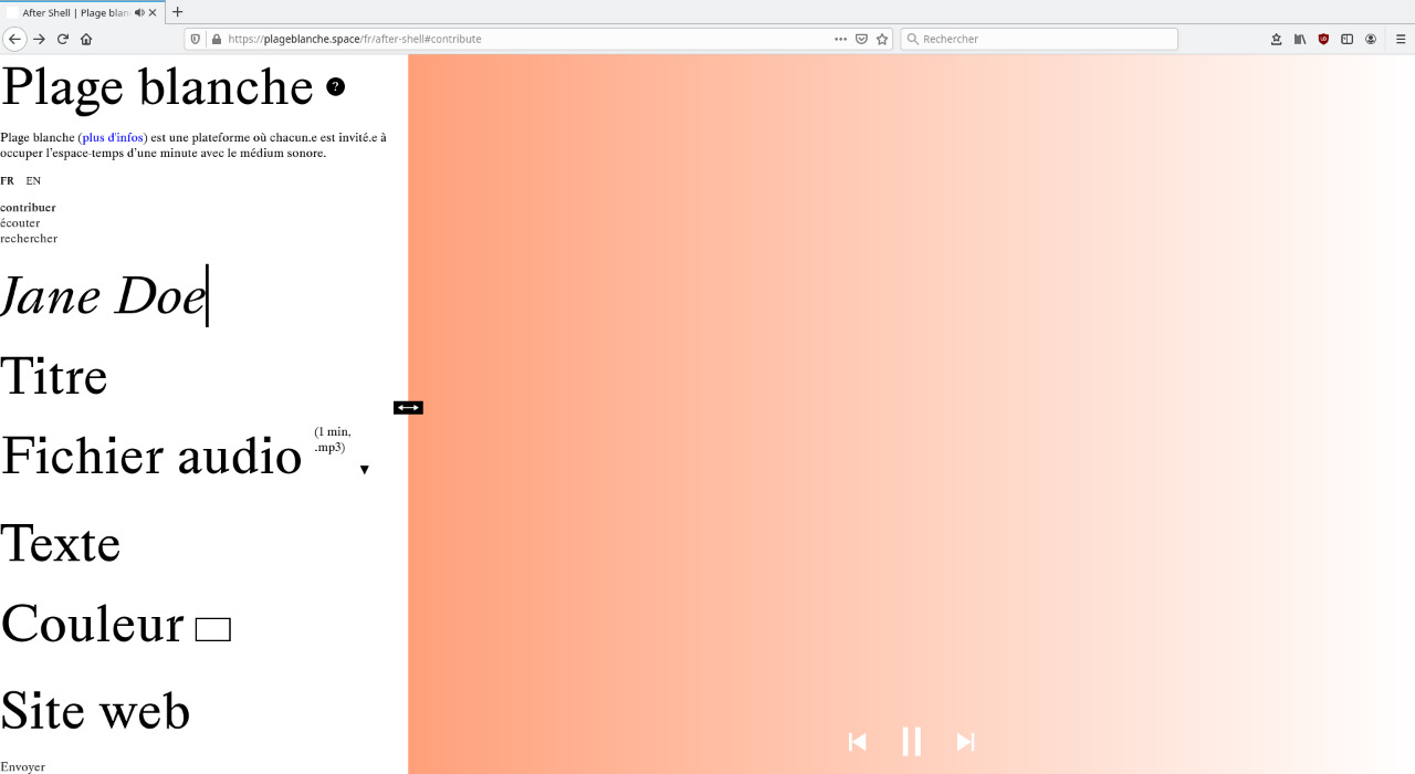
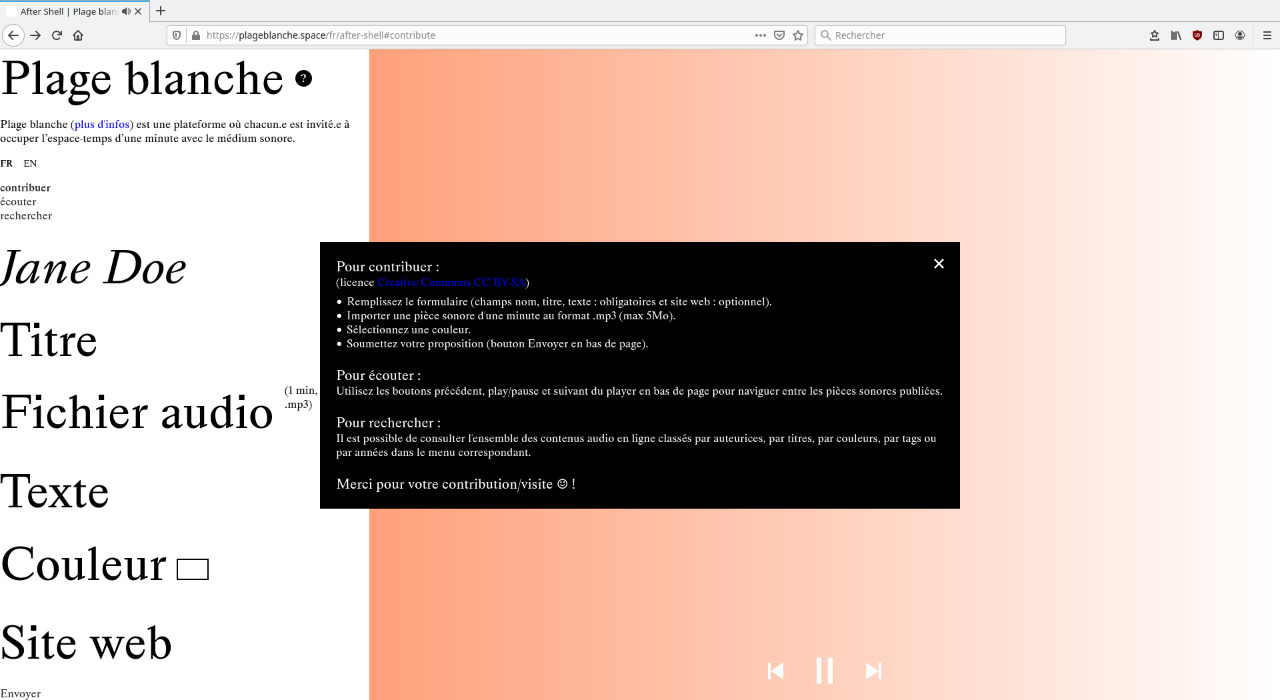
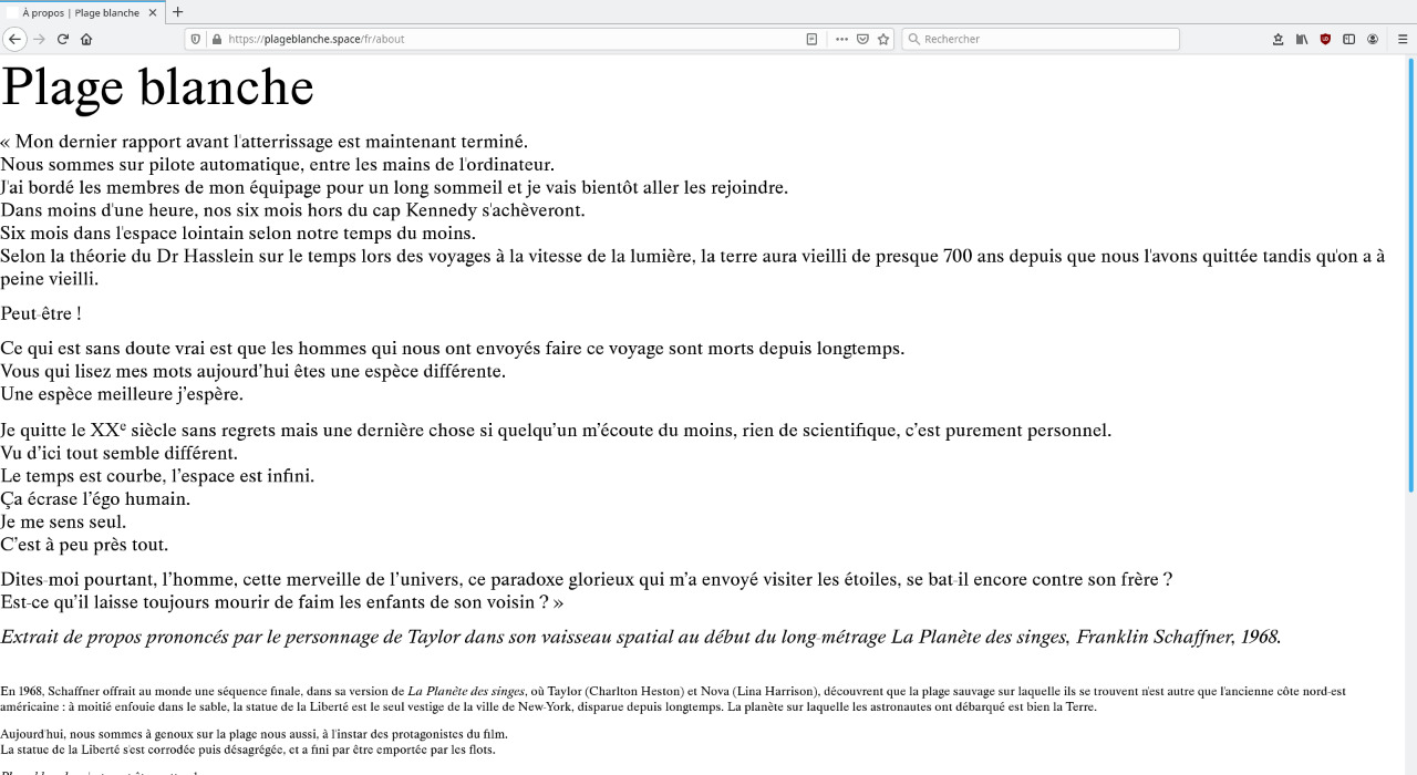
Graphic design and development of Plage blanche, a proposal by Marine Froeliger. Plage blanche is a web platform inviting people to occupy the space-time of one minute with the medium of sound. It is possible to publish, listen to or search for audio content. The economy of means is, in Plage blanche, an aesthetic bias. Constraint acts as a creative motor and the design is exposed to an awareness. This type of design approach renews the imagination. The website's interface was designed to enhance the value of the contribution, particularly through the importance given to the form, which occupies a third of the screen and is almost omnipresent.
On the other hand, there is little room for graphic enhancements, and none for images. The website's space is dedicated to sound, text and colour. Colour, as much as sound, characterises each published sound piece. White is the default colour of a web page (if no colour is assigned, the background will be white). So is the paper of the writing page, as long as it is blank of signs. In this sense, Plage blanche is also an invitation to colour: one leaves one's own, just as one leaves a sound imprint. There is also the idea of spending time. It's not necessarily a problem not to immediately understand how a website works, it depends at stakes. Plage blanche is a website to wander around.
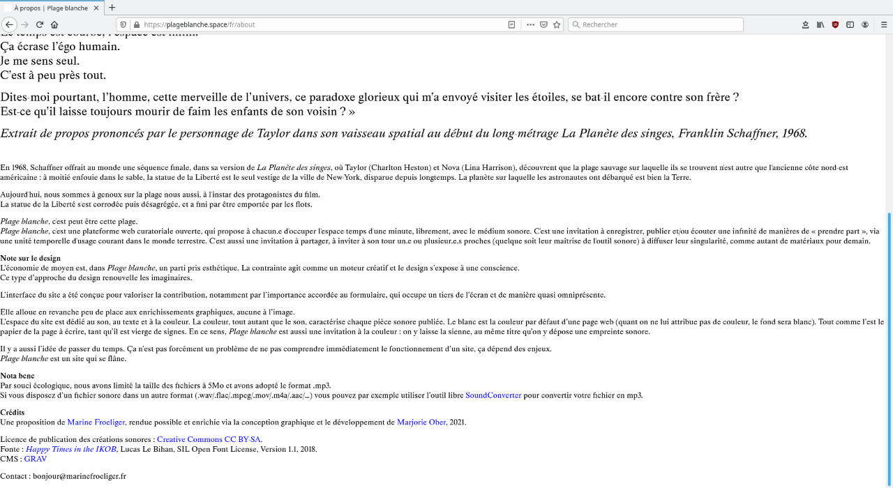
Listening session in Nancy with Marine Froeliger in the exhibition space of Ergastule on November 25, 2022 at 6:30 pm to discover the spectrum of Plage blanche published since its launch in 2021 and to analyze the footage of the website, like a time capsule that would be opened at a given time, to listen its content.
Infos
- Year:
-
2021
- Location:
-
Strasbourg
- Type:
-
co-creation with Marine Froeliger
- Licence to publish sound creations:
-
Creative Commons CC BY-SA
- Font:
-
Happy Times in the IKOB, Lucas Le Bihan, SIL Open Font License, Version 1.1, 2018.
- CMS:
-
GRAV
-
- Graphic design
- Website
Images
Text
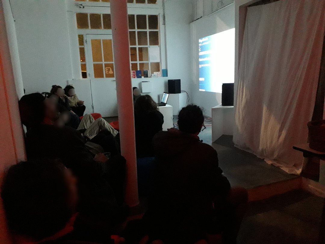
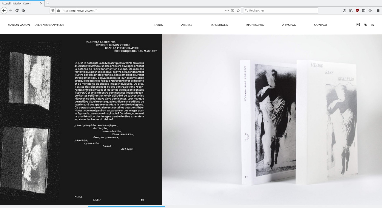
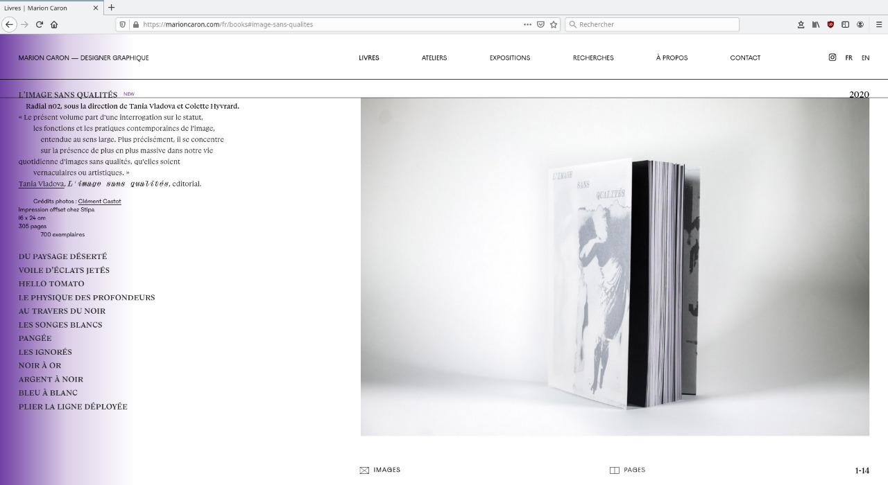
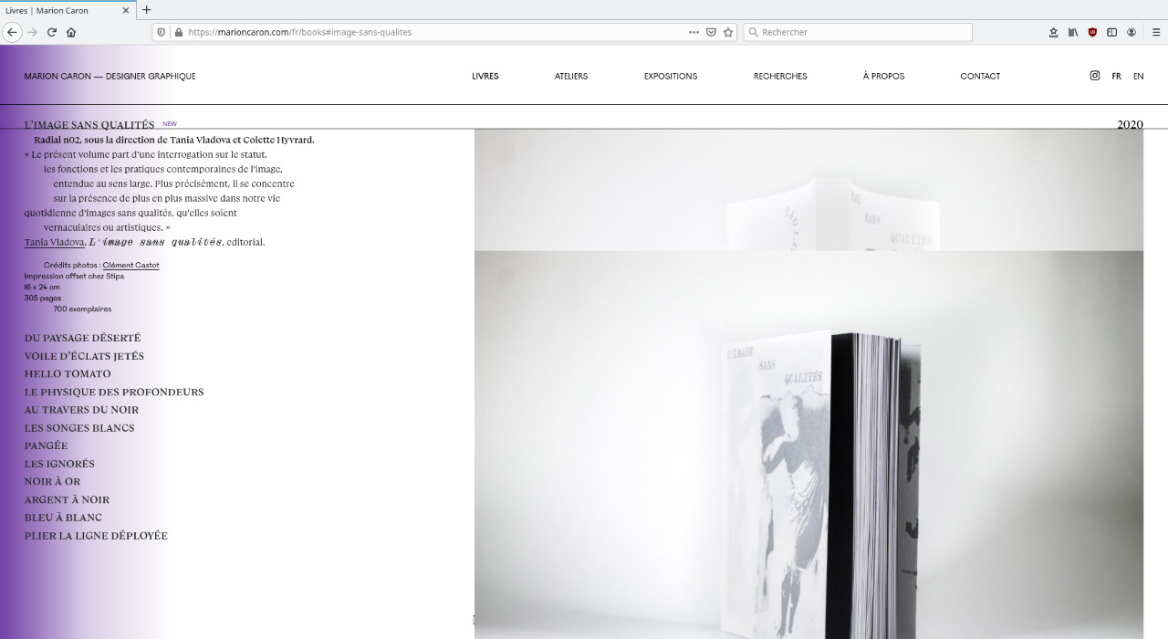
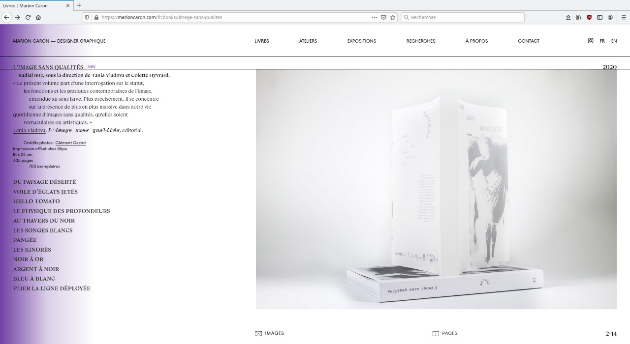
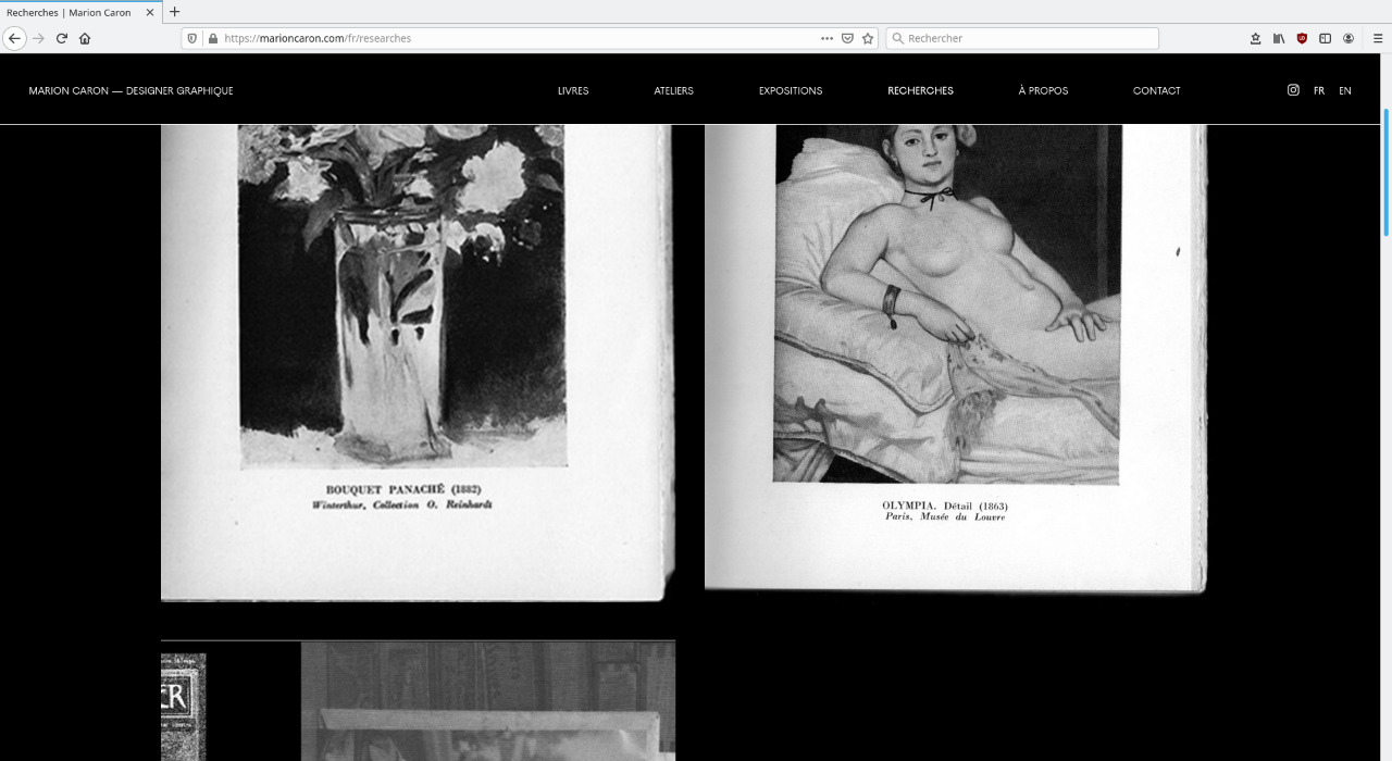
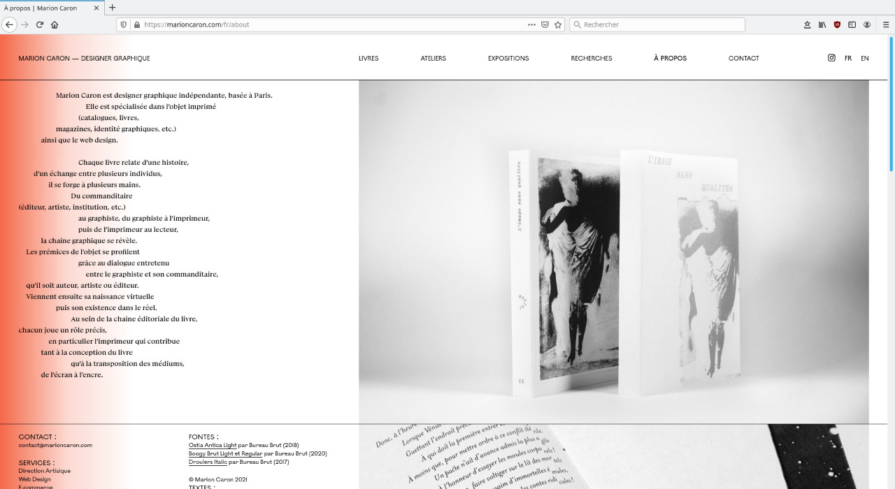
Graphic design and development of the website of the graphic designer Marion Caron.
In a desire to promote her work and her relationship with book design, the website shows the books conceived by Marion Caron in the form of both photographs, in order to show their bodies and volumes, and scans, to reveal the interior and the attention given to the layout.
Infos
- Year:
-
2021
- Location:
-
Paris
- Type:
-
commission
- Customer:
-
Marion Caron
- Texts:
-
Marion Caron
- Images:
-
unless otherwise stated, Marion Caron
- Fonts:
-
Ostia Antica Light (2018), Boogy Brut Light and Regular (2020) and Droulers Italic (2017) by Bureau Brut.
- CMS:
-
GRAV
-
- Graphic design
- Web platform
 Périple 2021 2021 platform control screen">
Images
Text
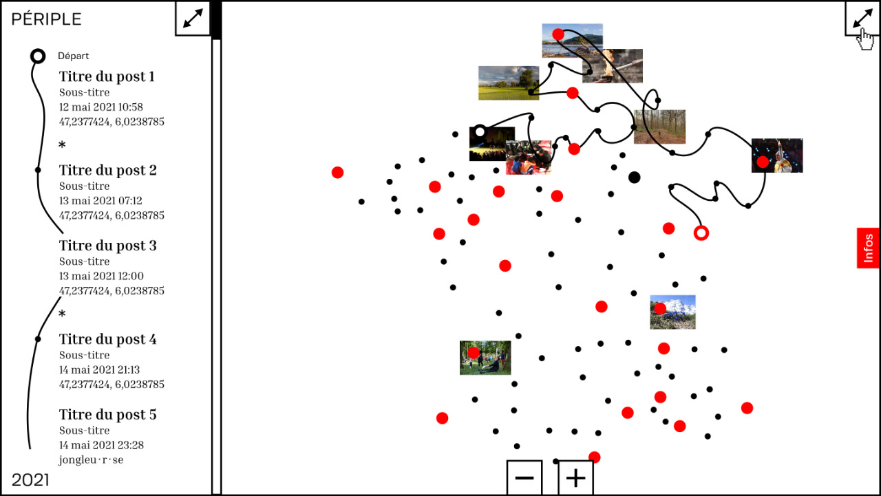
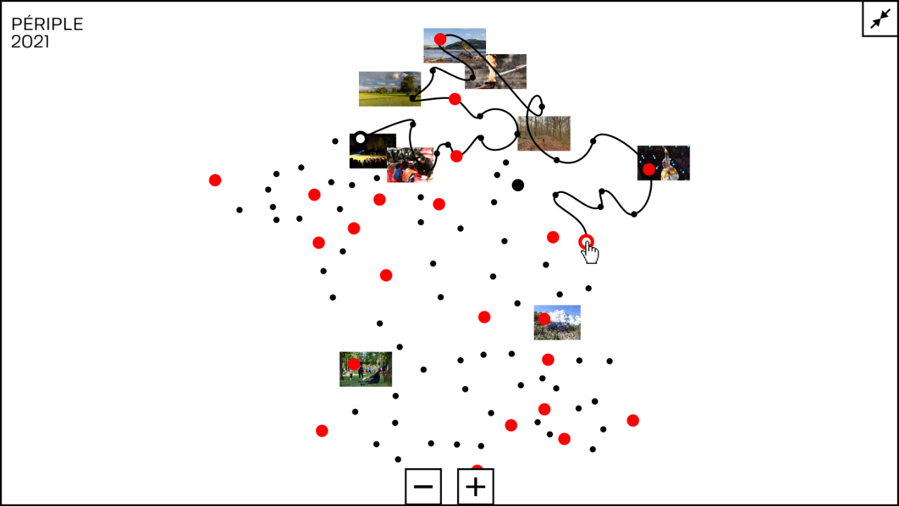
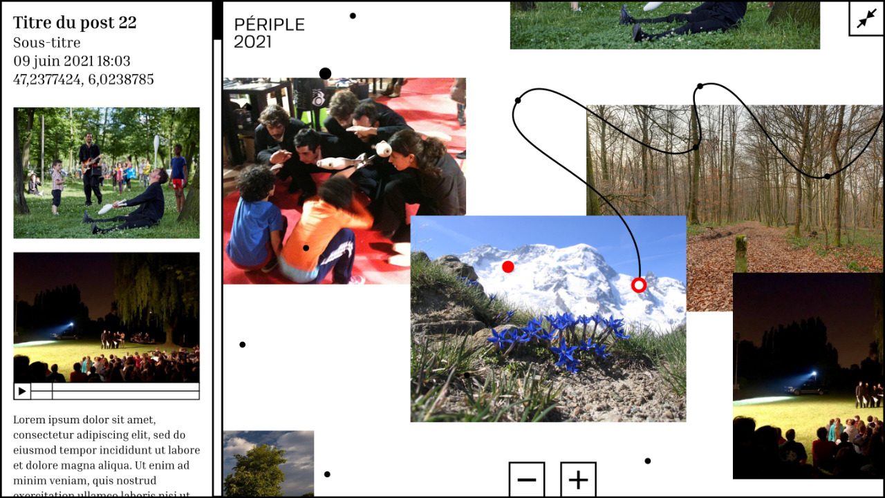
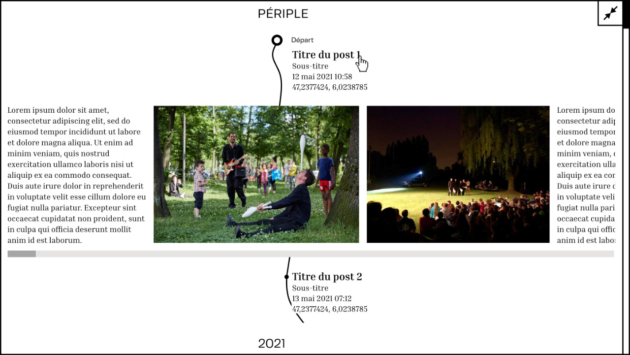
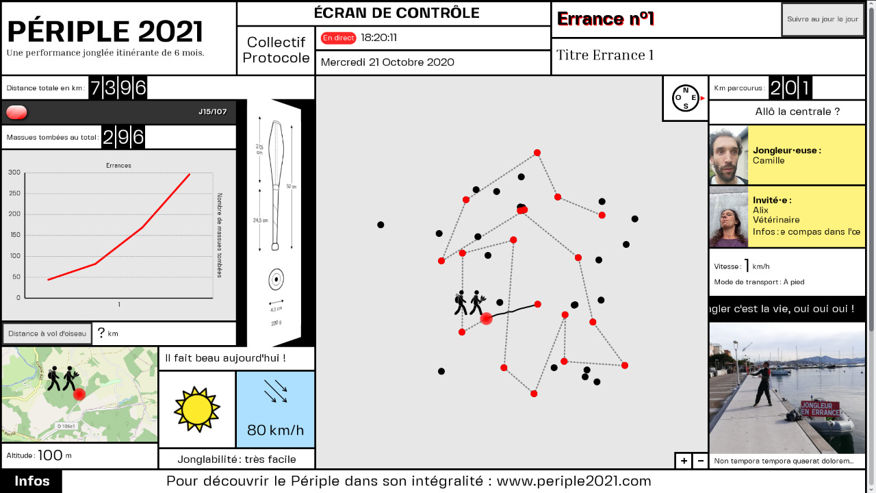
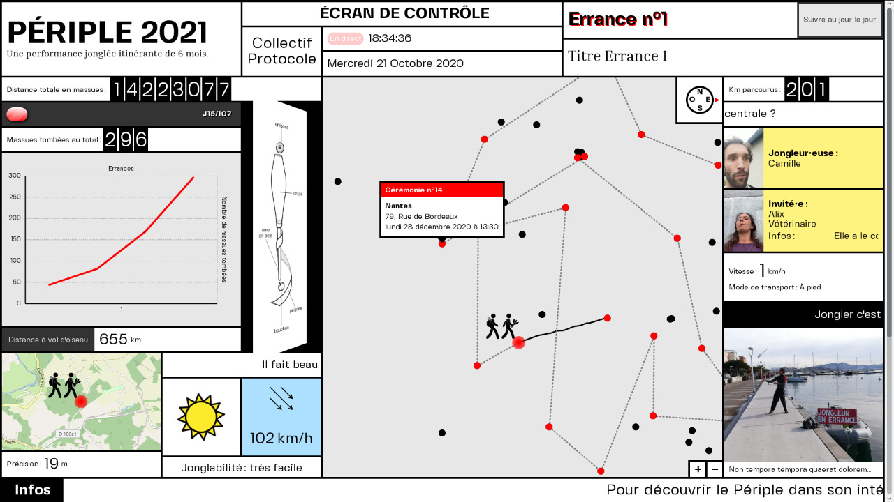
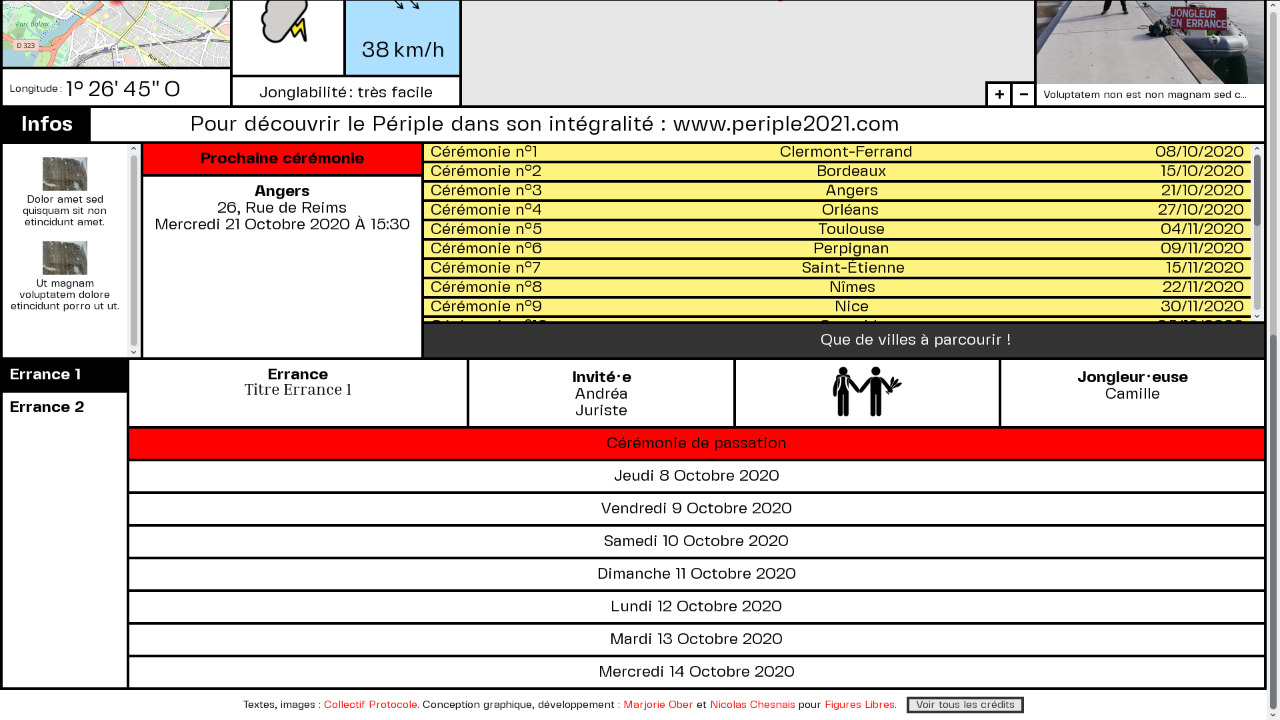
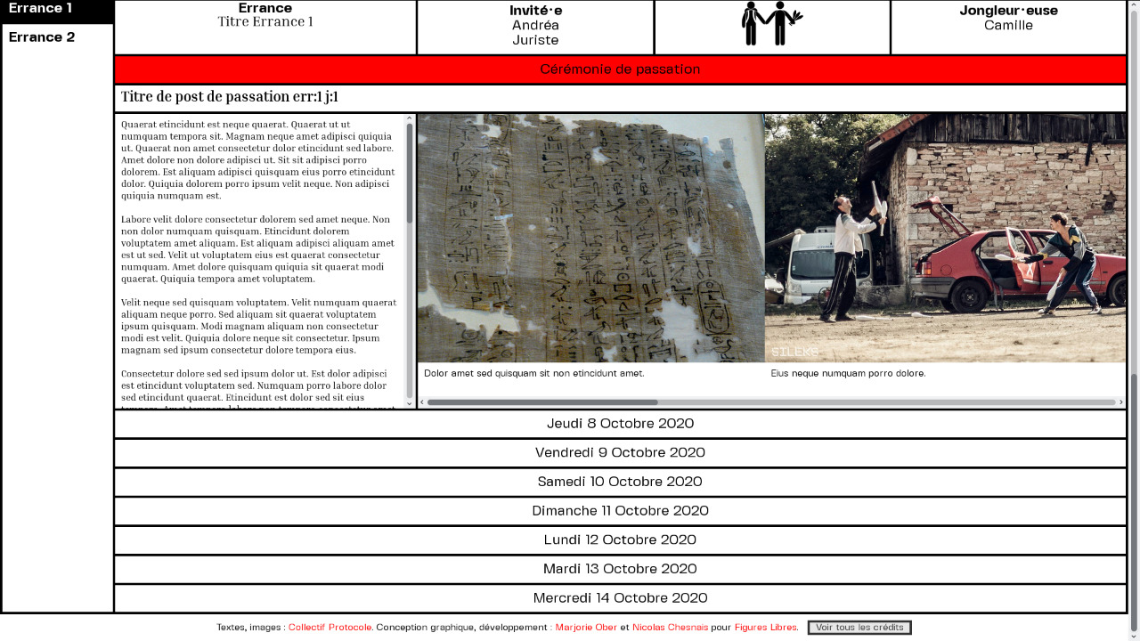
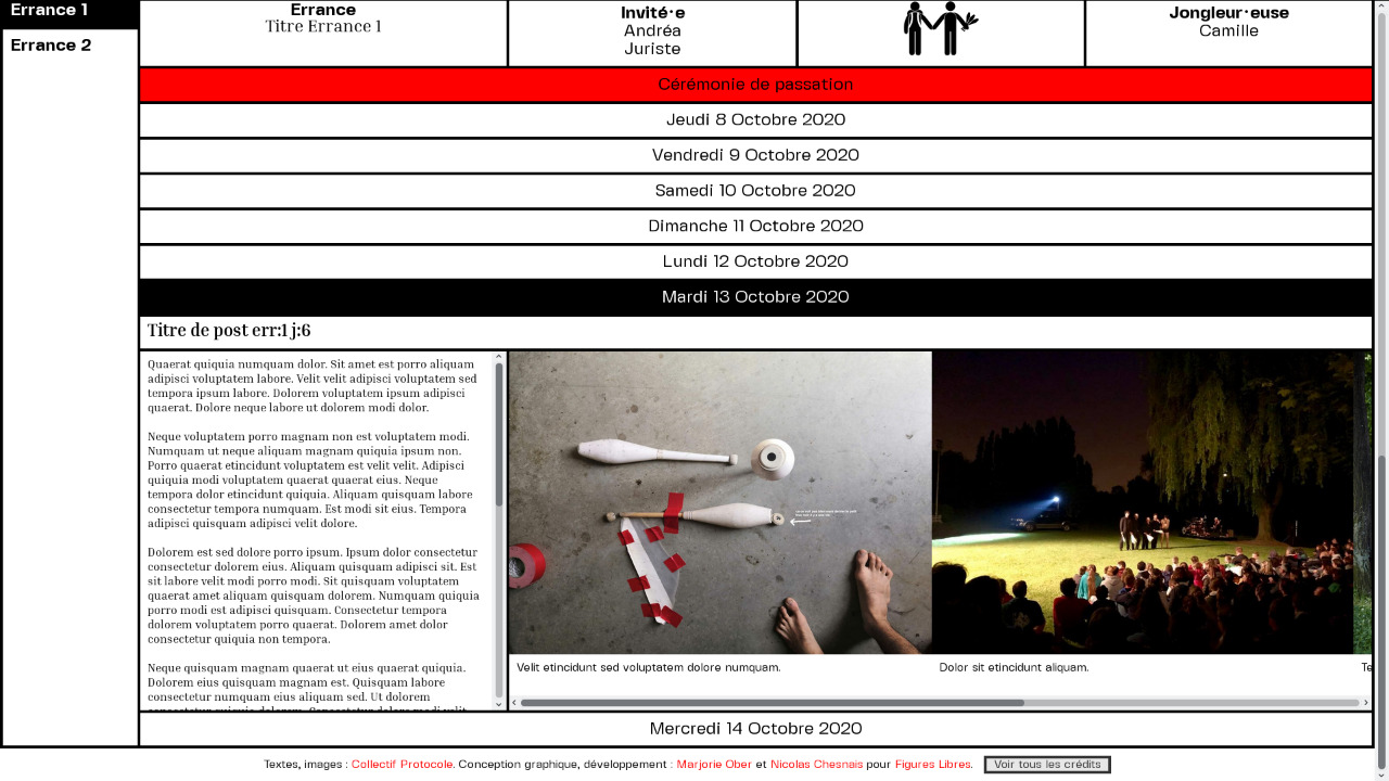
Graphic design and development of a custom web platform for Périple 2021. A six-month travelling juggling performance across France between March and August 2021, a project initiated by Collectif Protocole as part of a call for tenders.
The first four captures are the initial research thought for the project, the rest of the iconography presents the final version retained.
A control screen from which to follow the journey of the jugglers from afar, who provide their daily GPS location as well as a succession of information relating to the weather, the speed and mode of travel or the number of juggling clubs dropped. This live dashboard was broadcast in some of the theatres and partner places along the route of the journey and chosen for performances.
A diary is also available to read the daily reports and to access media such as images, videos or audio recordings that illustrate the encounters with the public. Each week is marked by a passing ceremony, where the handover of the juggling clubs leads to the departure of a new team, similar to the Olympic torch relay.In October 2021, a commission from Portugal required the translation of the whole website to make a smaller edition in the southwest of the country: A grande errância. Three weeks of juggling escapades between Faro, Sagres, Beja, Sines and Lisbon.
Infos
- Year:
-
2021
- Location:
-
Strasbourg
- Type:
-
commission in collaboration with Nicolas Chesnais
- Customer:
-
Figures Libres collective for Collectif Protocole
- Texts and images:
-
collectif Protocole
- Backend:
-
made with Flask
- Fonts:
-
Fivo Sans Modern by Alex Slobzheninovet (SIL Open Font License 1.1, 2018) and Inria Serif by Black[Foundry] (SIL Open Font License, 1.1, 2019).
- Weather emojis:
-
OpenMoji project, by students of the HfG Schwäbisch Gmünd design school and external contributors.
- Map:
-
Leaflet | Map data © OpenStreetMap contributors, CC-BY-SA.
-
- Graphic design
- Website
Images
Text
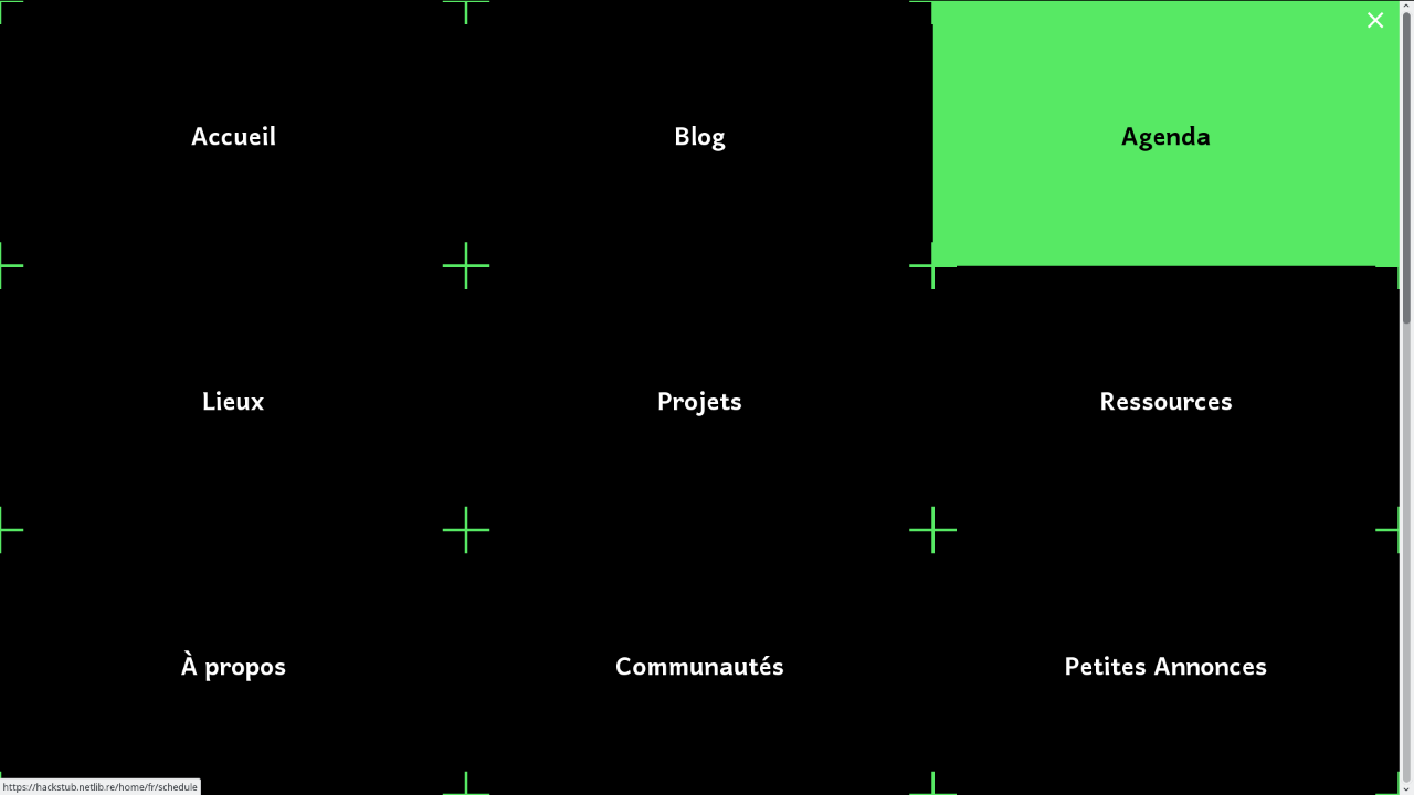
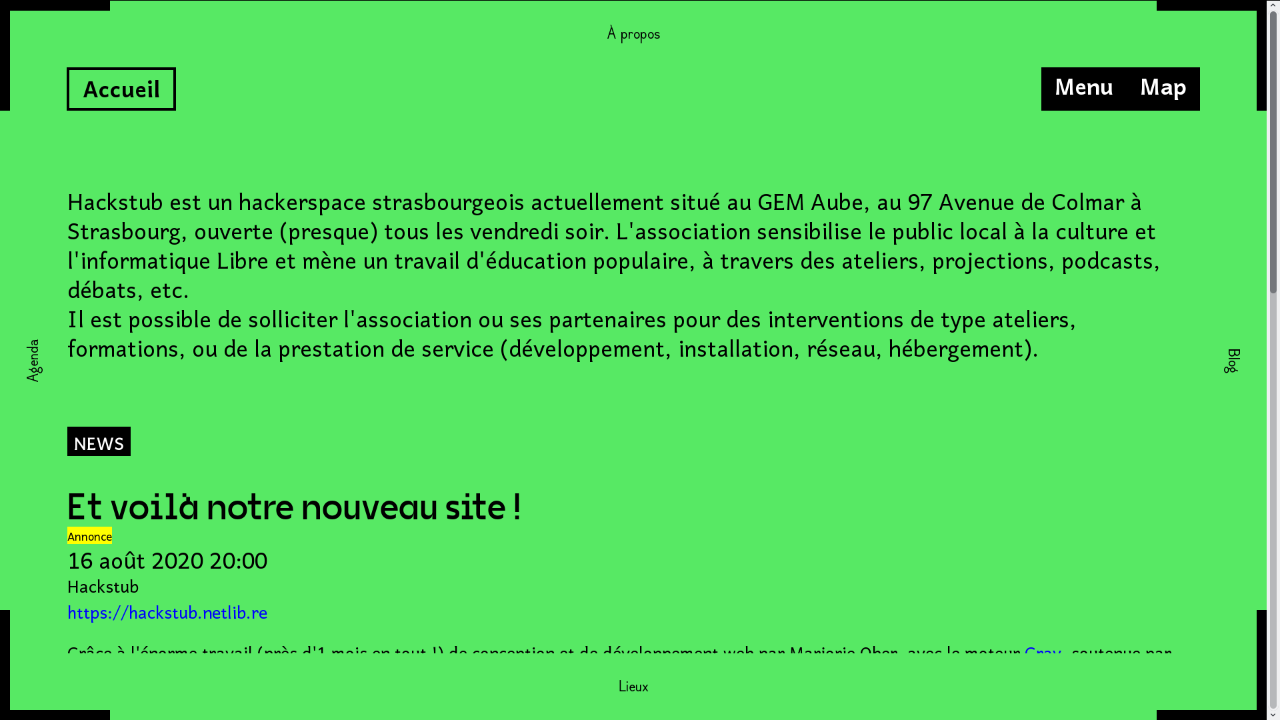
Graphic design and development of the website of Hackstub, a hackerspace in Strasbourg that raises awareness of the local public to the Libre culture. It is a top view representation of the hackerspace, each page corresponding to a room. These rooms are communicating, like the functioning of the association (a place to meet, share ideas, projects, knowledge, etc.).
It is possible to navigate the website in two ways: in Accessible mode through the Menu; in Exploration mode through the Map. The user is then free to choose the navigation mode he prefers or to which he intuitively turns. The website allows the user to find the information they are looking for very quickly (anchor menu) as well as to take the time to wander from one room to another (move by clicking on the name of a neighboring page/room). The register of boxes, cells, and the mode of movement selected were attractive for their affiliation to the world of video games and for the playful dimension thus conferred on navigation.
Infos
- Year:
-
2020
- Location:
-
Strasbourg
- Type:
-
commission
- Customer:
-
Hackstub
- Texts and images:
-
Hackstub
- Fonts:
-
VG5000 by Justin Bihan (2018), Québec by Victor Gaultney, Annie Olsen and Pablo Ugerman (2016), and Dauphine by Alexandre Leray, Stéphanie Vilayphiou, Charles Mazé and Coline Sunier (2012).
-
Visual identity
Images
Text
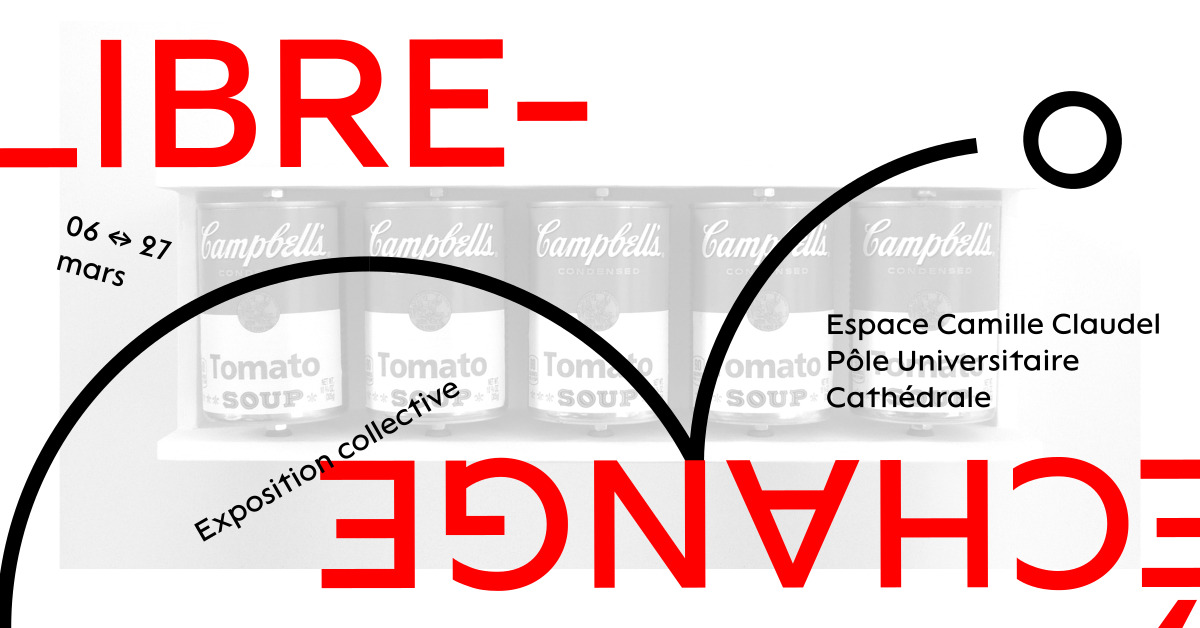
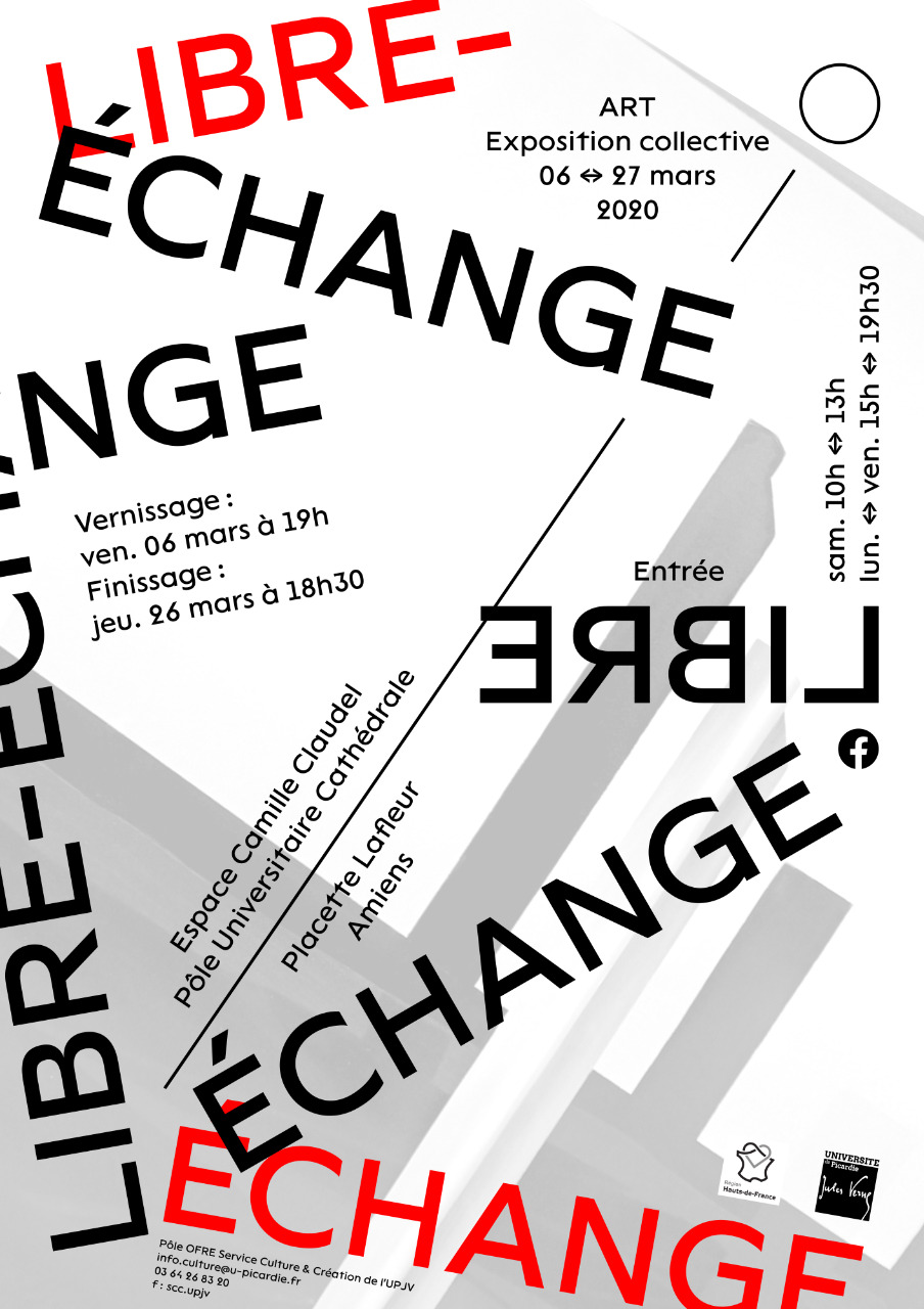
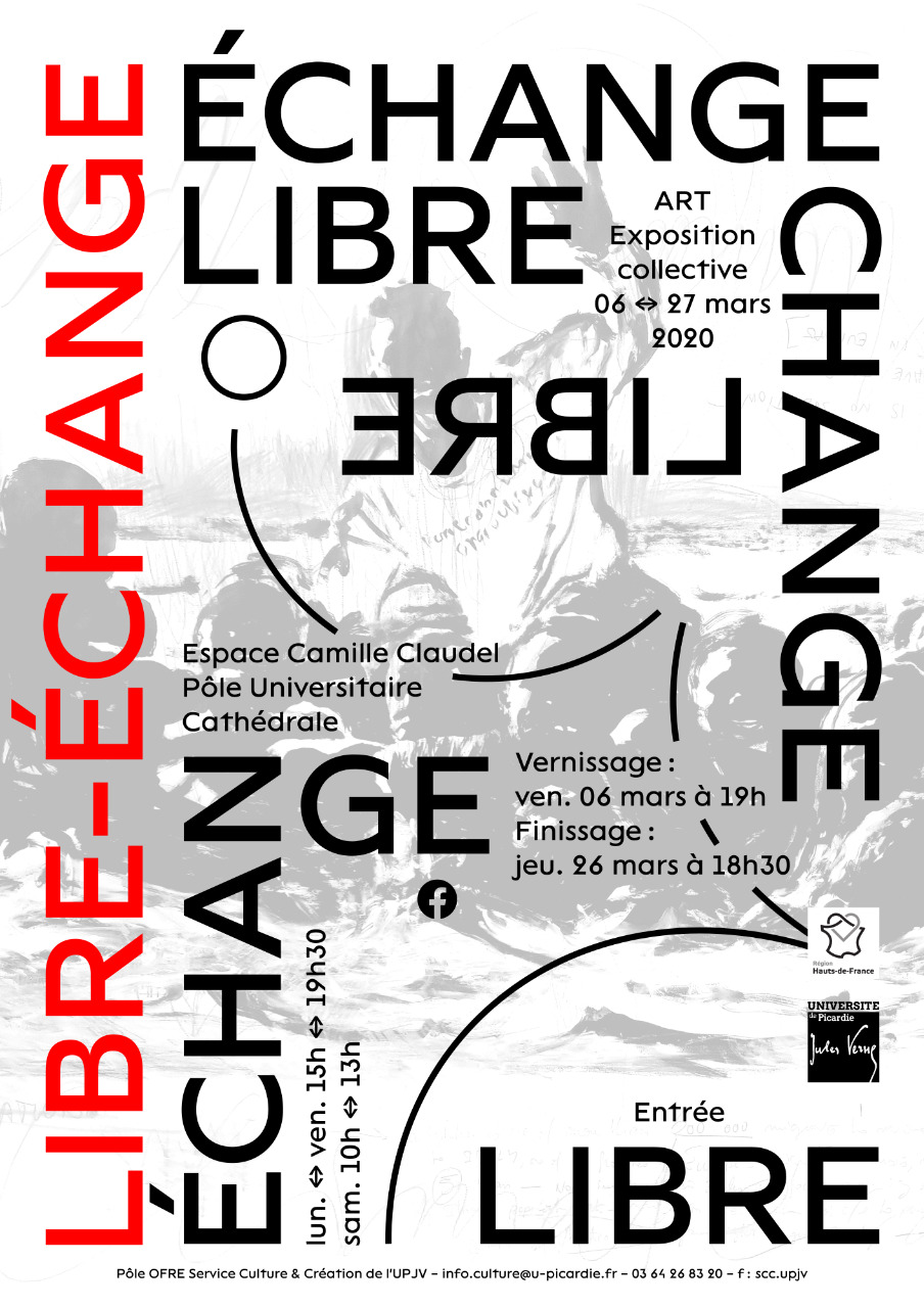
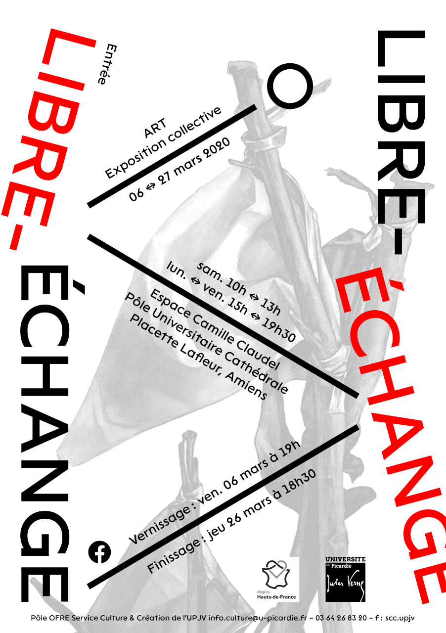
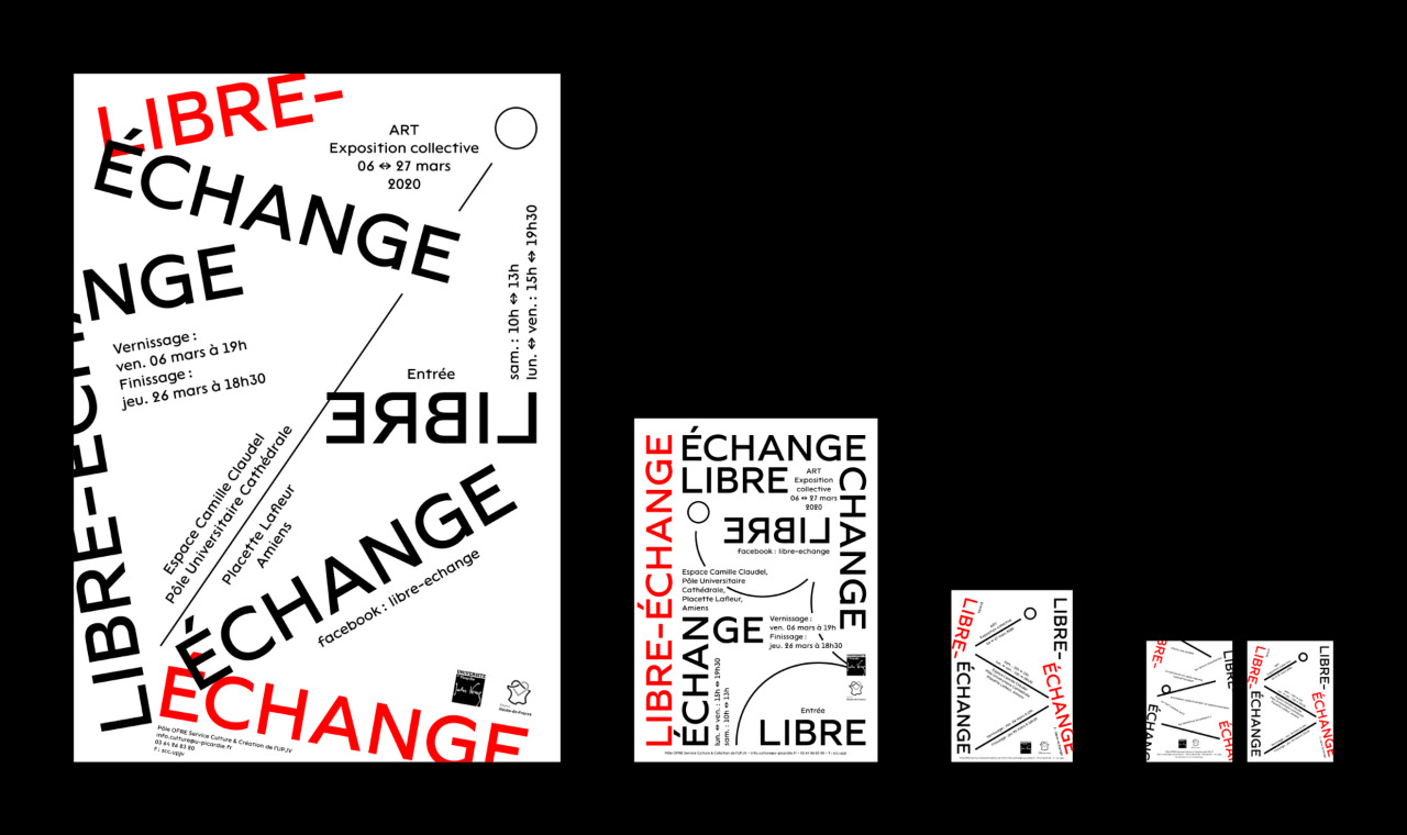
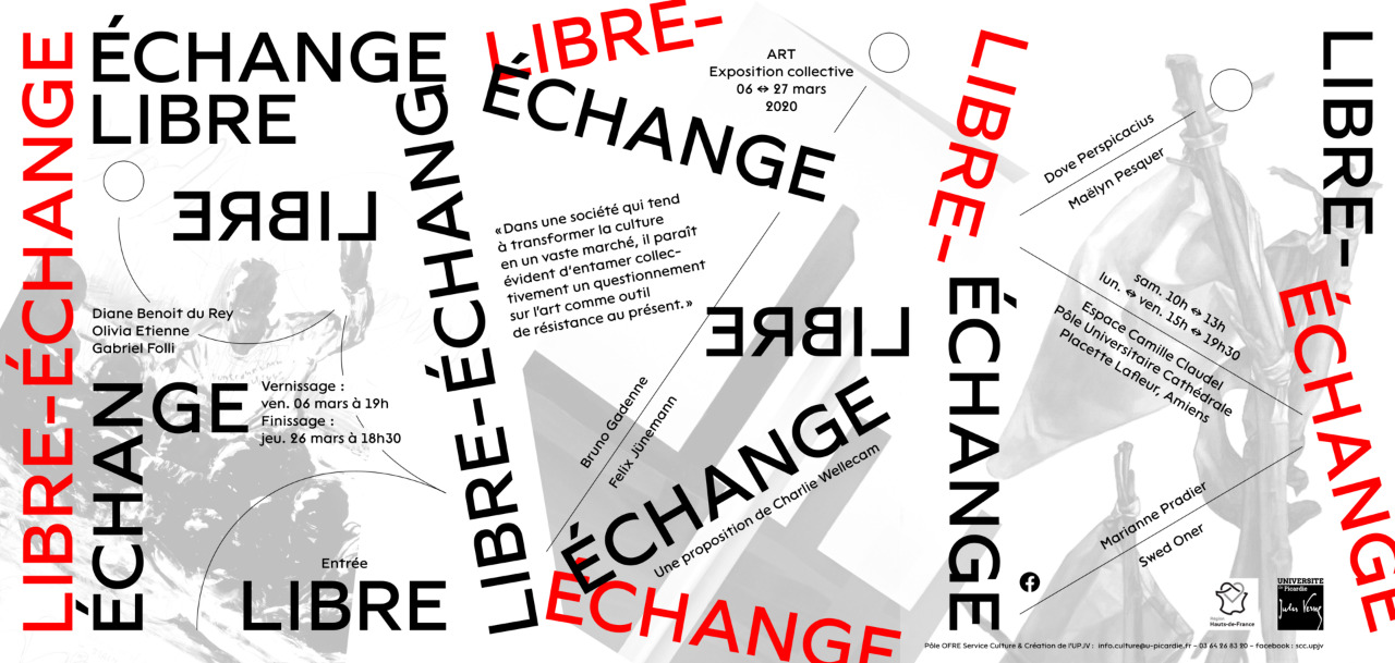
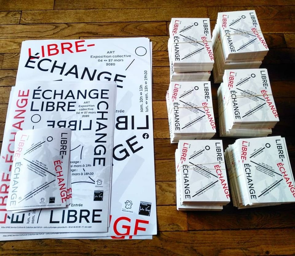
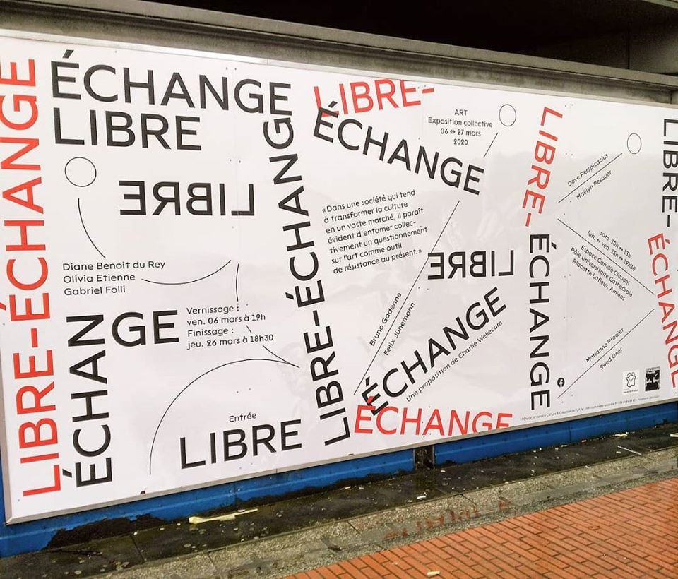
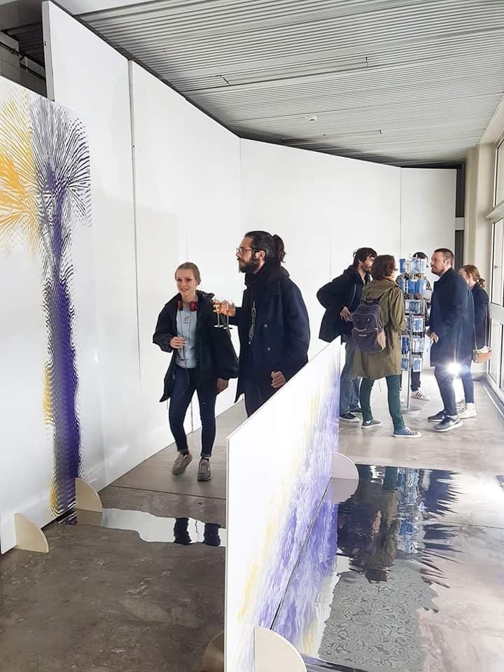
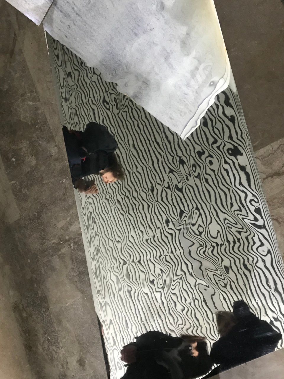
Visual identity of the contemporary art exhibition Libre-échange, from 06 to 27 March 2020 in Amiens. Creation of various formats of A1, A2, A3 posters, an A5 magazine page, an A6 flyer, a visual for social networks and a 4m20 by 2m panel.
The composition varies according to the media, inviting a fresh look, and challenging the eye differently according to the bounces or collisions to follow. All of the graphic sets are displayed in the large format, just as the line weight remains constant over the course of the posters, becoming thicker or thinner as the size of the host medium increases.
Libre-échange is a group exhibition curated by Charlie Wellecam as part of his doctoral research in art. Its subversive title refers to a book of the same name written by Pierre Bourdieu. Through this exhibition, the curator wanted to highlight the work of students and former students from various art schools.
Infos
- Year:
-
2020
- Location:
-
Amiens
- Type:
-
commission in collaboration with Nicolas Chesnais
- Customer:
-
Charlie Wellecam
- Visuals in the background of the posters:
-
visuals of the guest artists
- Photographs:
-
Charlie Wellecam
- Font:
-
Lack by Adrien Midzic (Velvetyne Type Foundry), 2013.
-
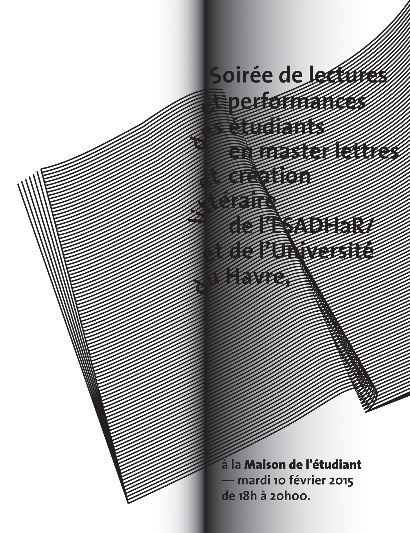
- Text
- Publication
Images
Text
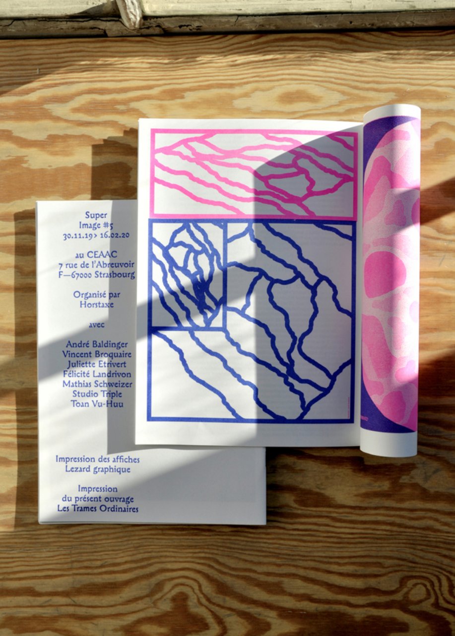
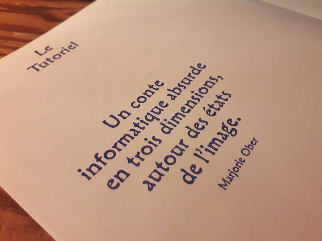
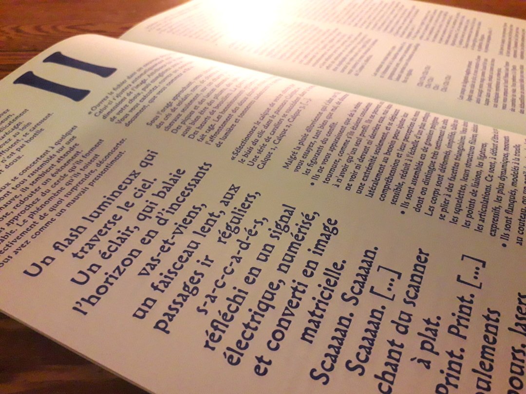
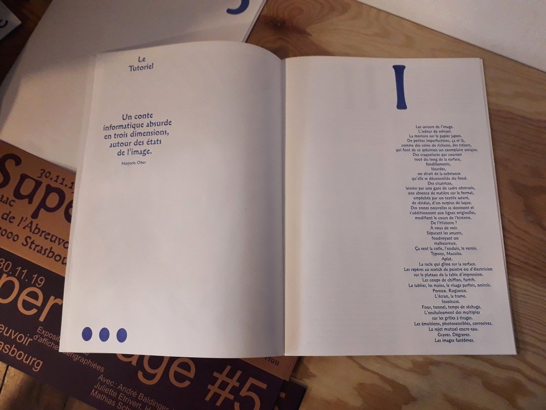
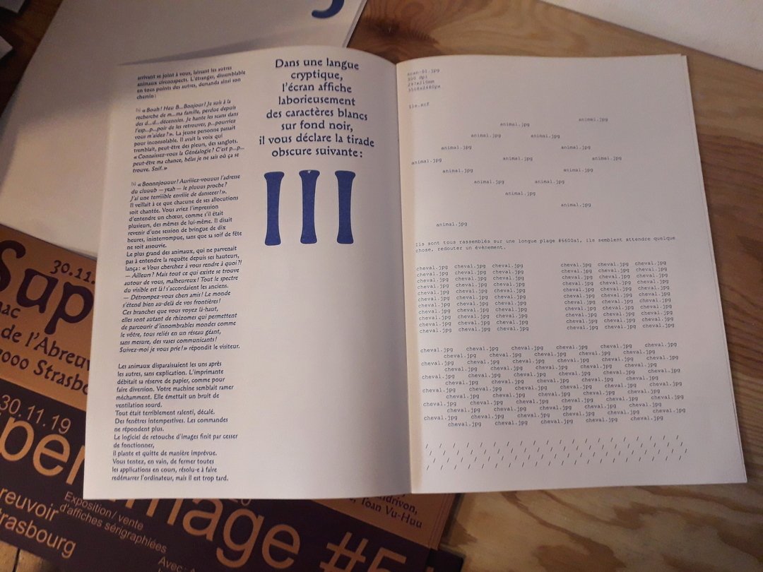
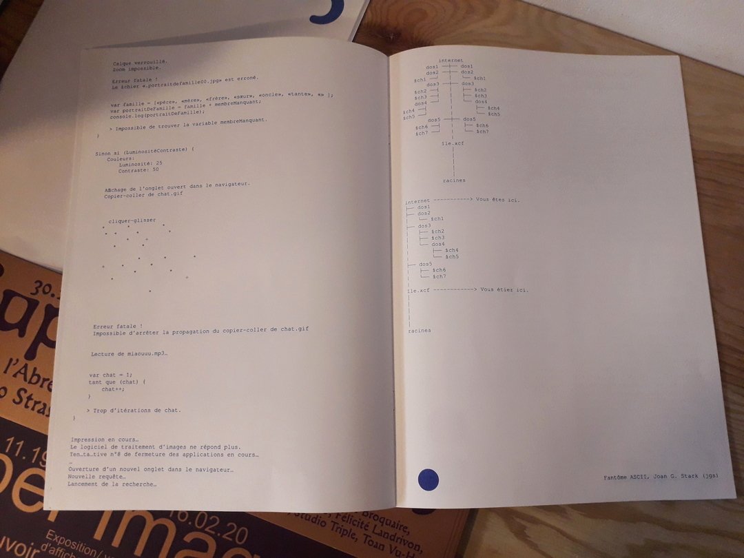
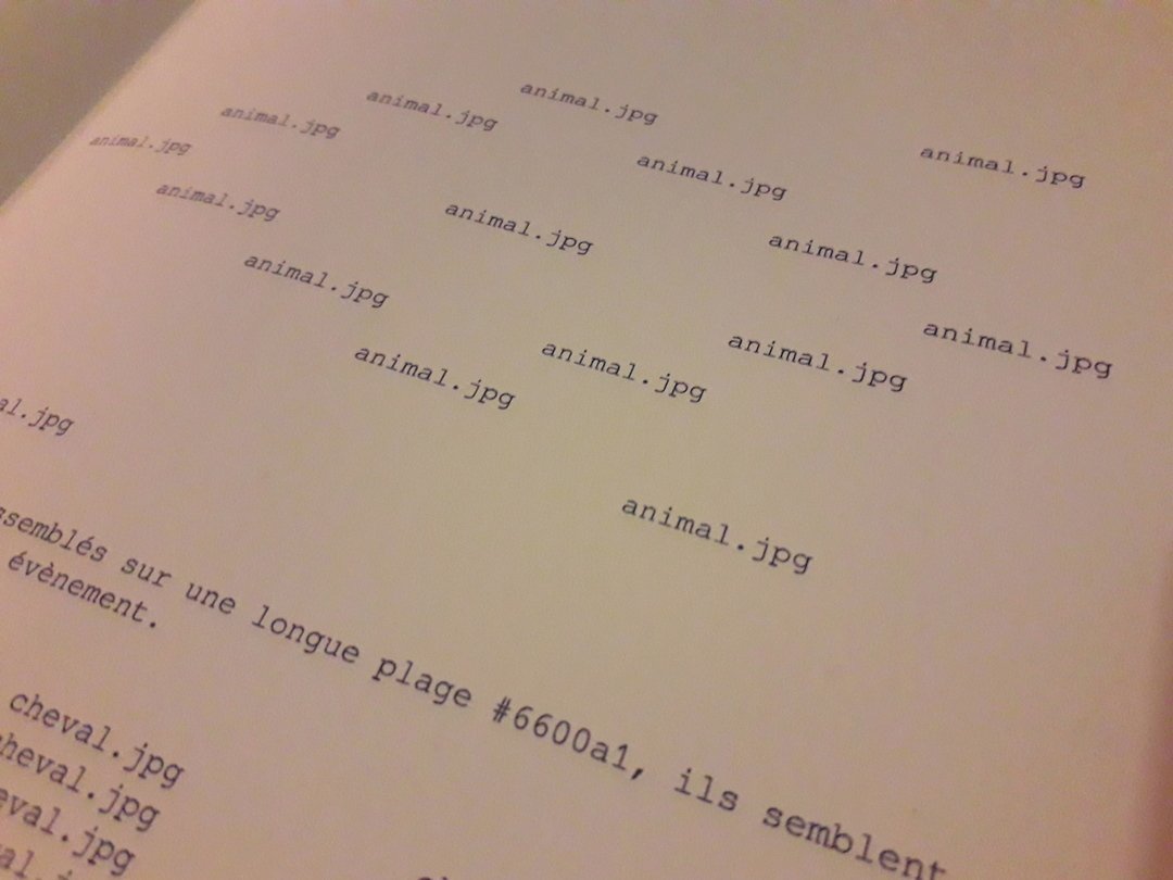
Text and drawings published in the edition accompanying the exhibition Super Image #5, from 30 November 2019 to 02 February 2020.
Absurd computer tale in three dimensions, around the states of the image. The reader is invited to project themselves into a (super) mental image, of which they are the hero.
Infos
- Year:
-
2019
- Location:
-
Strasbourg
- Type:
-
commission
- Customer:
-
Horstaxe for Super Image #5
- Page layout:
-
Hugo Feist (Horstaxe)
- Risography printing:
-
Les Trames Ordinaires
- Format:
-
21x29,7 cm
- Inks:
-
neon Pink and blue
- Paper:
-
Munken Lynx 120 gr
- Printing:
-
Limited to 80 copies
-
- Electronics
- Experiments
- Exhibition
Images
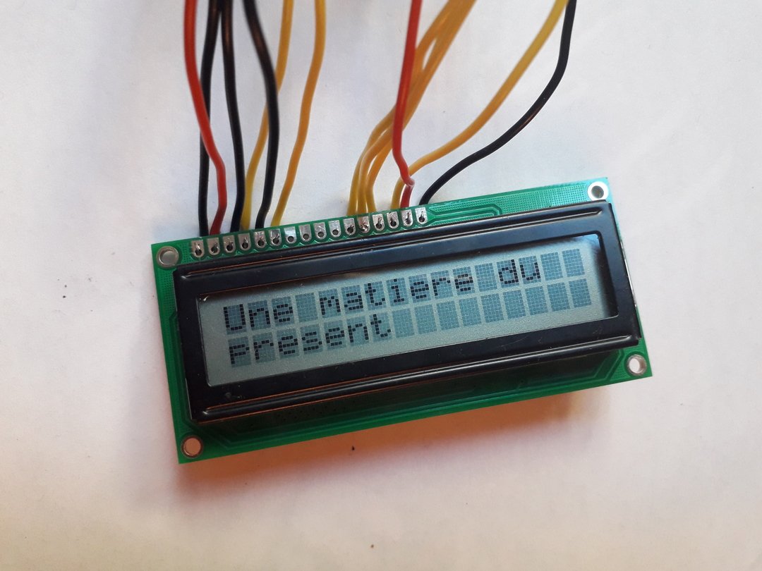
.jpg)
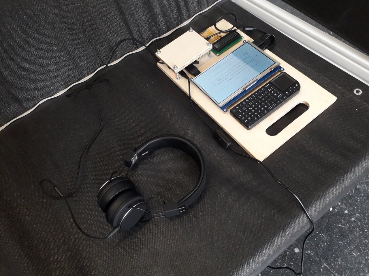
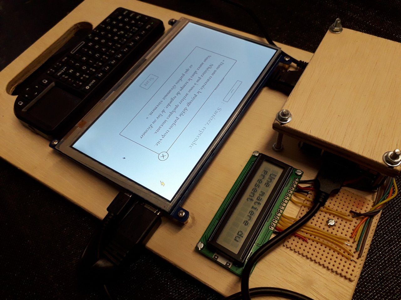
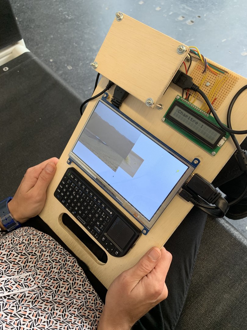
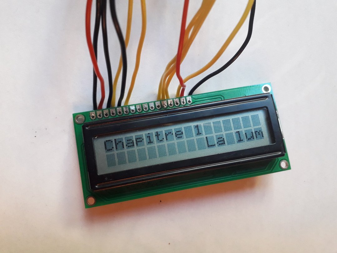
LCD screen (demonstration)
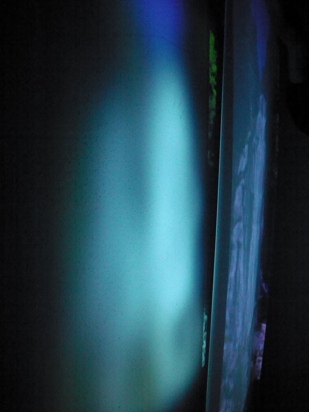
Scrolling text excerpt from Chapter 1 of Une matière du présent on an LCD screen.
The visible text says: “Une matière du présent. Chapter 1. Sunlight takes eight minutes to reach us. Behind each flash, there is a specific time, always more or less distant from us, often a mirage. I was looking for a place where the horizon curved back on itself, a place where all dead bodies and debris end up, like a landslide after rain on the sides of mountains.”Text
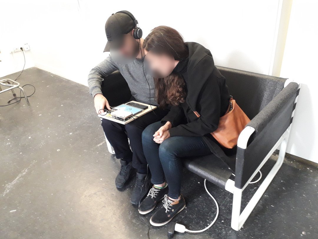
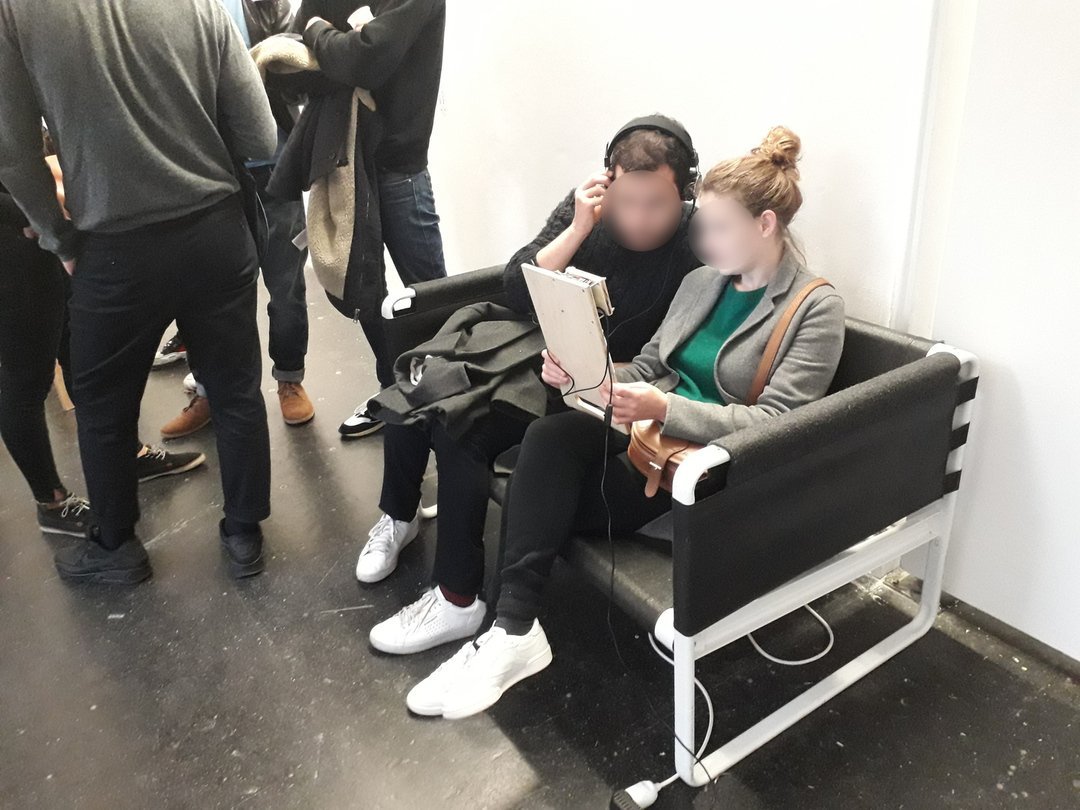
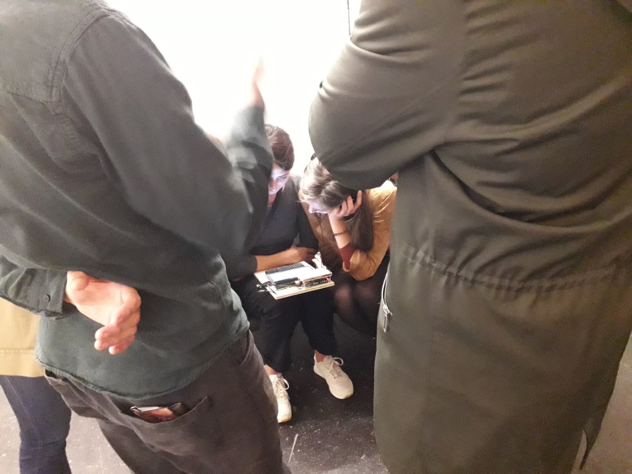
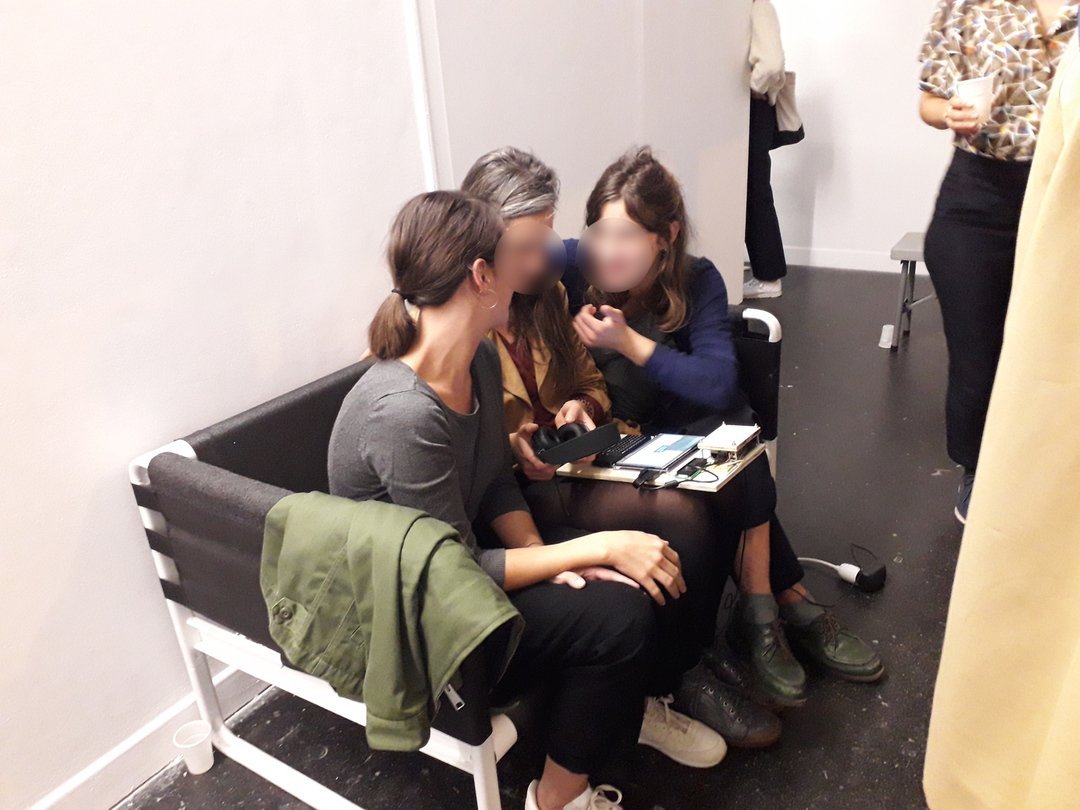
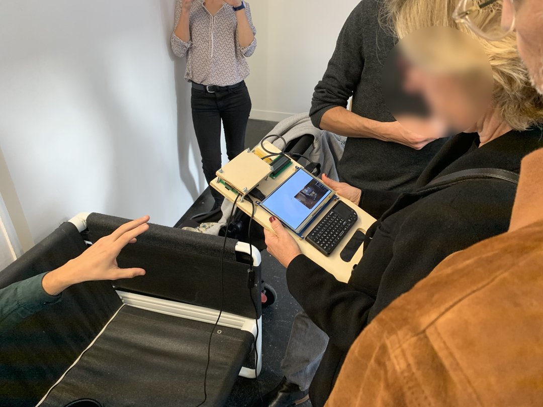
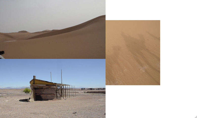
On the occasion of a reactivation of the exhibition Edition 1 of 149 at the Glassbox, initially online in October 2018, the piece Une matière du présent has been redesigned especially for this pop-up event, giving rise to a new collaboration with Pierre Frulloni. The idea being, for the time of a weekend, to ensure an in-depth mediation of the works with the presence of the artists, invited to meet and exchange with the public. From 11 to 13 October 2019 at the Glassbox, Paris, as part of the Grande Forme program.
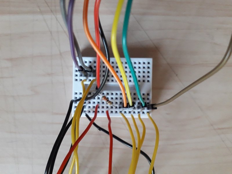
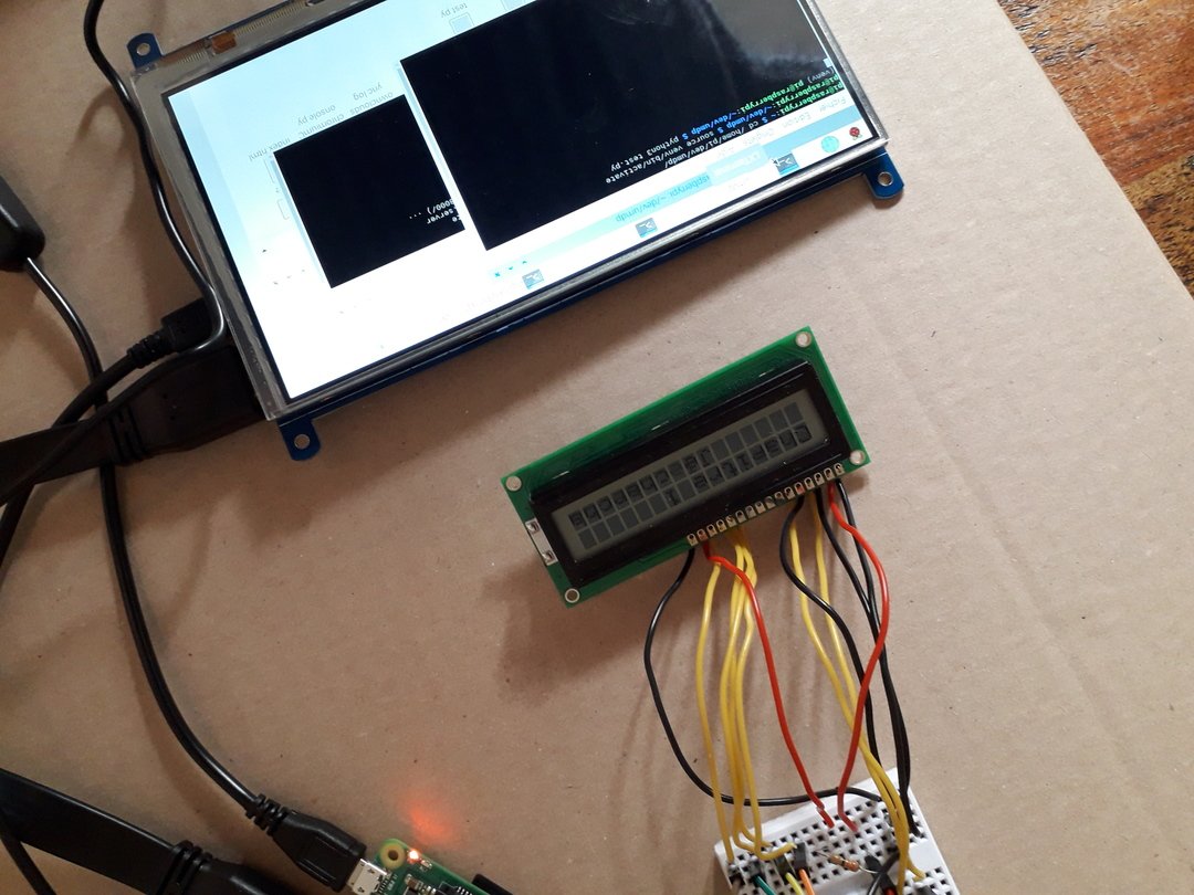
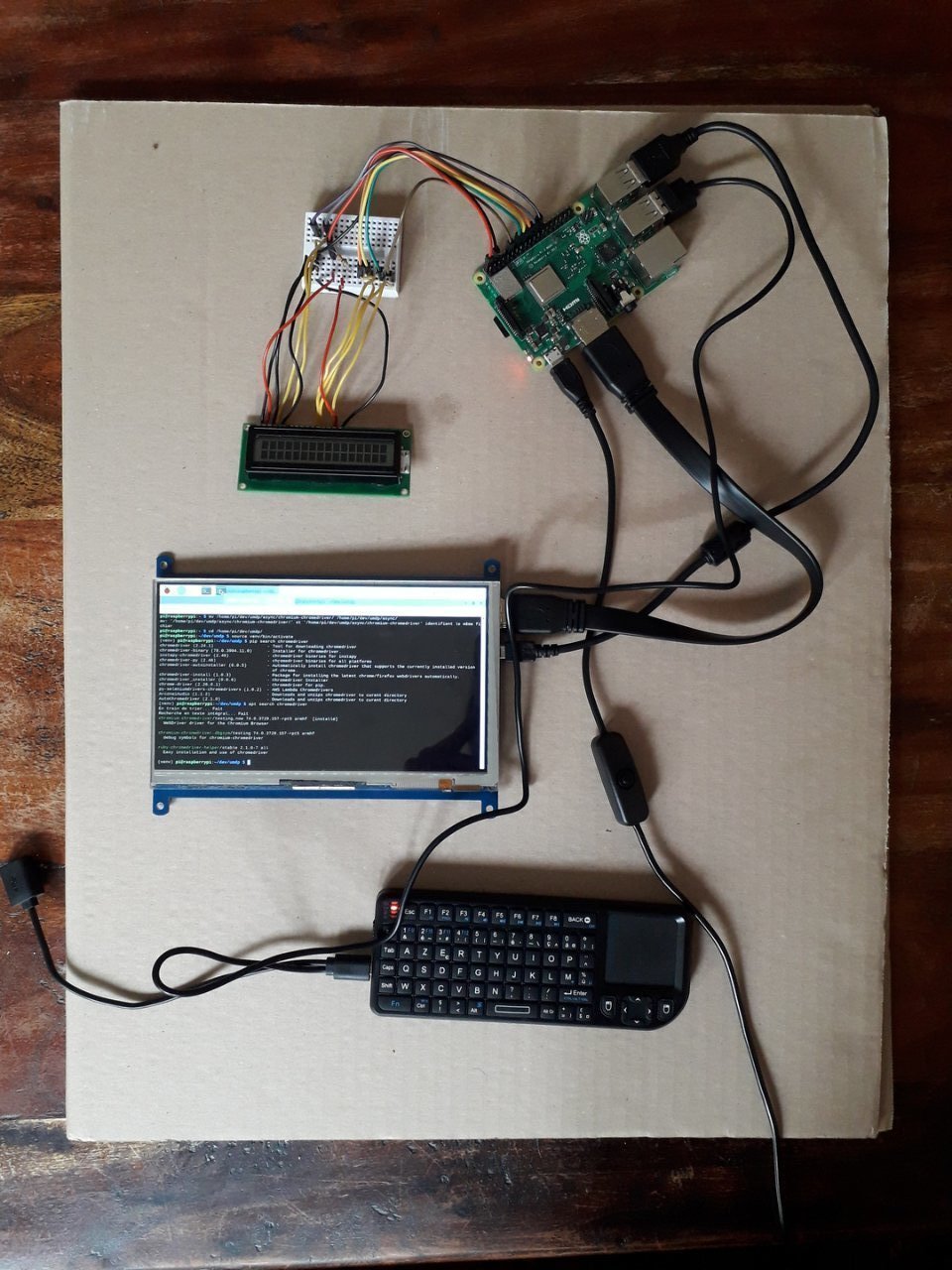
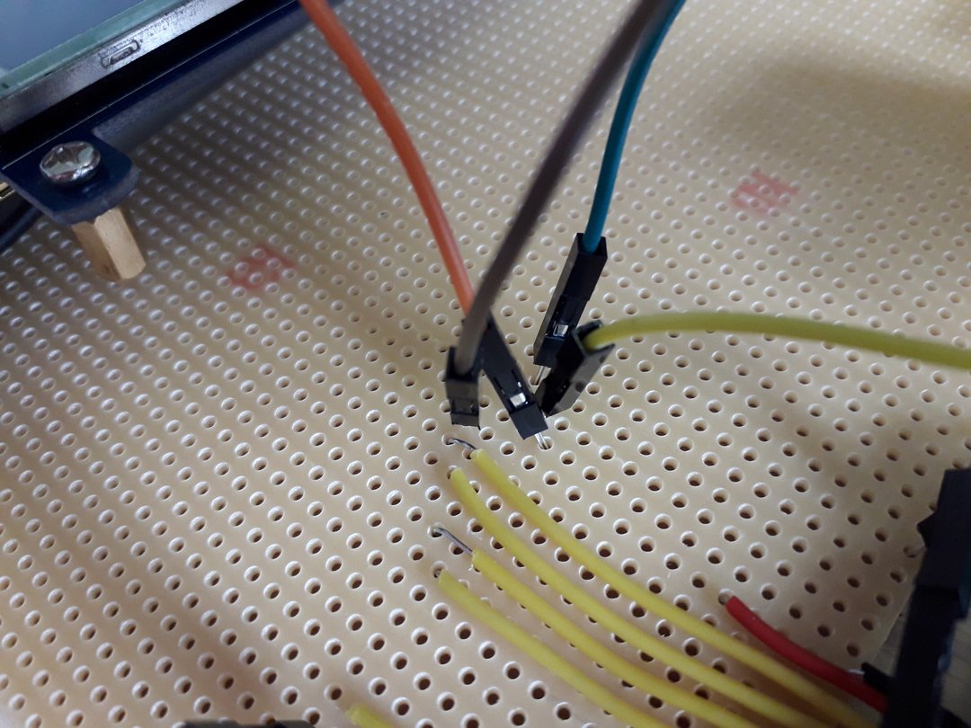
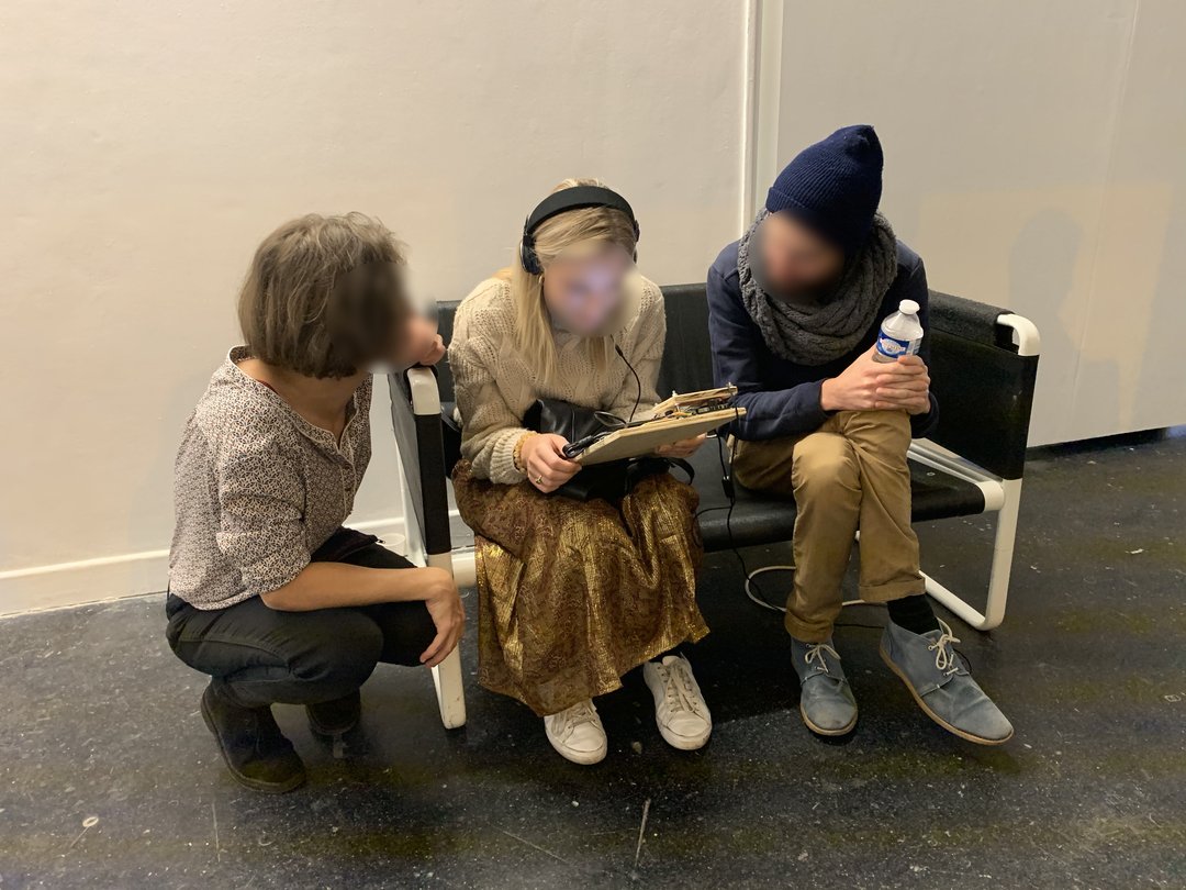
UMDP's V2 thus takes the form of a prehensible object custom-made for the specific needs of the work, a micro-computer built from scratch with minimal equipment, using recuperation, do-it-yourself, with an amateur approach. The aim is not to approach the project from the perspective of object design, but rather from the perspective of economy of means, with an educational dimension; to show the material complexity and the resources needed to run a site like this one. Manipulating the work requires patience, understanding how it works; the user must open a terminal, try out the command line following a protocol accessible on the machine, launch the site locally, etc. The user must be able to open the site with the help of a computer. The technology used - simple, free, nomadic, universal, which works a priori always and everywhere - resonates with the way Pierre Frulloni works on his travels.
The website's interface has been deconstructed and a separation of the media has been made, inviting the viewer to stop more often and for longer than in the initial device in order to be able to consult all the documents. He is thus more solicited, more likely to interact than before. His immersion is summoned by something other than immensity, one could have imagined, for example, an imposing video projection, but it was more a matter of getting the audience “on board”, sitting in space, approaching the “back seat” of a vehicle, disposing it at an intimate moment, two or three at most, delivered to a personal experience.
Infos
- Year:
- 2019
- Location:
- Paris
- Type:
- co-creation with Pierre Frulloni
- Design:
- Pierre Frulloni and Marjorie Ober
- Programming:
-
Marjorie Ober, with the help of Nicolas Chesnais
- Manufacturing of the object:
-
Marjorie Ober, with the help of Bernard Ober
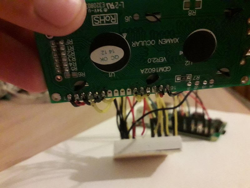
- Material:
- Raspberry Pi 3B+, 7-inch screen, 16x2 LCD screen, mini-keyboard, headset, various cables and connector wires, resistor, breadbord, micro screws, wood, chair.
-
Visual identity
Images
Text
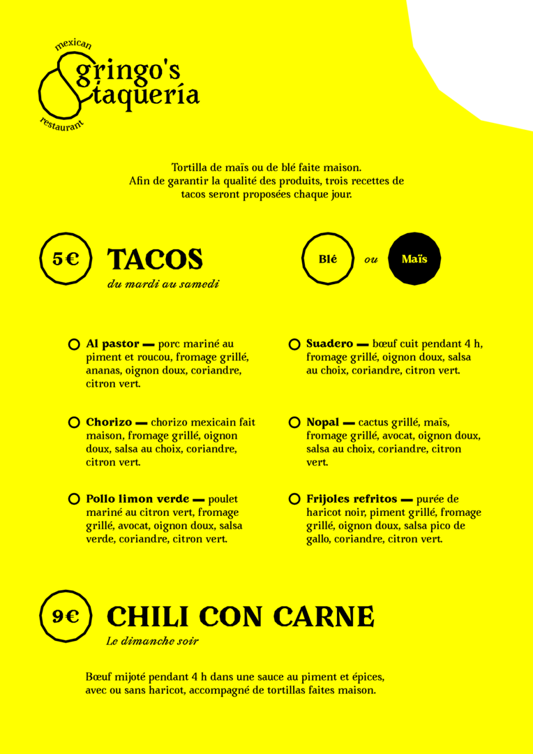
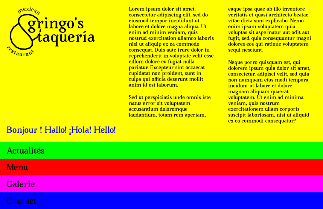
Research for the visual identity of Gringo's Taqueria, a restaurant offering Mexican specialities.
Creation of a logo, a business card, a menu and a website template.
Infos
- Year:
-
2019
- Location:
-
Strasbourg
- Type:
-
commission in collaboration with Nicolas Chesnais
- Customer:
- Gringo's Taqueria
- Font:
-
Avara by Raphaël Bastide (2019)
-
- Graphic design
- Exhibition
Images
Text
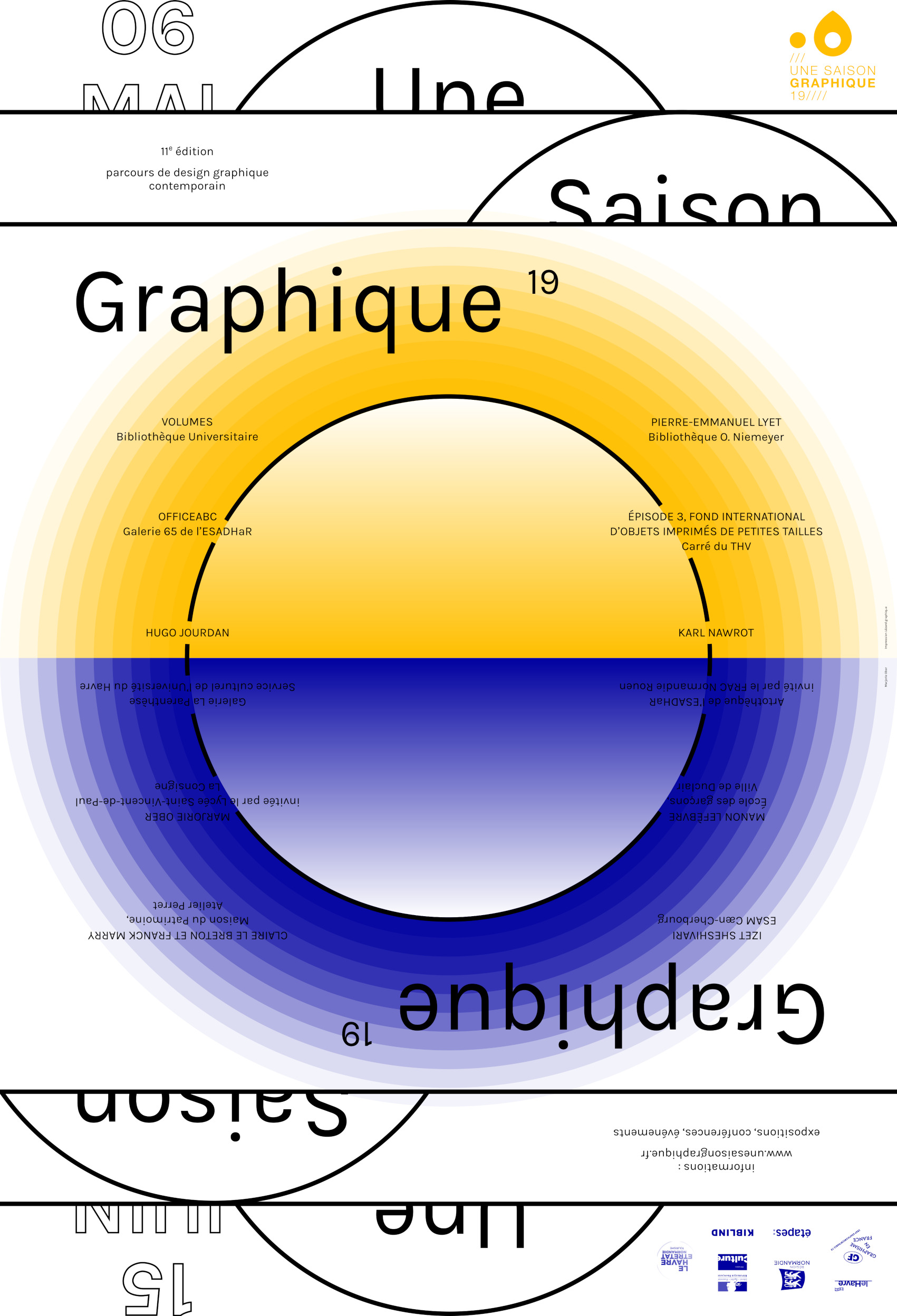
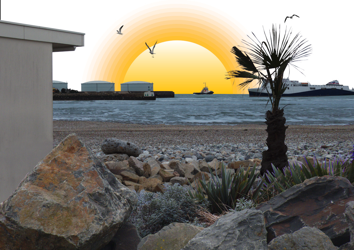
Personal exhibition at the Consigne SNCF from Le Havre as part of the Saison Graphique, from May 10 to June 15, 2019.
Installation, photography, design of printed communication medias, writing, mediation work with students in MANAA 1 at the Saint-Vincent-de-Paul high school.
All the images in this project were produced with free software. The postcards were made by the students in MANAA 1 of the Saint-Vincent group.
Infos
- Year:
-
2019
- Location:
-
Le Havre
- Type:
-
commission
- Customer:
-
Saint-Vincent-de-Paul highschool for Une Saison Graphique 19
- Silkscreen printing (Decaux formats):
-
Lézard graphique
- Risography (postcards):
-
Nicolas Pelletier
- Vitrophanies, tarpaulin and stickers:
-
PrintOclock
- Montage :
-
Nicolas Chesnais, Hélène Pitassi and Jérôme Grandguillot, with the help of friends from Le Havre and students from Saint-Vincent high school.
-
- Visual identity
- Animation
Plus Plus Egal project
Images

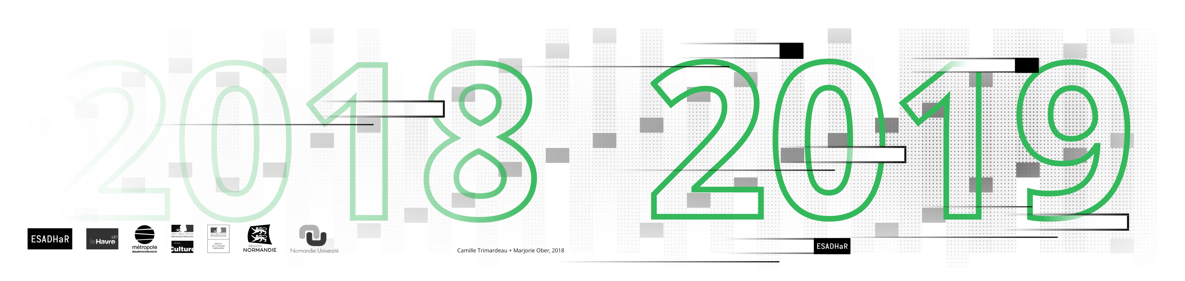
Animation for 2018-2019 greetings
Animated greeting card with a background soundtrack of chimes and soft vocals.
Here's a description of the animation: A grid of alternating grey and white vertical bars is punctuated with small black squares. The text “2018” is displayed in green. Horizontal bars cross the scene at high speed while the words “2018” disappear. Their passage causes the elements to disintegrate, with the squares falling and the vertical bars shooting up and down, revealing first the year 2019 in green, followed by “The entire ESADHaR team wishes you a happy new year” in black. Finally, the ESADHaR logo and those of its partners, also in black, enter the frame. These are the logos of the city of Le Havre, the Métropole de Rouen Normandie, the Ministry of Culture, the Prefect of the Normandy region, the Normandy region and Normandy University. The credits appear last and include the following information: “Camille Trimardeau - Marjorie Ober, 2018. Font: Sporting Grotesque. Music: Komiku, Mr Paillettes theme. 2018.”Text
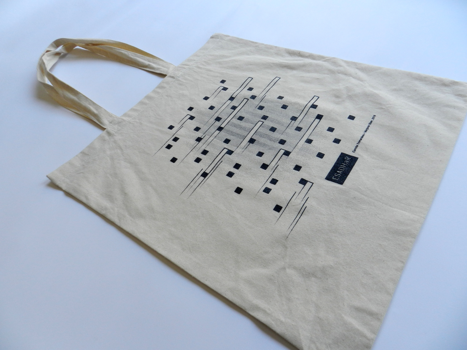
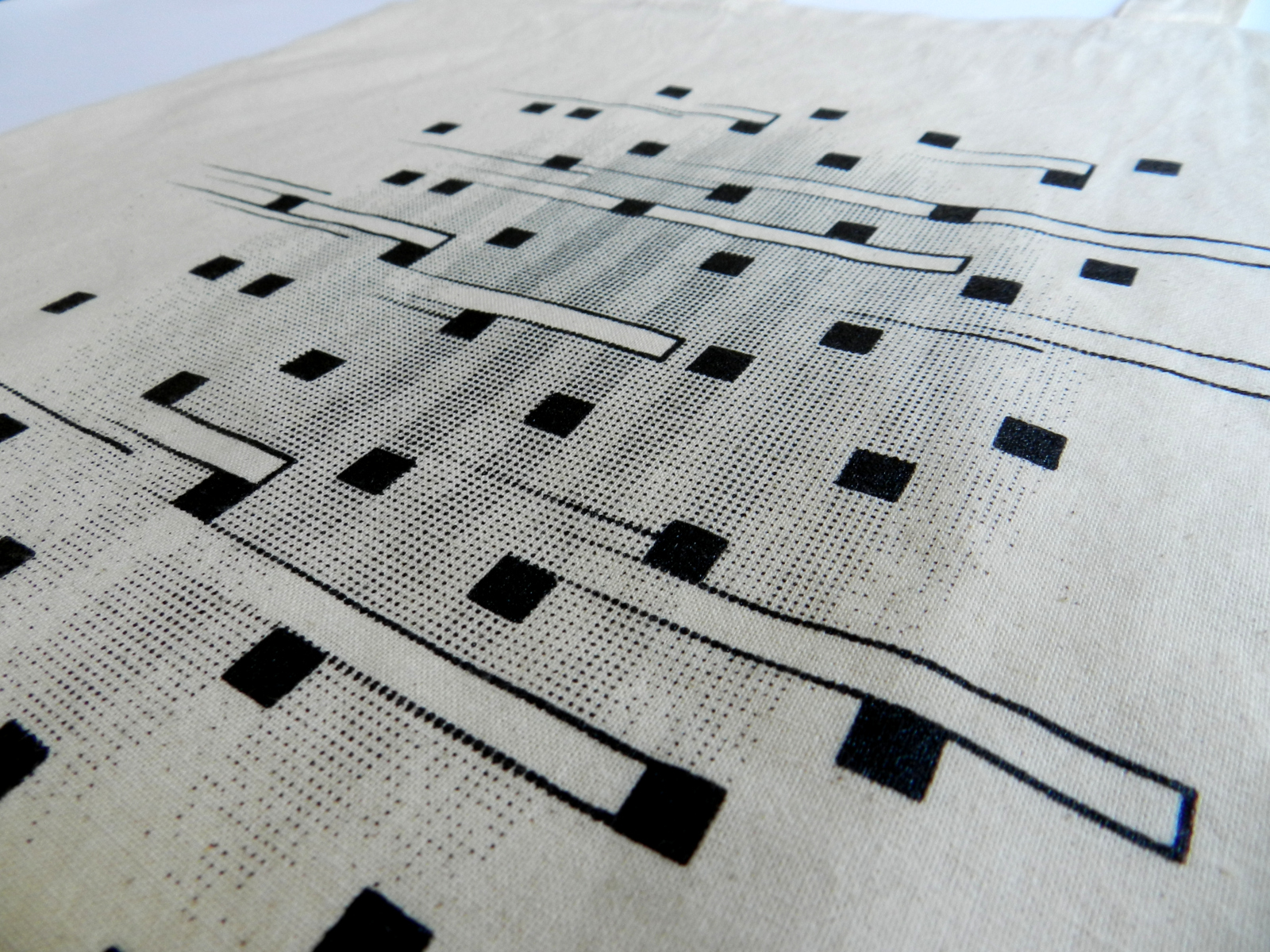
Graphic design of the internal communication of the École Supérieure d'Art et Design in Le Havre: templates for posters, invitation cards, kakemonos. Creation of a visual declined on tote bag, stylus, paper and animated greetings card.
By taking up the graphic charter of the establishment, the overall identity suggests the passage of time; by the scroll bars of the “scroll” in the templates, by the calendar that withers and the movement in the goodies and the greetings card.
Infos
- Year:
-
2018
- Location:
-
Le Havre
- Type:
-
commission in collaboration with Camille Trimardeau
- Customer:
-
École Supérieure d'Art et Design Le Havre-Rouen
- Fonts:
-
Open Sans by Ascender Fonts (2011), Interval by Alex Chavot (2012) and Sporting grotesque by Lucas Le Bihan (2016).
- Music:
-
Komiku, Mr Paillettes Theme, 2018.
-
- Graphic design
- Website
Images
Text
Graphic design and development of the website Une matière du présent. The project attempts to bring into play Pierre Frulloni's thesis in art, Des outils de résistance face à la ruine dans l’errance, through a navigation system designed by Marjorie Ober. It was commissioned by Le 149, a structure that distributes and promotes digital works online, created by artists and programmers invited to work together, founded by Anna Hess and Sacha Beraud.
Une matière du présent is a web page that presents itself as a travelling shot in which the user is invited to move around by means of a scroll. Audio, video and text documents are used to make the tour more enjoyable, like annexes slipped under the visitor's fingers. Thought as an open book, without binding, cut into chapters, the device allows a non-linear reading of the documents. In the form of loose-leaf pages, this disjointed exploration offers a narrative experience specific to each page update: after each refresh of the website, new images emerge. The visitor goes through the same path but does not see the same things, the story never begins or ends in the same way.
Infos
- Year:
-
2018
- Location:
-
Paris
- Type:
-
commission in collaboration with Pierre Frulloni
- Customer:
-
Le 149*, as part of Édition 1, with the support of DICRéAM
- Design:
- Pierre Frulloni and Marjorie Ober
- Graphic design, programming:
- Marjorie Ober, with the help of Nicolas Chesnais
- Images, videos and audios:
- Charlotte Pargue (Norway), Antoine Barrot (Morocco) and Pierre Frulloni (Norway, Greece, Morocco).
- Texts:
-
Pierre Frulloni, with extracts from the bilingual French-Tifinagh book Contre-champs de l'Atlas designed with Antoine Barrot, published in 2016 by the École Supérieure d'Art de Clermont Métropole.
- Fonts:
-
Cormorant by Catharsis fonts (2015), Garcia by Anton Moglia (2015) and Tifinagh Revue by IRCAM (2008).
-
- Graphic design
- Websites
Images
Text
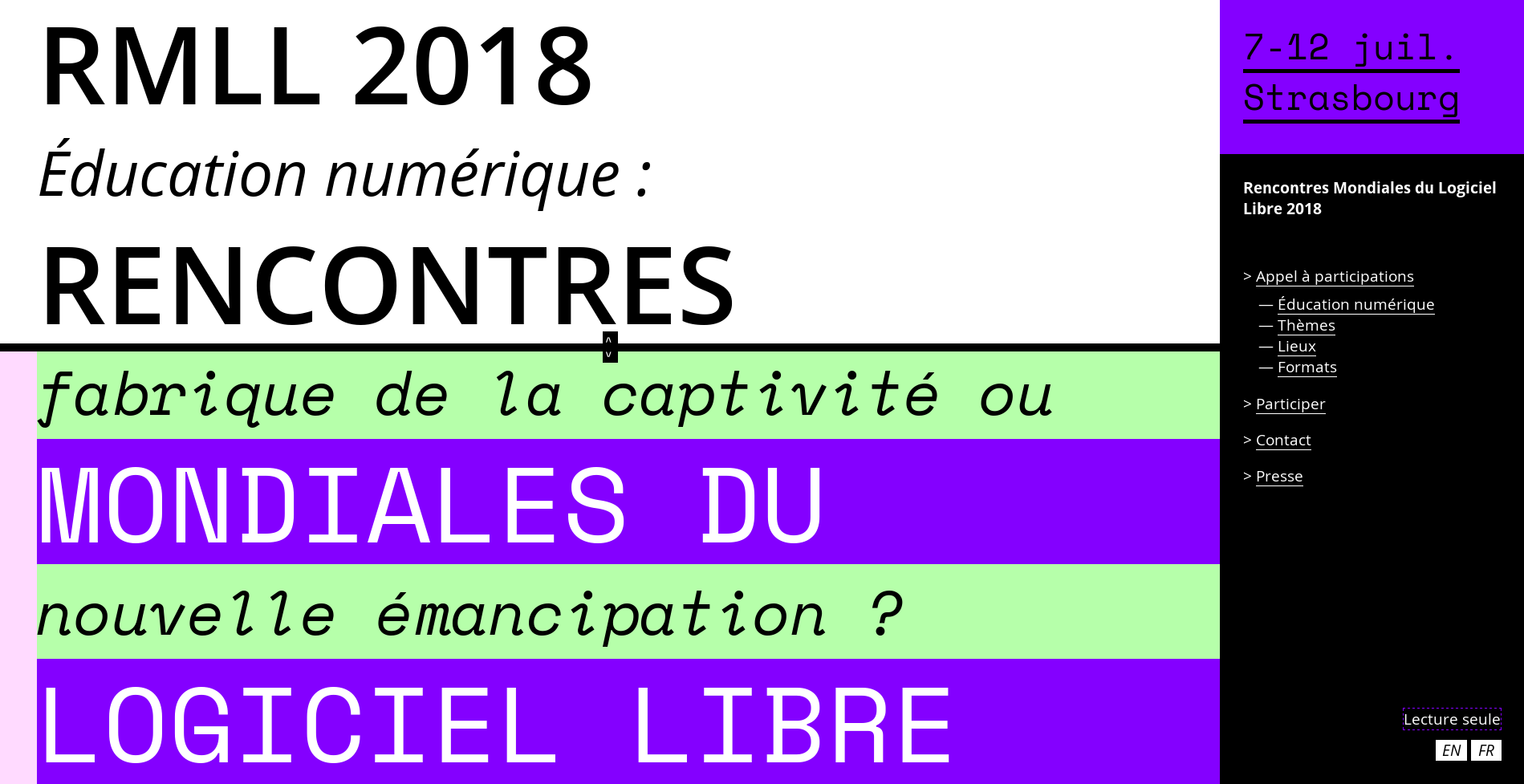
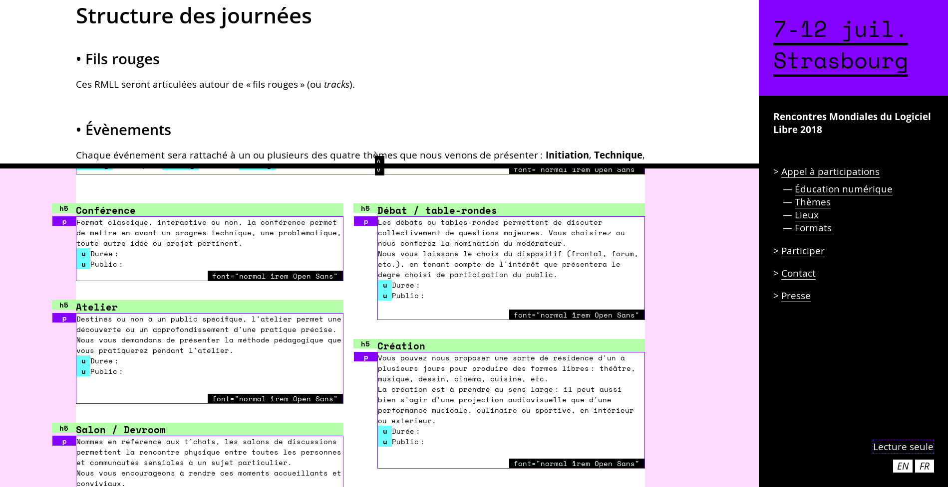
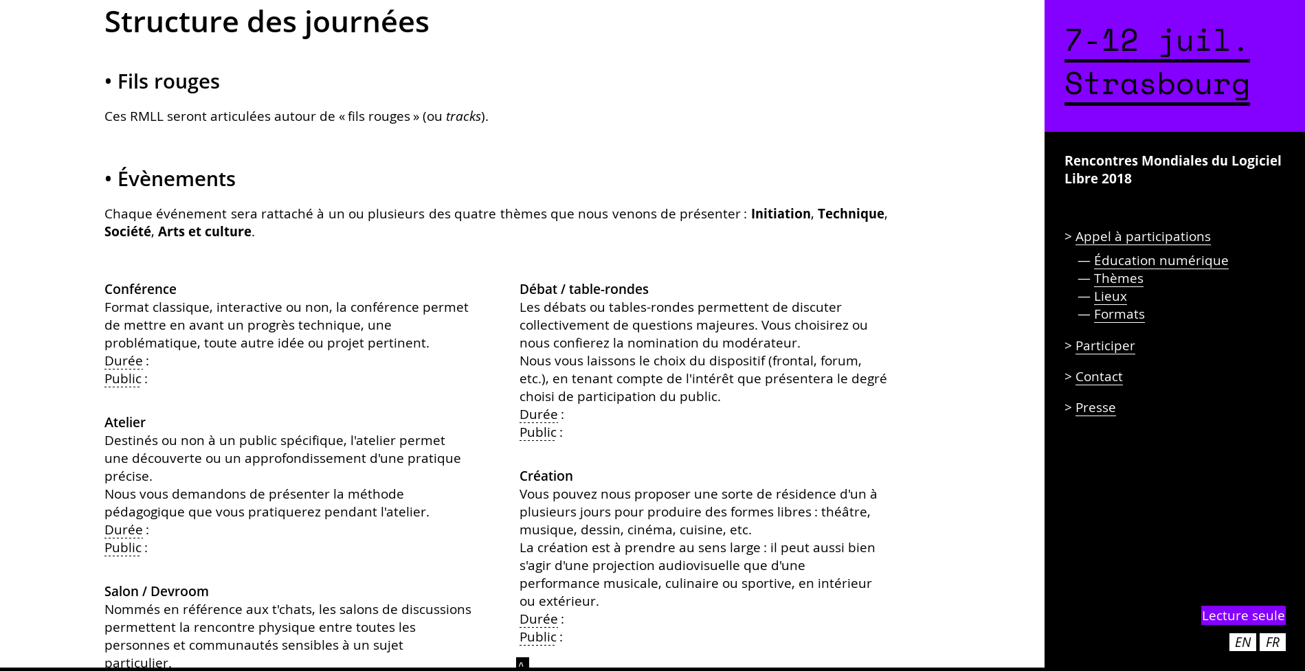
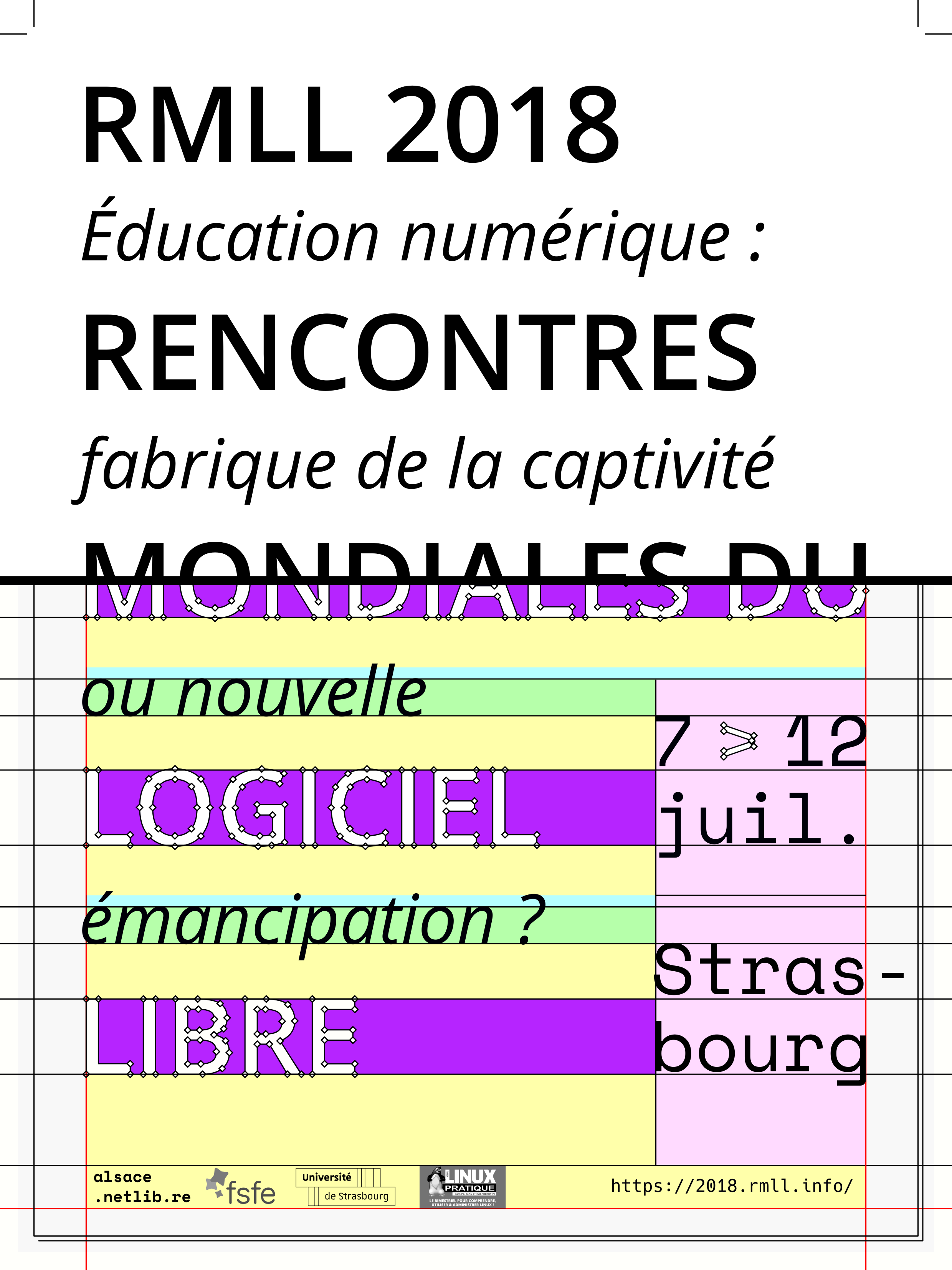
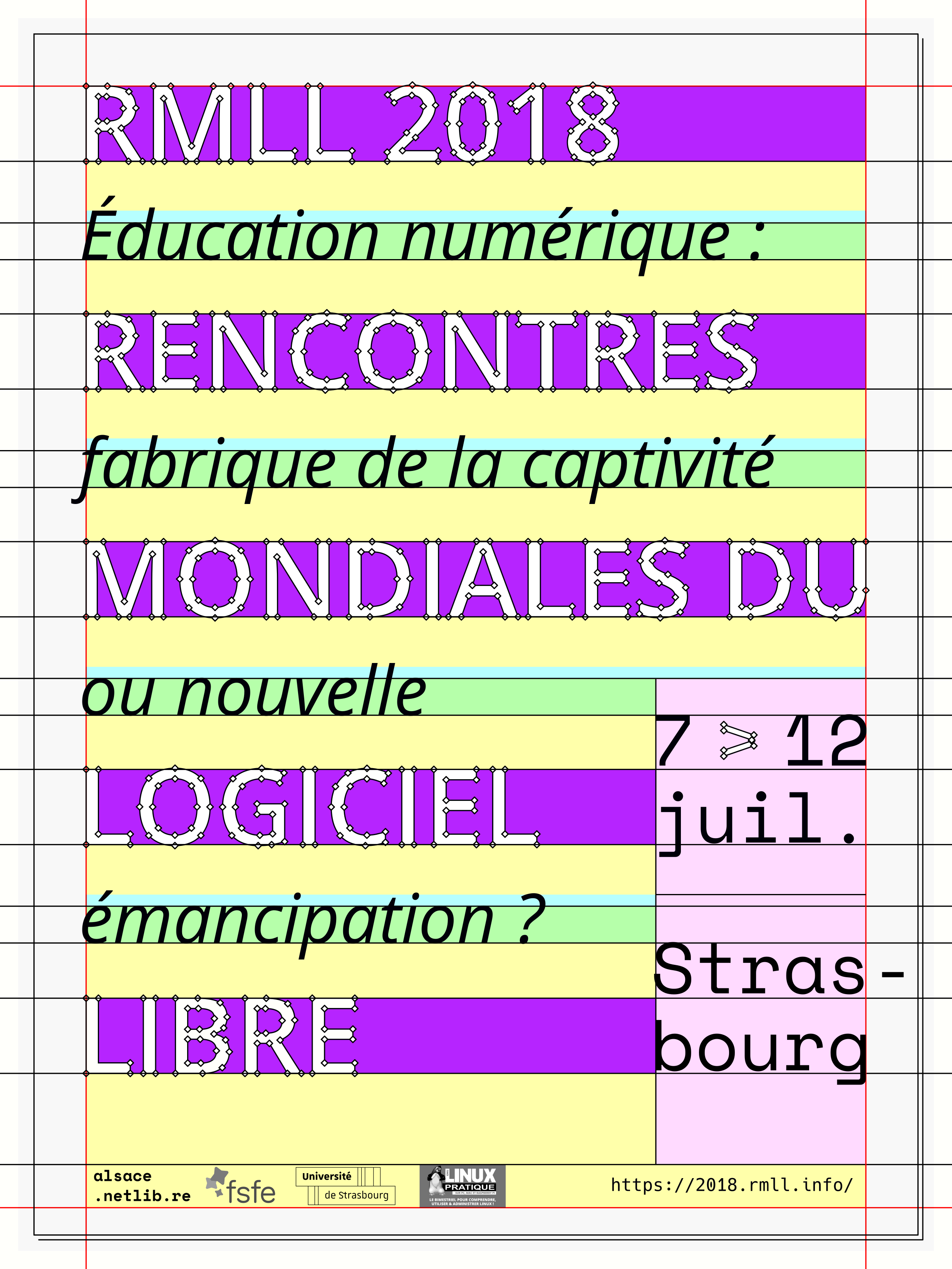
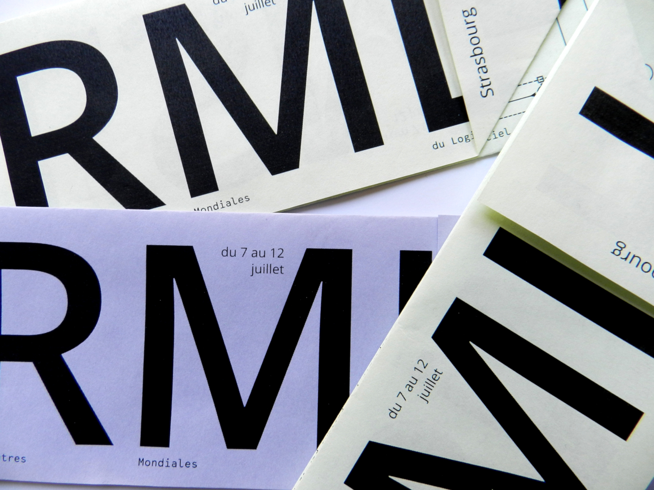
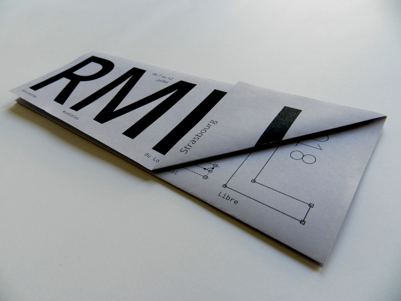
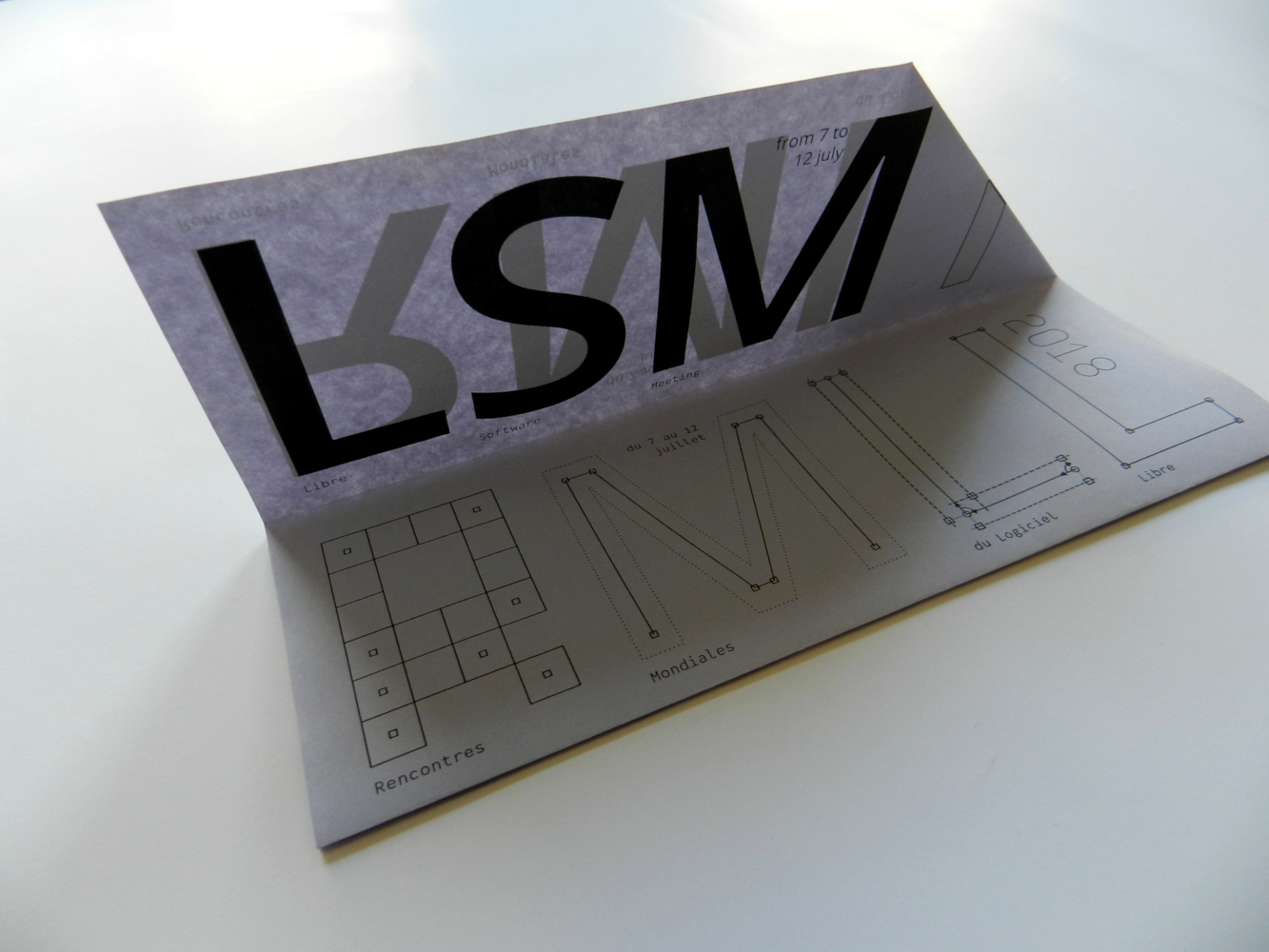
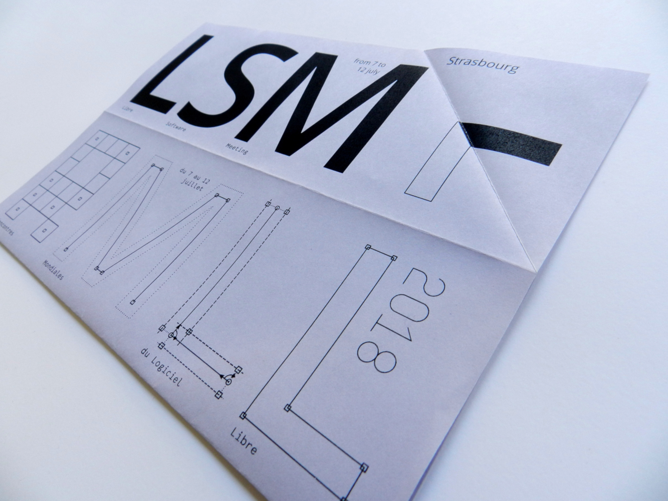
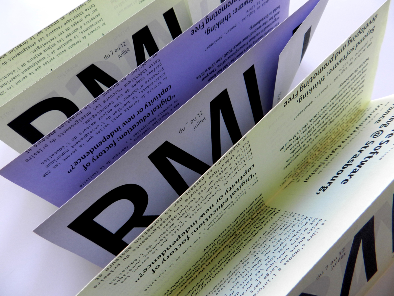
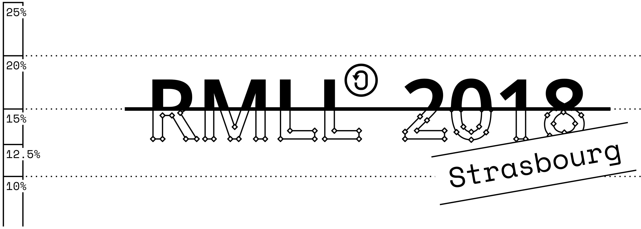
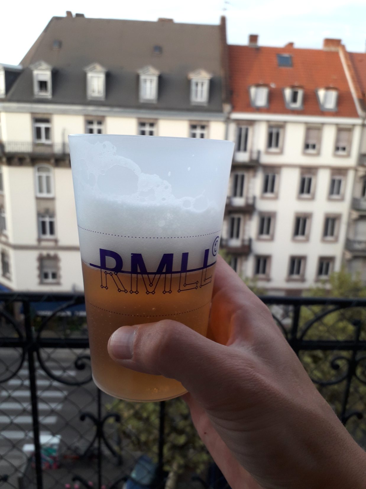
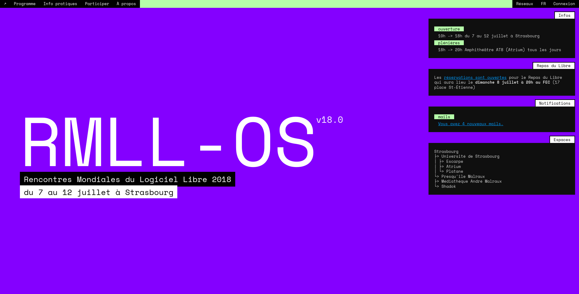
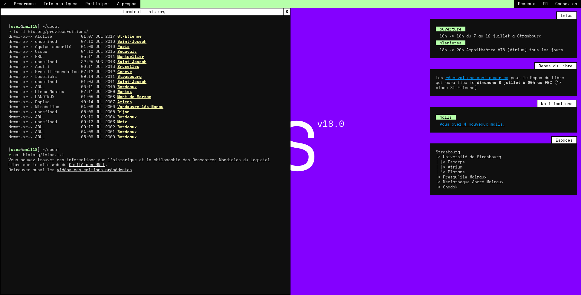
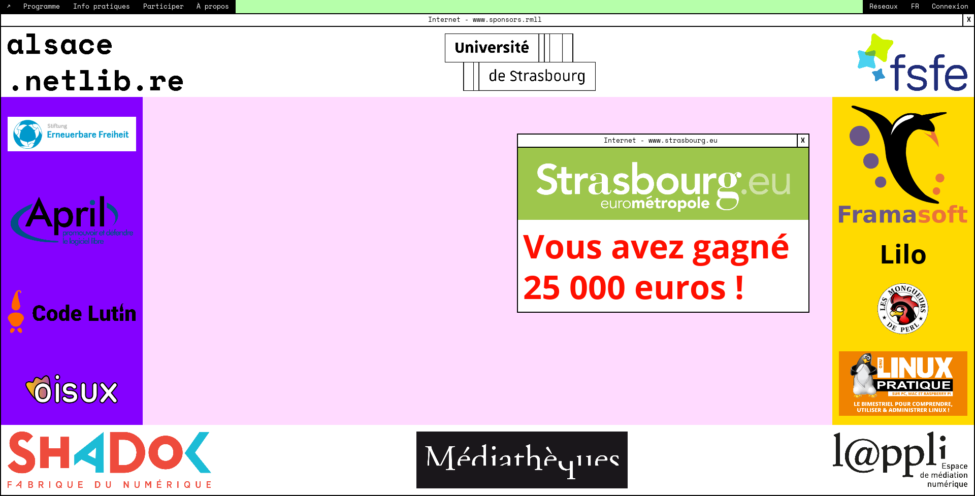
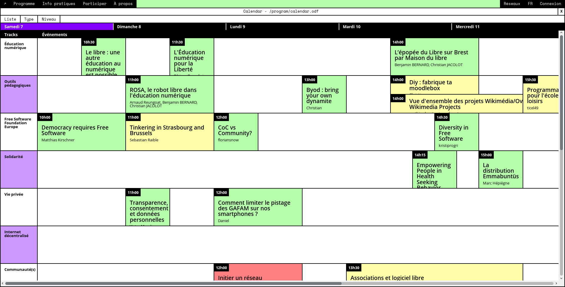
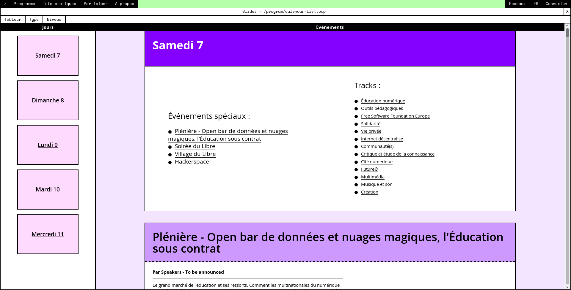
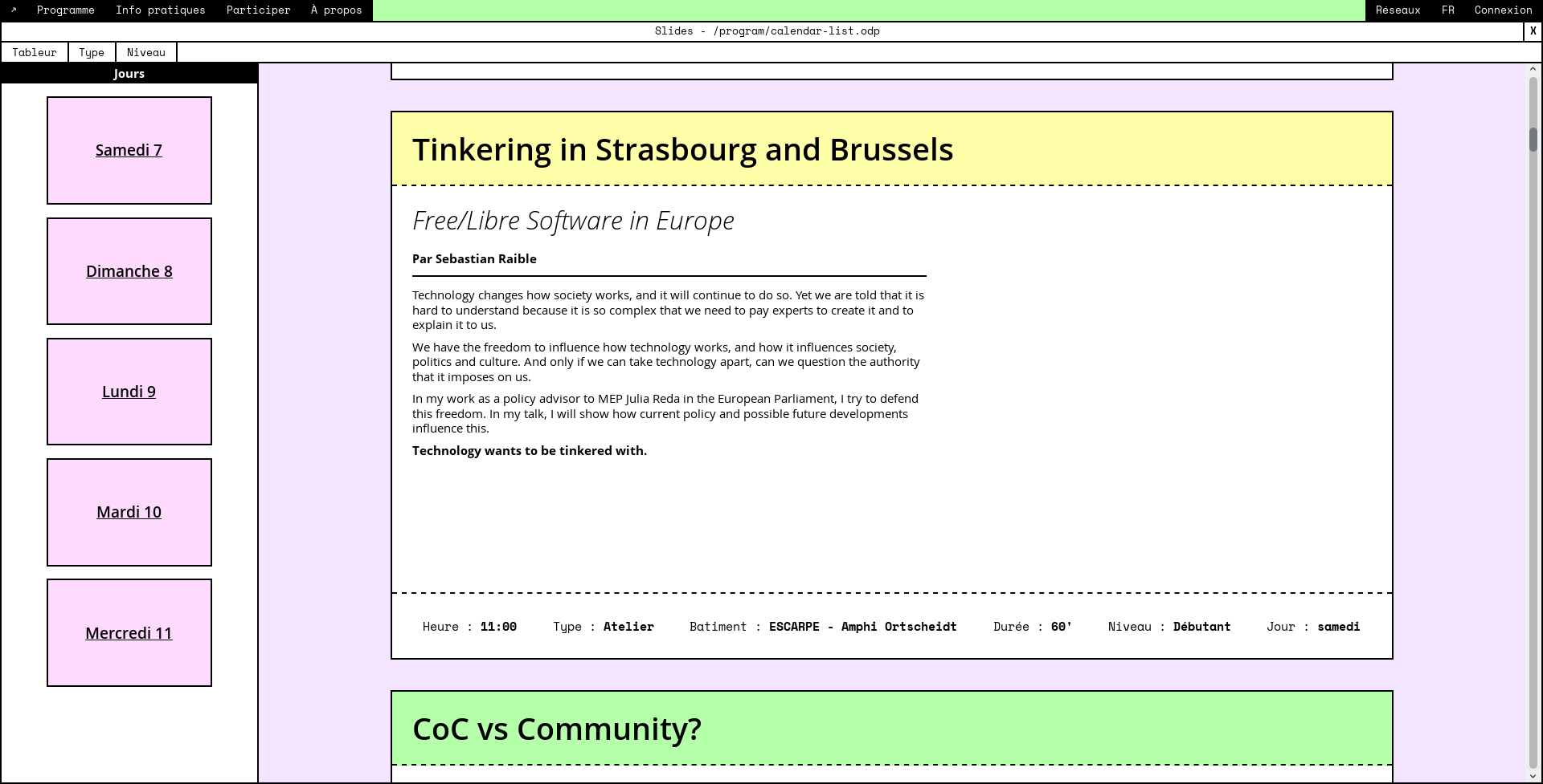
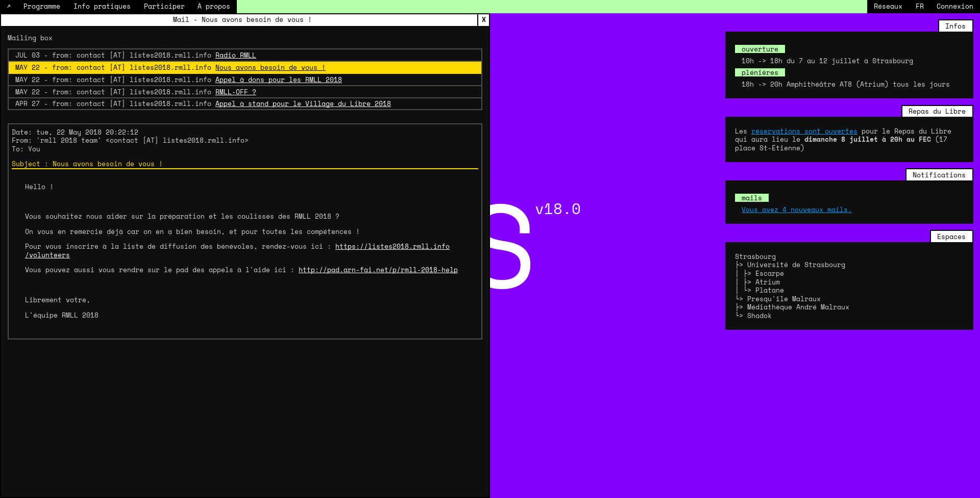
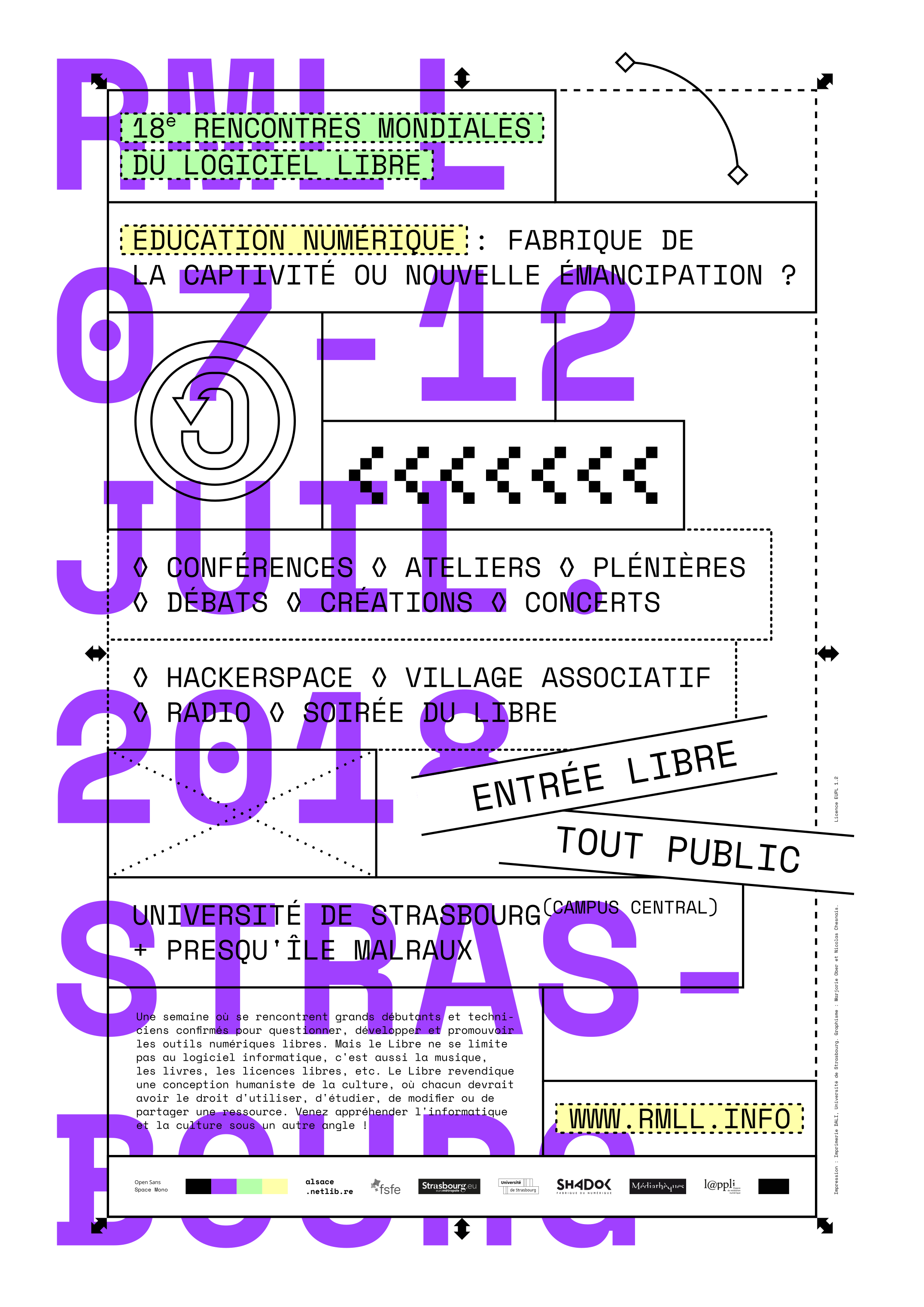
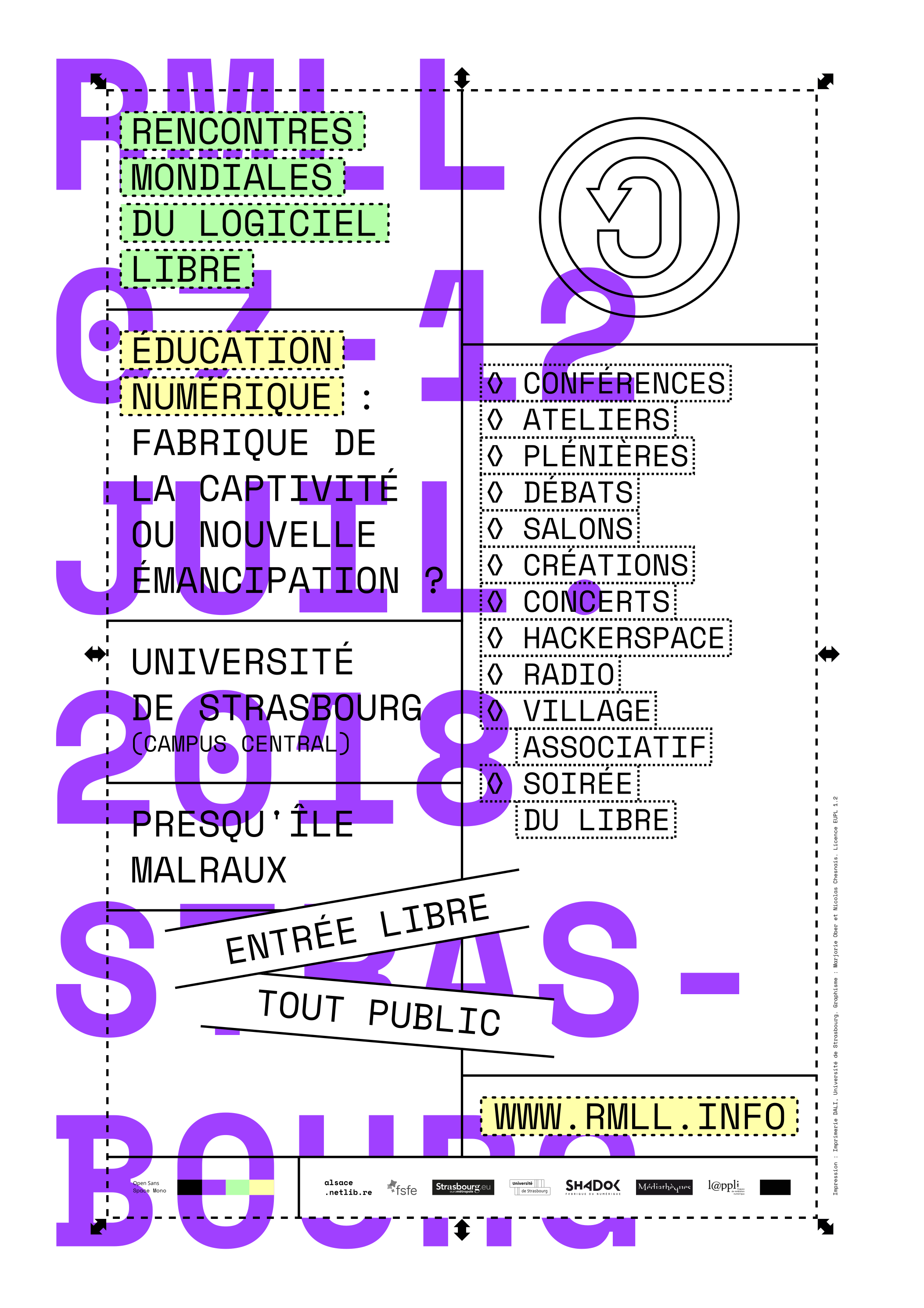
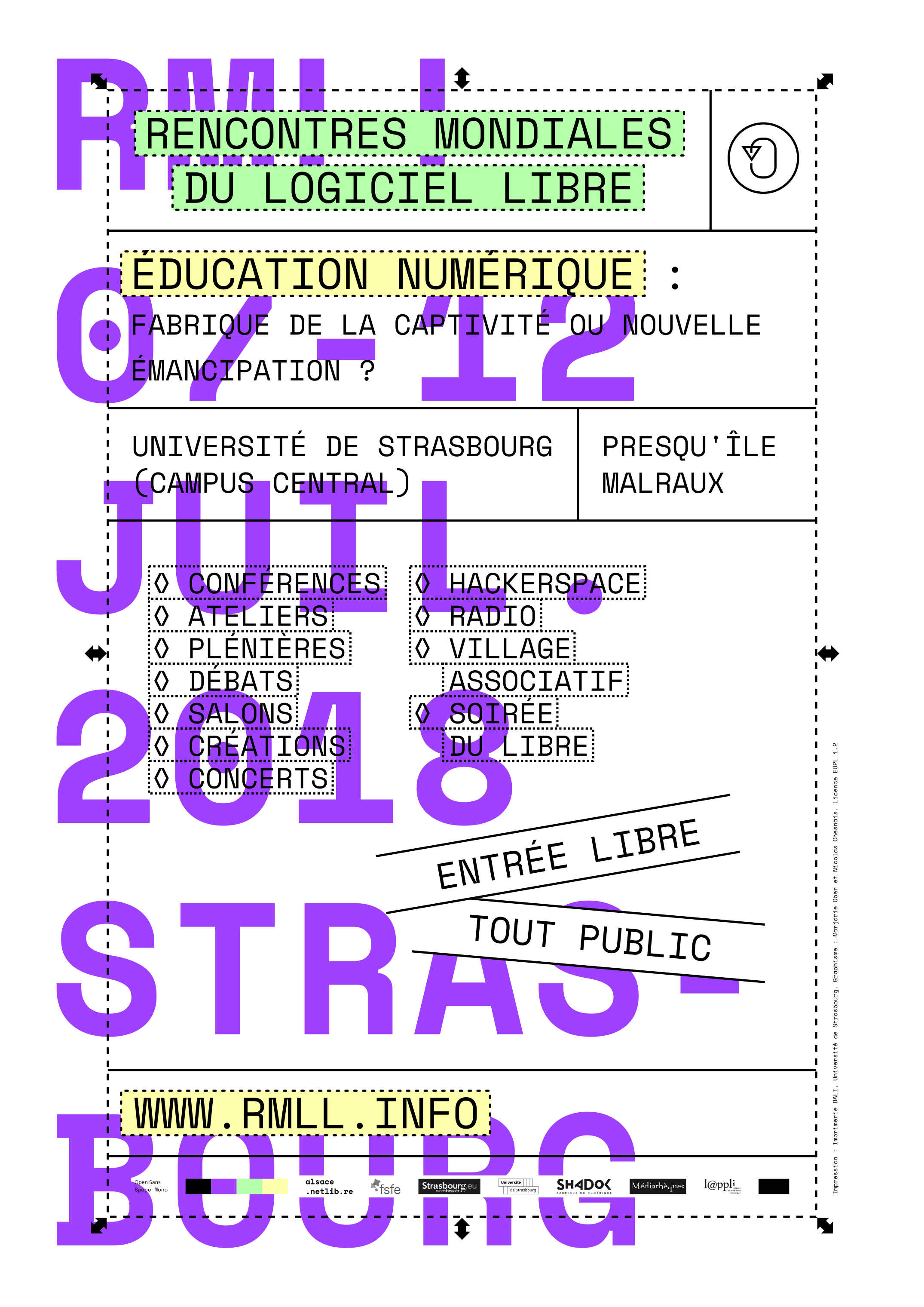
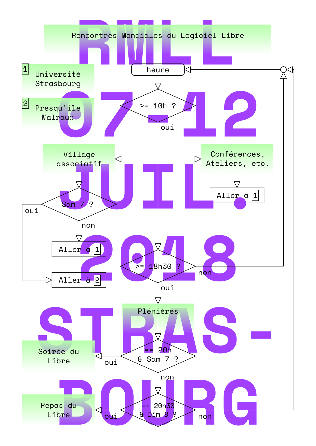
Realization of the communication of the LSM* 18: websites, posters, flyer, leaflet, programme, banners for social networks, tarpaulins, cup, t-shirt, badge, sticker, signage.
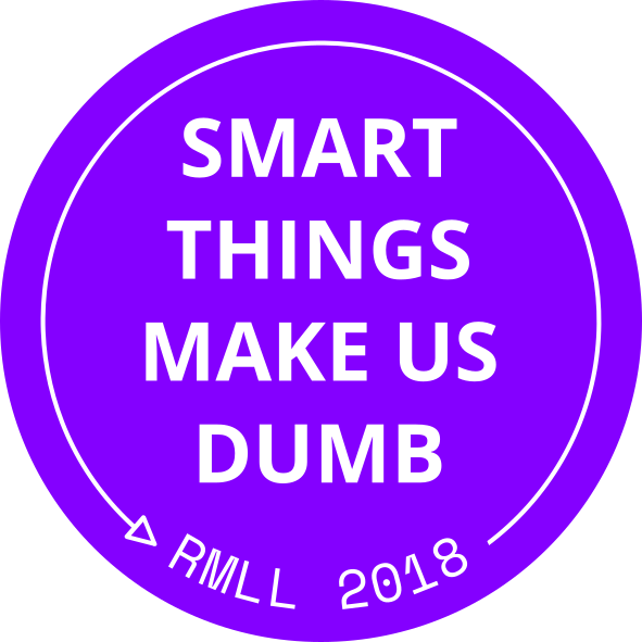
The visual identity explores the idea of making visible what is usually hidden. It follows an experimental and pedagogical logic. The information is translated by different layers of computer abstraction, from low-level language to the graphic interface. Depending on the media, the public perceives sometimes the text in “plain text” and sometimes the “source” (code, programming or software layer).
The identity was presented remotely at Libre Graphics Meeting 20 from Strasbourg on May 28, 2020.
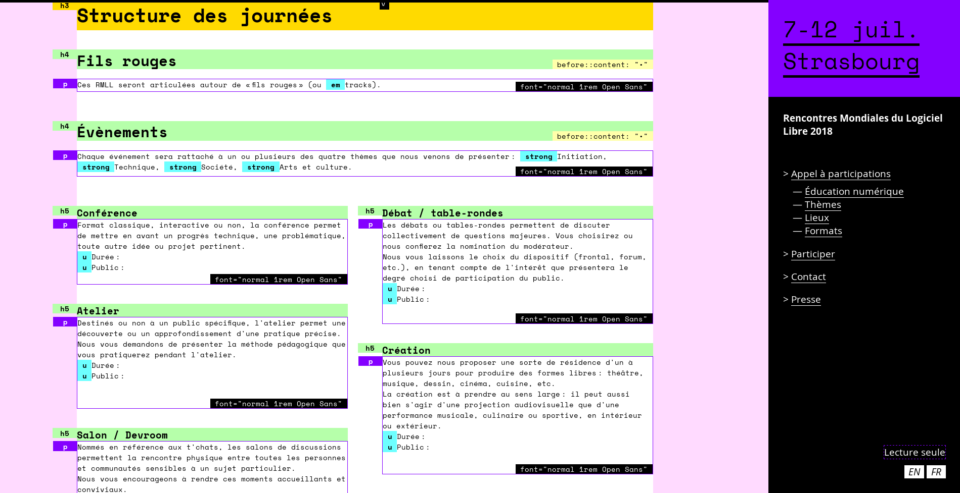
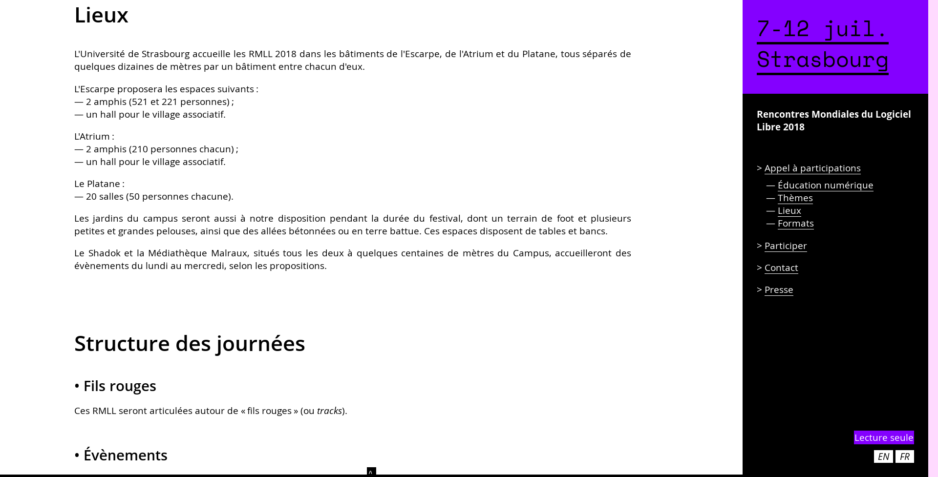
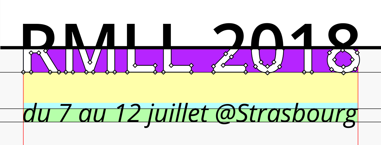
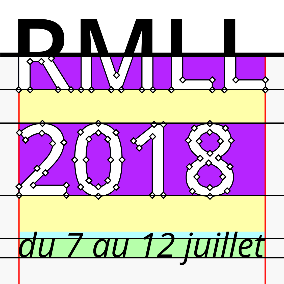
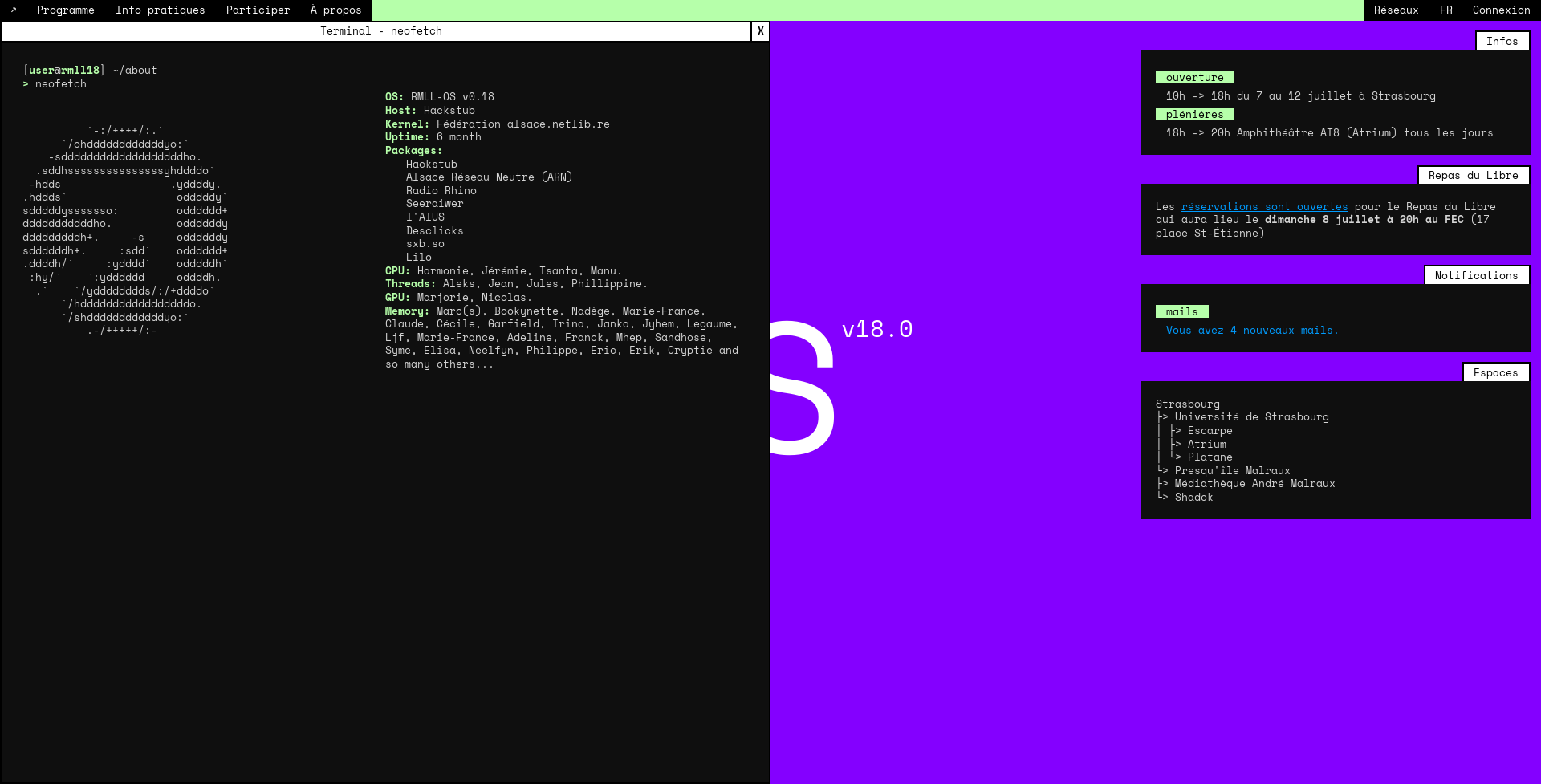
*A week where beginners and experienced technicians meet to question, develop and promote open source digital tools in order to approach computer science and culture from another angle. Free software, music, books and licences, whether it be software, music, books or licences, claims a humanistic conception of culture where everyone would be able to use, study, modify or share a resource. Libre Software Meeting, “Digital Education: fabric of captivity or new emancipation?”, University of Strasbourg (Central Campus), from 07 to 12 July 2018. Event organised by the alsace.netlib.re Federation, supported by the Hackstub association. With the support of the City and University of Strasbourg, the FSFE, the Shadok, the André Malraux library and the @ppli.
Infos
- Year:
-
2018
- Location:
-
Strasbourg
- Type:
-
commission in collaboration with Nicolas Chesnais
- Customer:
-
Hackstub
- Fonts:
-
Open Sans by Ascender Fonts (2011) and Space Mono by Colophon Foundry (2016).
- License:
- EUPL 1.2.
Links
- ● Libre Software Meeting 2018: Call for participation – New window
- ● Libre Software Meeting 2018: Video of the call for participation on Nextcloud – New window
- ● Website of Libre Software Meeting 2018 – New window
- ● Libre Software Meeting 2018: Video of the main platform on Nextcloud – New window
- ● Libre Software Meeting 2018: Sources on Github – New window
- ● Libre Software Meeting 2018: Online presentation of the visual identity at the Libre Graphics Meeting in Rennes on 28 May 2020 on Nextcloud – New window
- ● Libre Software Meeting 2018: Presentation text (FR/EN) for LGM 2020 on a sans-nuage pad – New window
-
- Visual identity
- Book design
Plus Plus Egal project
Images
Text
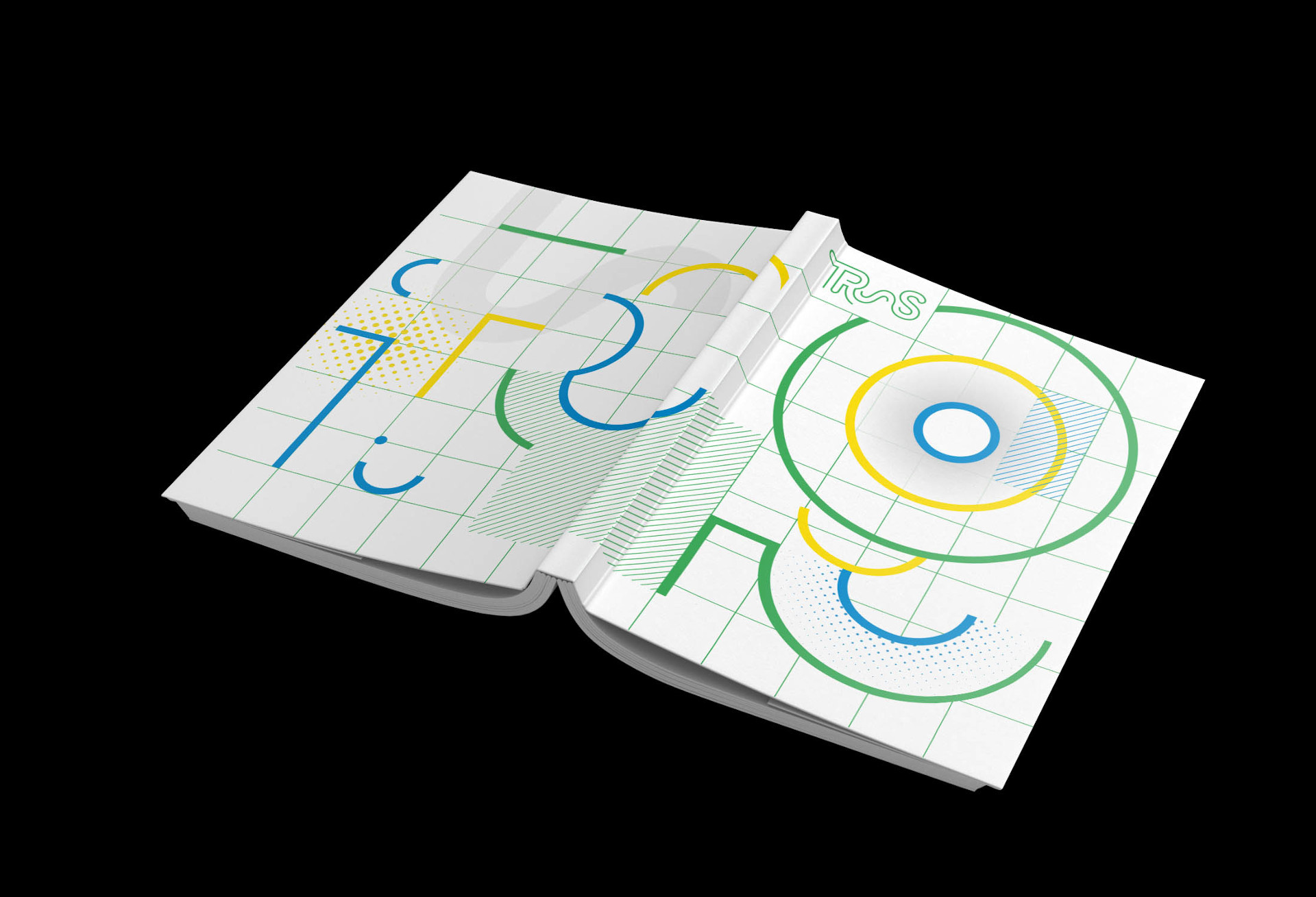
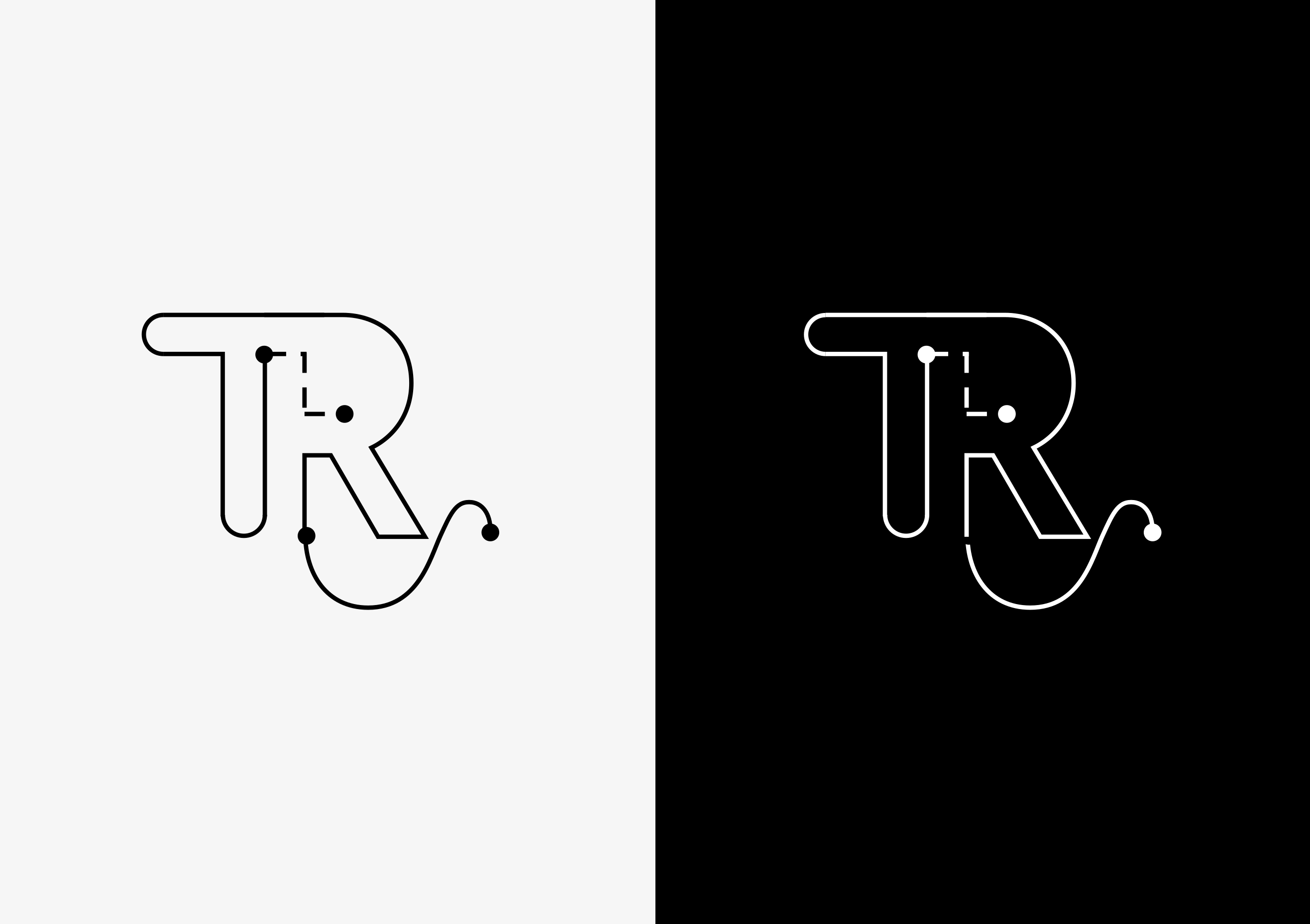
Design of a graphic charter and a booklet for the audiovisual signage project TR~S, for trams and high service level buses. Project led by sound designer Coralie Diatkine.
The identity of the open outline refers in its variations (continuous, discontinuous line, etc.) to the multimodality of transport and territories: from plane to boat, from boat to train, etc.
Infos
- Year:
-
2017
- Location:
-
Strasbourg
- Type:
-
commission in collaboration with Camille Trimardeau
- Customer:
-
Coralie Diatkine
- Fonts:
-
Moderat by Fabian Fohrer et Fabian Huber (2015).
-
- Graphic design
- Installation
Images
Text
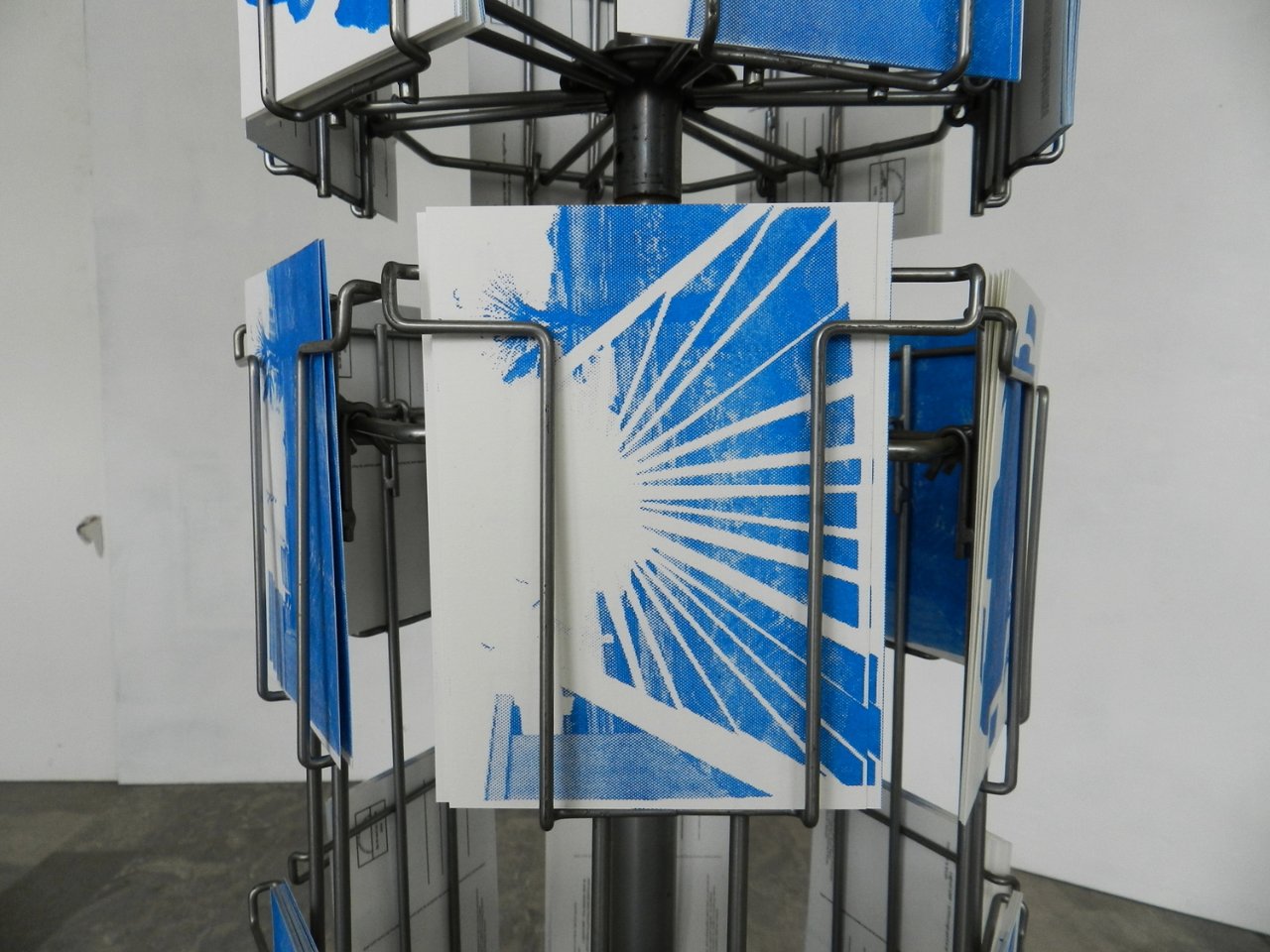
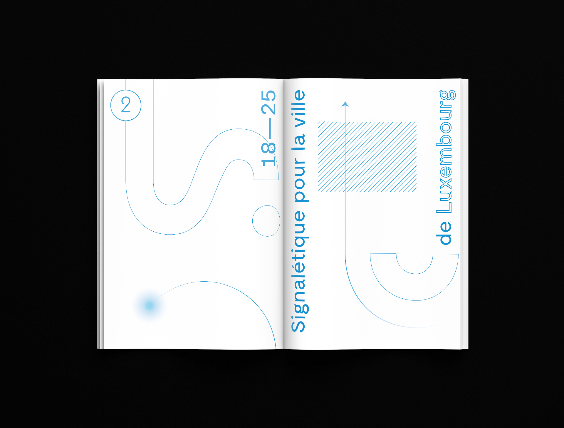
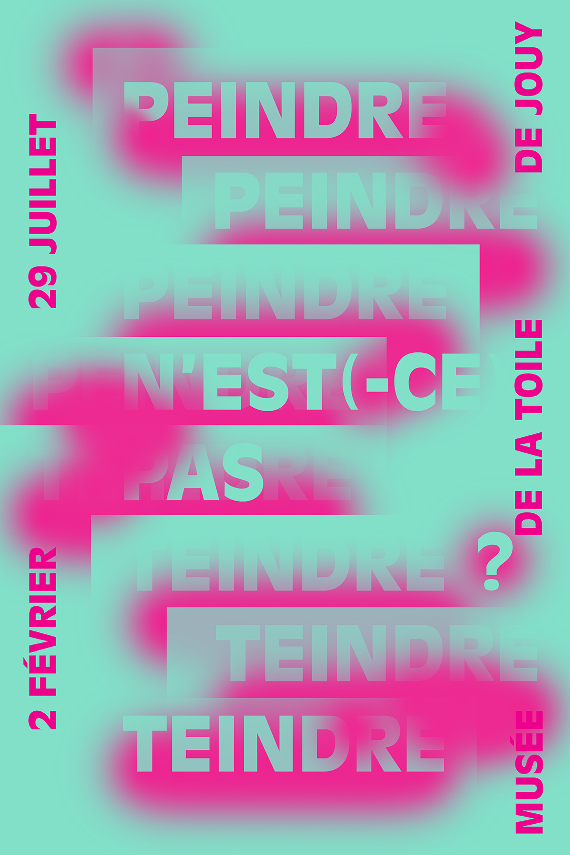
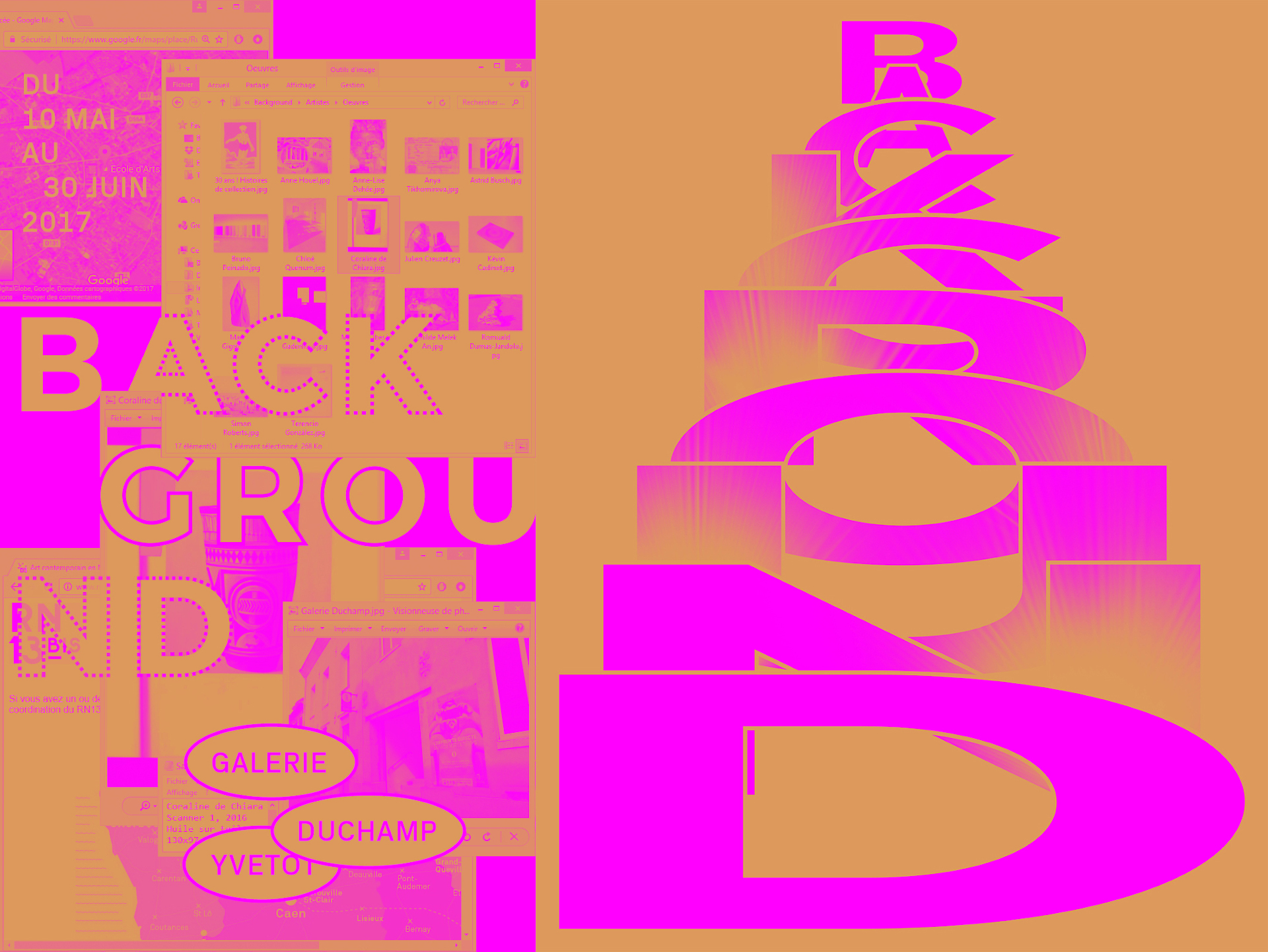
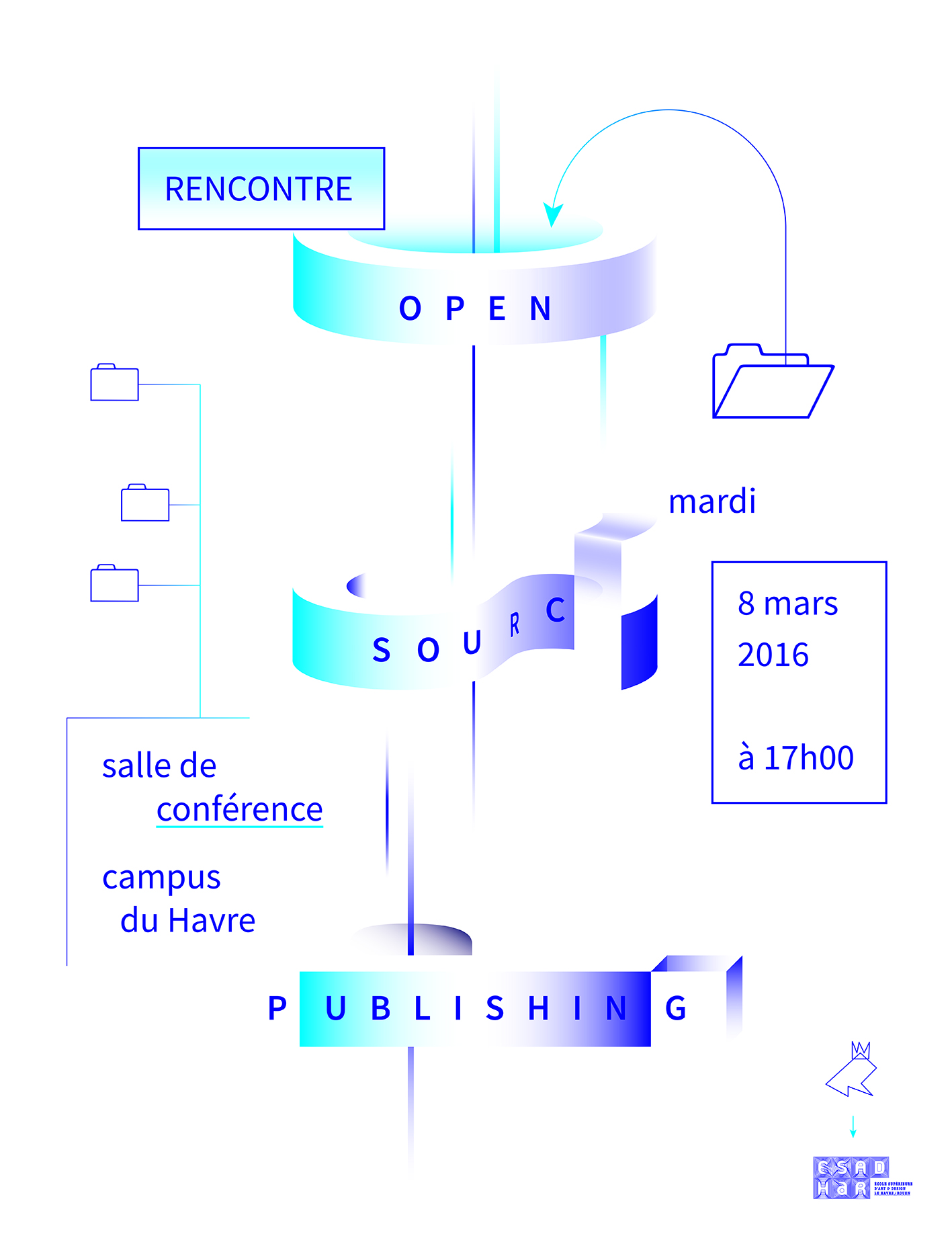
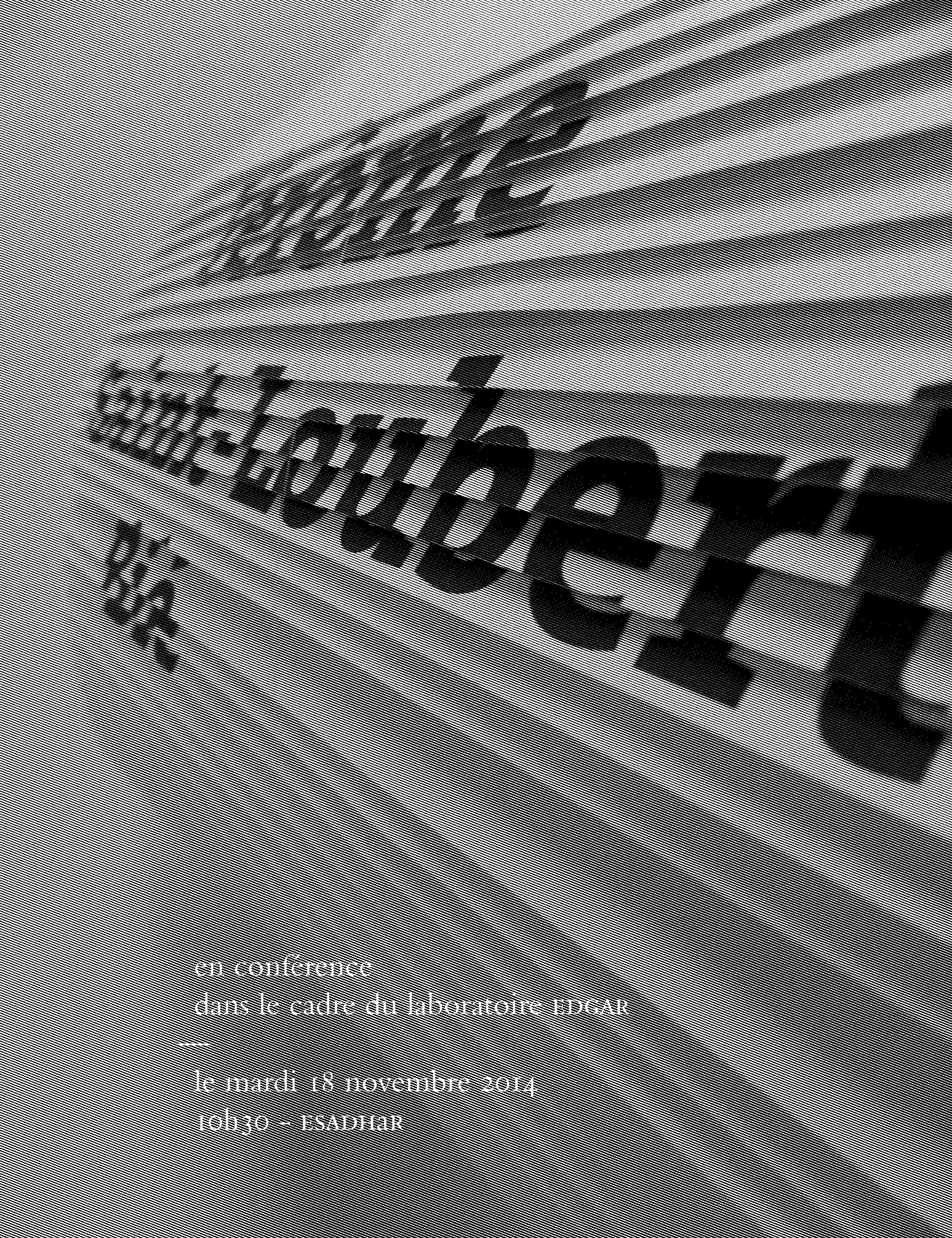
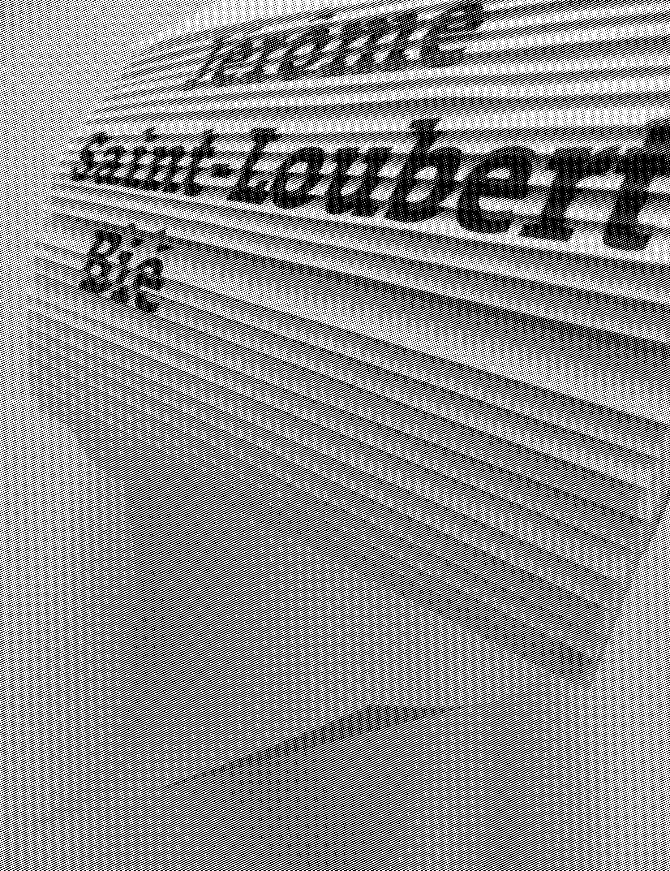
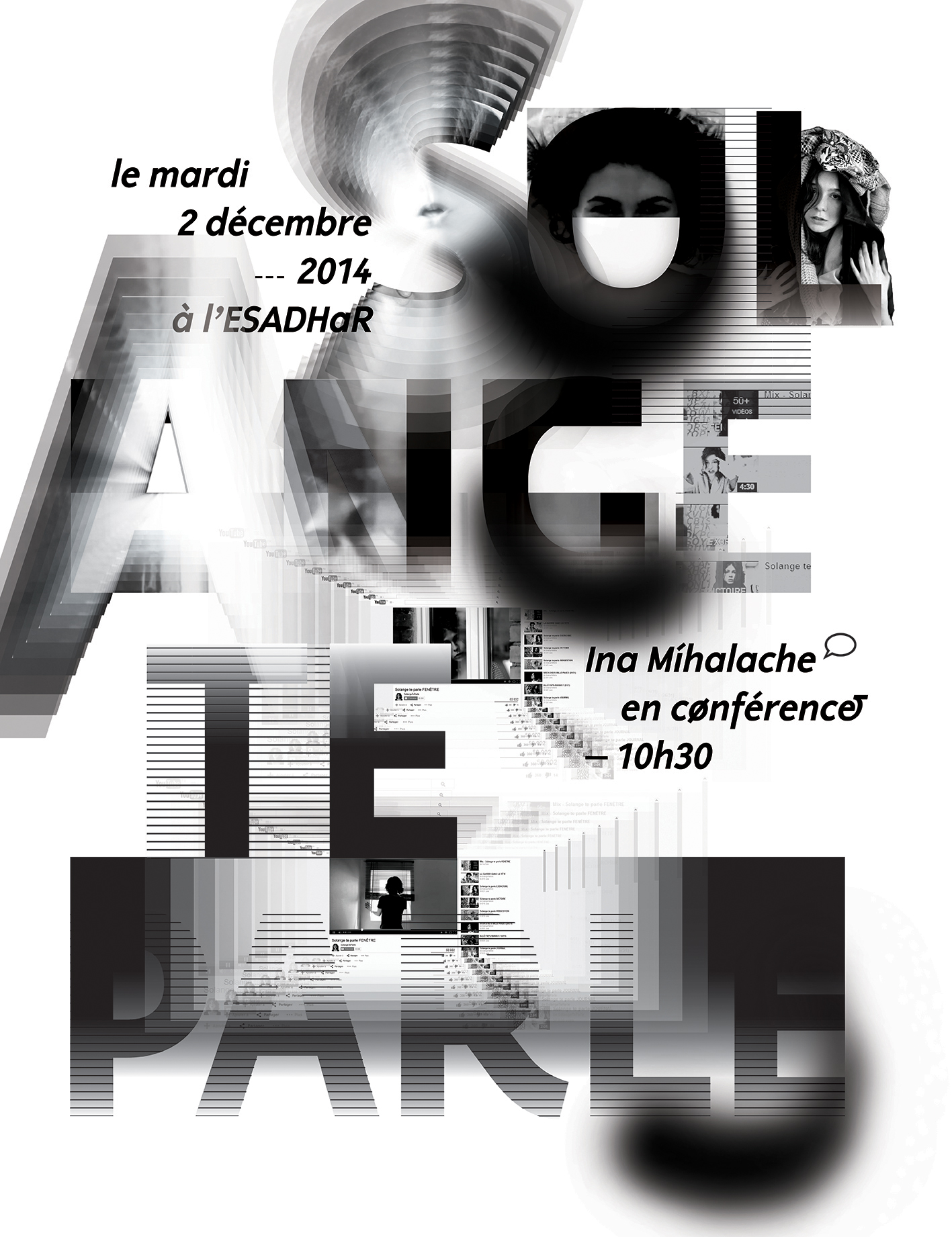
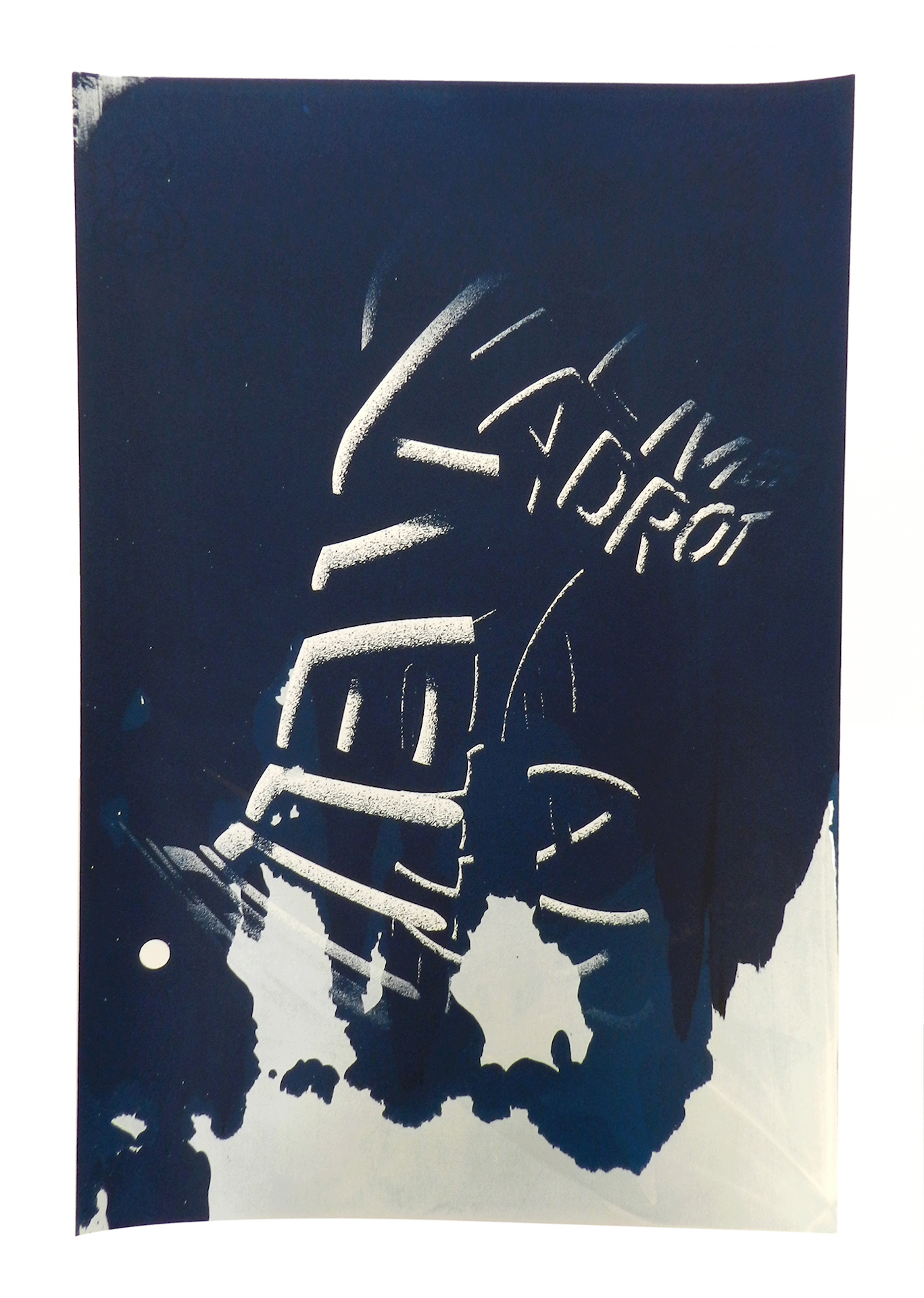
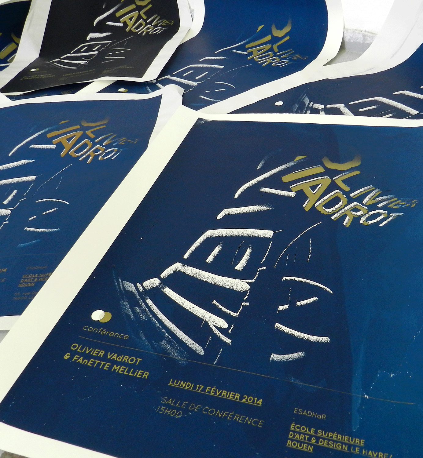
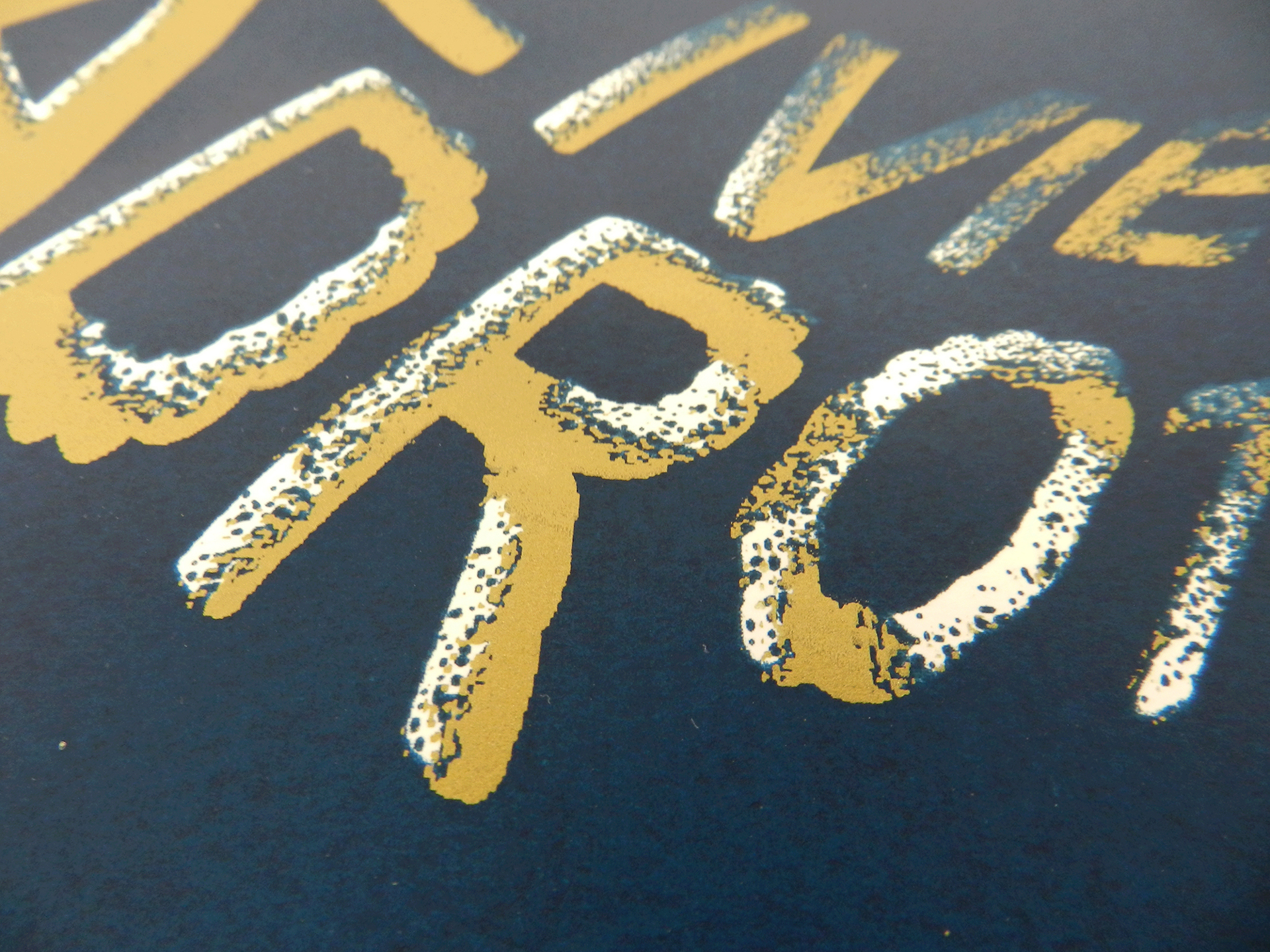
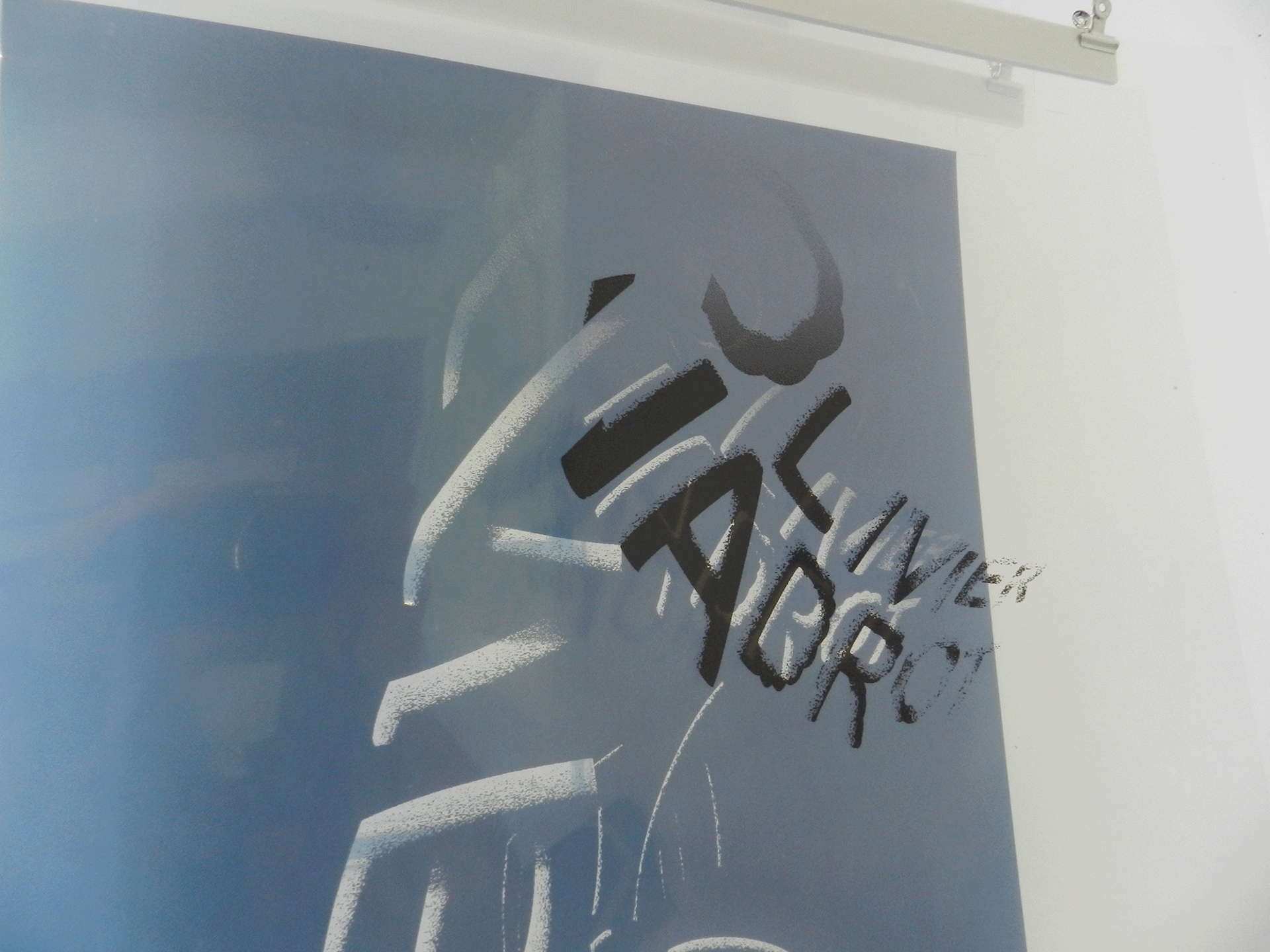
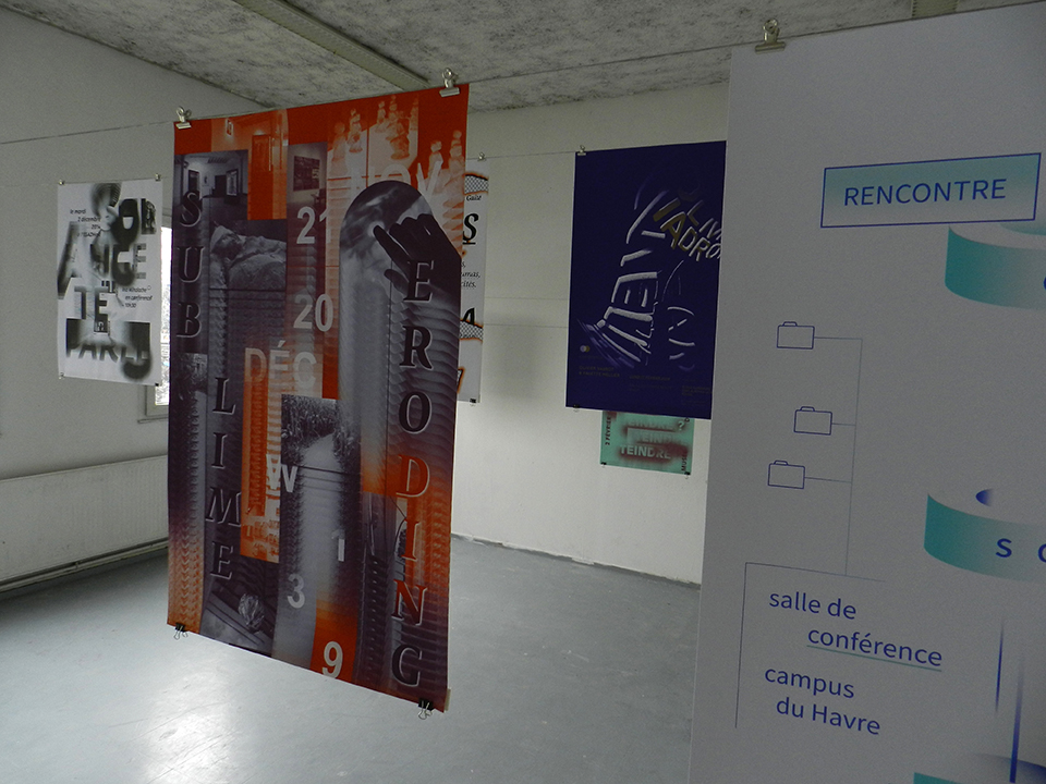
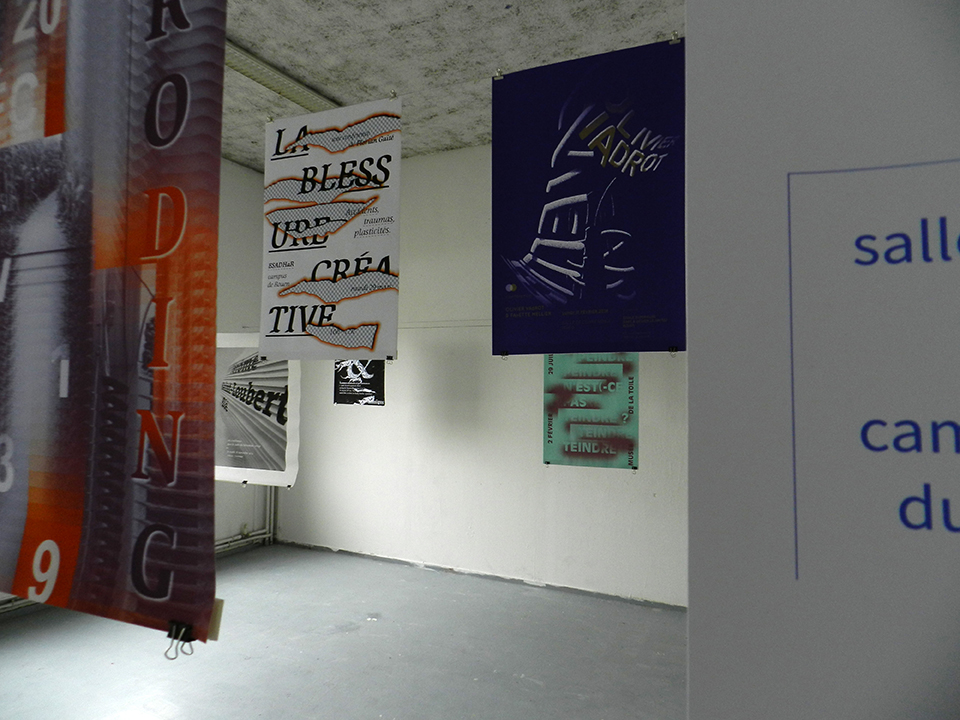
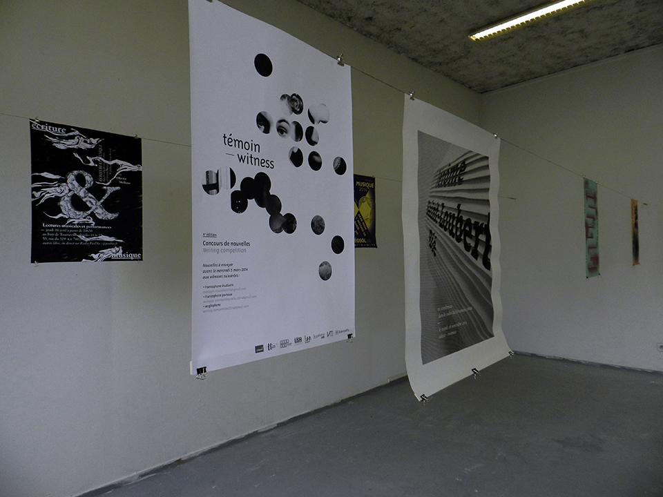
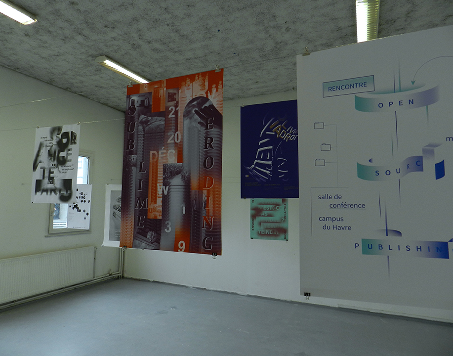
Serie of silkscreened posters for the conferences, workshops and exhibitions at ESADHaR* (Jérôme Saint-Loubert Bié, Solange te parle, Open Source Publishing, etc).
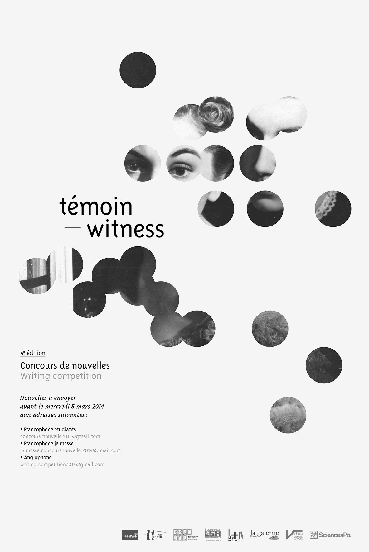
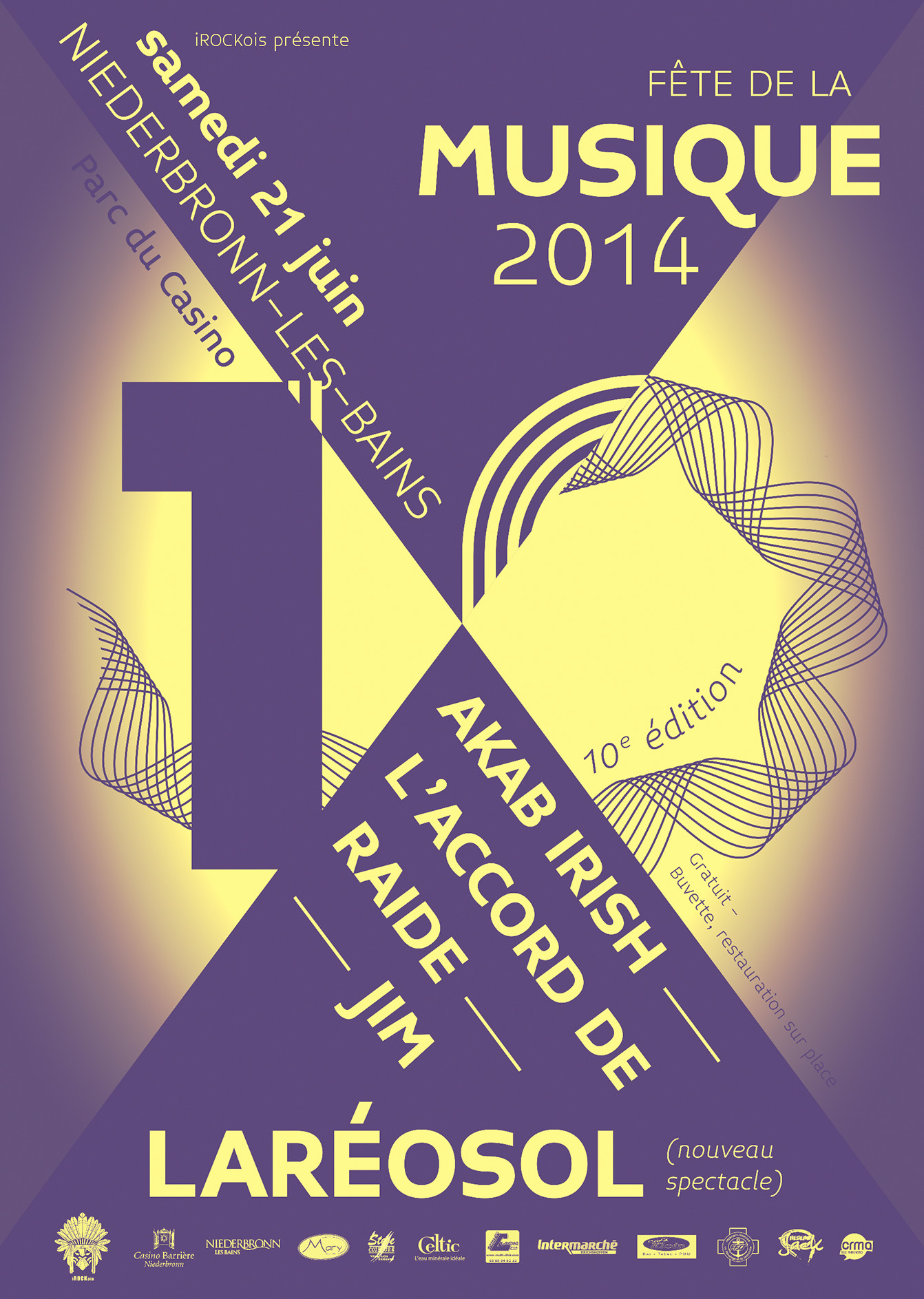
*Exceptions: exhibitions Background, Sublime Eroding and Peindre n’est-ce pas teindre ?, Fête de la Musique 2014, Témoin – Witness short stories competition (winning poster, 2013. ESADHaR, University of Le Havre, La Galerne bookstore).
Installation: DNSEP hanging (ESADHaR), cables, pliers, nails, June 2016.
Posters ballad that offers two types of “trips”: a circulation in space and a circulation of the eye (stray gaze within the poster). The viewer can thus view the visuals both in an overall view and in a frontal view, as he or she moves.
Infos
- Year:
-
2017
- Location:
-
Strasbourg
- Type:
-
personnal project
-
Exhibition
Images
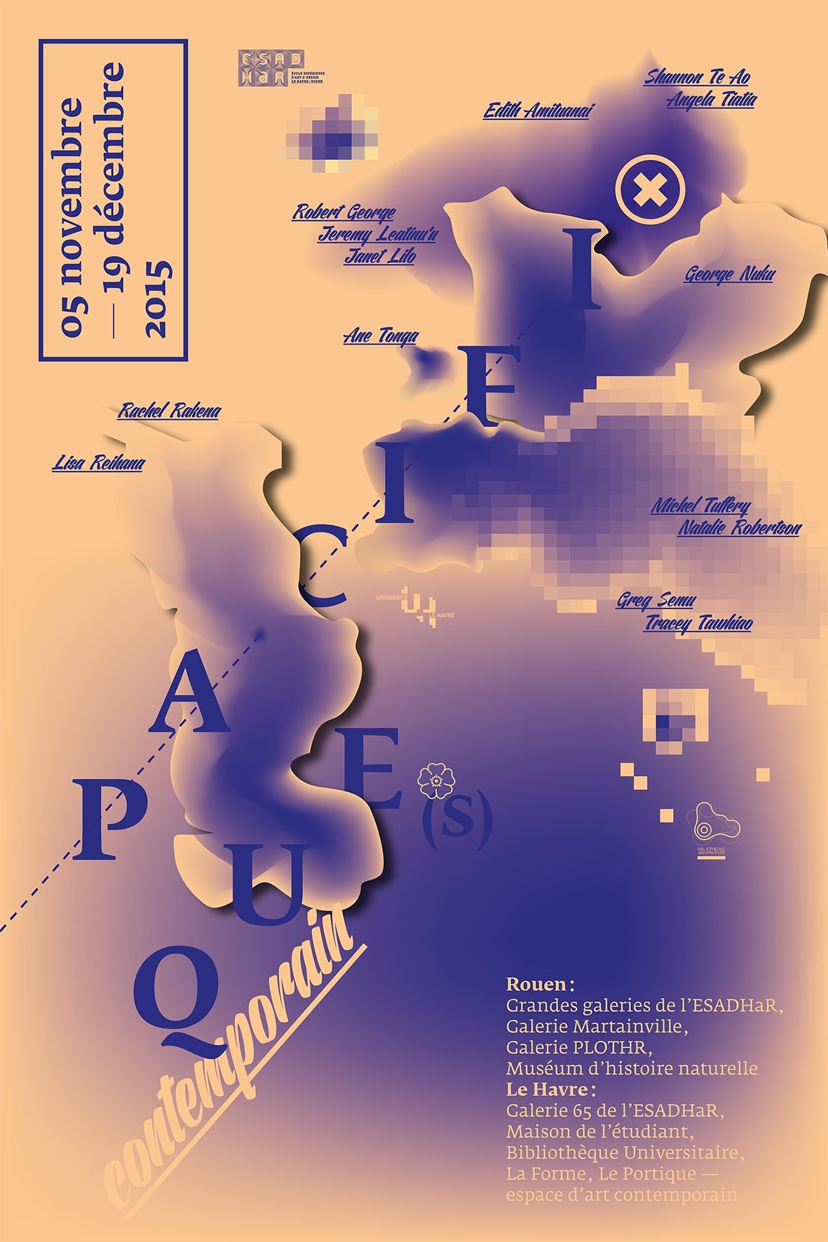
Text
Group exhibition organized by the Réseau RN13bis — art contemporain en Normandie, from May 10 to June 30, 2017, Galerie Duchamp (Yvetot).
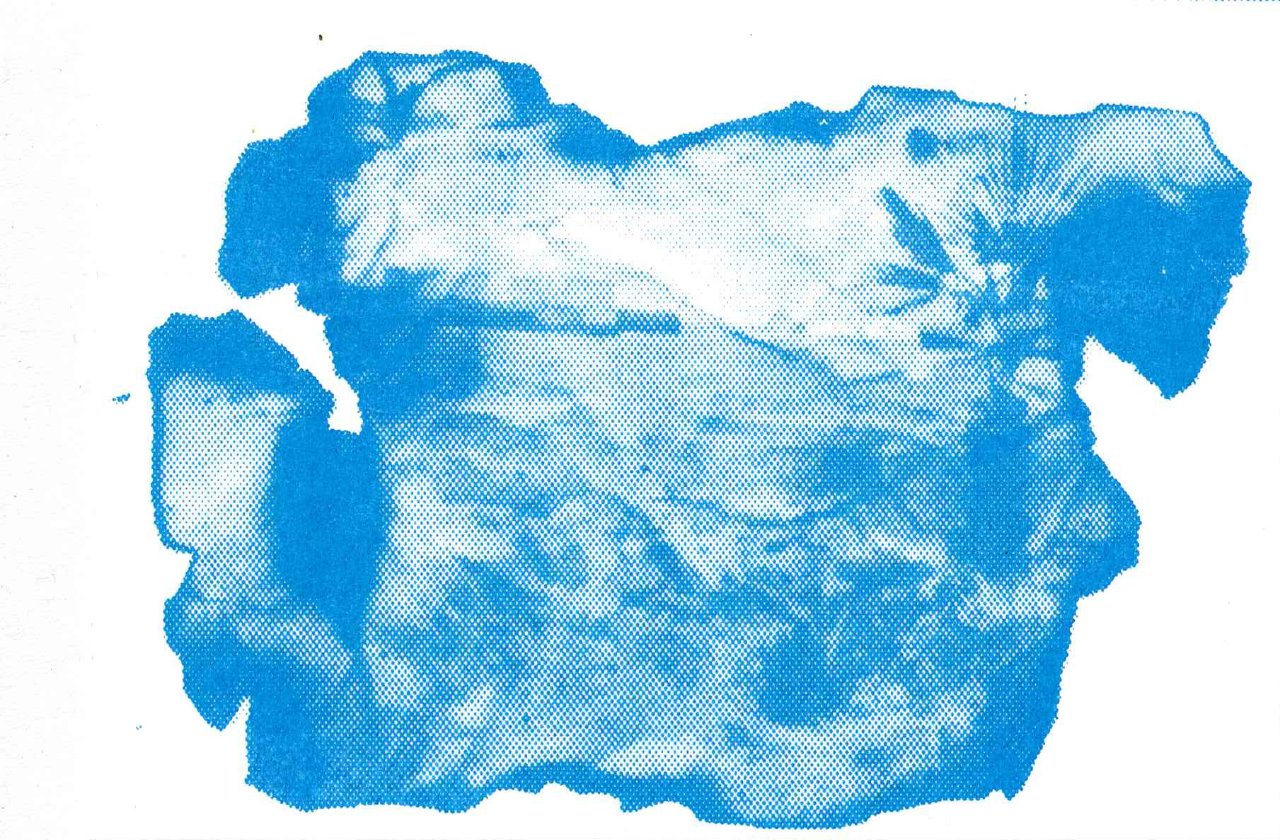
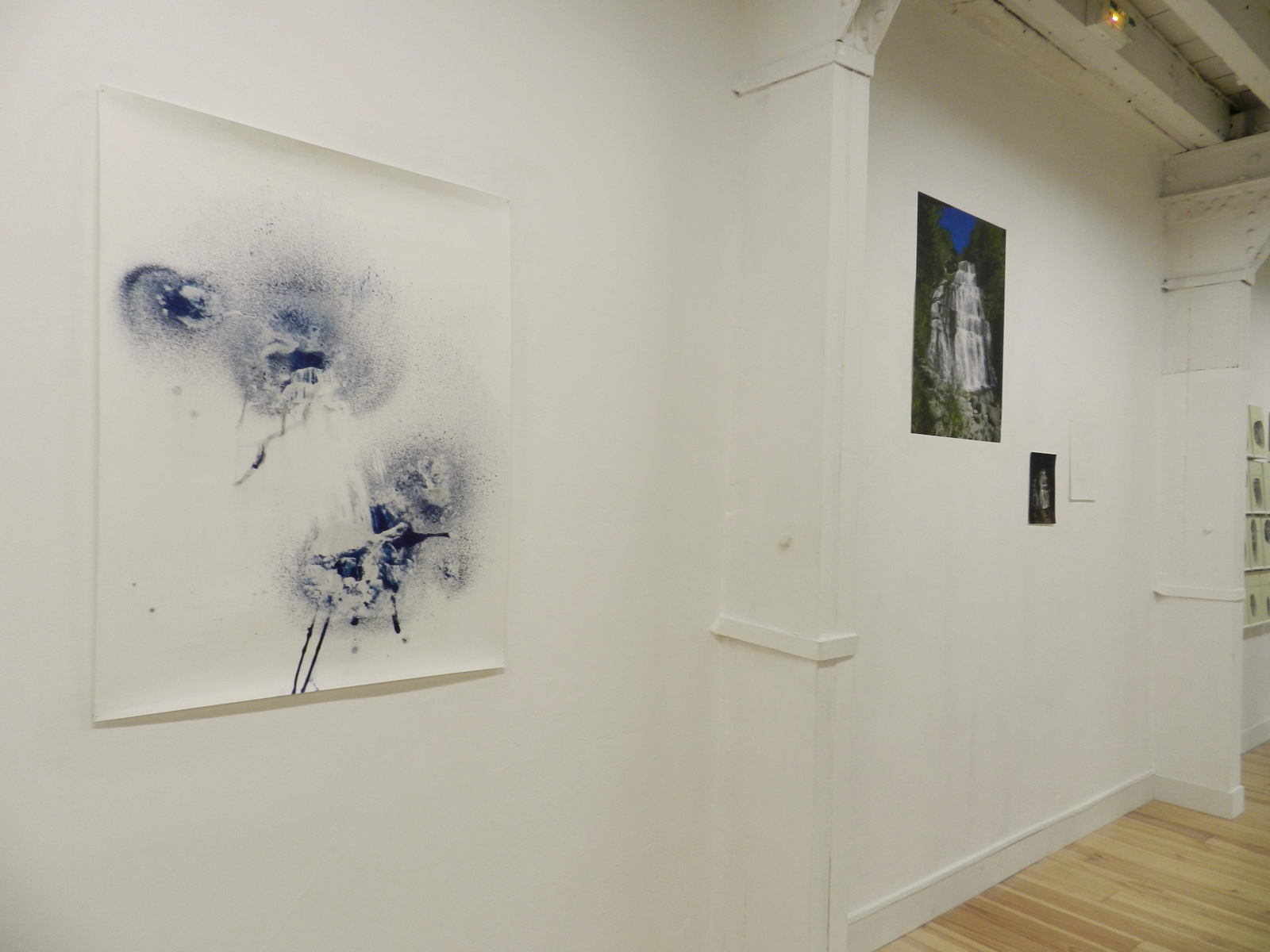
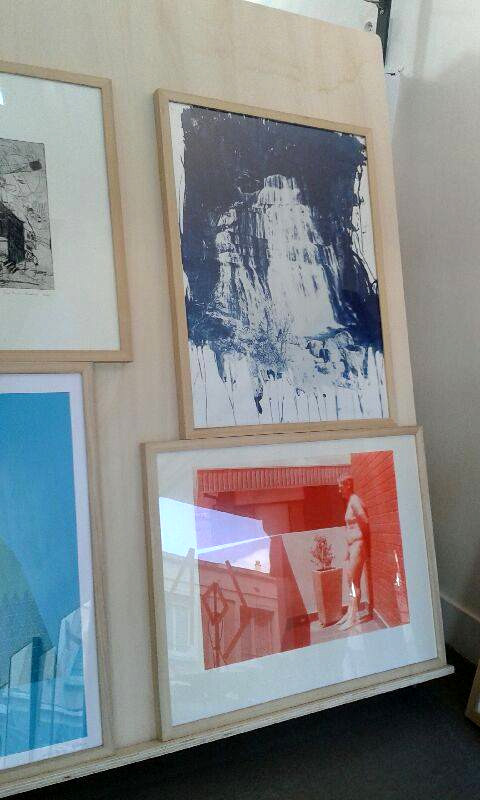
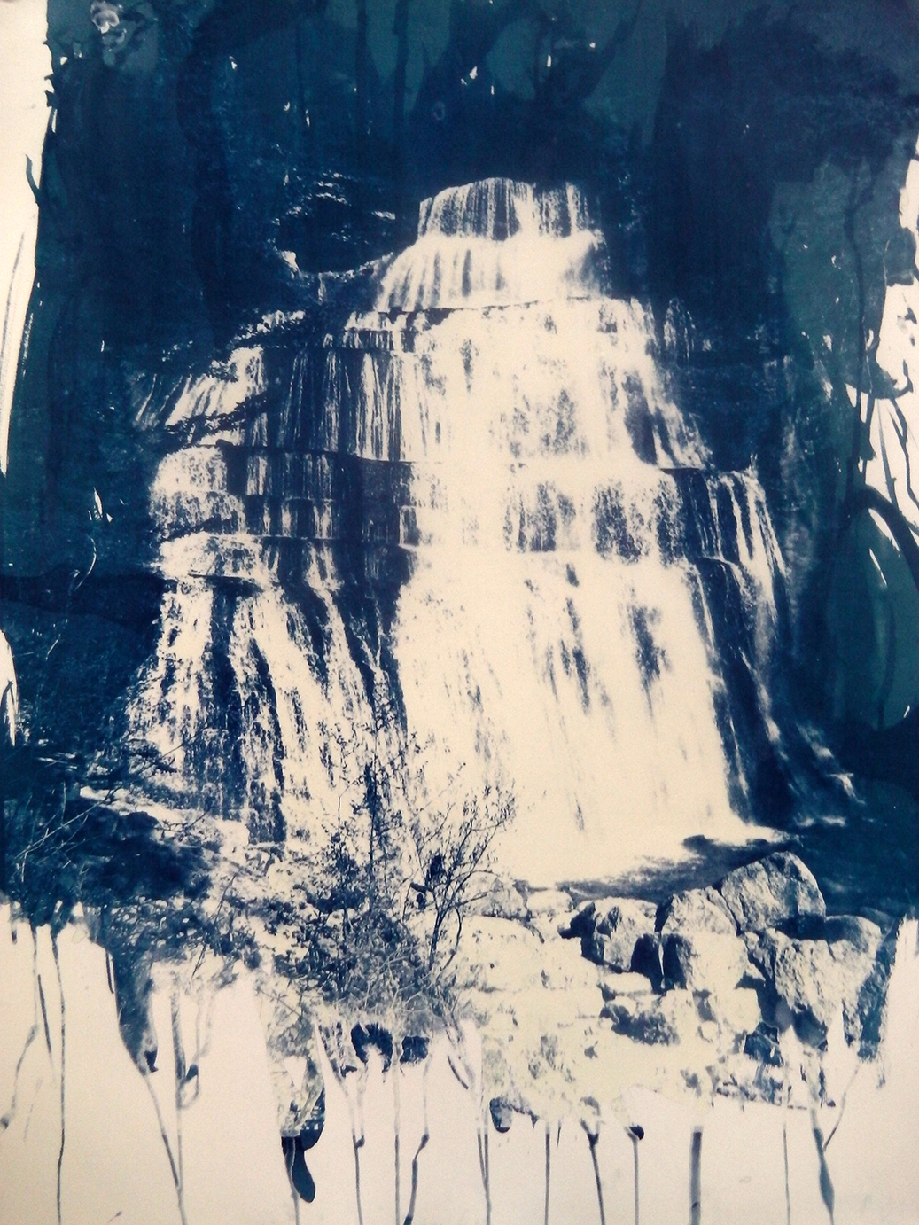
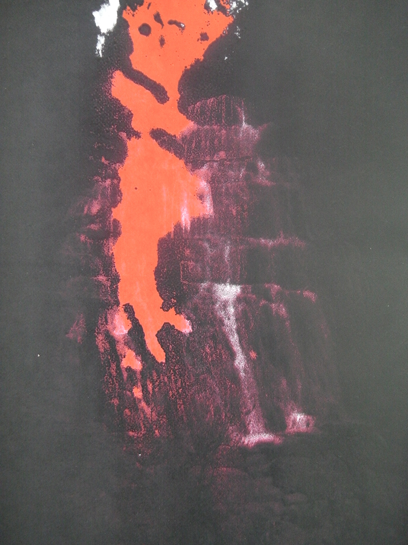
Works on display: extracts from the Cascades serie (cyanotype, inkjet printing on canvas, four-pass silkscreen printing simulating four-colour process, embossing), June 2016.
Acquisition of cyanotype n°1 by the ESADHaR art library on this occasion.
Infos
- Year:
-
2017
- Location:
-
Yvetot
- Type:
-
commission
- Customer:
-
Duchamp Gallery
- Curating:
- Séverine Duhamel
- Selection of pieces:
- Mathieu Roquet
-
- Graphic design
- Website
Images
Text
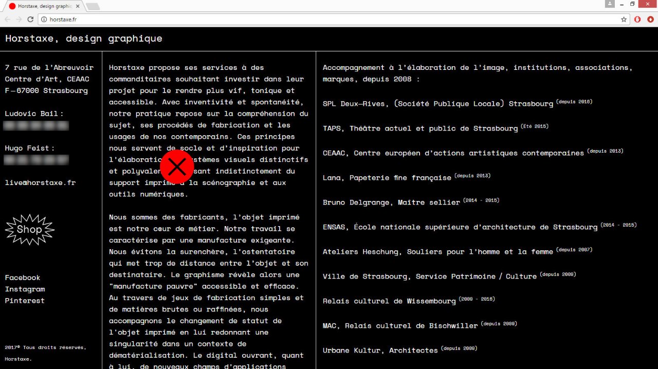
Graphic design and development of Horstaxe's website (Ludovic Bail and Hugo Feist).
The website tries to stage the studio's artistic approach, where graphic design is often revealed in its truest nature: the ephemeral, evanescent state (free display, stealth exhibitions). The images fall like the leaves of a tree, resonating with the brevity of the existence of the graphic support, before being stored in the corresponding project folders.
Infos
- Year:
-
2017
- Location:
-
Strasbourg
- Type:
-
commission
- Customer:
-
Horstaxe
- Font:
-
Space Mono by Colophon Foundry (2016).
- Images, texts:
- Horstaxe
-
Plus Plus Egal project
Images
Text
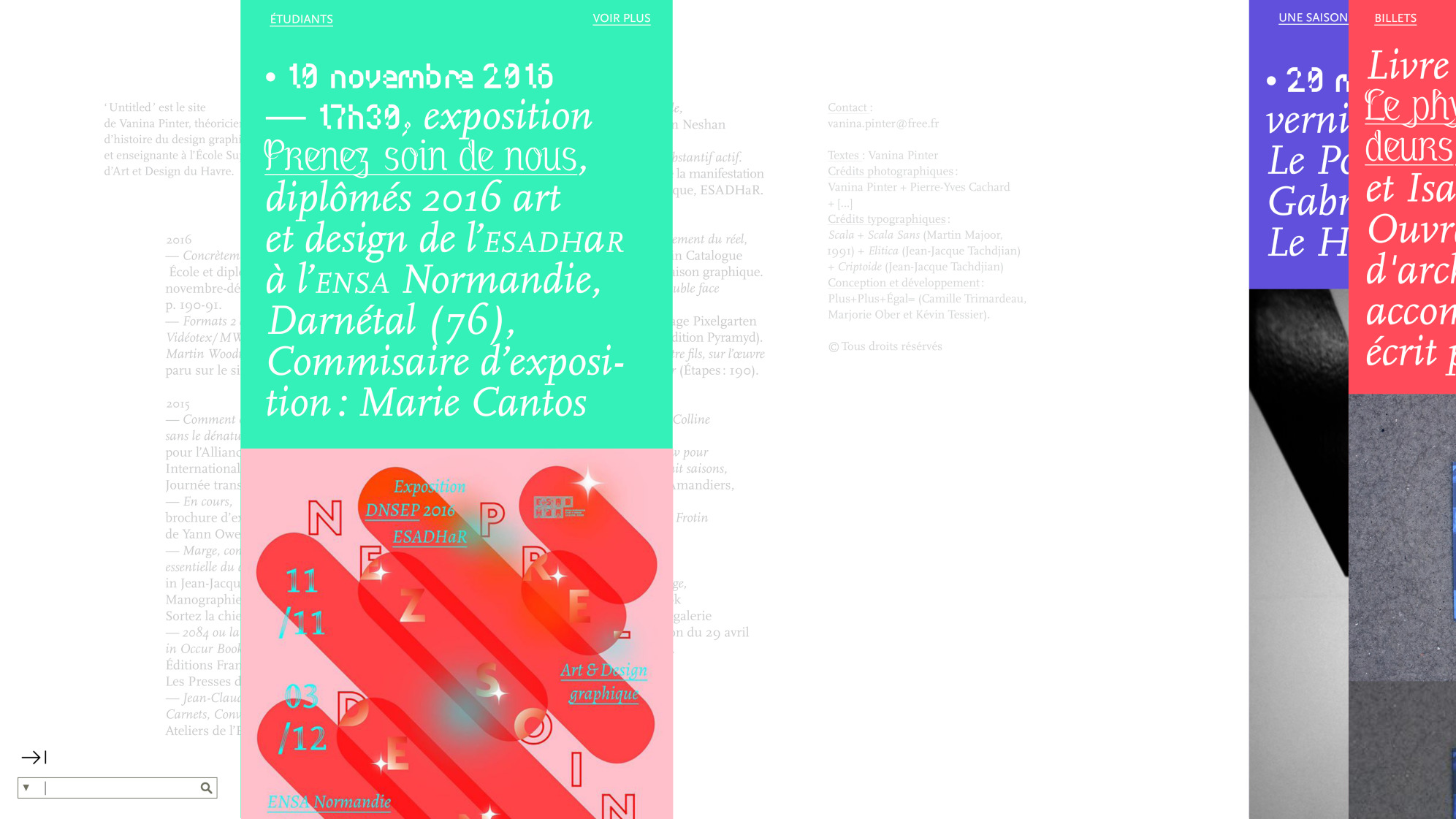
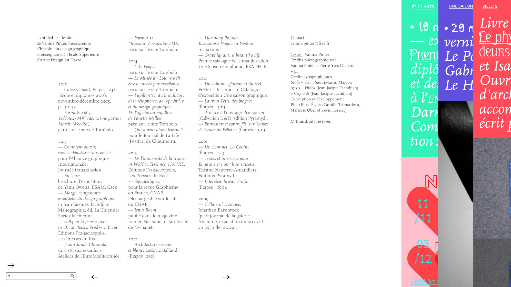
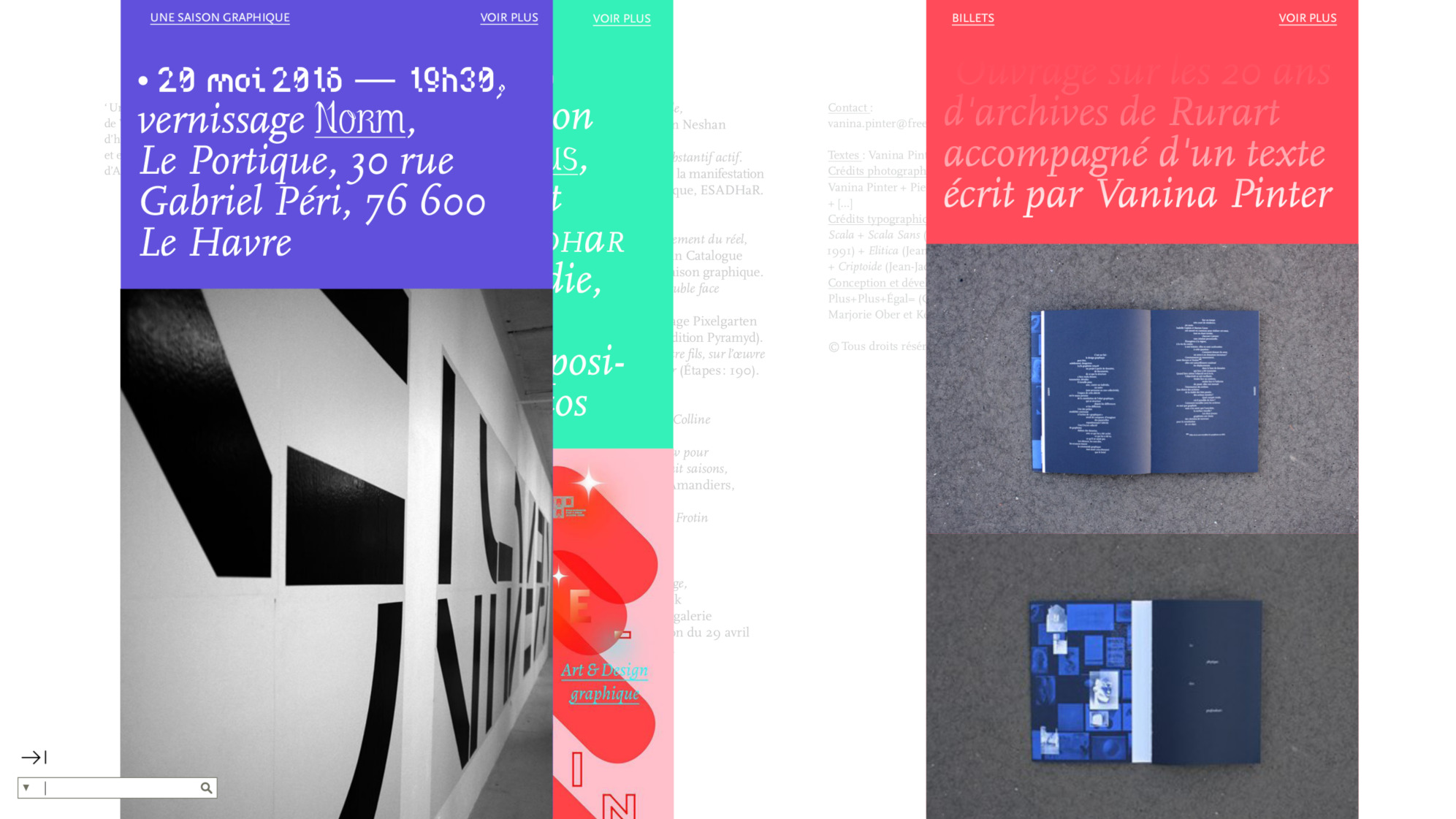
Graphic design and development of Vanina Pinter's website, theorist and teacher at ESADHaR in Le Havre.
The interface was designed as a top view of Vanina Pinter's “desk”, which the visitor can deploy or store. Her texts, in the background, coexist with her research work split into news streams (dissemination of student work, sharing readings, exhibition visits, etc.) in the foreground.
Infos
- Year:
-
2017
- Location:
-
Paris
- Type:
-
commission in collaboration with Camille Trimardeau and Kévin Tessier
- Customer:
-
Vanina Pinter
- Images, texts:
- Vanina Pinter
- Fonts:
-
Scala by Martin Majoor (1991), Elitica (2014) and Criptoide (2003) by Jean-Jacques Tachdjian.
-
- Text
- Publication
Images
Text
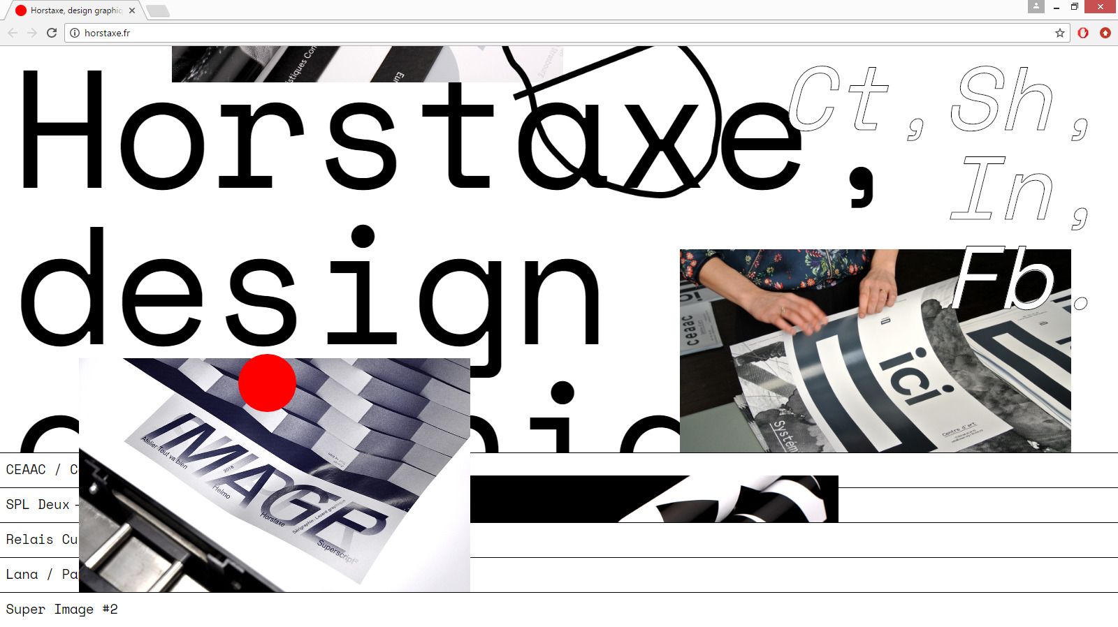
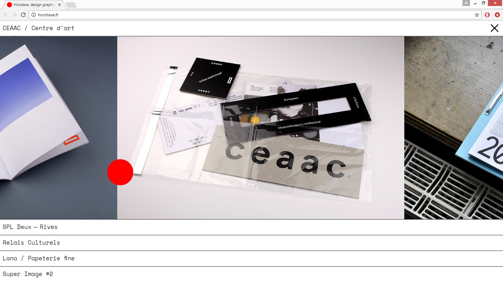
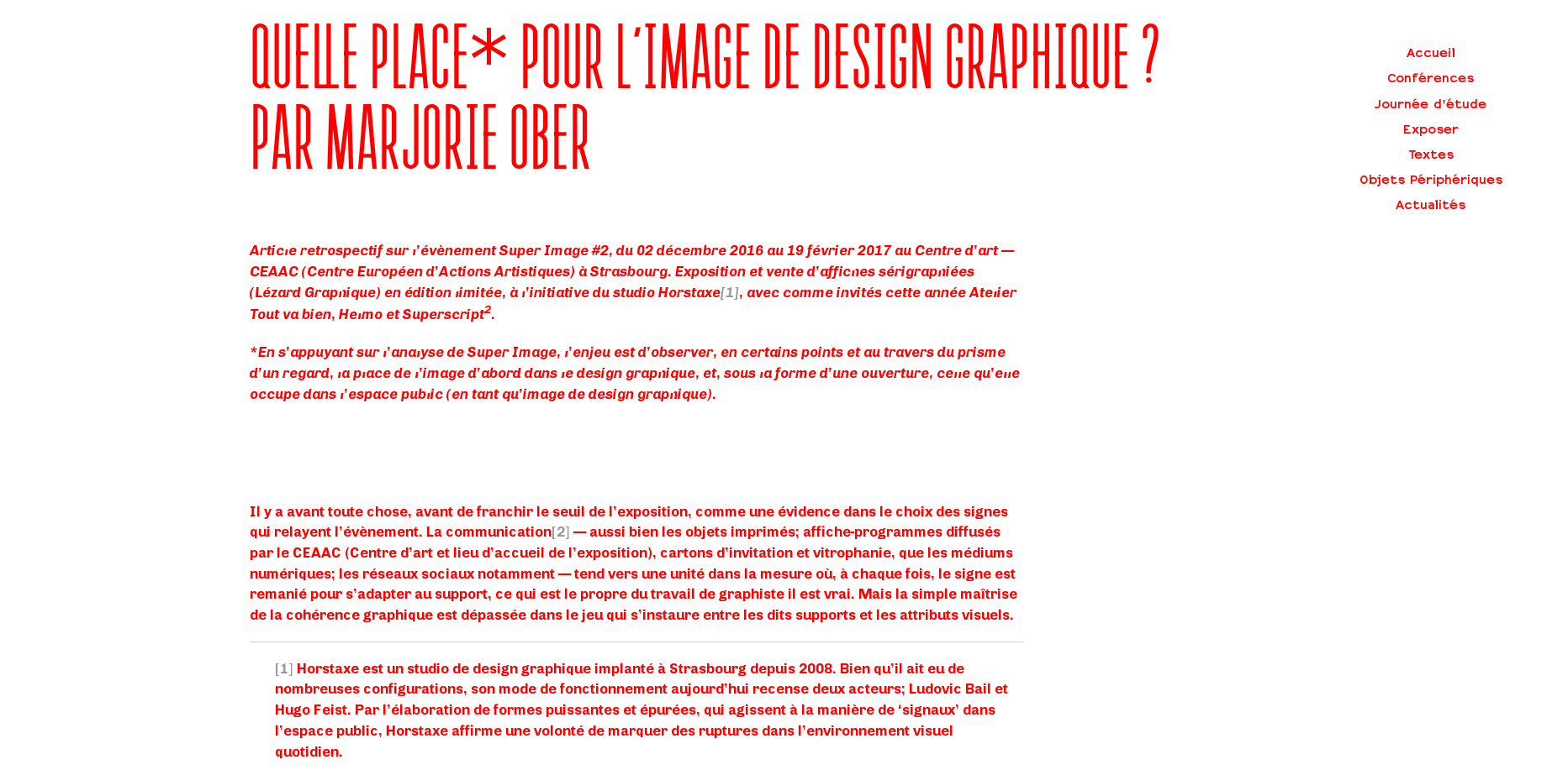
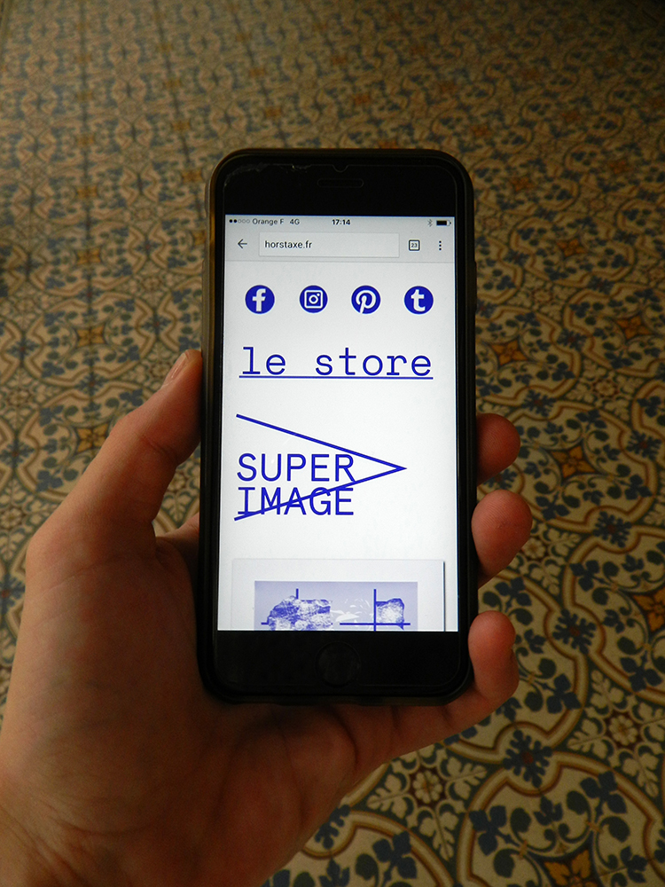
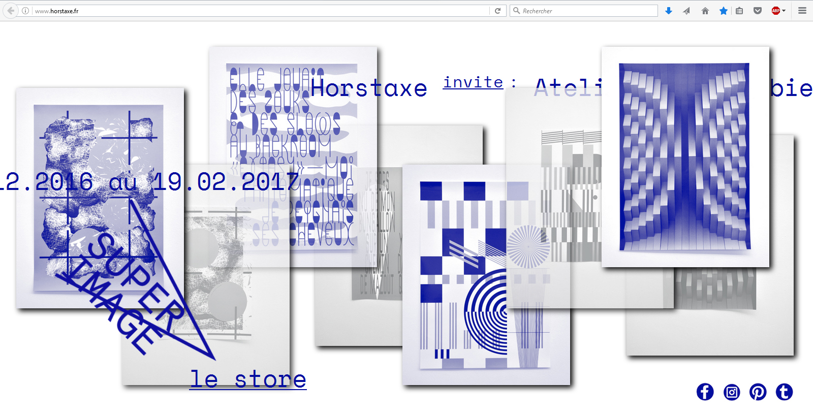
Article written as part of Super Image #2 (exhibition and poster sale organized by the Horstaxe studio) at the Centre Européen d'Actions Artistiques Contemporaines (CEAAC) in Strasbourg, from 03 December 2016 to 19 February 2017.
Text published on the E-D-G-A-R website in April 2017.
Based on Super Image's analysis, the challenge is to observe, at certain points and through the prism of a glance, the place of the image first of all in graphic design, and, in the form of an opening, the one it occupies in the public space (as a graphic design image).
Infos
- Year:
-
2017
- Location:
-
Strasbourg
- Type:
-
commission
- Customer:
-
Horstaxe
-
- Graphic design
- Website
Images
Text
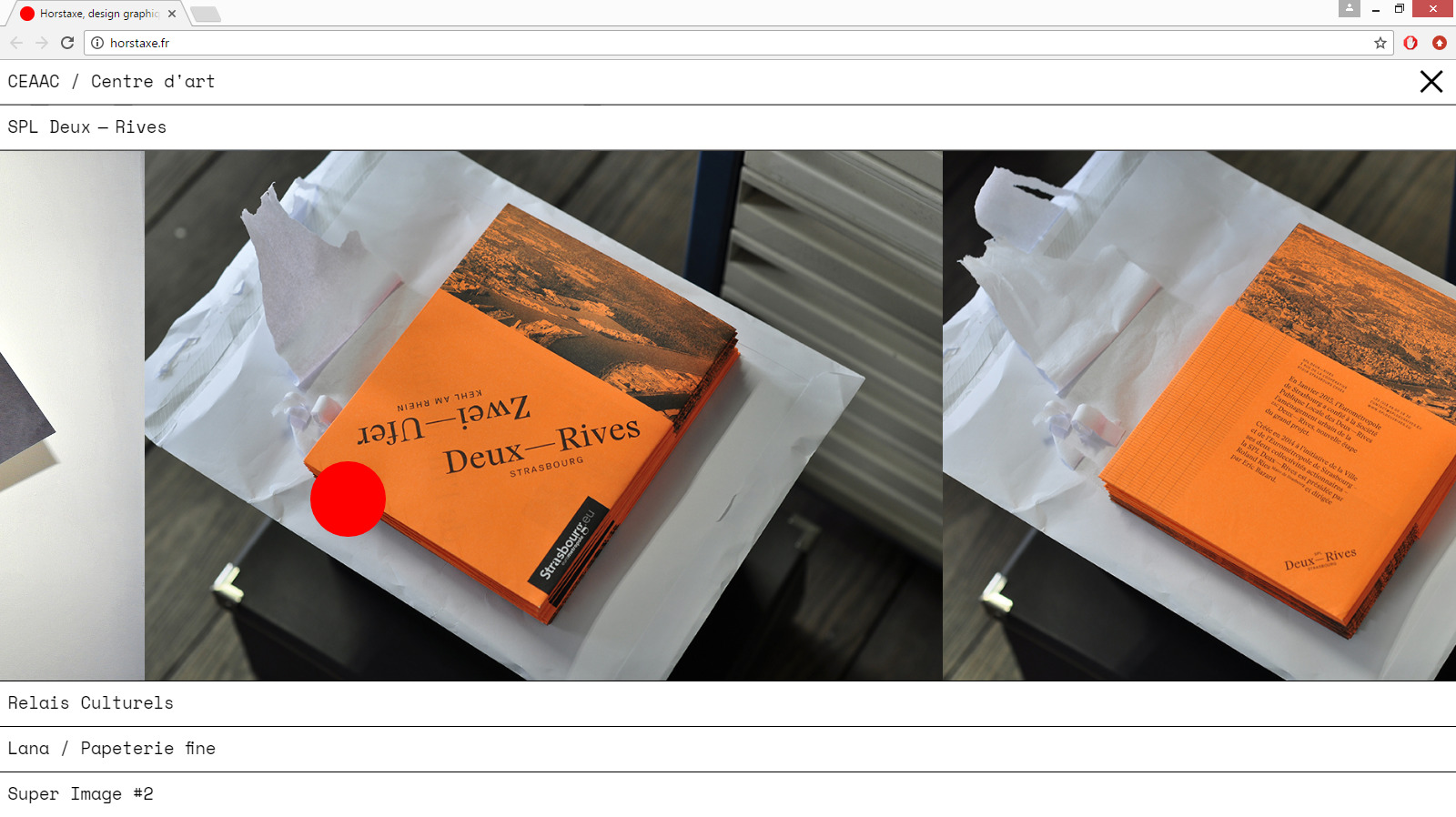
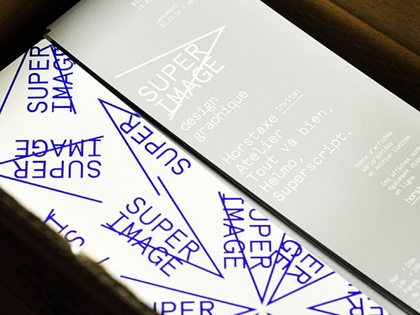
Work on the communication of the Super Image #2 graphic design exhibition for the Horstaxe studio: invitation card, web page, article, photographs.
Article published on the website of E-D-G-A-R in May 2017.
*Exhibition and sale of screen-printed posters (Lézard graphique) in limited edition, with Atelier Tout va bien, Helmo and Superscript2. From 03 December 2016 to 19 February 2017 at the Centre Européen d'Actions Artistiques Contemporaines (CEAAC) in Strasbourg.
Infos
- Year:
-
2016
- Location:
-
Strasbourg
- Type:
-
commande
- Customer:
-
Horstaxe
- Font:
-
Apercu by Colophon Foundry (2010).
-
- Installation
- Exhibition
Images
Text
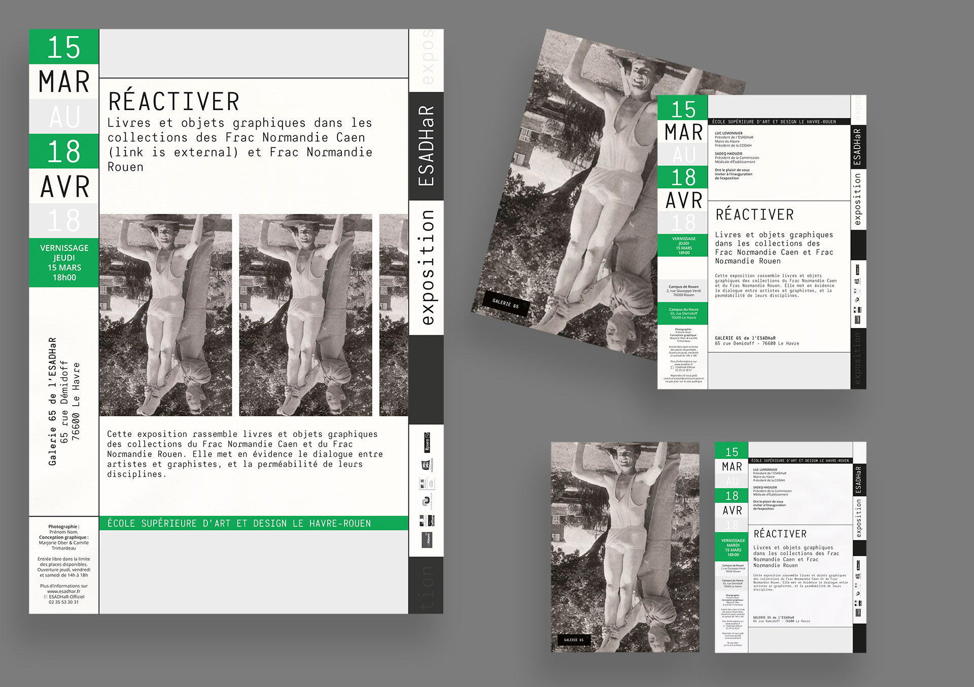
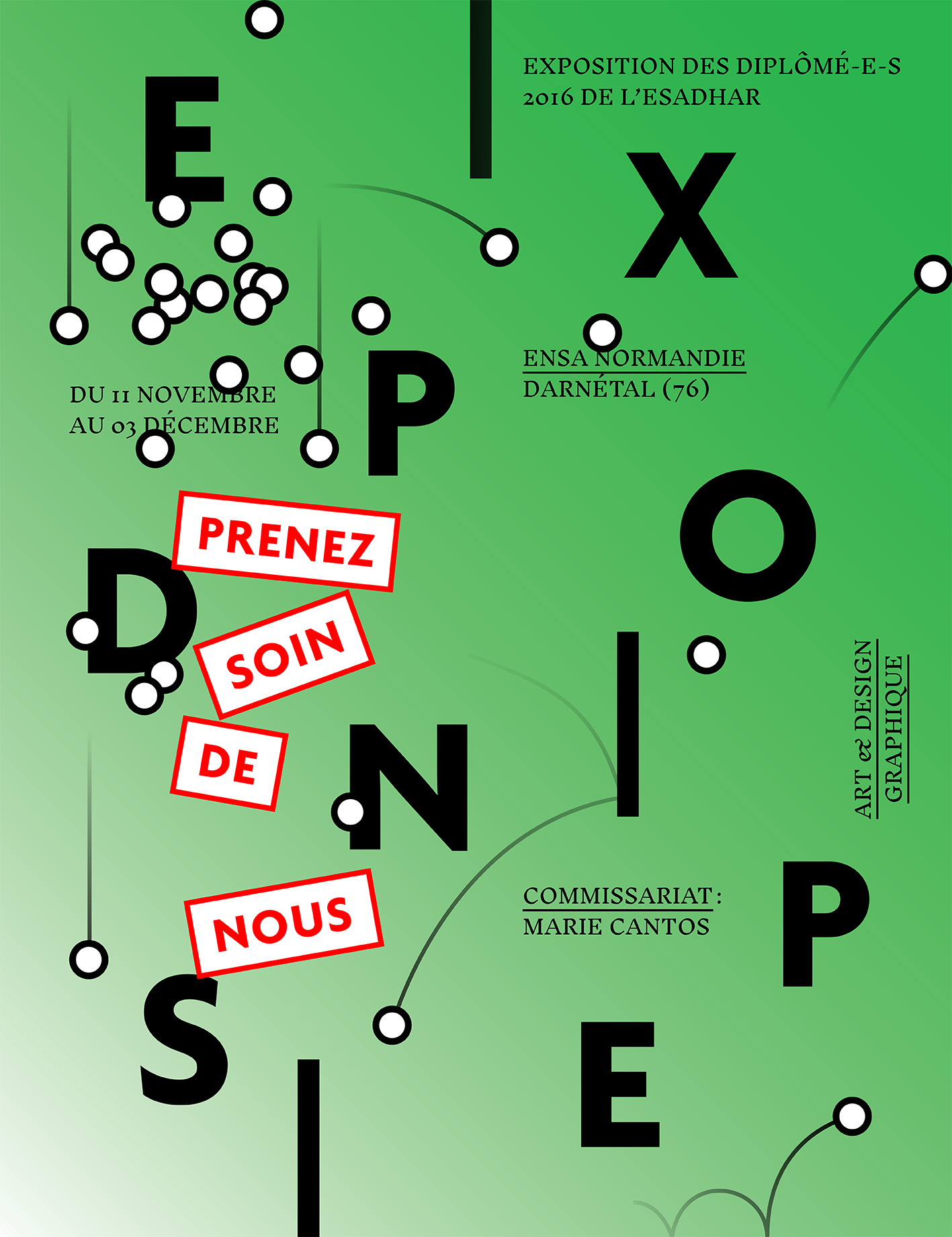
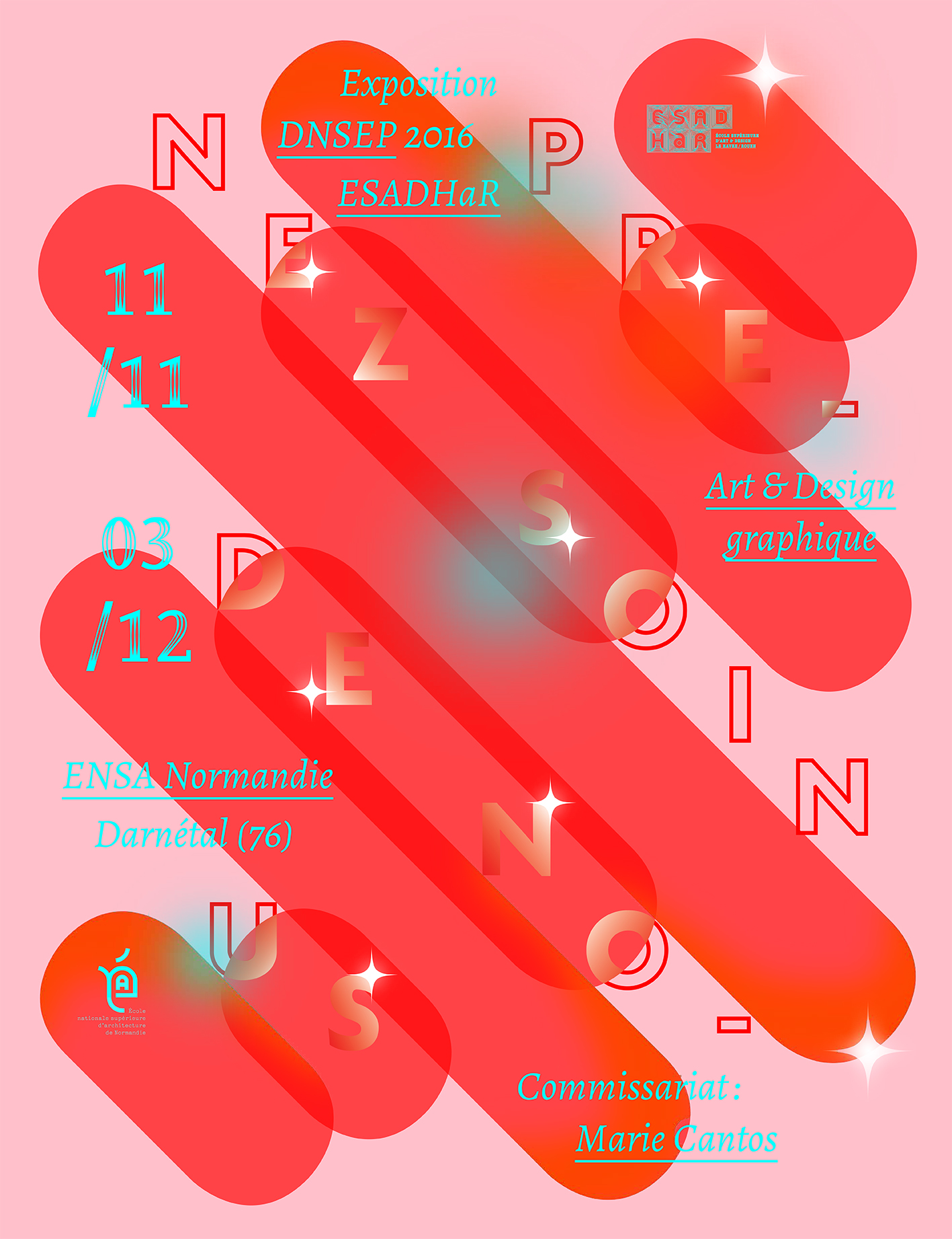
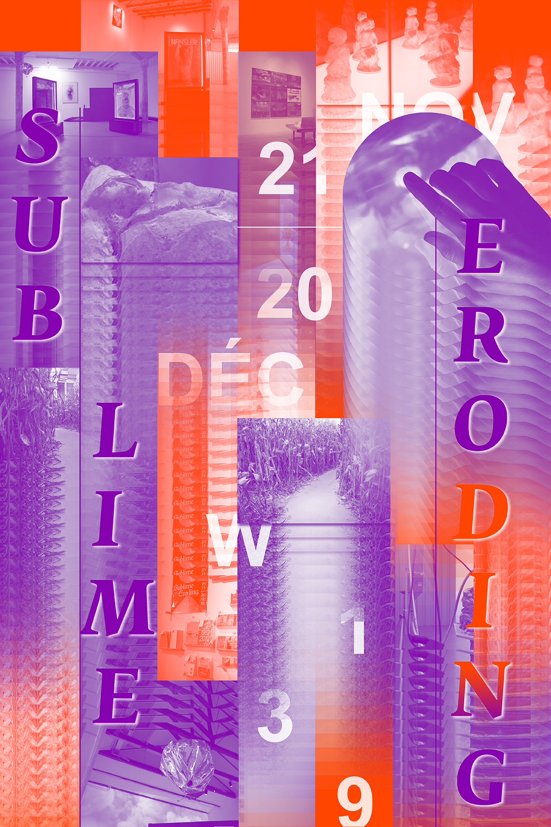
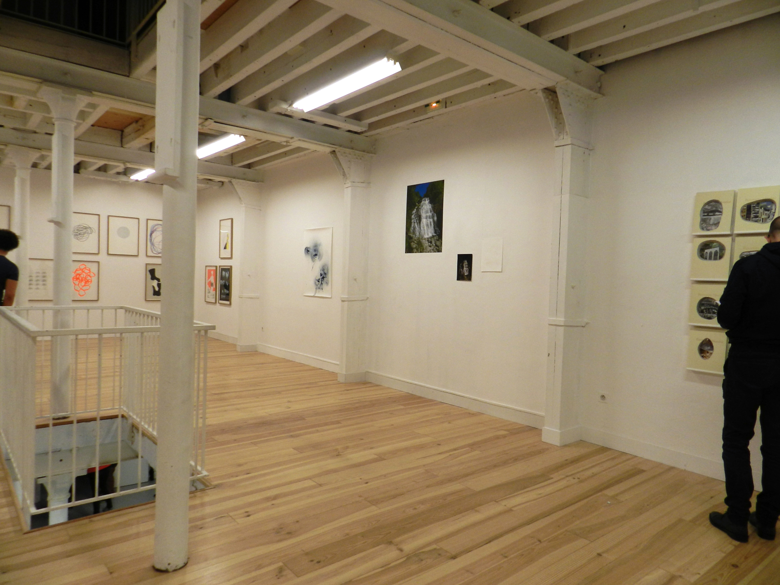
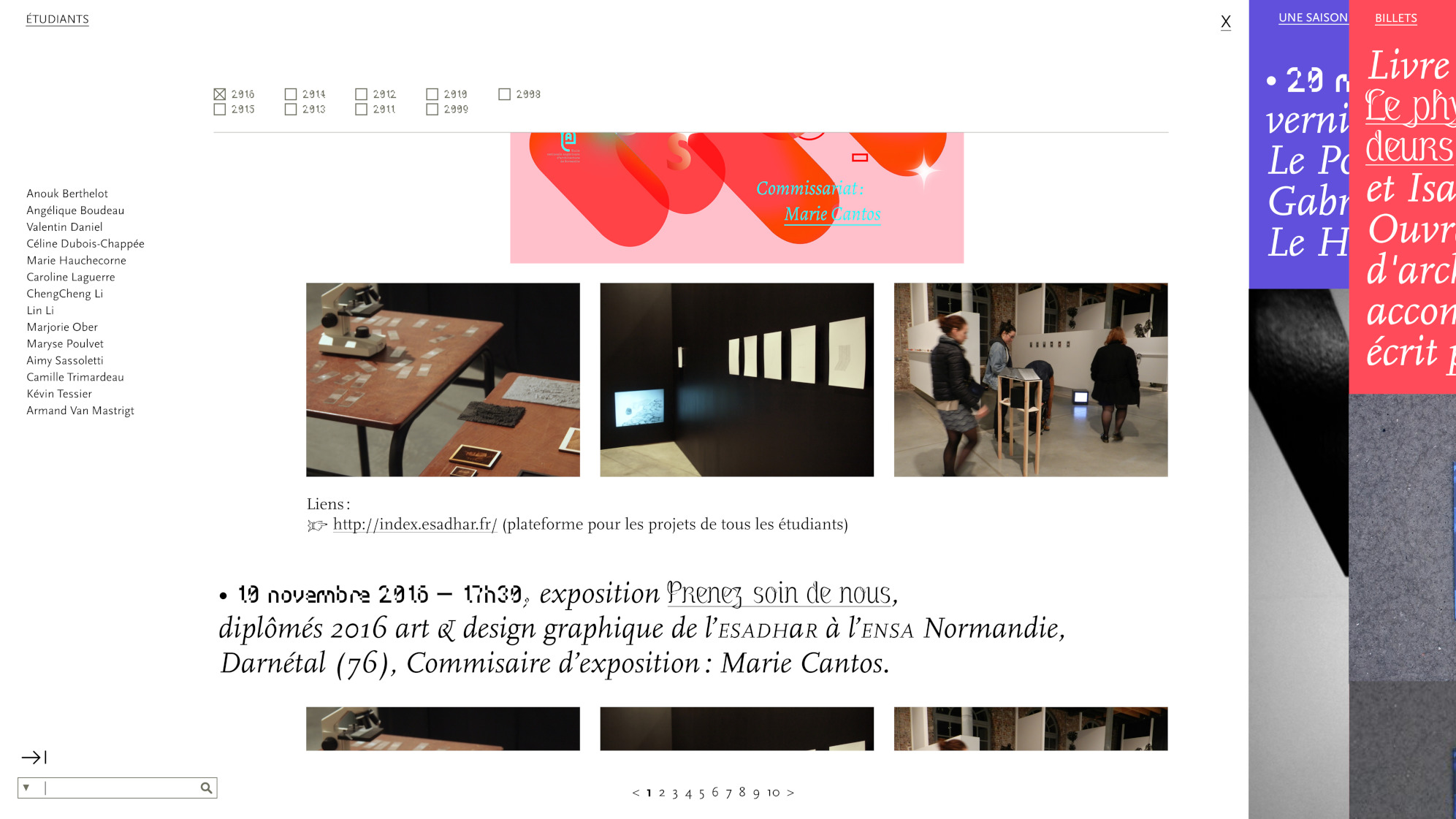
Exhibition of ESADHaR graduates (class of 2016) which brings together the Rouen and Le Havre campuses, from 11 November to 03 December 2016 at École Nationale Supérieure d'Architecture de Normandie in Darnétal.
Exhibits on display: excerpts from the Cascades series (silkscreen printings on plexiglass mounted on filtered rods, cyanotype, laser engravings on various materials), June 2016.
The scenography, thought so that the works enter in resonance, allowed the multiple appearance of my artworks in the middle of those of other artists.
Infos
- Year:
-
2016
- Location:
-
Darnétal
- Type:
-
commission
- Customer:
-
École Supérieure d'Art et Design Le Havre-Rouen
- Exhibition curator:
- Marie Cantos
-
- Interactive installation
- Experiments
Plus Plus Egal project
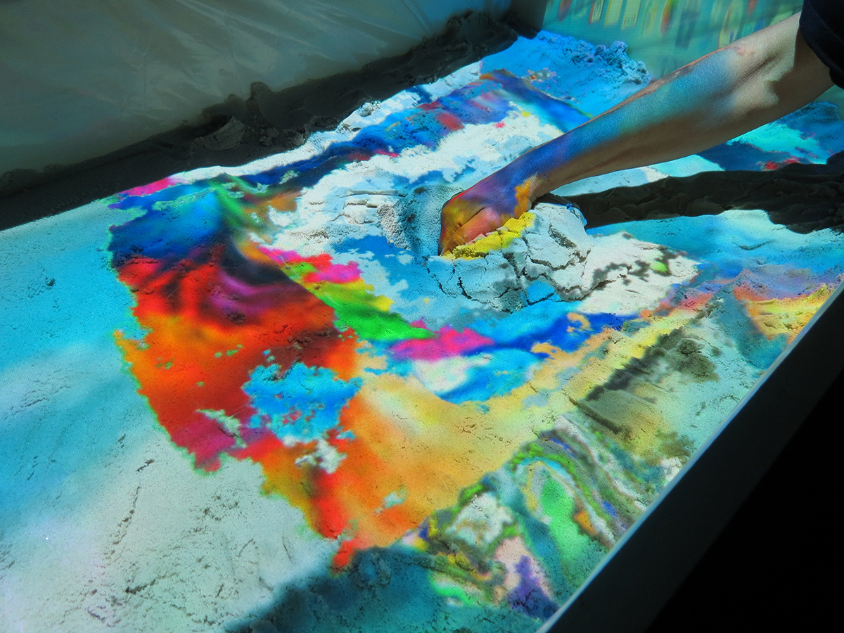
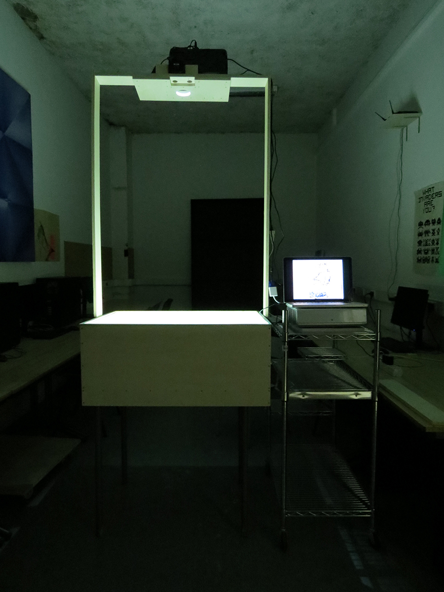
Images
First tests
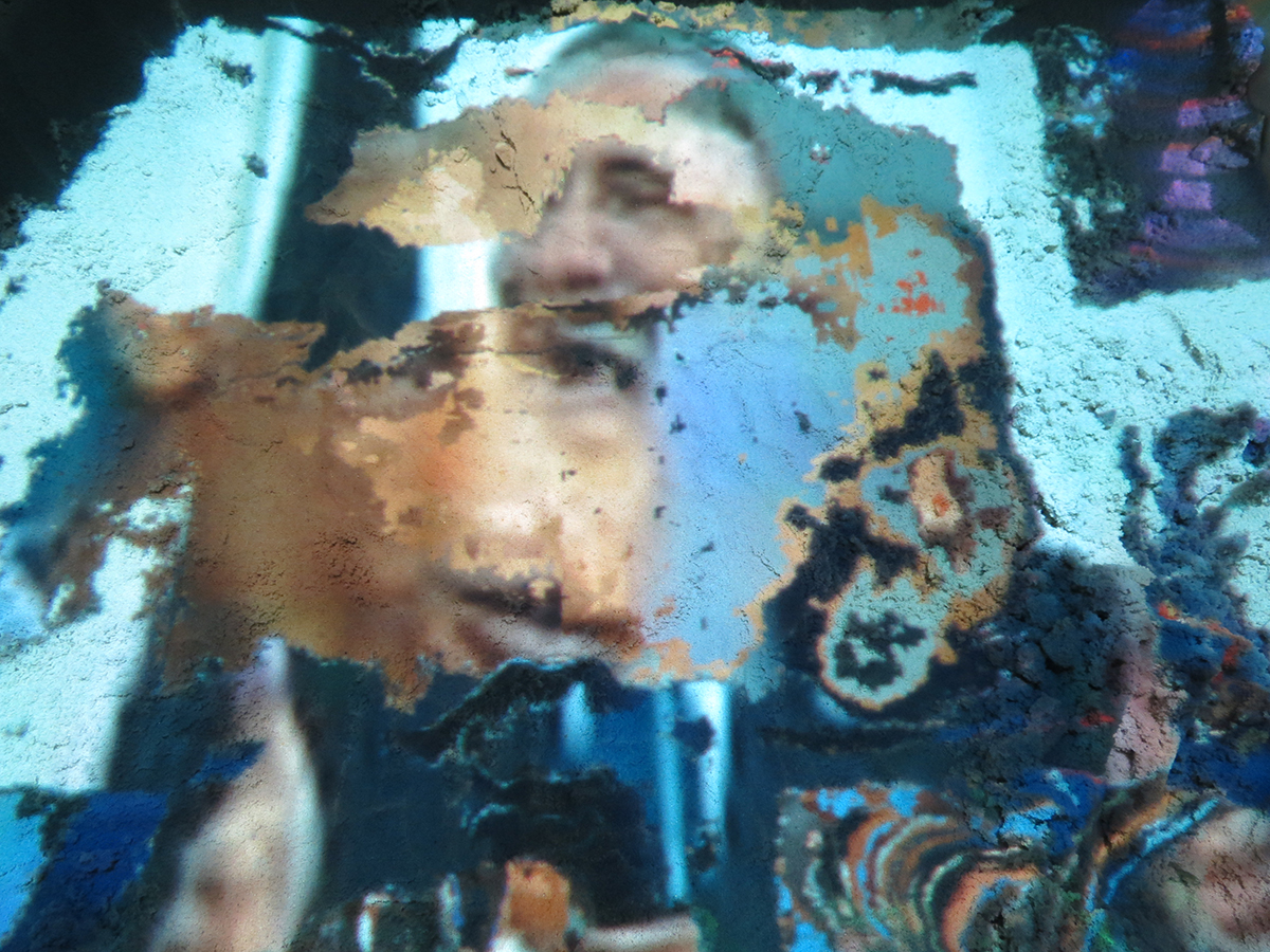
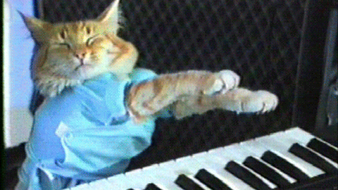
Projection of a GIF onto sand that creates a succession of visual references to famous memes featuring cats, such as the pleading gaze of Puss in Boots in Shrek or the Buttered cat paradox (a cat with a slice of bread around its head). A hand digs into the sand and seems to trigger the sequence of images.
Presentation of the installation
Introduction to the video with the title “Web Archaeology” and credits “Camille Trimardeau + Marjorie Ober. Programming: Jean-Noël Lafargue. Structure: Hélène Pitassi. ESADHaR - June 2016”. We hear hands typing on a computer keyboard as white text appears on a black background.
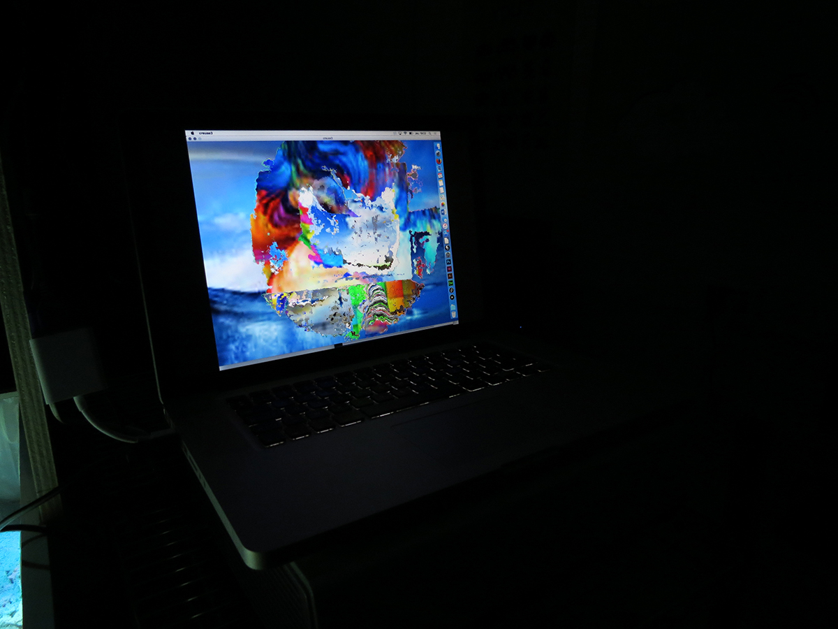
We then see a laptop with hands typing the search term “seabed” into the keyboard. The query appears on the screen in blue against a background of layers of images in shades of white and blue.
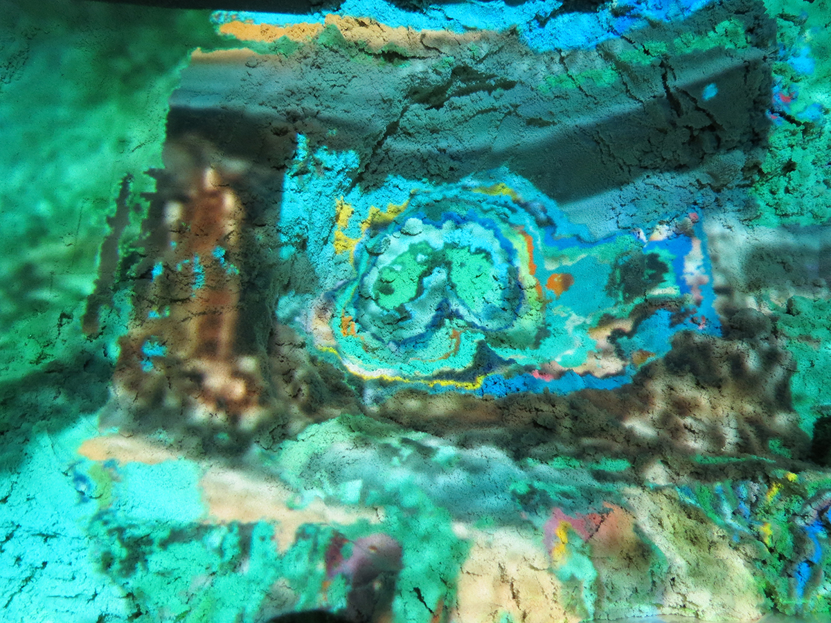
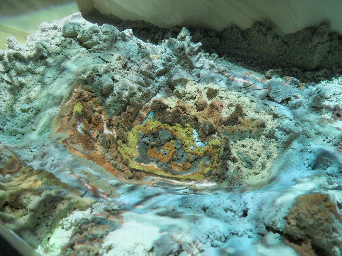
The camera moves sideways to frame a close-up of a sand tray onto which the search results are projected. An arm digs into the material to reveal layers of overlapping images of aquatic landscapes.Detail view
A detailed view of the seabed research, which reaches deeper layers and reveals shades of blue punctuated with yellow and orange. The visual exploration is more abstract here, but it creates more relief, as can be seen from the intensified movements of the hand sculpting the sand.
Text
Interactive installation (prototype) that literally expresses the idea of digging into the web, it is a principle of navigation through images.
A computer connected to the Internet allows you to enter a word into a search engine (Google), which automatically and randomly saves 15 images in the form of superposed strata, using a program developed in Processing 3. This result is then projected onto a sandbox, a Kinect captures the spectator's movements and evaluates the topography. By manipulating the sediments, analogies can be observed between the images that are created in layers of depth.
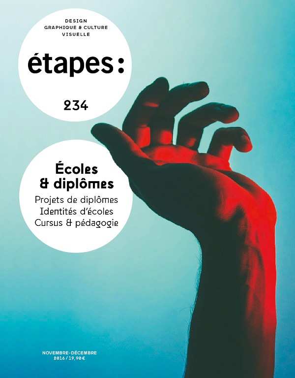
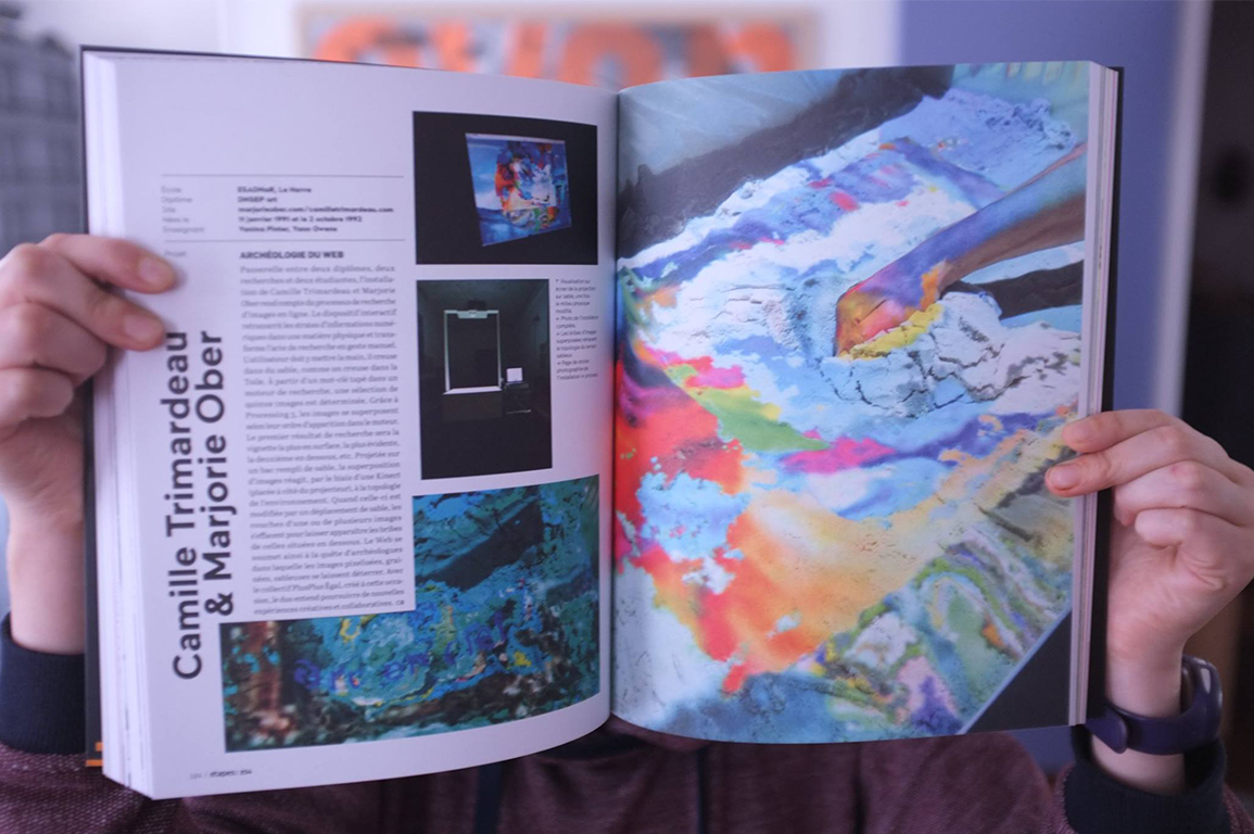
Project published in Étapes: 234 (Écoles & diplômes) magazine in November 2016 and presented in video at the Saint-Étienne Design Biennial during the exhibition Le Monde, sinon rien (The World or Nothing) from 6 April to 31 July 2022 at the Cité du Design.
Infos
- Year:
-
2016
- Location:
-
École Supérieure d'Art et Design Le Havre-Rouen, Le Havre campus, (multimedia room).
- Type:
-
co-creation with Camille Trimardeau
- Material:
-
table, wood, sand, video projector, Kinect, computer, Internet.
- Programming (Processing 3):
- Jean-Noël Lafargue
- Structure:
- Hélène Pitassi
-
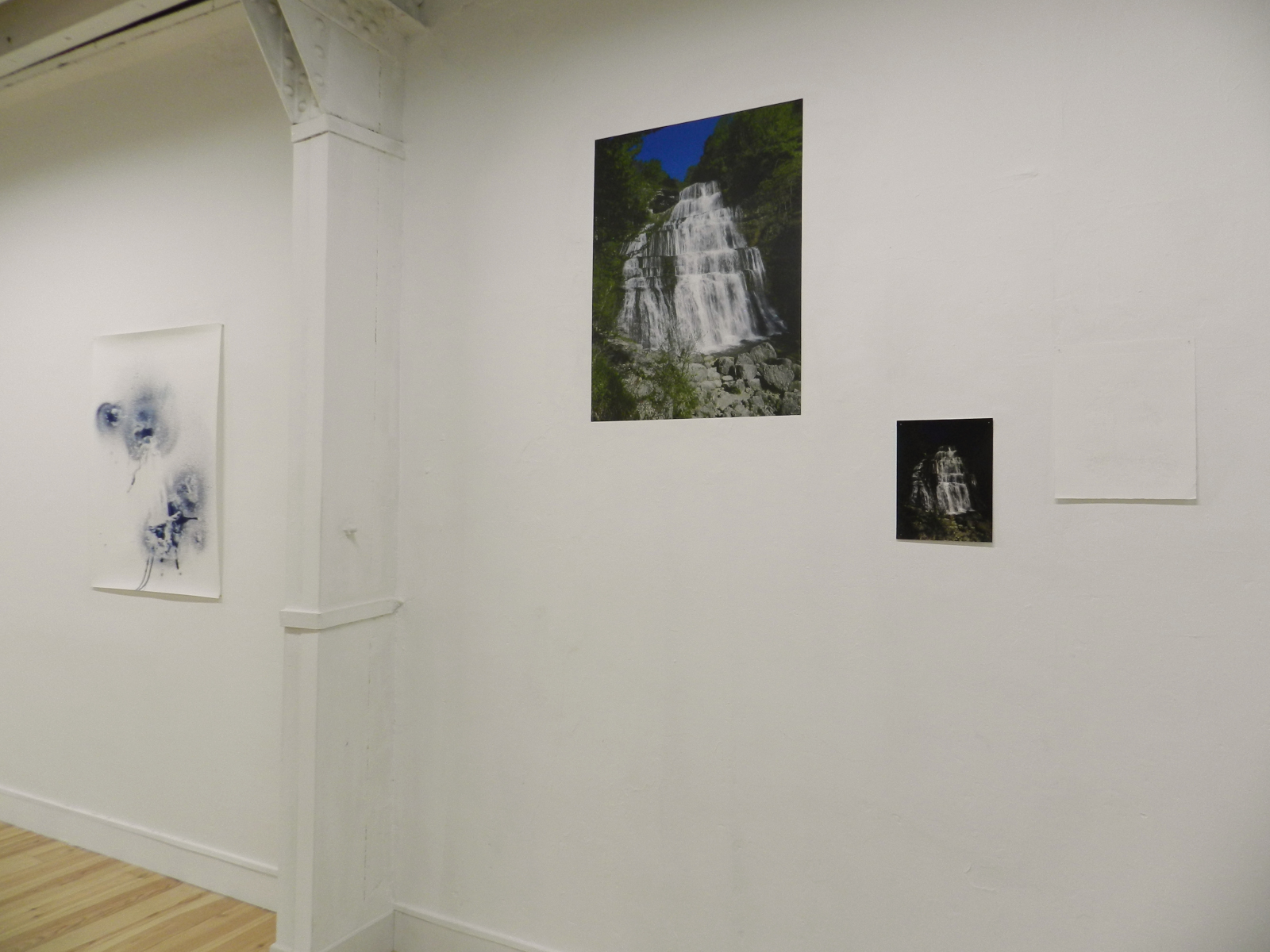
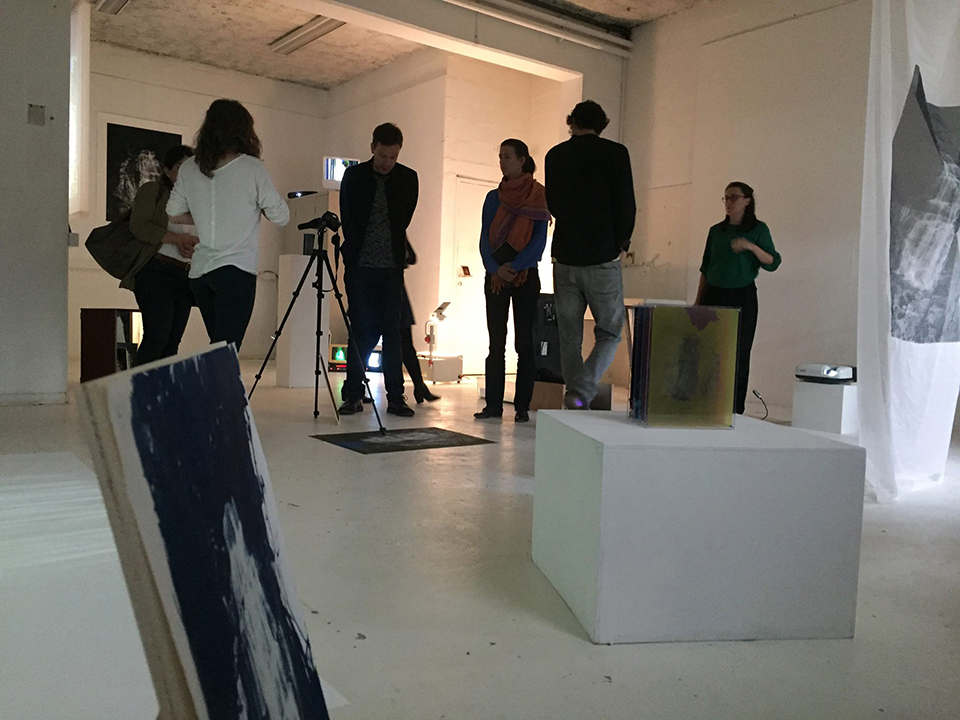
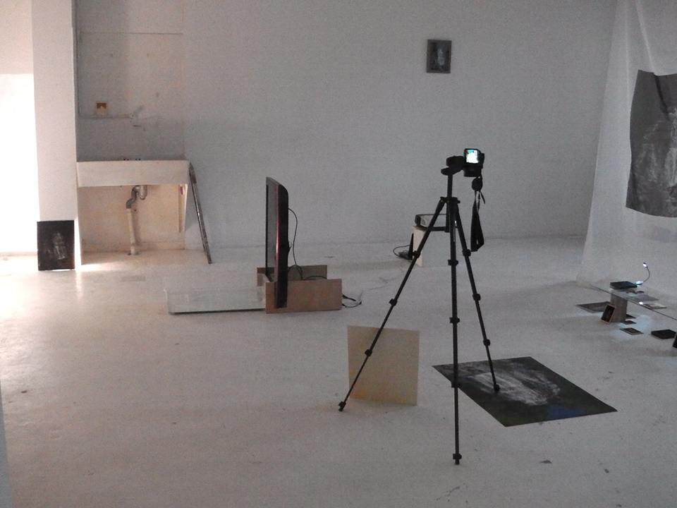
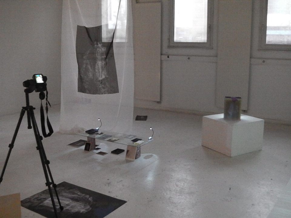
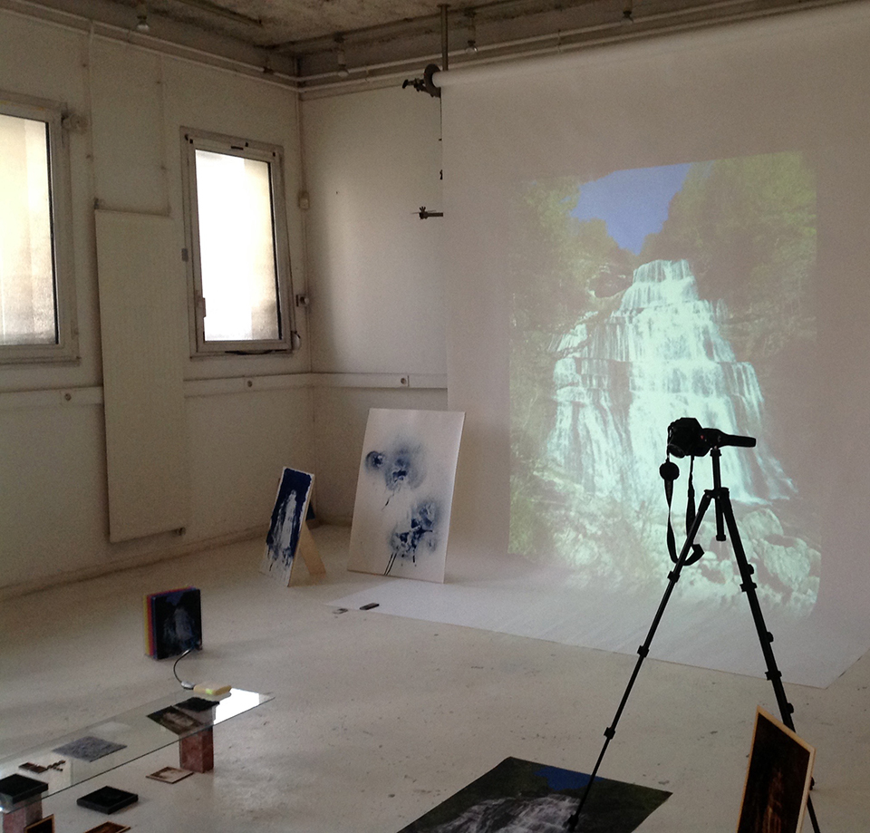
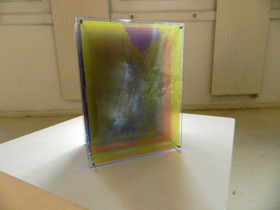
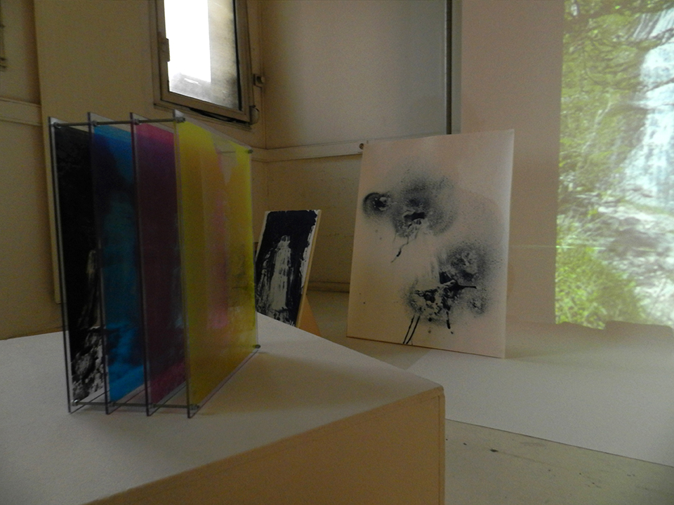
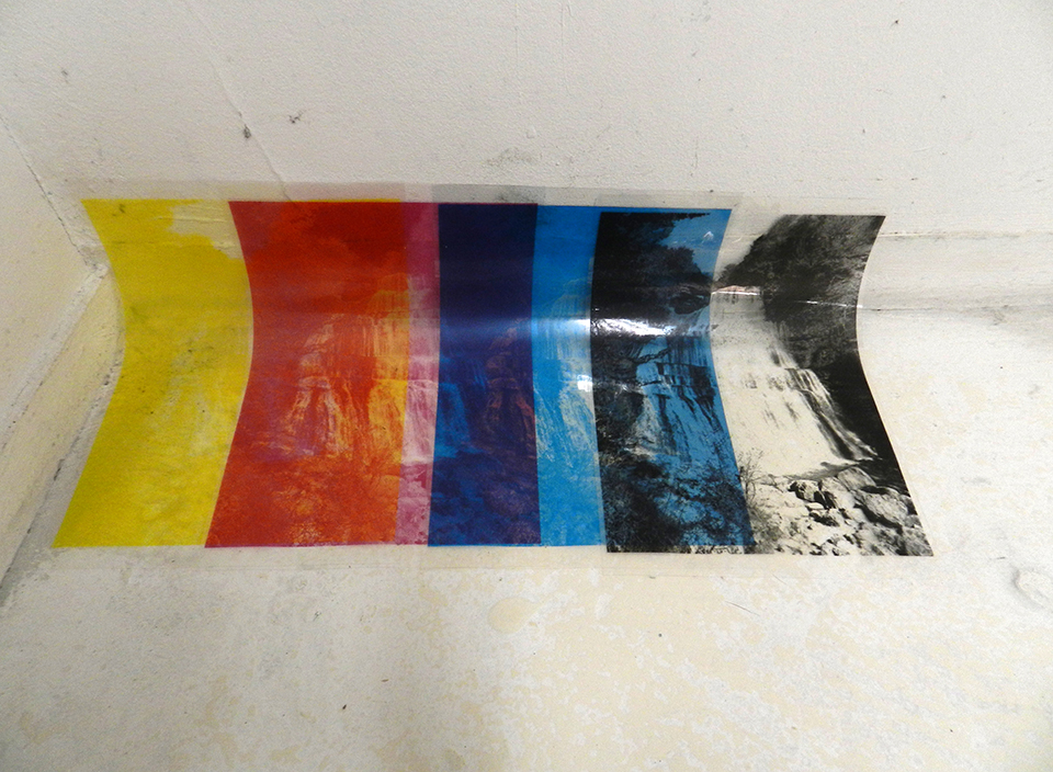
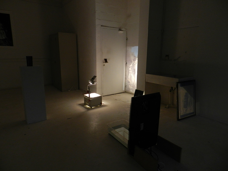
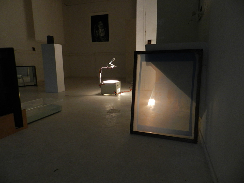
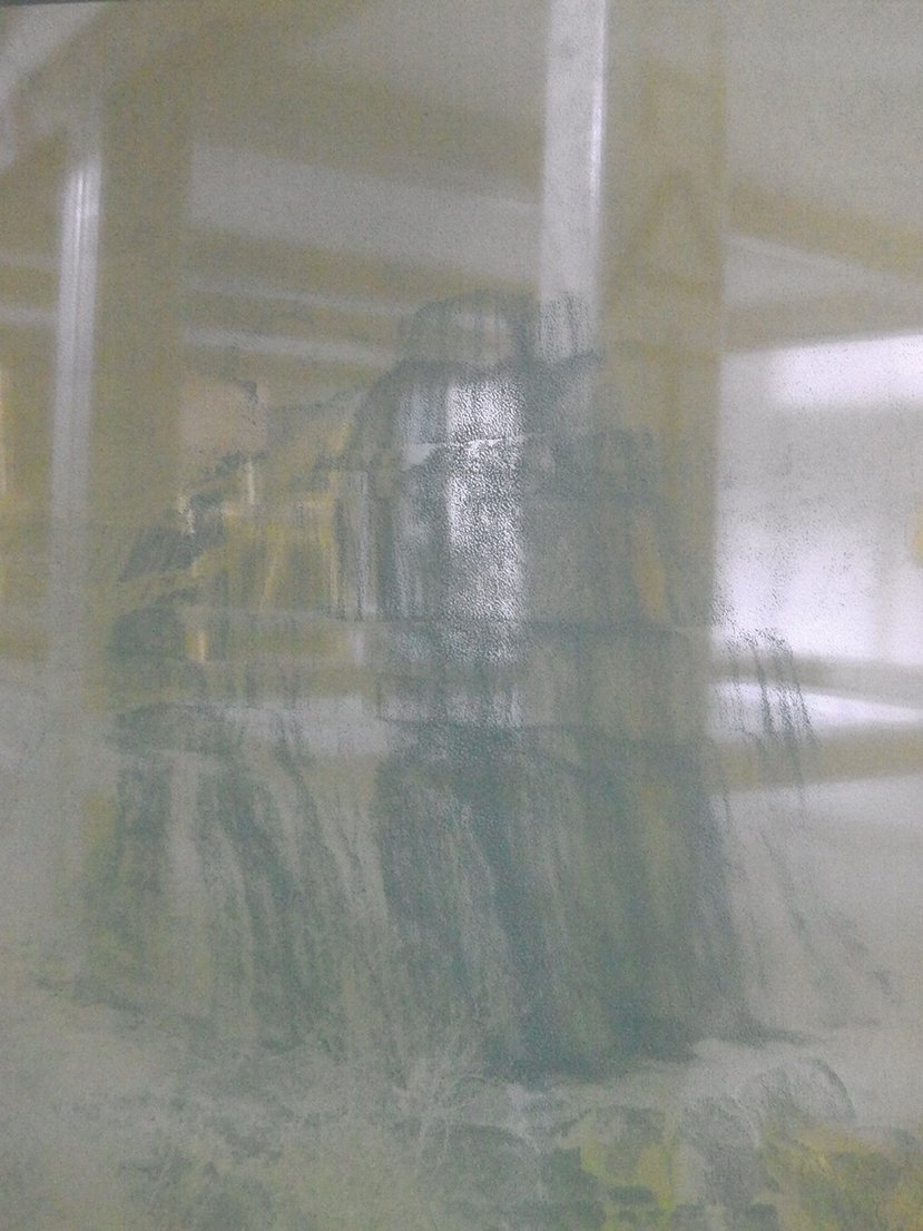
Installation
Images
Text
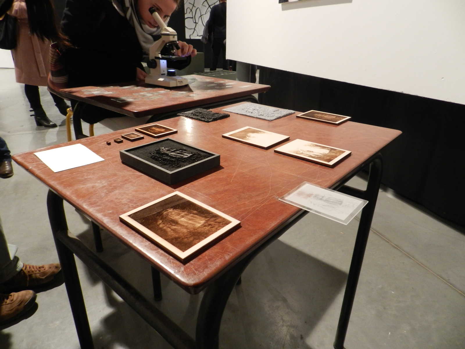
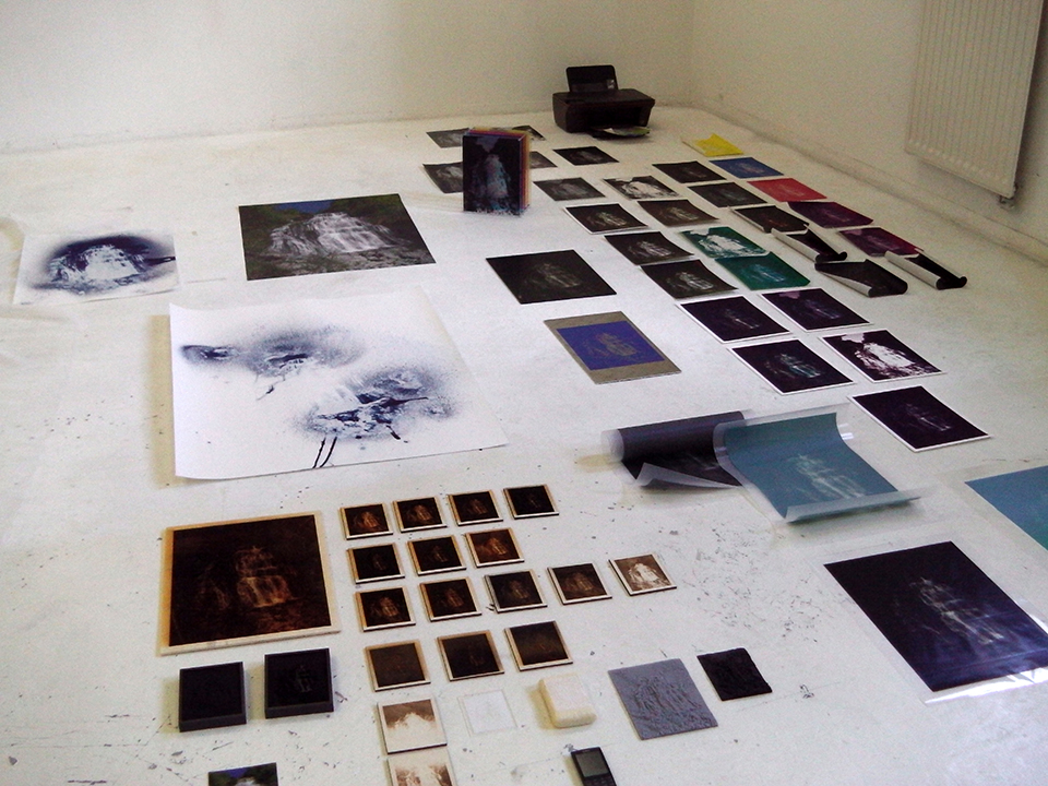
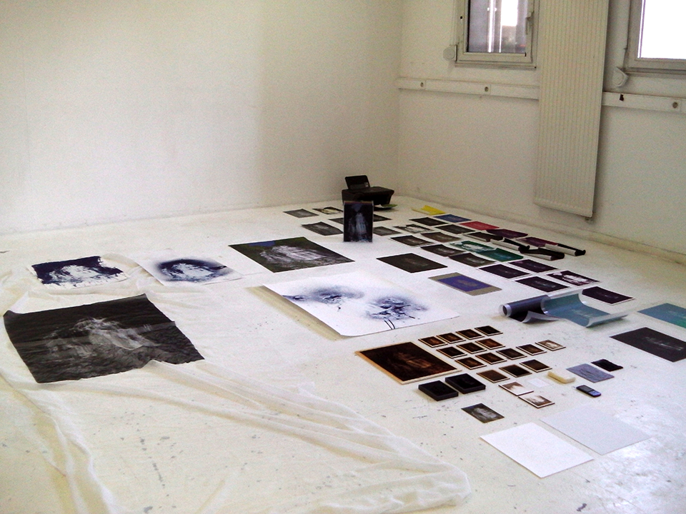
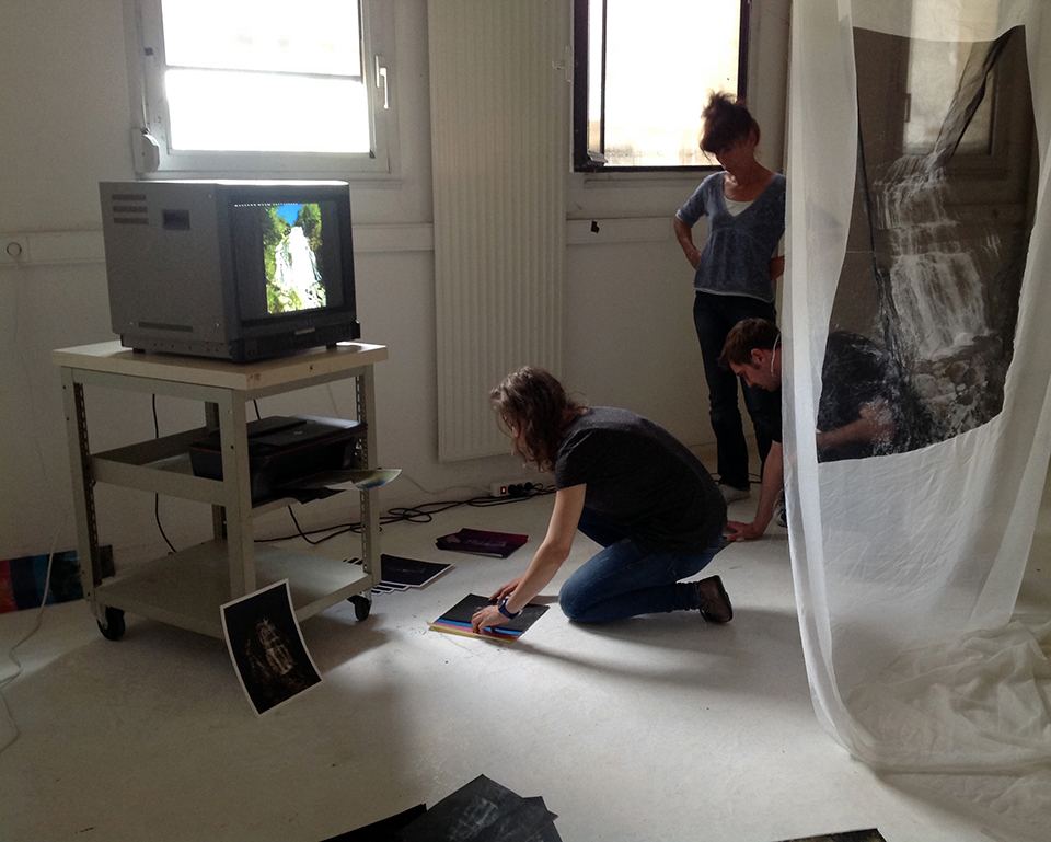
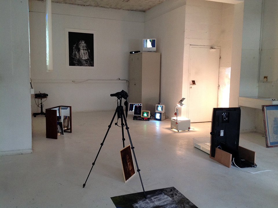
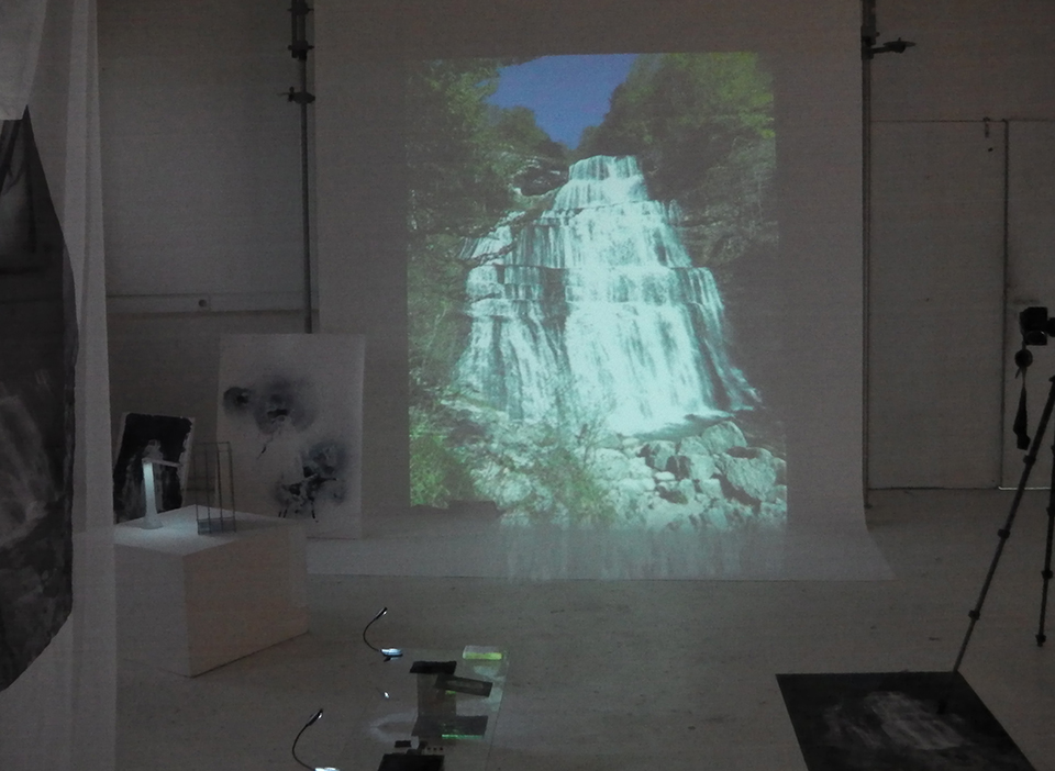
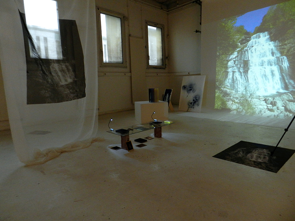
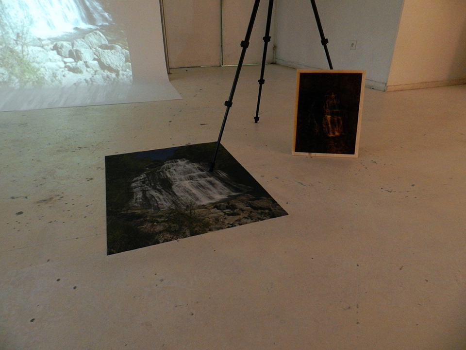
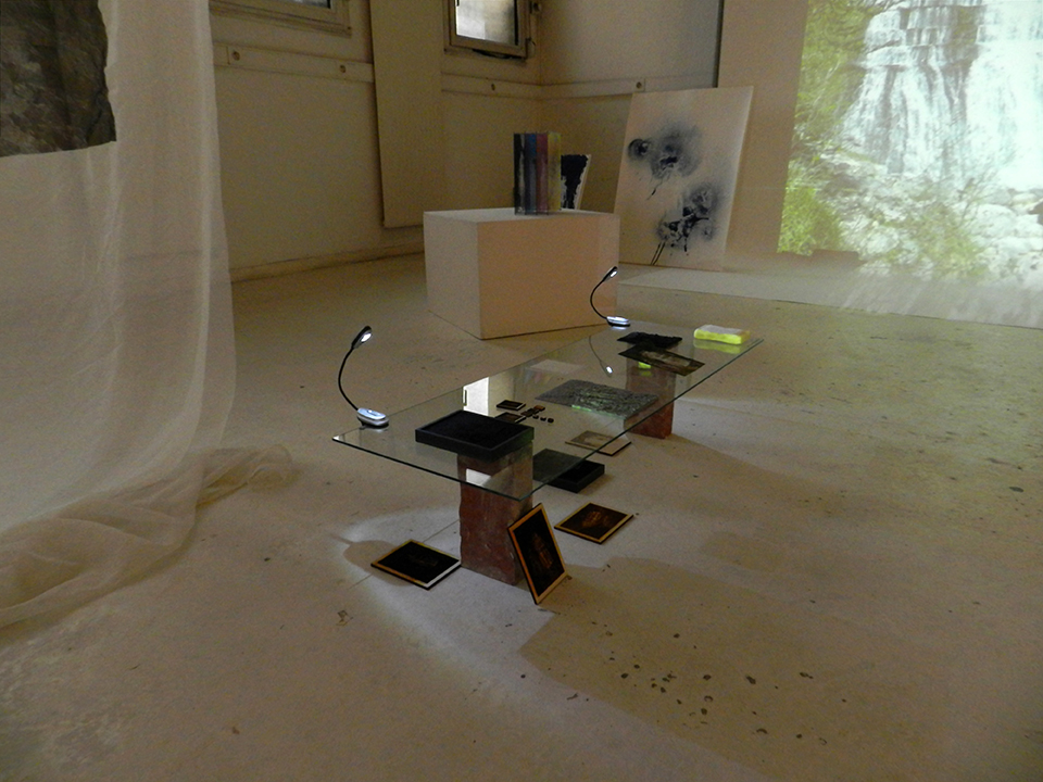
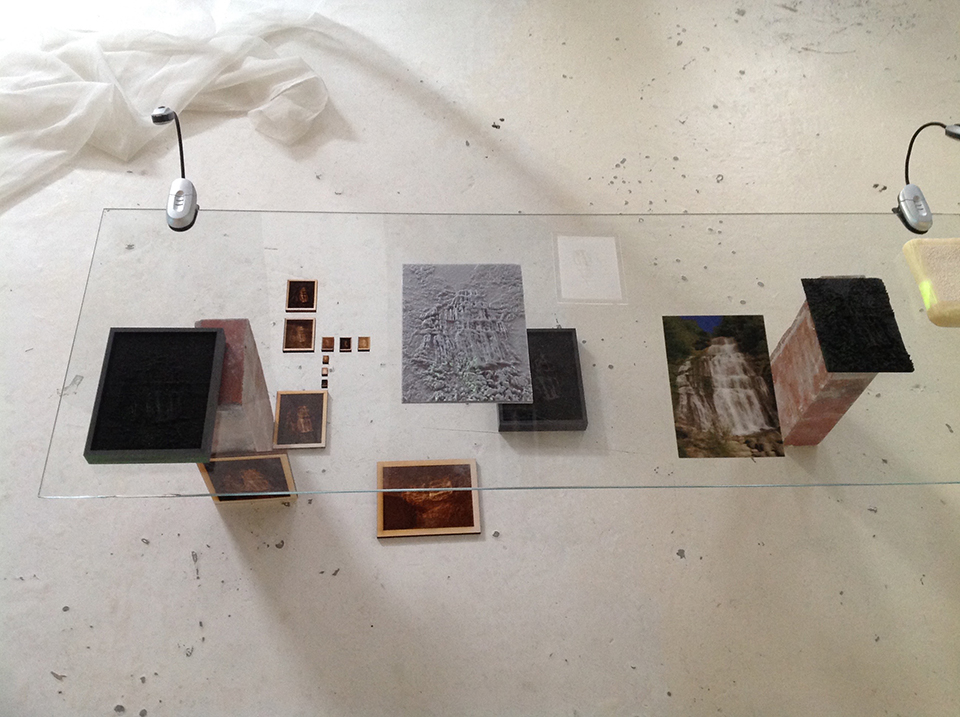
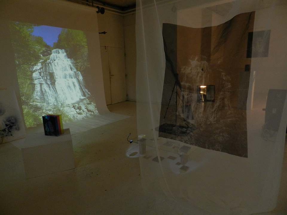
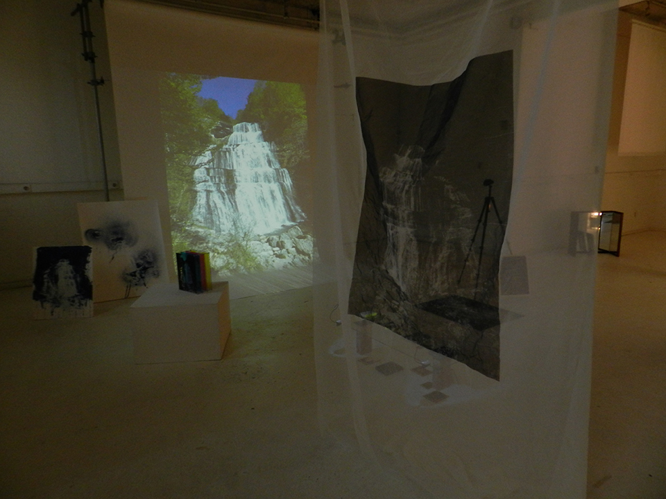
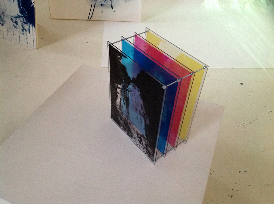
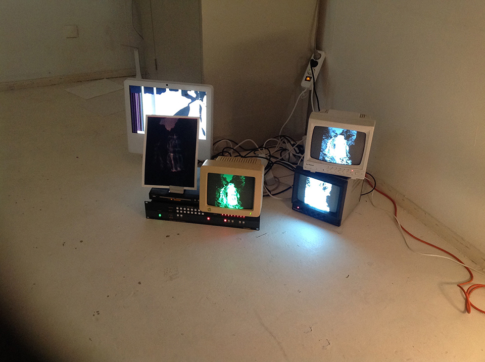
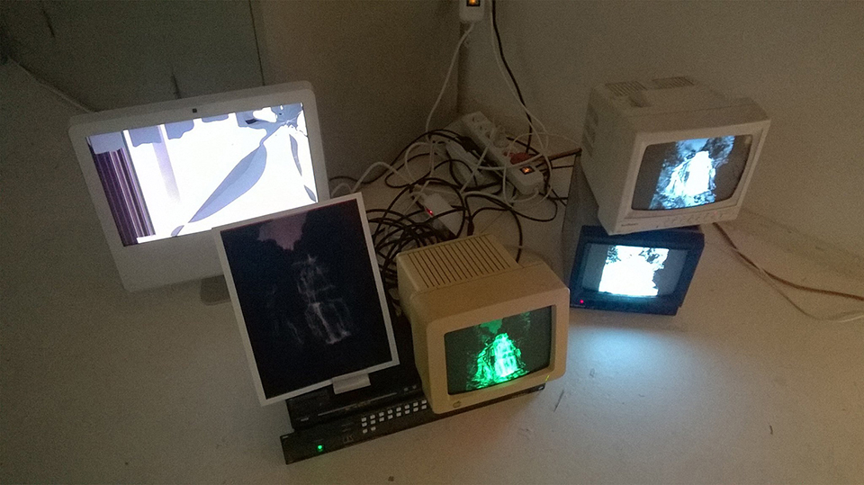
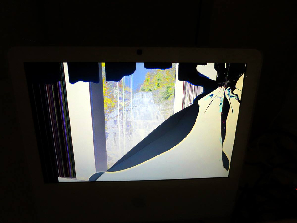
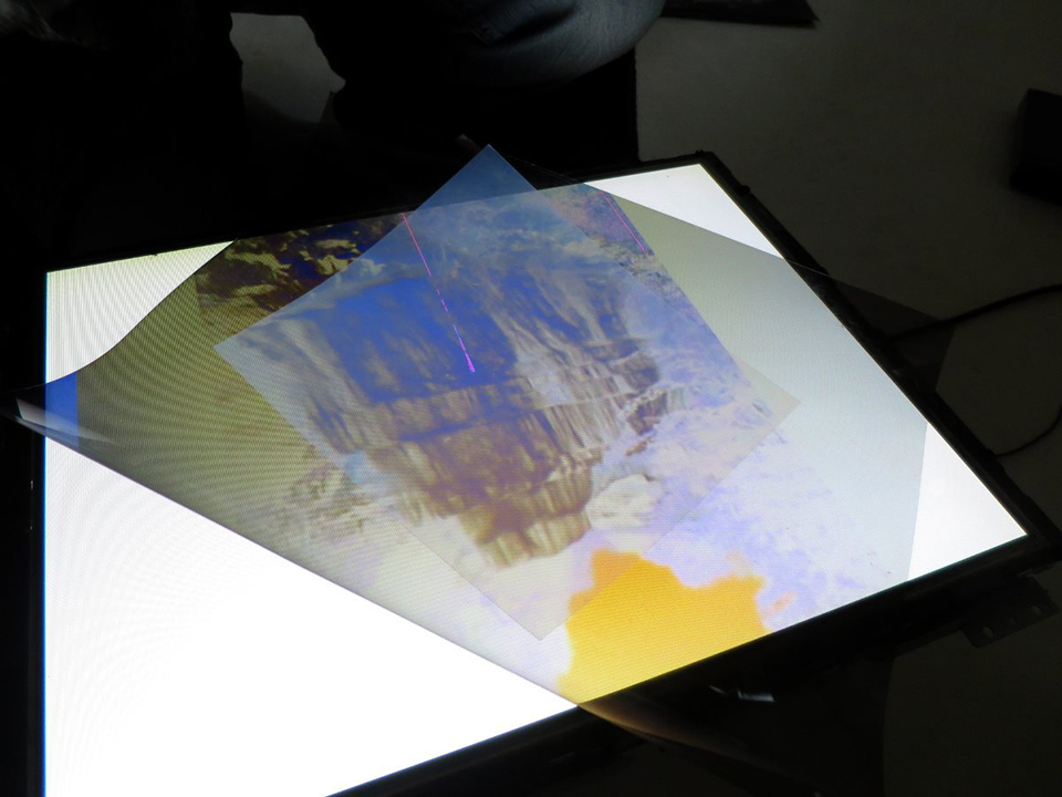
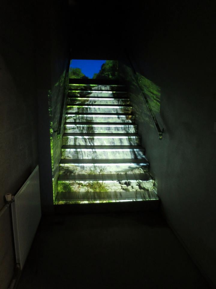
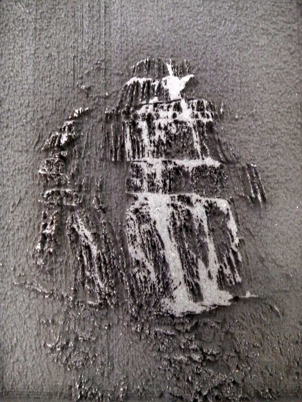
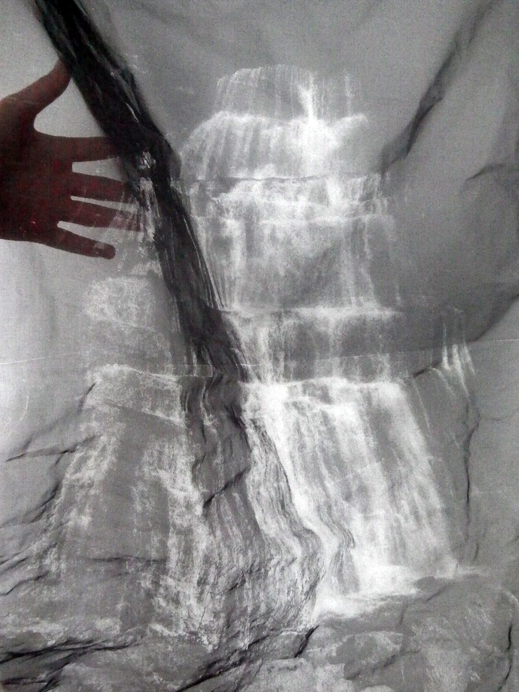
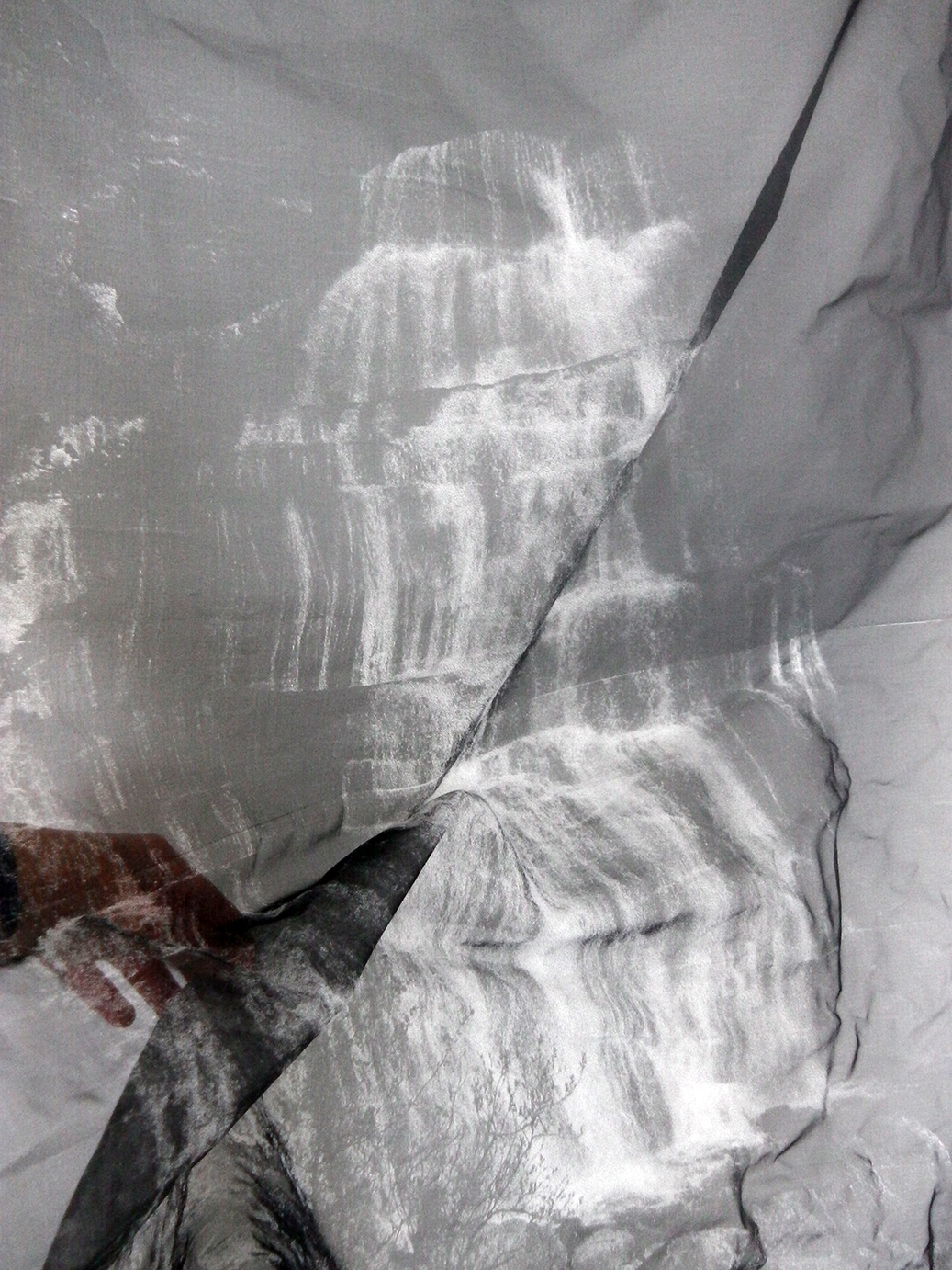
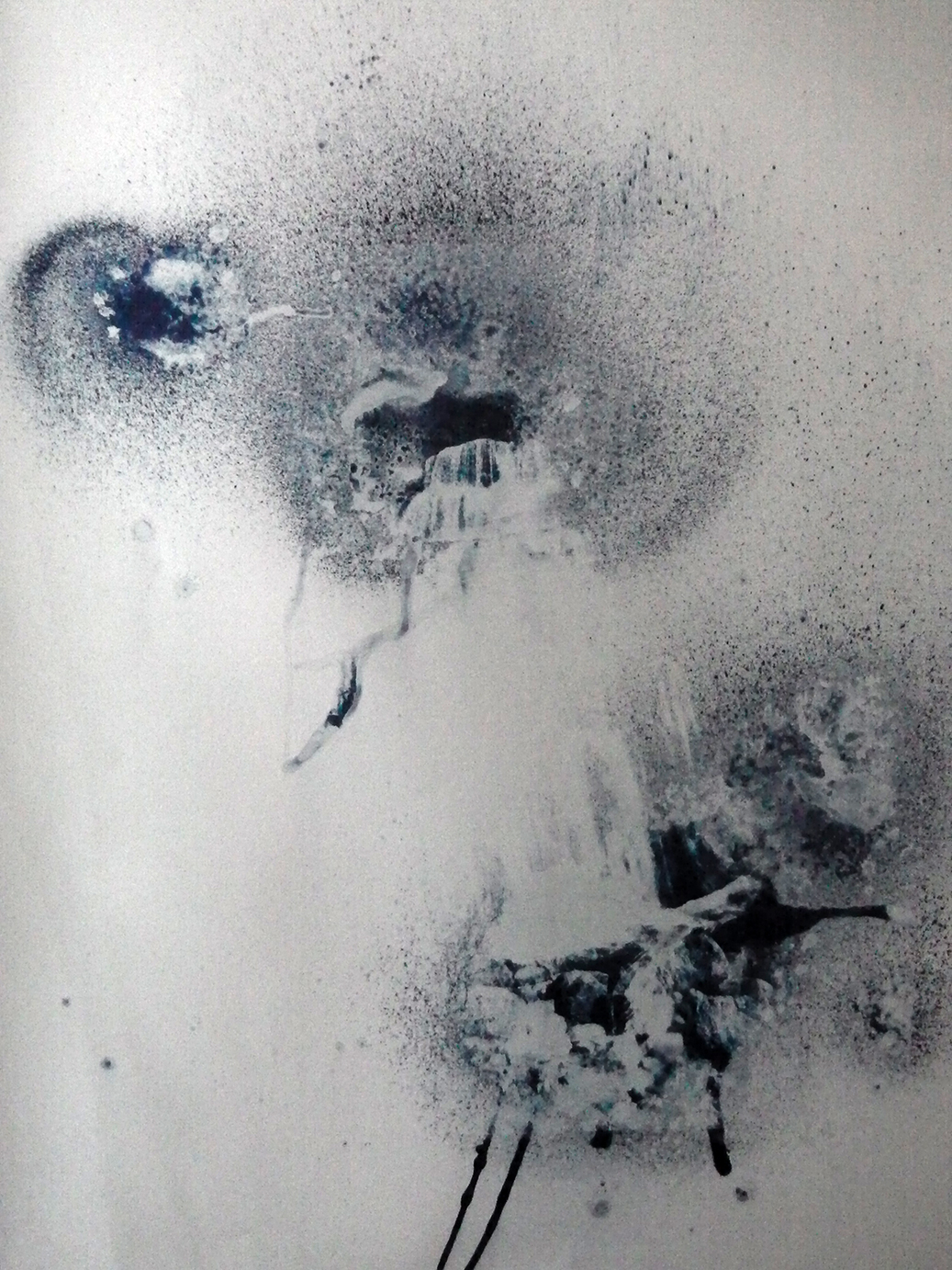
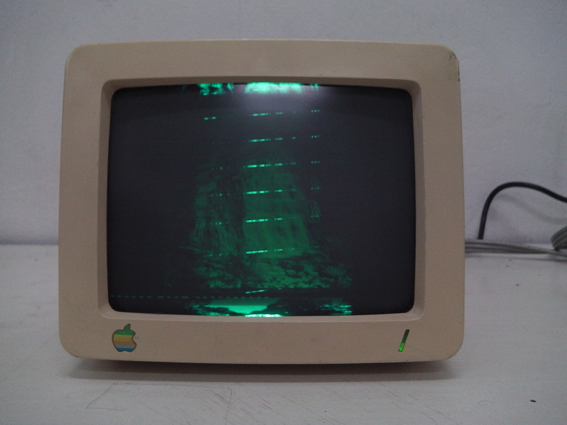
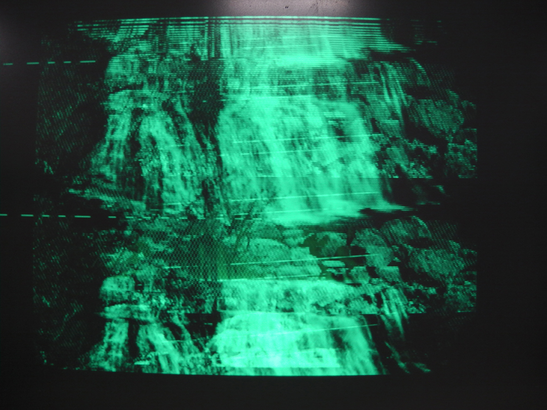
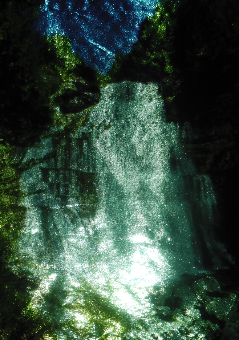
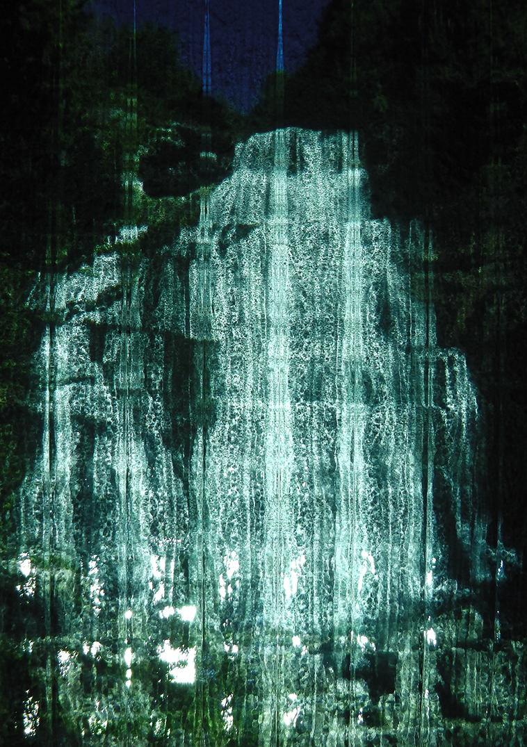
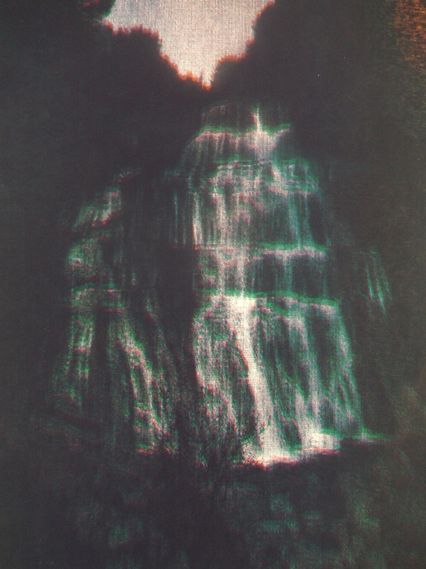
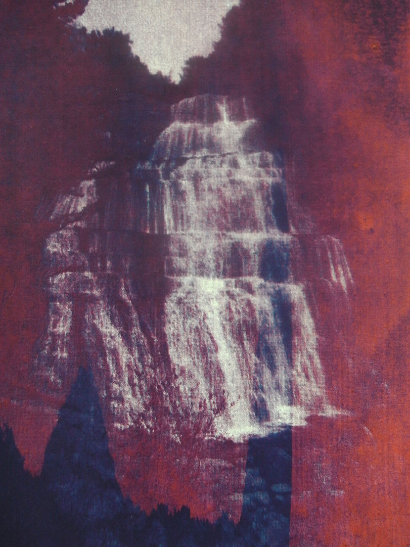
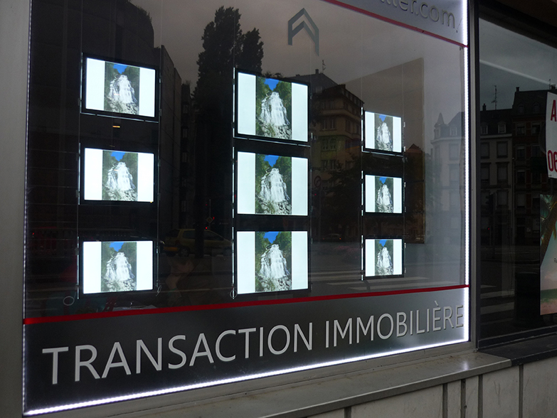
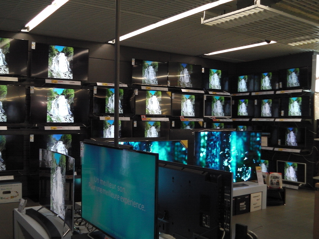
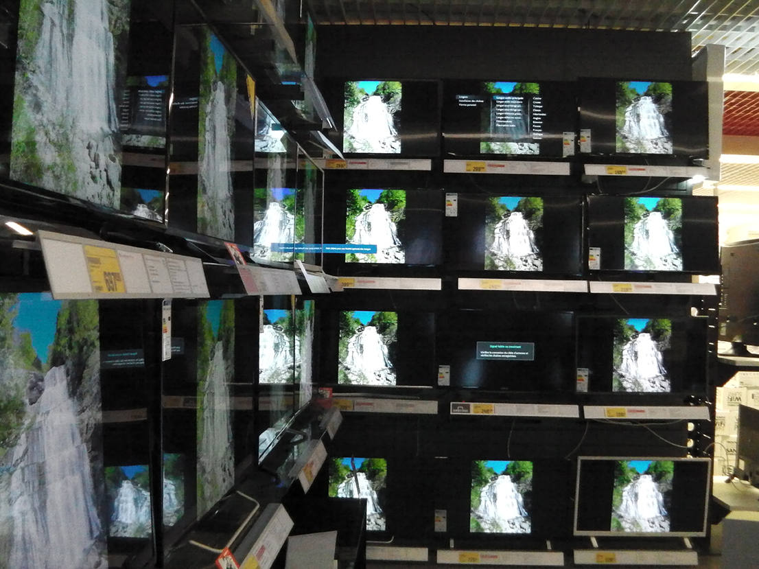
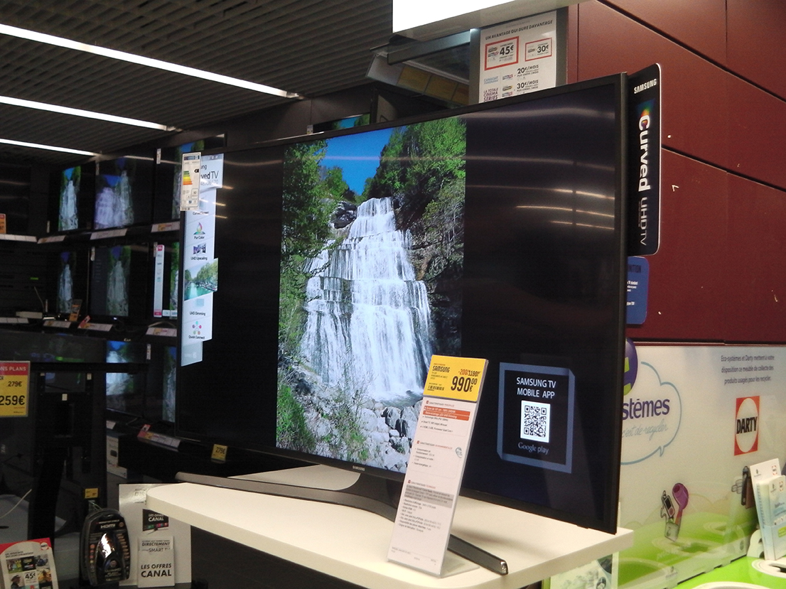
Experimental project conducted in DNSEP: a creative process that traces the cycle of an image (source), such as a collection of occurrences of that image. Research laboratory organized in three phases: documentation (immersion, information) / experiments (techniques and plastics) / installation (space setting and connections between the parts, curating).
This project affirms the (purely) medial existence of the image, it raises the question of the multiplicity of its appearances, and of our inability to anticipate them (all), it is a major concern for web designers for example, facing the possibilities of the responsive.
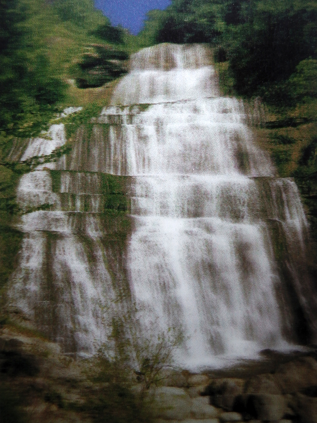
Apart from the question of support, there is still the technique that comes into play. The liquidity of the image, this waterfall, captured in its reality, captured in its environment, seemed obvious for some transpositions: aqueous techniques such as silkscreen printing, the fluidity of the digital, etc. This “spinning” context allowed me to “follow” this image as it crossed mediums, and to observe its changes of state from paper to screen, each movement offering it its own materiality and different plastic potential. This “vertical” exploration, which brings the gaze into the image, (re)defines our relationship to technical reproducibility (Walter Benjamin says) and pictorial creation, from printing to display. It is a letting go, decompartmentalizing from the computer's straitjacket that can sometimes lock us into a certain aesthetic, a systematism.
The installation, which was initially intended to be a kind of flattening, an assumed display, revealing the relief by the objects themselves, without hierarchy, and recalling the restitution of archaeological excavations, finally became a living installation, establishing poetic and/or philosophical connections, rather than a scientific inventory.
Infos
- Year:
-
2016
- Location:
-
École Supérieure d'Art et Design Le Havre-Rouen, Le Havre campus, (photo studio).
- Type:
-
personnal projet
- Image:
-
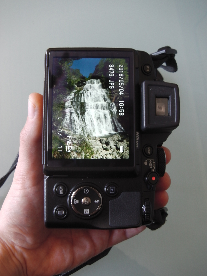
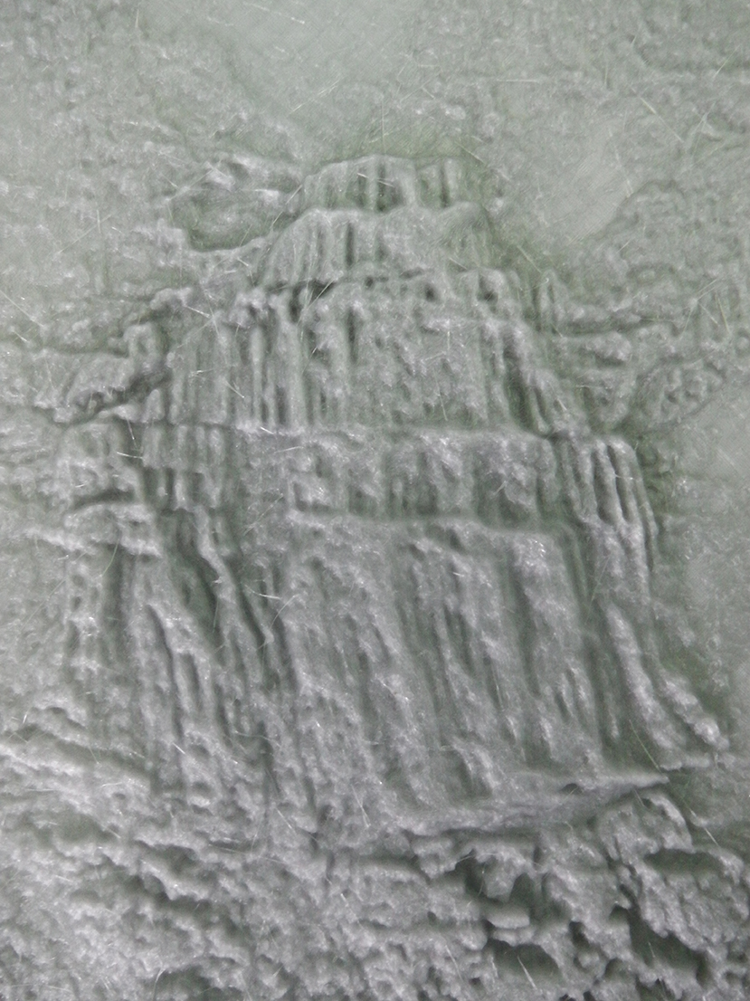
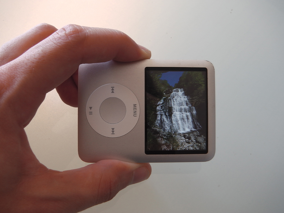
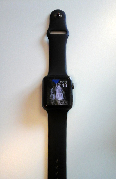
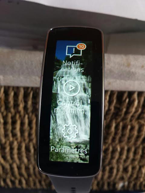
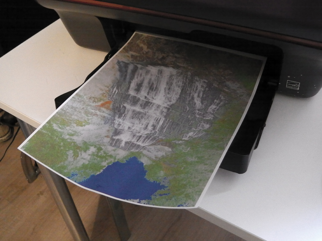
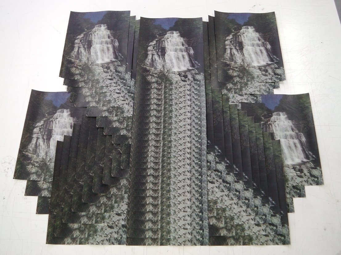
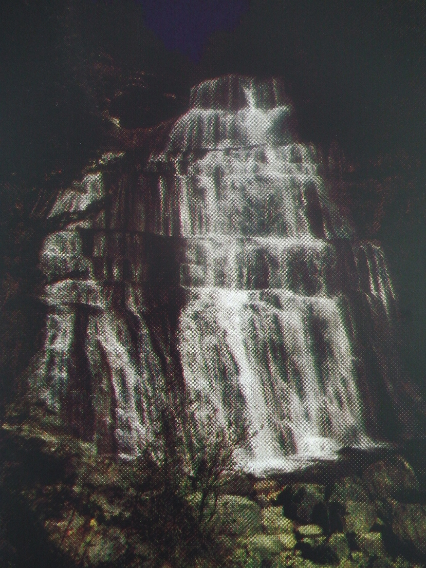
Éventail waterfall, Hérisson domain, Jura (personal photograph).
-
- Printing
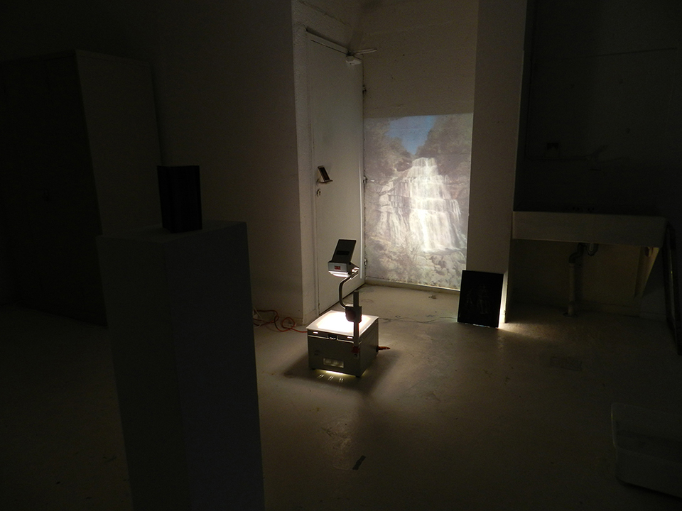
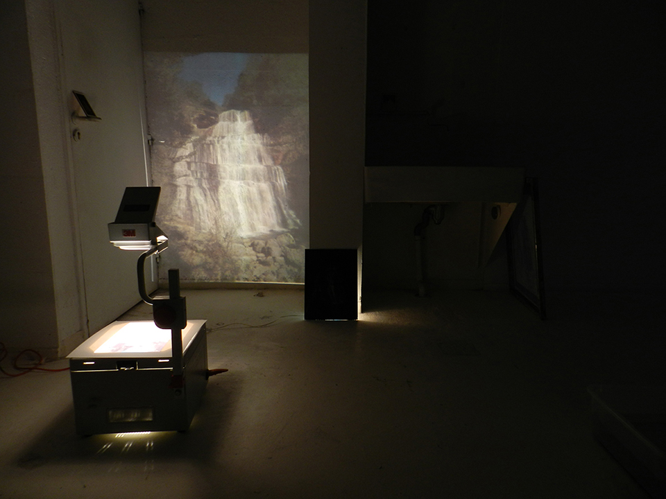
- Experiments
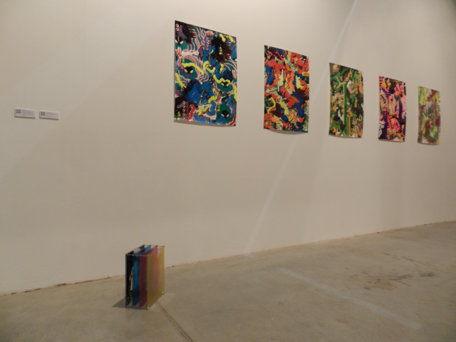
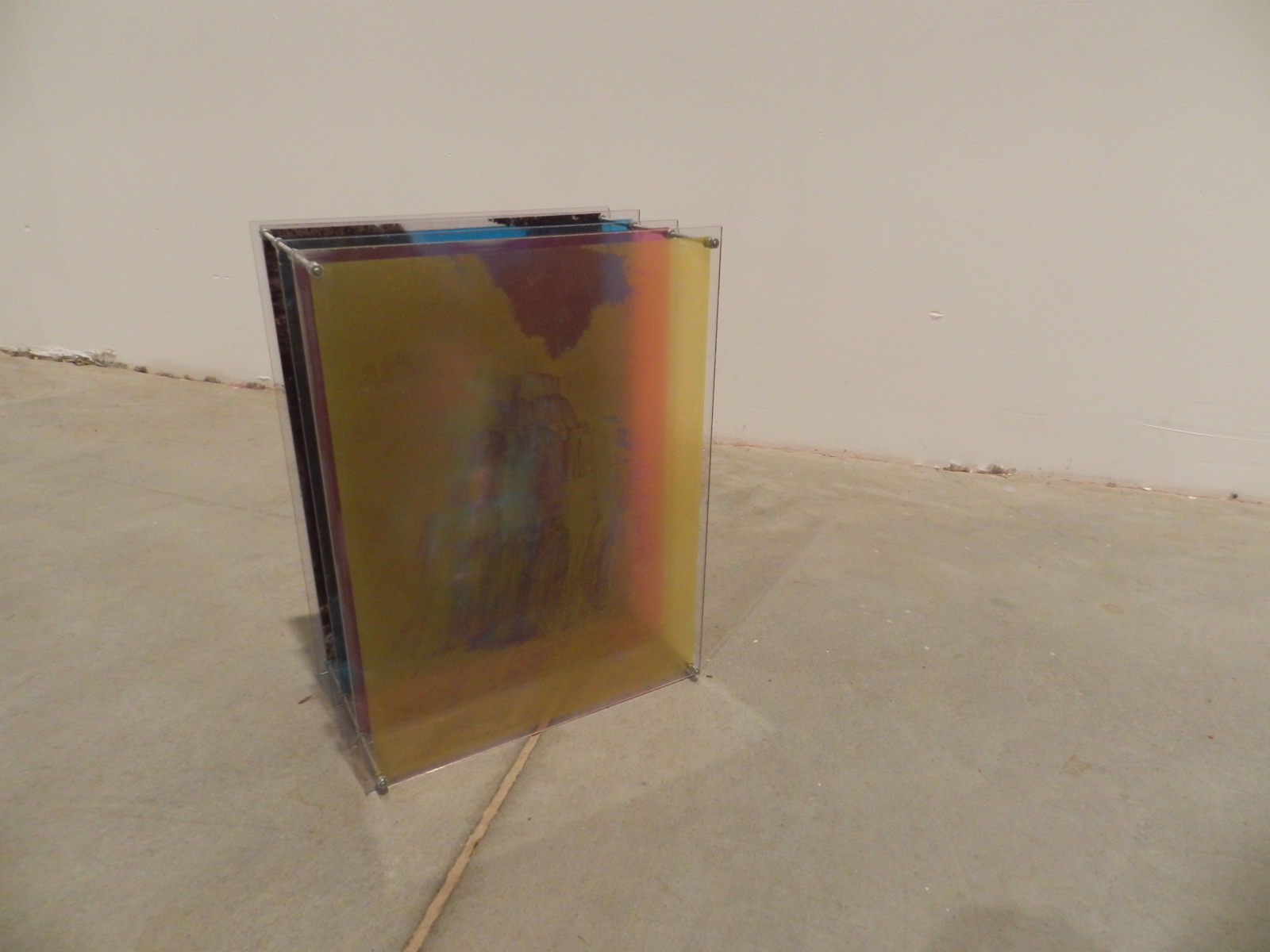
Images
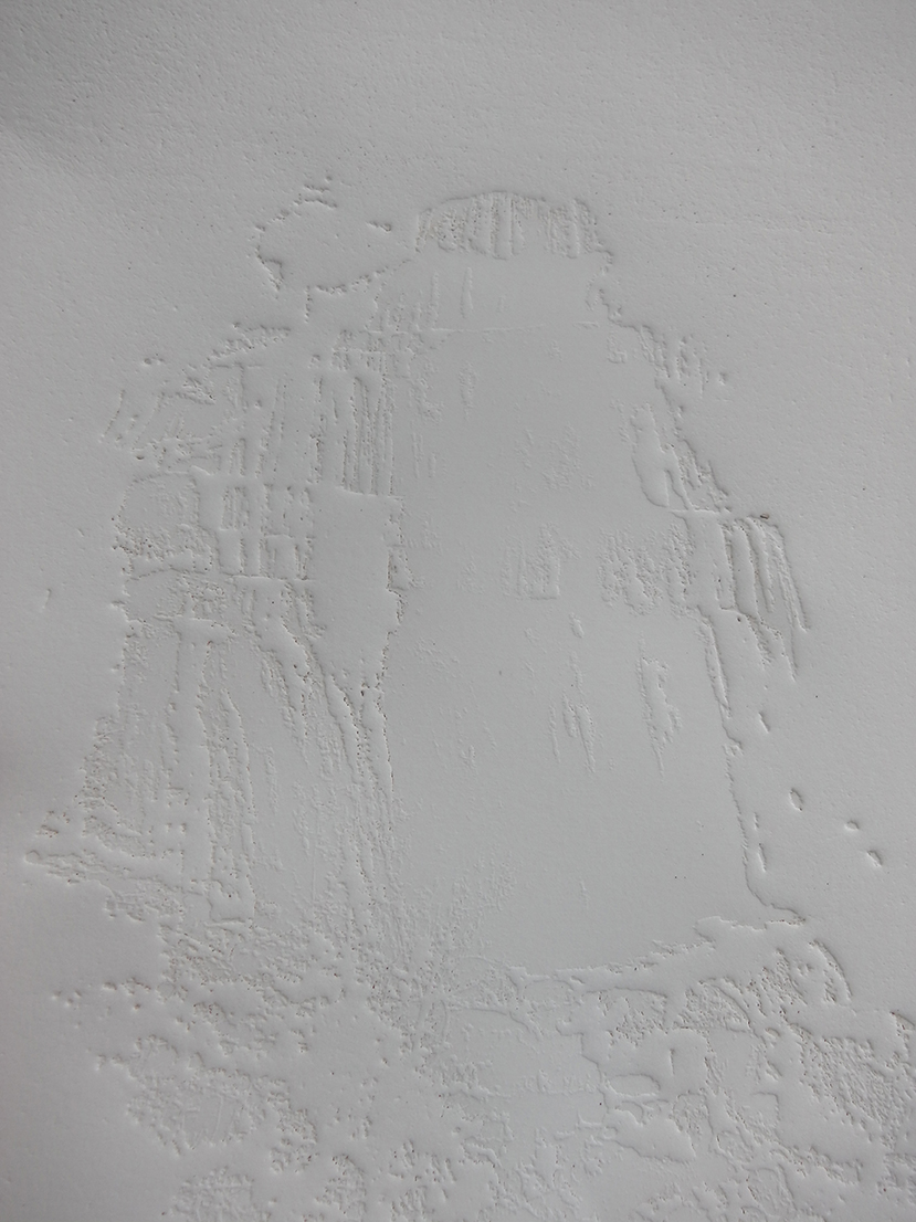
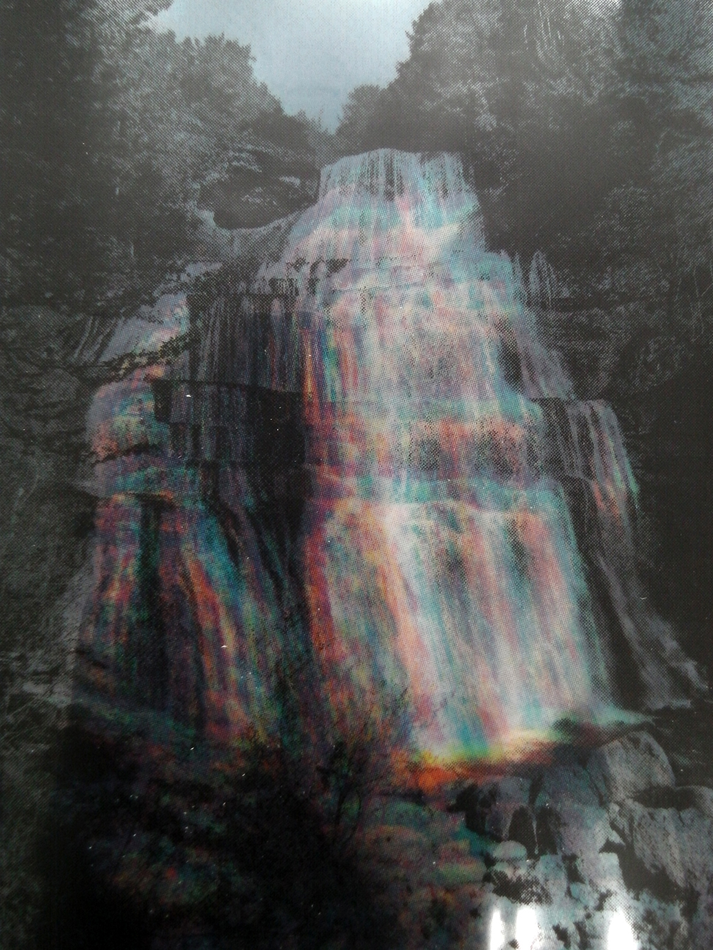
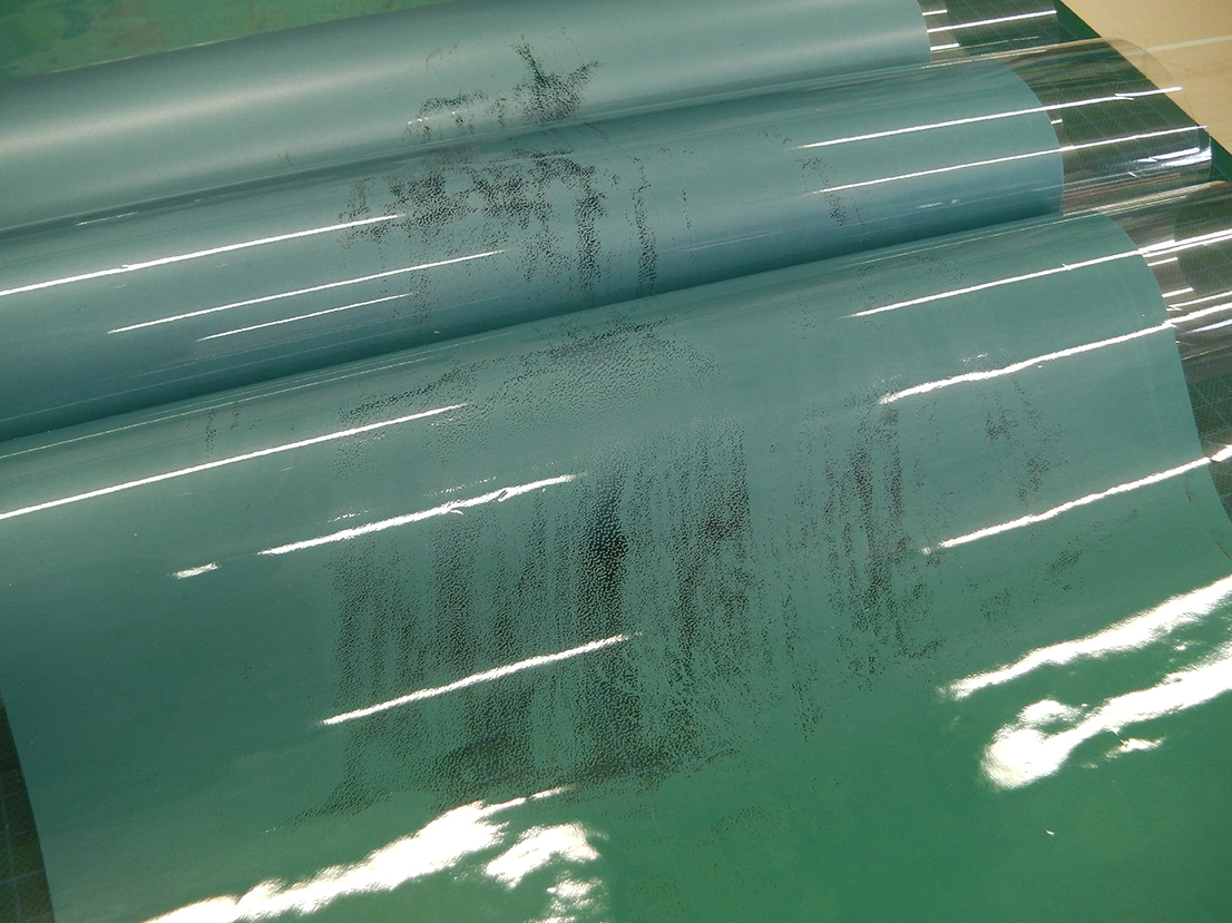
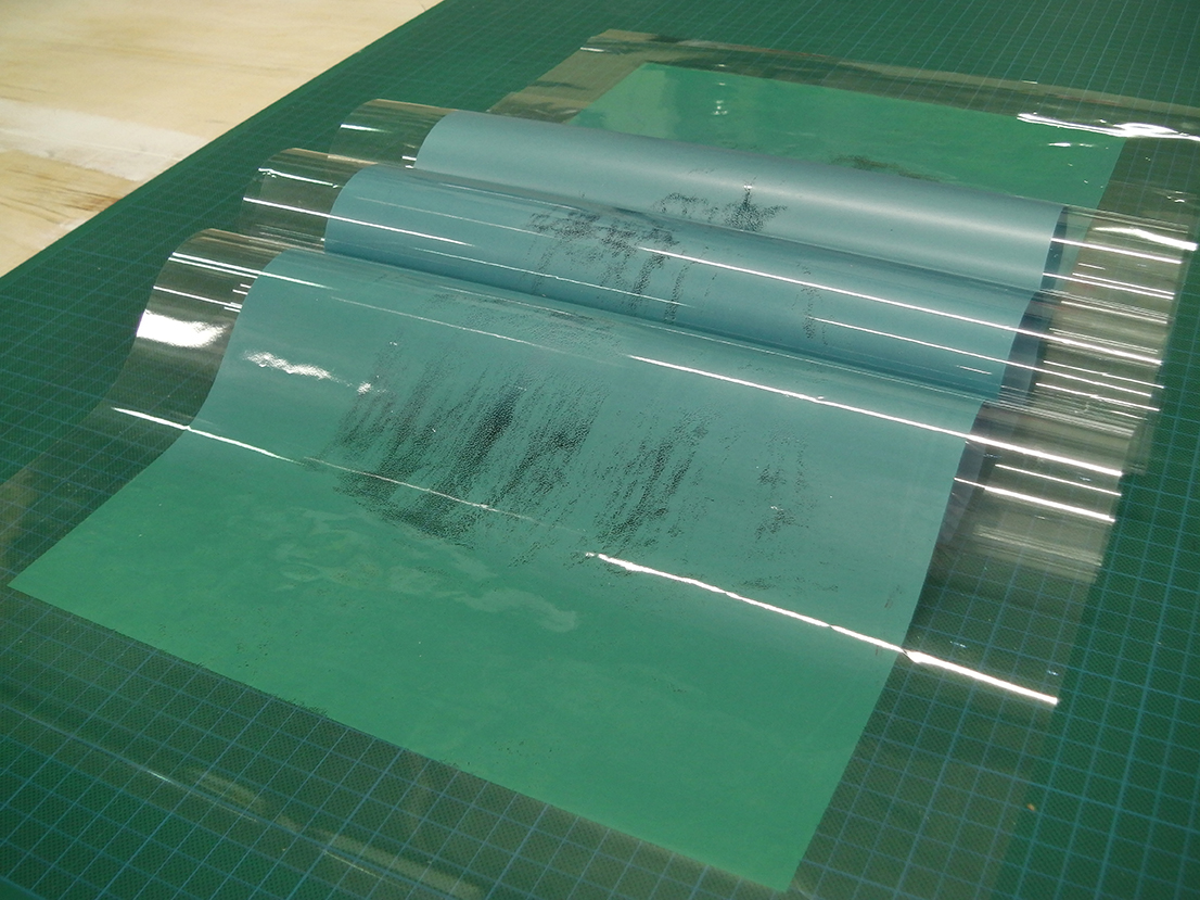
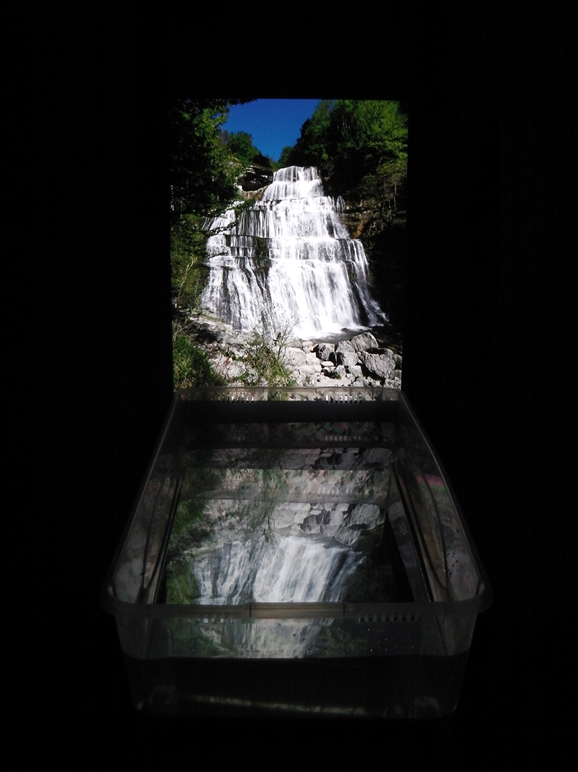
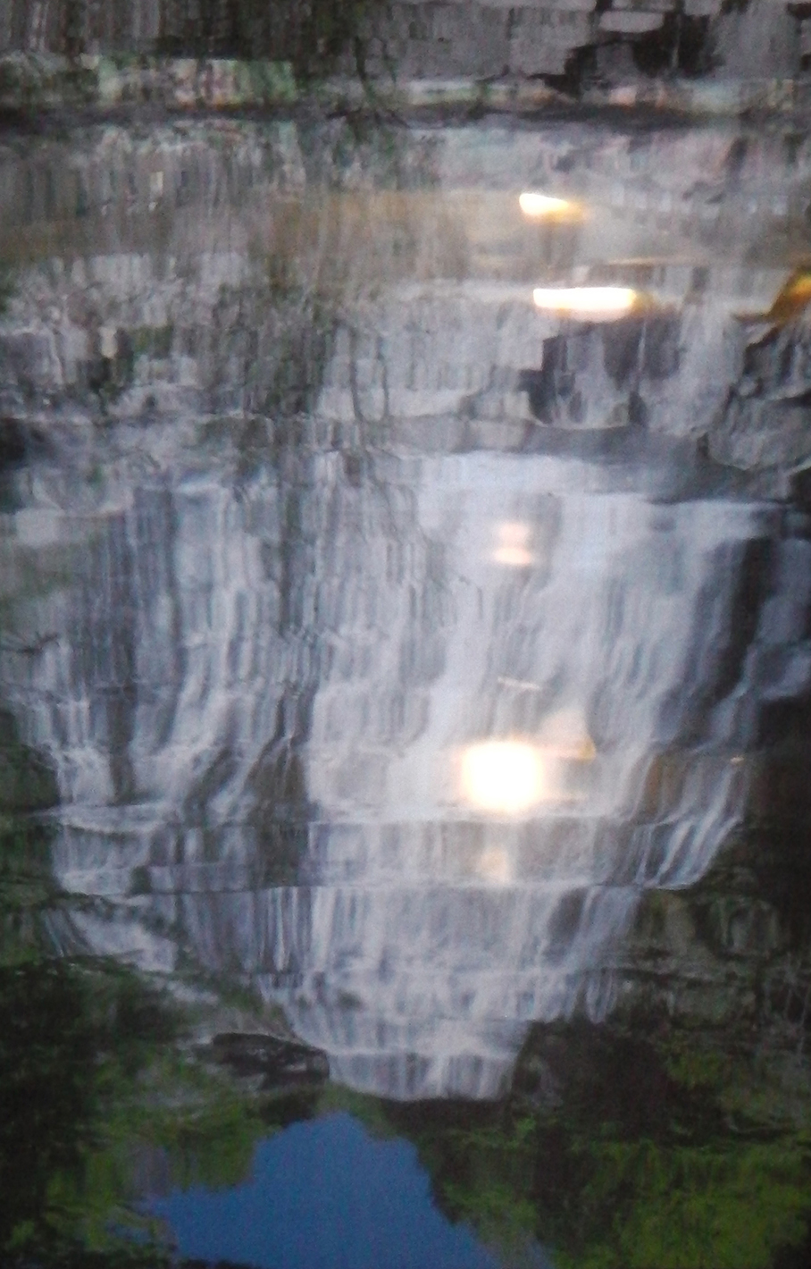
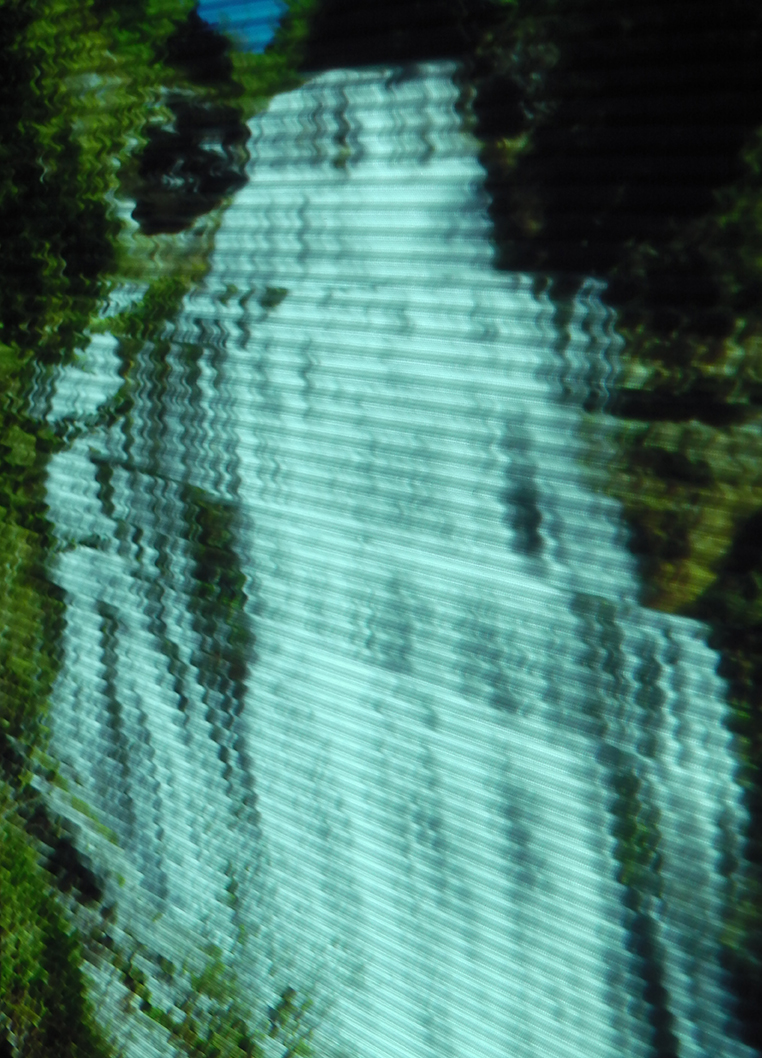
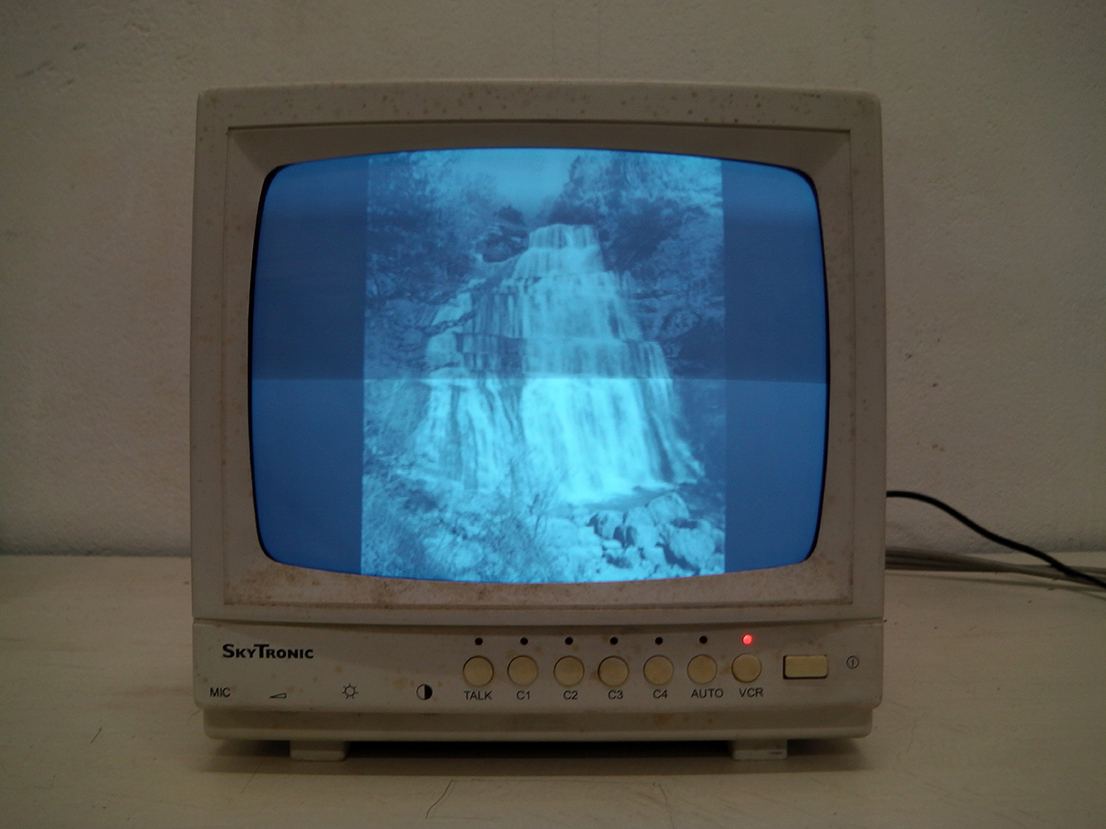
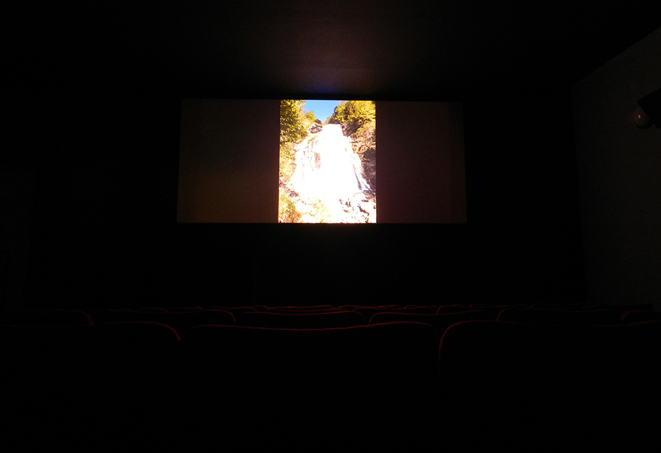
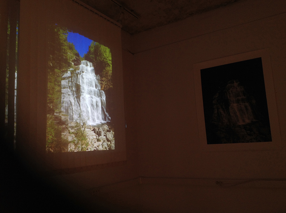
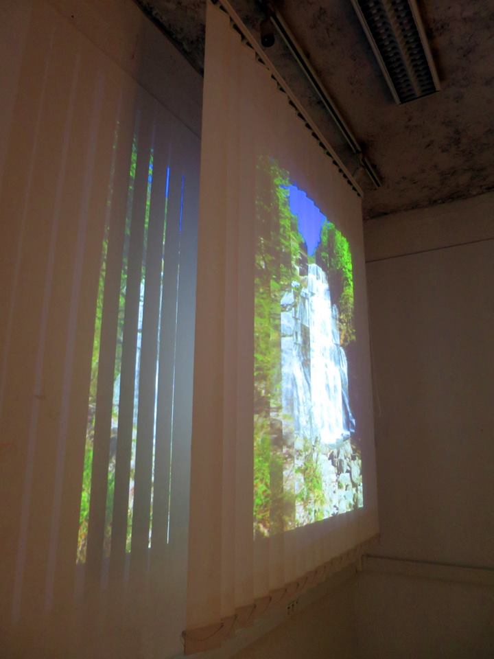
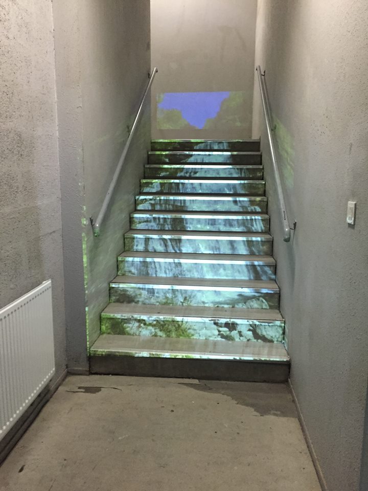
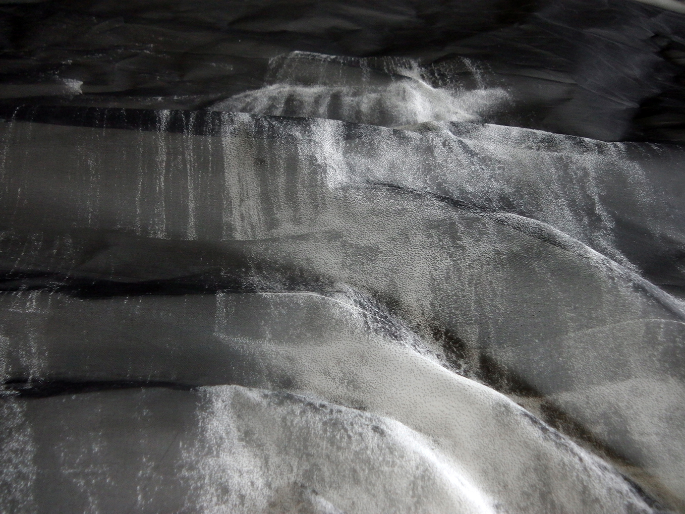
Éventail waterfall reflection
Close-up view of the reflection of the Hérisson Waterfall from a screen in a tank of agitated water whose waves gradually calm down.
Text
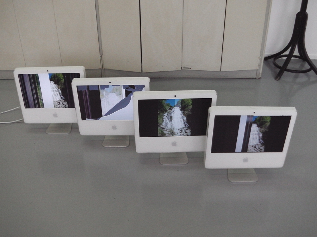
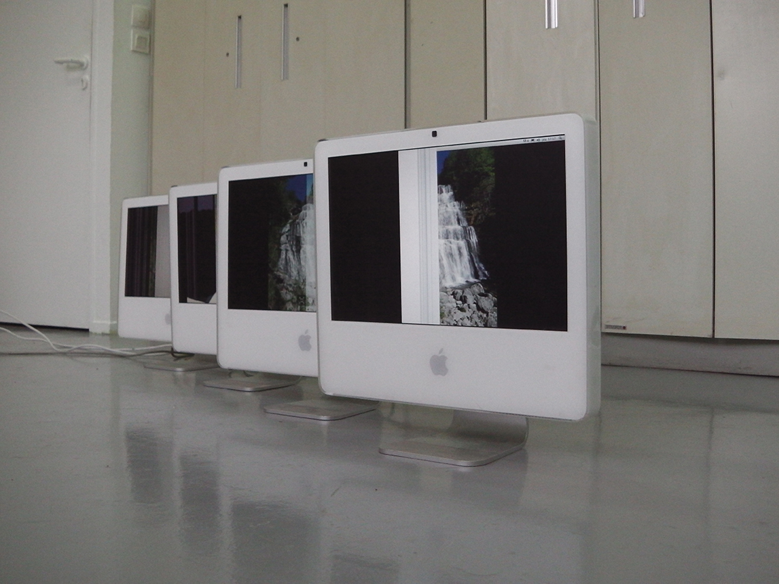
Various analog and digital experiments conducted between May and June 2016 at ESADHaR in Le Havre.
Multiple printings (from silkscreen to 3D printing), displays on different types of screens (from connected watch to cinema), projections on materials, etc.
Infos
- Year:
-
2016
- Location:
-
Le Havre
- Type:
-
personnal project
- Image :
-
Éventail Waterfall, Hérisson domain, Jura (personal photograph).
-
- Graphic design
- Book design
Images
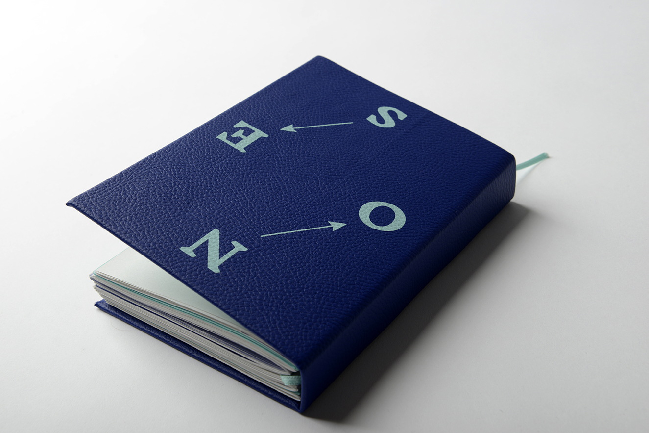
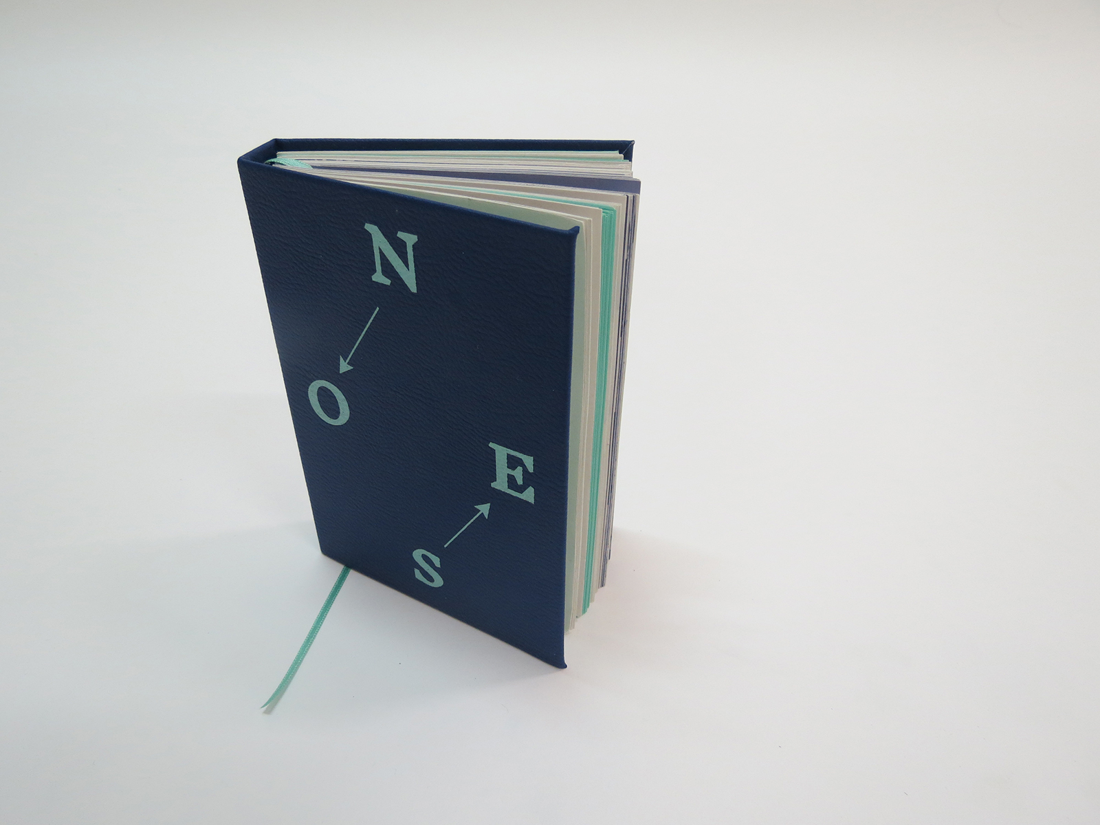
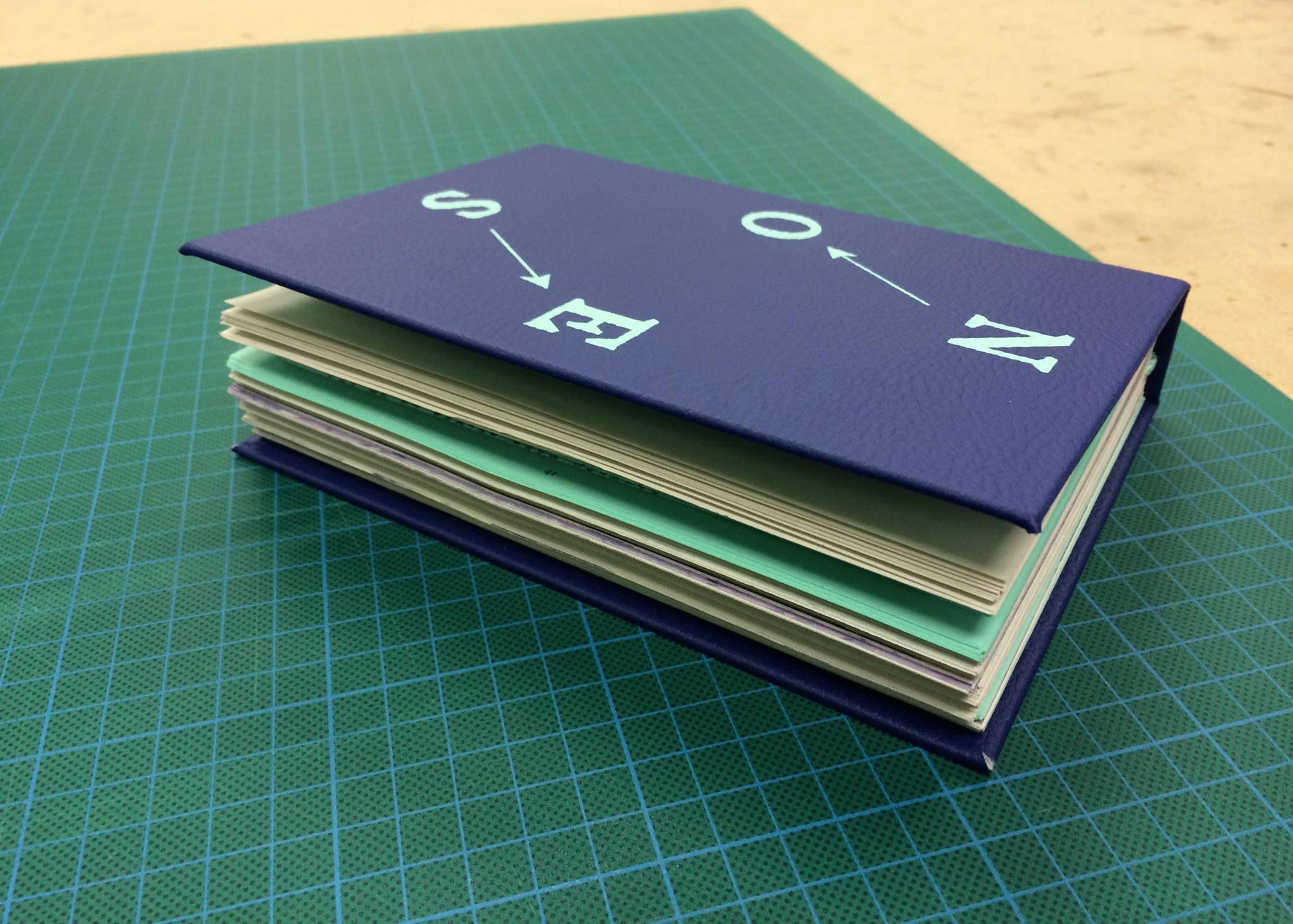
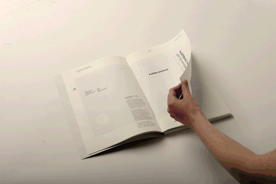
Text
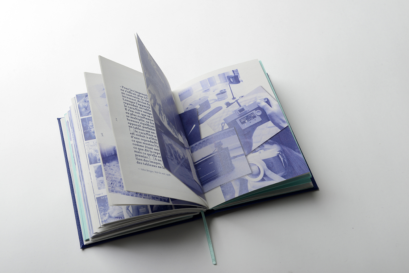
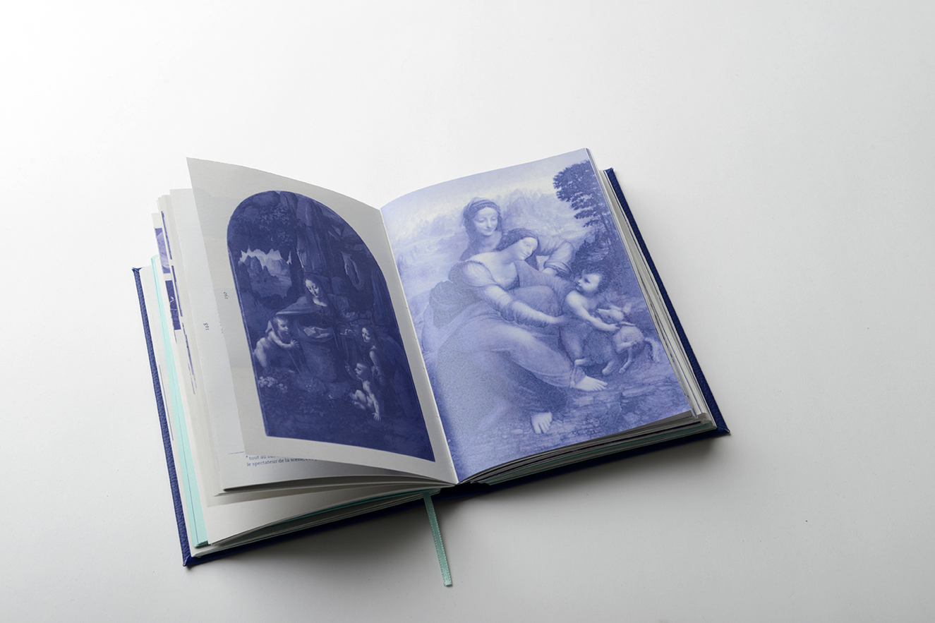
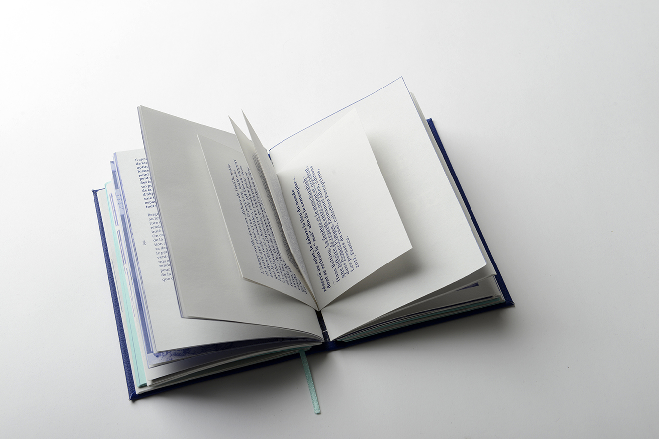
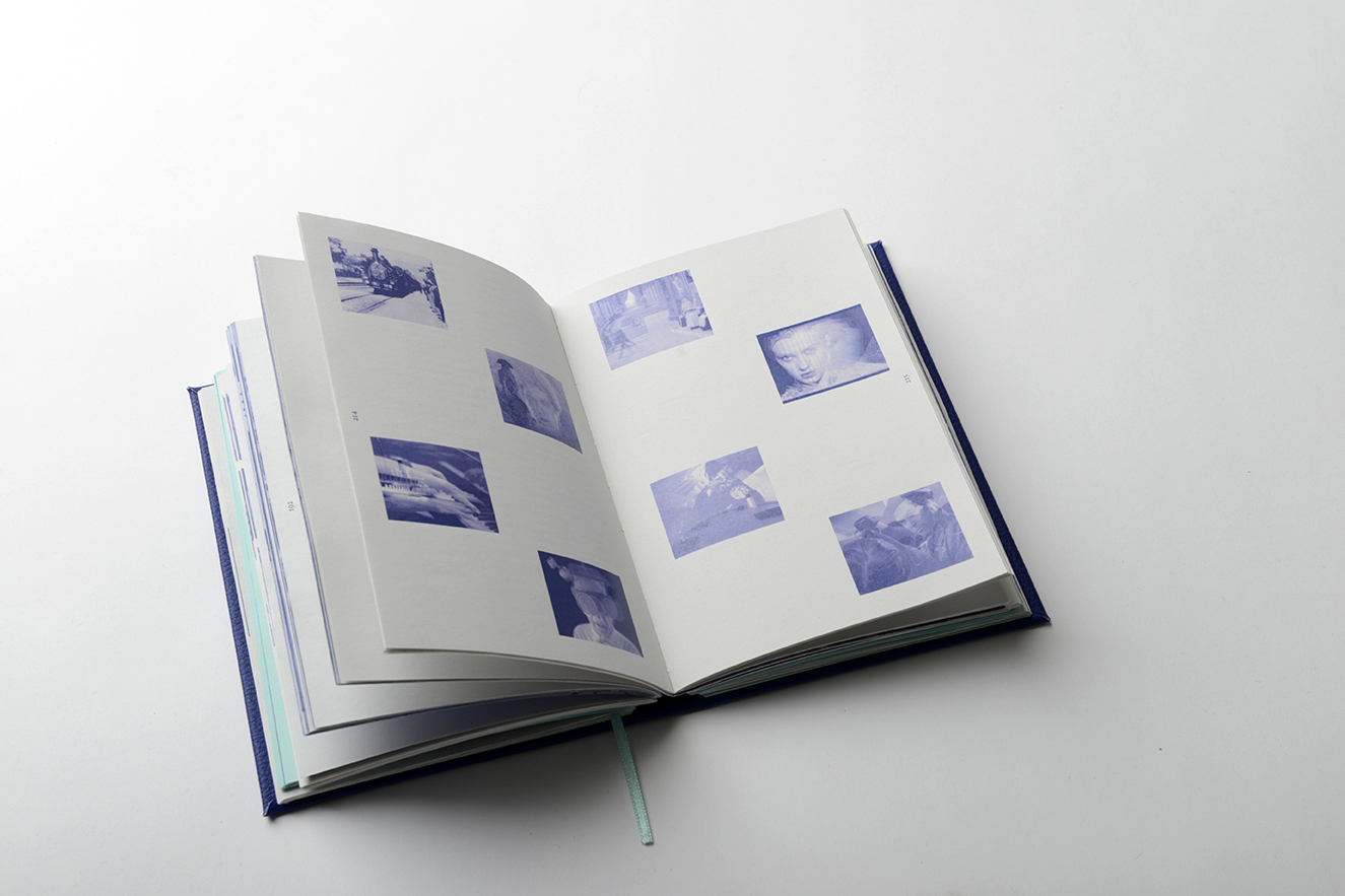
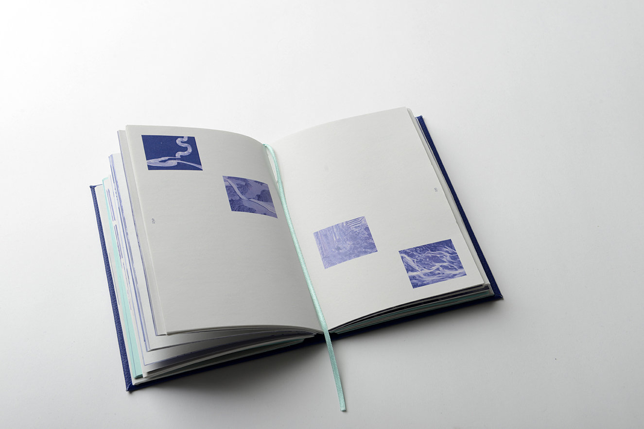
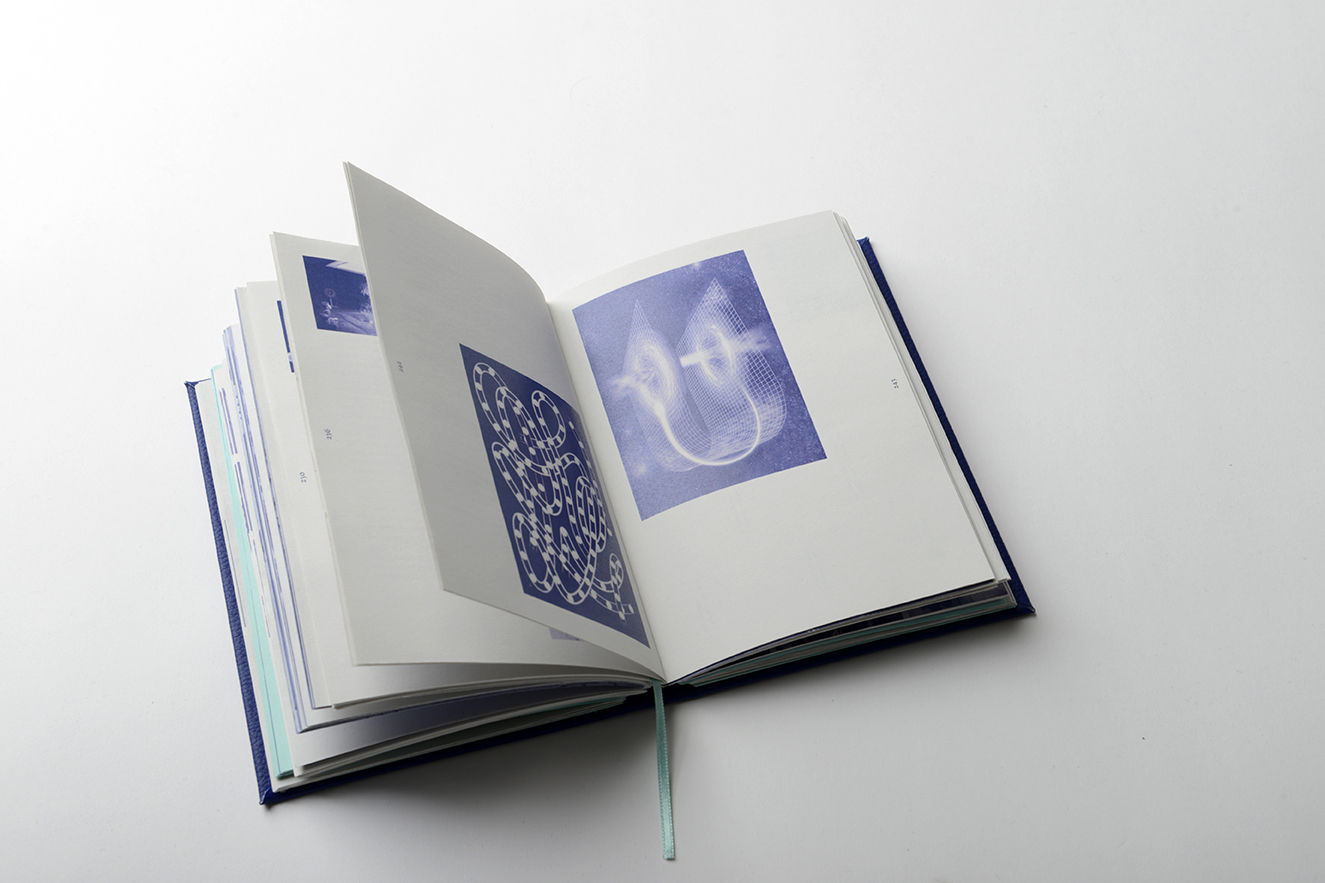
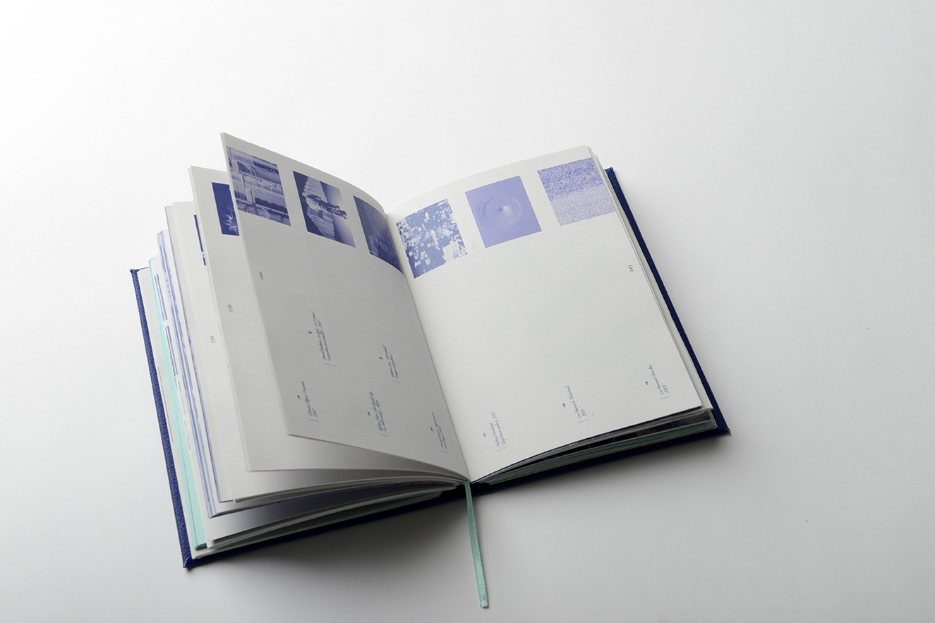
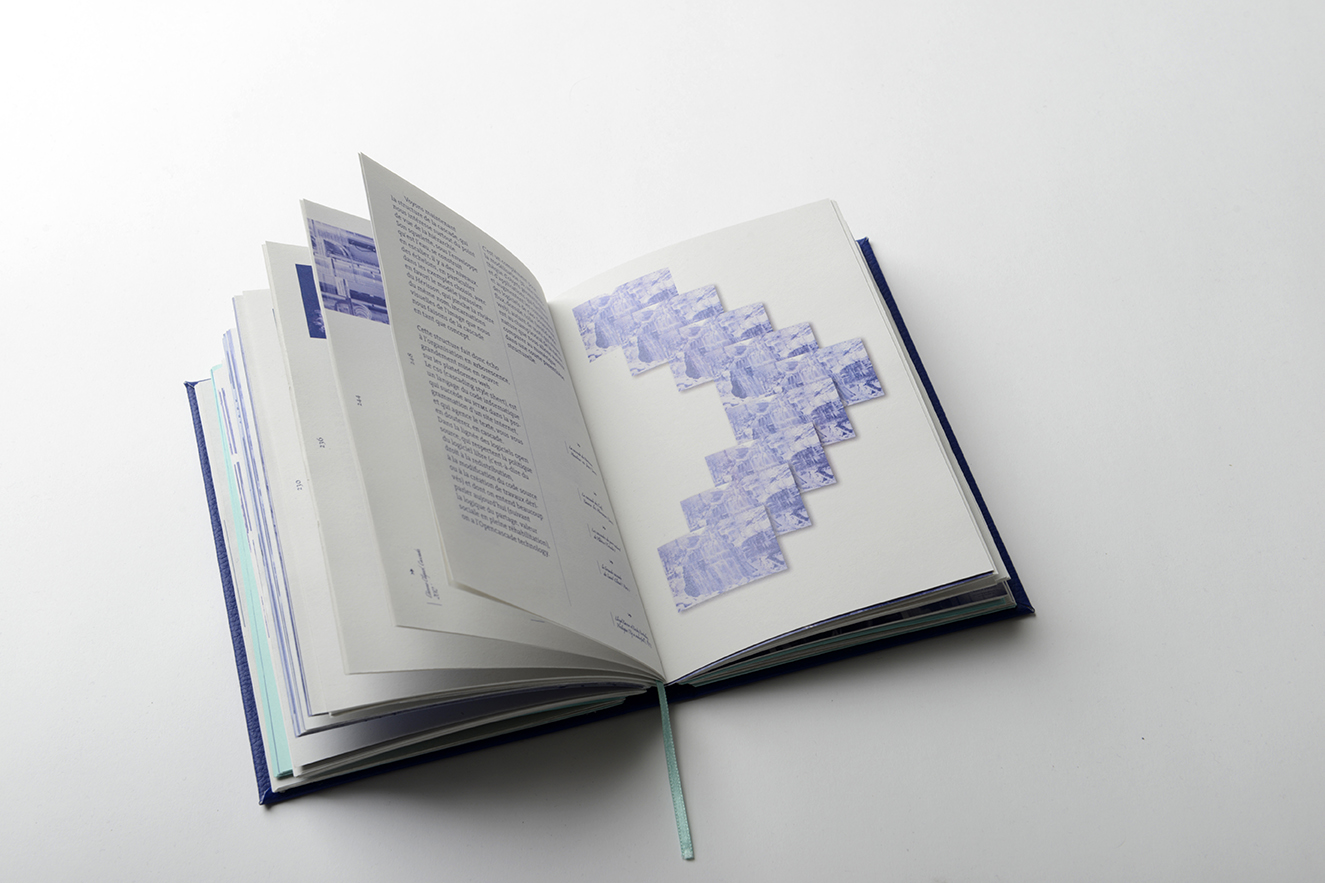
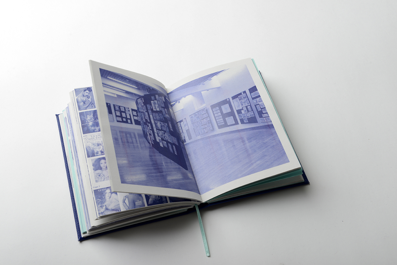
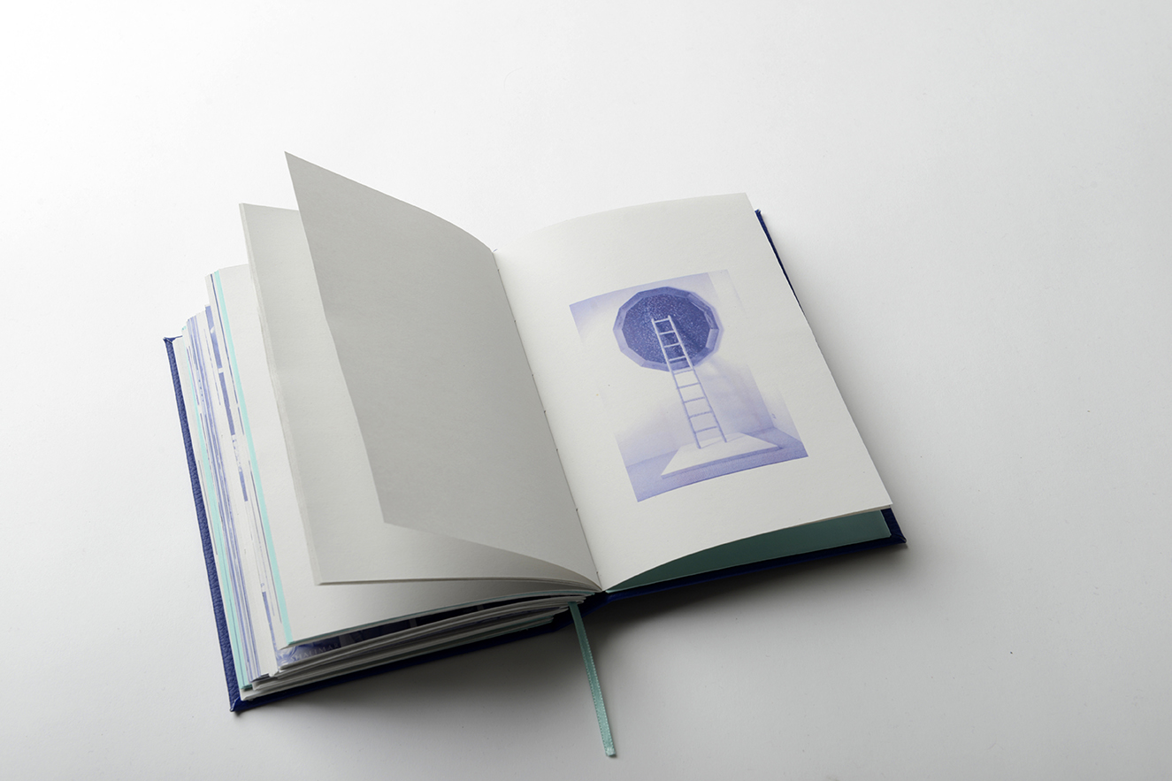
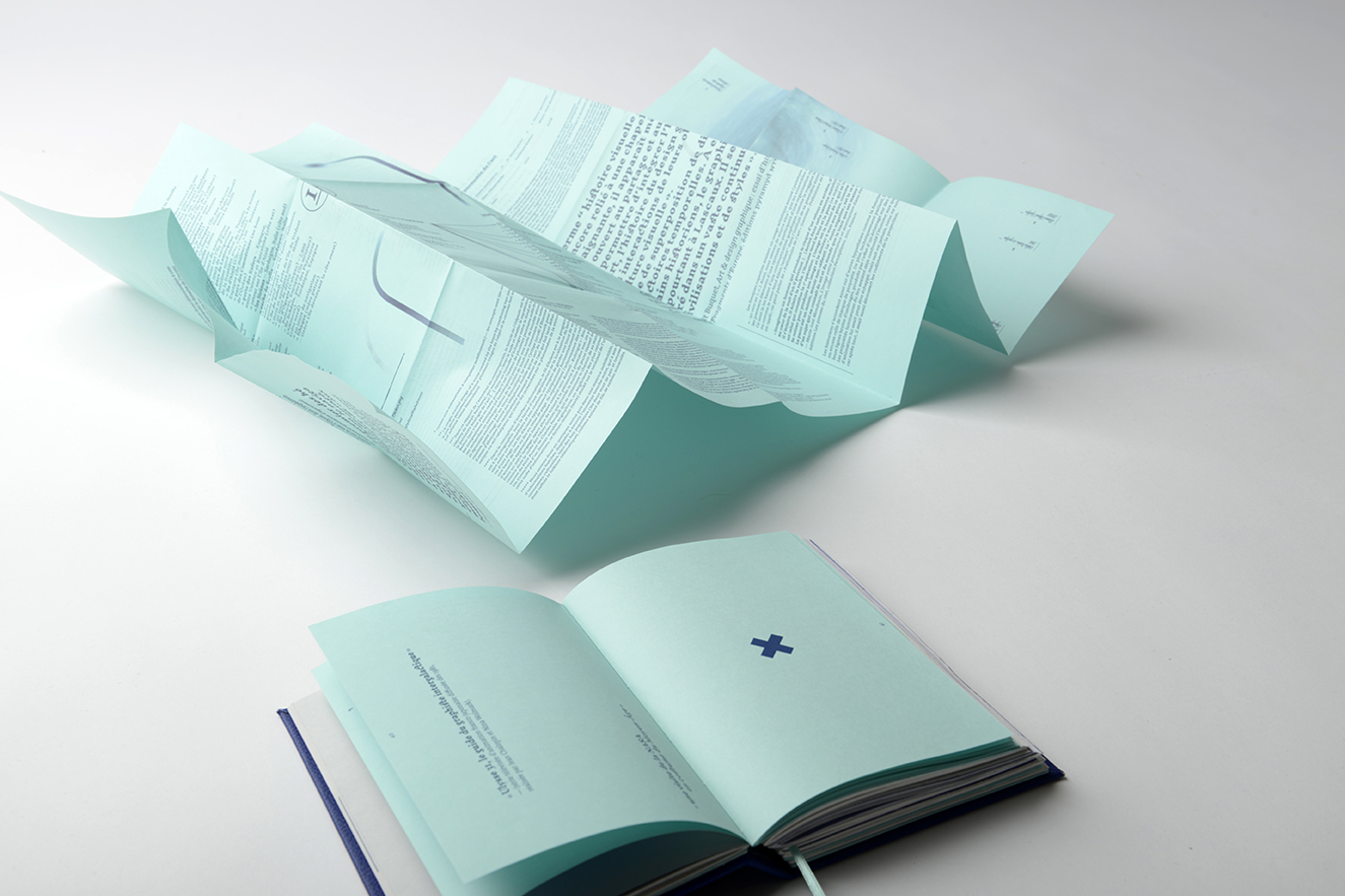
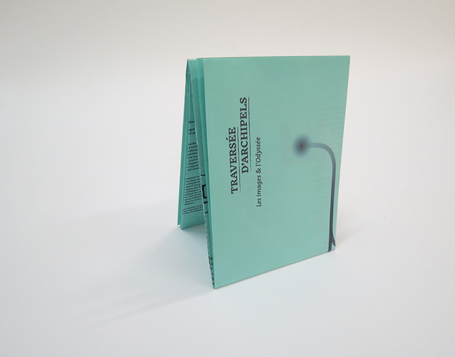
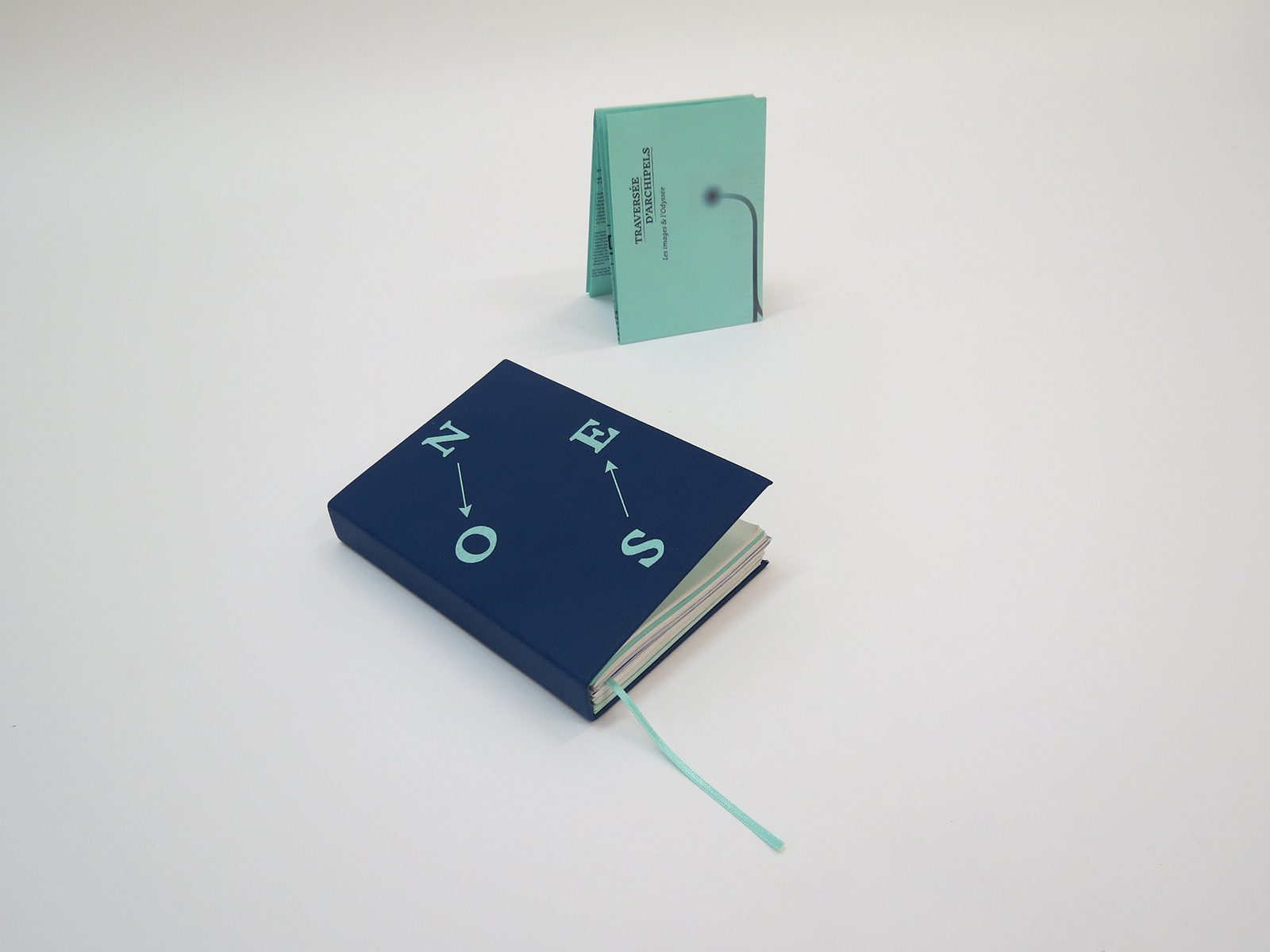
After defining a field of action in the vast domain of image thanks to the master thesis, I wanted to build my diploma project (DNSEP) around a promise: to propose “image experiments”. I conceive my projects as tools that deal with different travel modes/accesses to the image. Basically, I’m interested in what images summon when they are composed together, when they are adjoining (and thus can have many different meanings). My approach to graphic design is therefore concerned with the work of editing (as understood by Aby Warburg, Georges Didi-Huberman, Jacques Rancière and André Malraux in his Musée imaginaire, 1947) and with the questions raised by iconography.
This master thesis, which was a trigger, functions as a reference point in the sea of images that submerges us today and where our gaze has to “slalom”. It is a reflection on the relationship that links the viewer to the image, but under the metaphor of travel and the Odyssey. The “island” dimension of this diploma, which calls for circulation, is reflected in the presentation of my work (hanging in three rooms, ESADHaR, June 2016).
Printed at ESADHaR, June 2016. Format 125x180 mm, 374 pages.
Infos
- Year:
-
2016
- Location:
-
Le Havre
- Type:
-
personnal project
- Project monitoring:
- Vanina Pinter and Bachir Soussi-Chiadmi
- Printing:
- printed at ESADHaR in Le Havre in 8 copies in June 2016
- Binding:
- Hélène Pitassi
- Format:
- 125x180 mm, 374 pages
- Fonts:
-
Inknut antiqua by Claus Eggers (2014) for the titles, Thesis serif by Lucas de Groot (1994) for the main text and Aguafina script by Sudtipos (2007) for the notes.
-
- Graphic design
- Book design
Plus Plus Egal project
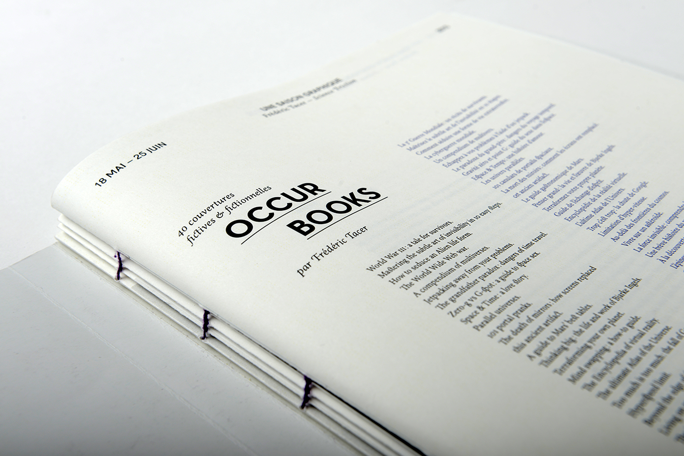
Images
Text
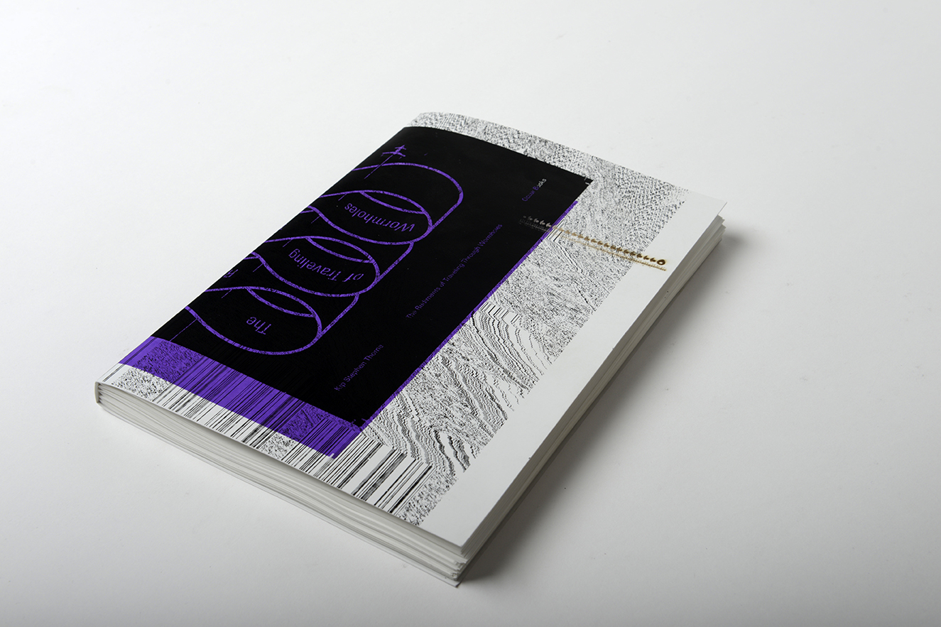
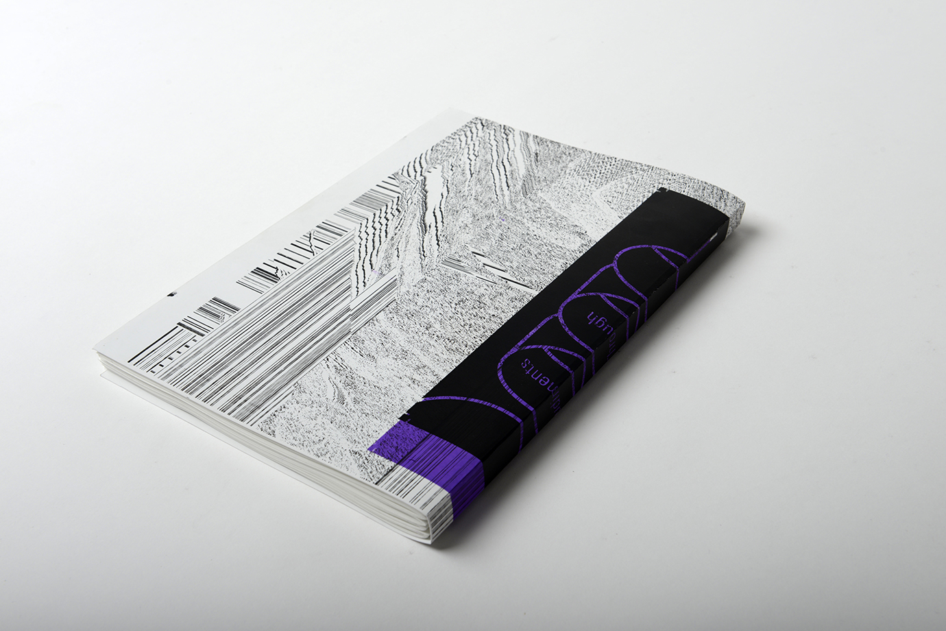
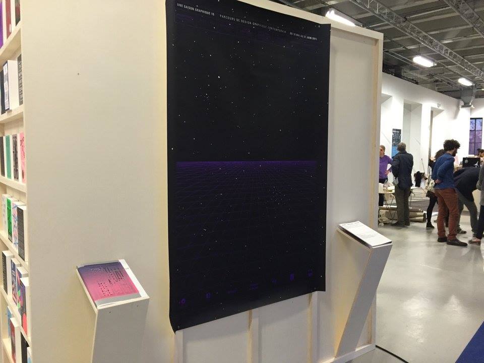
Catalogue accompanying the exhibition Science Friction by Frédéric Tacer at ESADHaR Gallery 65, as part of the Saison graphique 15.
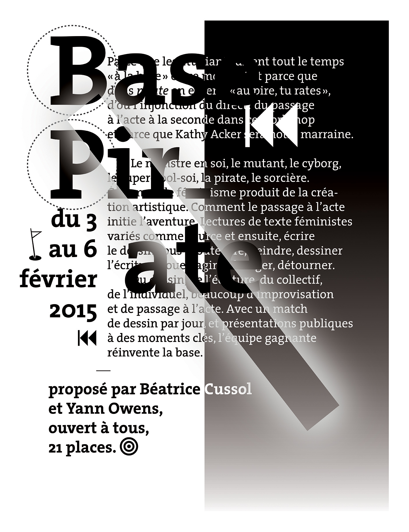
The composition work aims to establish parallels between the visuals of the covers created by Frédéric Tacer and the articles that inspired them. The notion of anticipation appears through various layout tricks such as the semi-transparency of the paper, which evokes different temporalities (past, present, future) and also induces the idea of “layers”, with reference to the printing mode (silkscreen printing) used for the covers, or the USG logo crossing the entire book. It was printed in black and white, with the exception of summary purple overprints (and the binding thread) which use the same shade as Frédéric Tacer in his generic poster for the Saison graphique. The cover is an original macule generously set aside by Yann Owens, it is decorated with a laser engraving representing the logo of the Saison graphique which runs at full speed, a reminder of the internal crossing it makes. Four other macules, all different, are slipped between the booklets, making each copy unique.
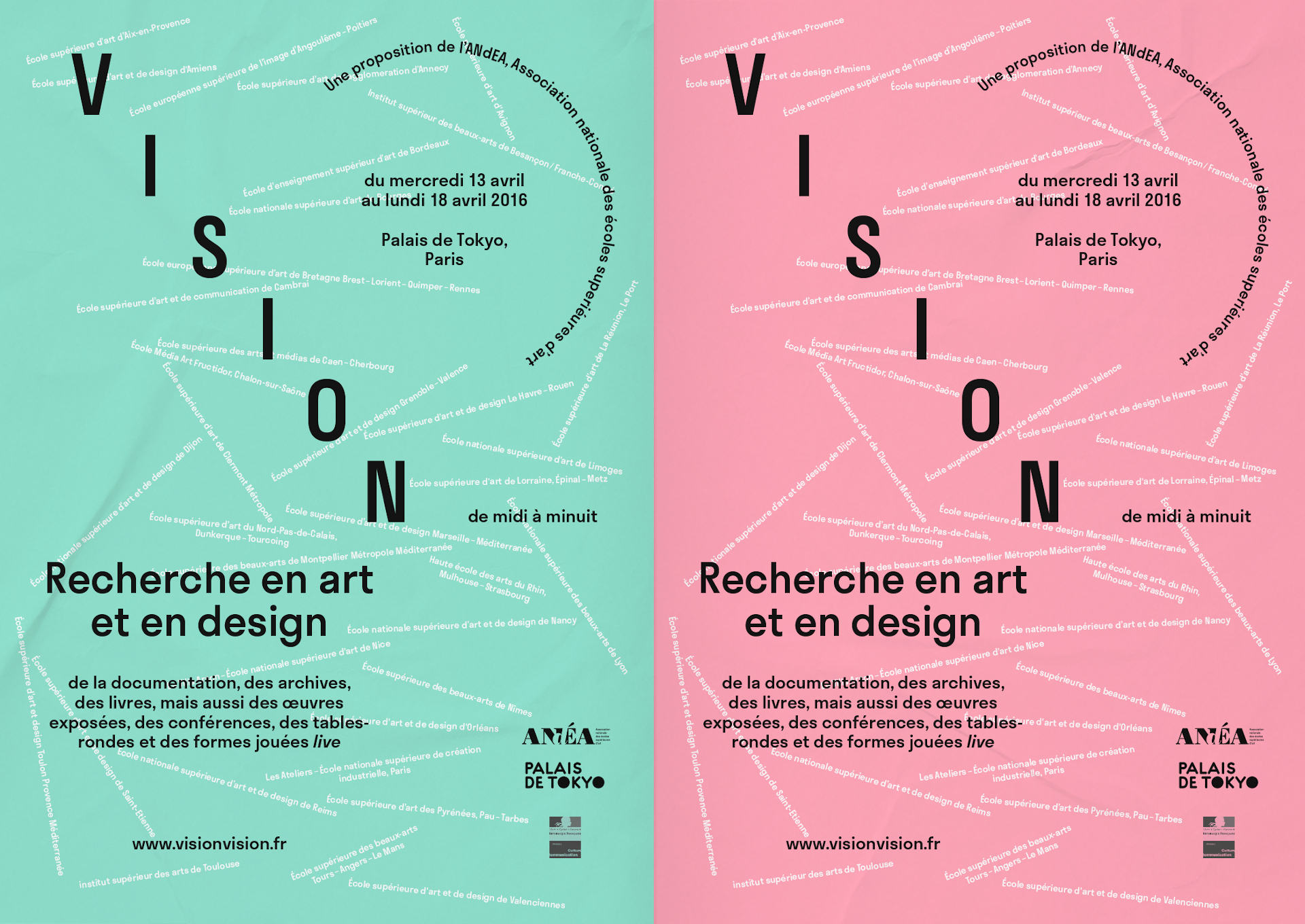
Exhibited at the Palais de Tokyo for the Vision, Recherche en Art et en Design event, proposed by Association Nationale des Écoles Supérieures d'Art (ANdÉA), from 13 to 18 April 2016 and published on the E-D-G-A-R website in May 2015.
Infos
- Year:
-
2015
- Location:
-
Le Havre
- Type:
-
co-creation with Camille Trimardeau and Anouk Berthelot
- Visuals:
- Frédéric Tacer
- Original macules, silkscreen printing :
- Yann Owens
- Printing:
- printed at ESADHaR in Le Havre in 6 copies in mai 2015.
- Format:
- 210x297 mm, 224 pages
- Binding:
- Hélène Pitassi
- Fonts:
-
Neutraface by Christan Schwarz (2002) and Fugue by Radim Peško (2010) for the titles, Minion by Robert Slimbach (1990) for the texts.